
- Services
- Case Studies
- Technologies
- NextJs development
- Flutter development
- NodeJs development
- ReactJs development
- About
- Contact
- Tools
- Blogs
- FAQ
 Scroll to discover
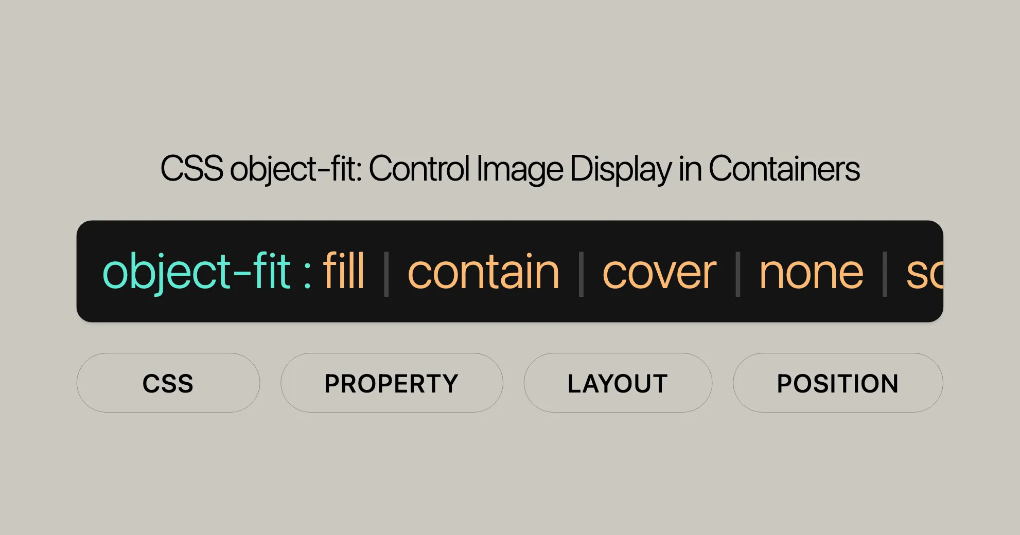
 CSS object-fit Control Image Display in Containers
Explore options like fill, contain, cover, none, and scale-down.
Introduction
The object-fit property in CSS is super handy for controlling how images and videos fit within their containers. It’s a game-changer for responsive design, ensuring that media elements look great on any screen size.
Specification
The object-fit property is defined in the CSS Images Module Level 3. This module sets the rules for handling images and other replaced elements in web design. By following these standards, object-fit ensures consistency across different browsers and platforms.
Description
The object-fit CSS property controls how images and videos fit within their containers. It’s crucial for maintaining the aspect ratio and ensuring that media elements display correctly on different devices.
With object-fit, you can make sure media elements fit their containers perfectly, whether you want to maintain the aspect ratio, crop the content, or stretch it to fit.
Syntax
The object-fit property is easy to use. Here’s the basic syntax:
object-fit: contain;object-fit: cover;object-fit: fill;object-fit: none;object-fit: scale-down;
/* Global values */object-fit: inherit;object-fit: initial;object-fit: revert;object-fit: revert-layer;object-fit: unset;
Each value dictates how the content should be resized to fit its container.
Values
Here are the possible values for object-fit and what they do:
contain
The content is scaled to maintain its aspect ratio while fitting within the container. The entire object will fit within the box, but there may be empty space around it.
cover
The content is sized to maintain its aspect ratio while filling the entire container. If the aspect ratio doesn’t match, parts of the content may be cropped.
fill
The content is sized to fill the container exactly, potentially stretching the content to fit.
none
The content is not resized.
scale-down
The content is sized as if none or contain were specified, whichever results in a smaller object size.
Global Values
inherit: Inherits the value from its parent element.initial: Sets the value to its default value.revert: Resets the property to its default value, ignoring any parent element’s value.revert-layer: Resets the property to its default value, ignoring any parent element’s value, but considering the CSS cascade layers.unset: Resets the property to its natural value, which means if the property is naturally inherited, it acts likeinherit; otherwise, it acts likeinitial.
Formal Definition
Here’s a breakdown of the formal definition of object-fit:
| Property | Value |
|---|---|
| Initial value | fill |
| Applies to | Replaced elements |
| Inherited | No |
| Computed value | As specified |
| Animation type | Discrete |
- Initial value: The default value is
fill. - Applies to: Replaced elements like images and videos.
- Inherited: No, it doesn’t inherit from parent elements.
- Computed value: The value you specify.
- Animation type: Changes are applied discretely, not smoothly.
Examples
HTML
<section>  <h2>object-fit: fill</h2>  <img class="fill" src="WebsiteUrl" alt="MDN Logo" />  <img class="fill narrow" src="WebsiteUrl" alt="MDN Logo" />
  <h2>object-fit: contain</h2>  <img class="contain" src="WebsiteUrl" alt="MDN Logo" />  <img class="contain narrow" src="WebsiteUrl" alt="MDN Logo" />
  <h2>object-fit: cover</h2>  <img class="cover" src="WebsiteUrl" alt="MDN Logo" />  <img class="cover narrow" src="WebsiteUrl" alt="MDN Logo" />
  <h2>object-fit: none</h2>  <img class="none" src="WebsiteUrl" alt="MDN Logo" />  <img class="none narrow" src="WebsiteUrl" alt="MDN Logo" />
  <h2>object-fit: scale-down</h2>  <img class="scale-down" src="WebsiteUrl" alt="MDN Logo" />  <img class="scale-down narrow" src="WebsiteUrl" alt="MDN Logo" /></section>
CSS
h2 {  font-family: Courier New, monospace;  font-size: 1em;  margin: 1em 0 0.3em;}
img {  width: 150px;  height: 100px;  border: 1px solid #000;  margin: 10px 0;}
.narrow {  width: 100px;  height: 150px;}
.fill {  object-fit: fill;}
.contain {  object-fit: contain;}
.cover {  object-fit: cover;}
.none {  object-fit: none;}
.scale-down {  object-fit: scale-down;}
Result
This example shows how different object-fit values affect the display of images within their containers. Each image demonstrates a specific behavior, helping you understand the differences.
Additional Example
HTML
<div class="image-container"> <h2>object-fit: cover</h2> <img class="image-fit" src="WebsiteUrl" alt="The Sower" /></div>CSS
.image-container {  margin: 20px 0;}
.image-fit {  object-fit: cover;  width: 150px;  height: 350px;  border: 2px solid teal;}
Result
This example shows an image being cropped to fit its container using object-fit: cover. The image maintains its aspect ratio but is clipped to fill the container’s dimensions exactly.
Interactive Example
HTML
<div class="interactive-example"> <h2>Interactive object-fit Example</h2> <img id="interactive-image" src="WebsiteUrl" alt="The Sower" /> <button onclick="changeObjectFit('fill')">Fill</button> <button onclick="changeObjectFit('contain')">Contain</button> <button onclick="changeObjectFit('cover')">Cover</button> <button onclick="changeObjectFit('none')">None</button> <button onclick="changeObjectFit('scale-down')">Scale-down</button></div>CSS
.interactive-example {  margin: 20px 0;}
#interactive-image {  width: 200px;  height: 350px;  border: 1px solid #666;}
JavaScript
function changeObjectFit(value) { document.getElementById('interactive-image').style.objectFit = value;}Result
This interactive example allows users to see the effects of different object-fit values in real-time by clicking buttons. The image will change its fitting behavior based on the selected value.
Specifications
The object-fit property is defined in the CSS Images Module Level 3 specification. This module outlines the behavior and rules for handling images and other replaced elements in web design. The object-fit property is a crucial part of this specification, providing developers with the tools to control how elements fit within their containers.
Browser Compatibility
The object-fit property is widely supported across modern web browsers, making it a reliable tool for web developers. Below is a summary of browser compatibility for the object-fit property:
| Browser | Version | Initial Support Date |
|---|---|---|
| Google Chrome | 31.0 | November 2013 |
| Mozilla Firefox | 36.0 | February 2015 |
| Microsoft Edge | 16.0 | September 2017 |
| Opera | 19.0 | January 2014 |
| Safari | 7.1 | September 2014 |
See Also
For further exploration and related CSS properties, you may also want to check out:
- [
object-position]WebsiteUrl: This property allows you to alter the alignment of the replaced element’s content object within the element’s box. - [
image-orientation]WebsiteUrl: This property specifies the orientation of an image. - [
image-rendering]WebsiteUrl: This property provides hints to the browser about how to make speed vs. quality trade-offs when rendering images. - [
image-resolution]WebsiteUrl: This property specifies the resolution of an image. - [
background-size]WebsiteUrl: This property specifies the size of the background images. - [Understanding aspect ratios]WebsiteUrl: This guide helps you understand the concept of aspect ratios in web design.
Help Improve MDN
Was this page helpful to you? If you found this information useful, consider contributing to MDN Web Docs. Your contributions can help improve the quality and accuracy of the documentation, making it a valuable resource for the web development community.
To learn more about how you can contribute, visit the [MDN Contribution Guidelines]WebsiteUrl. Your input is greatly appreciated and can make a significant difference in the quality of web development resources available to everyone.
This page was last modified on Jul 15, 2024, by [MDN contributors]WebsiteUrl. If you encounter any issues or have suggestions for improvement, please [report a problem with this content]WebsiteUrl.
Your feedback is essential in maintaining the quality and relevance of MDN Web Docs, ensuring that it remains a valuable resource for the web development community.
 Latest Blogs
  สร้างเว็บไซต์ 1 เว็บ ต้องใช้งบเท่าไหร่? เจาะลึกทุกองค์ประกอบ website development cost อยากสร้างเว็บไซต์แต่ไม่มั่นใจในเรื่องของงบประมาณ อ่านสรุปเจาะลึกตั้งแต่ดีไซน์, ฟังก์ชัน และการดูแล พร้อมตัวอย่างงบจริงจาก Till it’s done ที่แผนชัด งบไม่บานปลายแน่นอน
  Next.js สอน 14 ขั้นตอนเบื้องต้น: สร้างโปรเจกต์แรกใน 30 นาที เริ่มต้นกับ Next.js ใน 14 ขั้นตอนเพียงแค่ 30 นาที พร้อม SSR/SSG และ API Routes ด้วยตัวอย่างโค้ดง่าย ๆ อ่านต่อเพื่อสร้างโปรเจ็กต์แรกได้ทันทีที่นี่
  วิธีสมัคร Apple Developer Account เพื่อนำแอปขึ้น App Store ทีละขั้นตอน อยากปล่อยแอปบน App Store ระดับโลก มาอ่านคู่มือสมัคร Apple Developer Account พร้อมเคล็ดลับ TestFlight และวิธีอัปโหลดที่ง่ายในบทความเดียวนี้ได้เลย
  TypeScript Interface คืออะไร? อธิบายพร้อมวิธีใช้และข้อแตกต่างจาก Type เรียนรู้วิธีใช้ TypeScript Interface เพื่อสร้างโครงสร้างข้อมูลที่ปลอดภัยและเข้าใจง่าย พร้อมเปรียบเทียบข้อดีข้อแตกต่างกับ Type ที่คุณต้องรู้ ถูกรวมเอาไว้ในบทความนี้แล้ว
  Material-UI (MUI) คืออะไร อยากสร้าง UI สวยงามและเป็นมืออาชีพในเวลาอันรวดเร็วใช่ไหม มาทำความรู้จักกับ Material-UI (MUI) ที่ช่วยให้คุณพัฒนาแอปพลิเคชันบน React ได้ง่ายและดูดีในทุกอุปกรณ์
  เปรียบเทียบ 3 วิธีติดตั้ง install node js บน Ubuntu: NVM vs NodeSource vs Official Repo แบบไหนดีที่สุด? เรียนรู้วิธีติดตั้ง Node.js บน Ubuntu ด้วย NVM, NodeSource หรือ Official Repo เลือกวิธีที่เหมาะกับความต้องการของคุณ พร้อมเปรียบเทียบ เพื่อการพัฒนาที่มีประสิทธิภาพ!
 Talk with CEO
Explore our best articles, cover a wide variety of technologies 
 ReactJs
  Flutter
  Nodejs
  Nextjs
  TailwindCSS
  Typescript Golang AstroJs Jest Website development th Mobile application th Reactjs th Nextjs th Flutter th Software house th Nodejs th Typescript th
  CSS
CSS We'll be right here with you every step of the way.
We'll be here, prepared to commence this promising collaboration.


Whether you're curious about features, warranties, or shopping policies, we provide comprehensive answers to assist you.