
- Services
- Case Studies
- Technologies
- NextJs development
- Flutter development
- NodeJs development
- ReactJs development
- About
- Contact
- Tools
- Blogs
- FAQ
 Scroll to discover
 CSS justify-self Master Alignment in Web Layouts
Explore use cases and available options for precise alignment.
Introduction
The CSS justify-self property is a handy tool for web developers. It lets you control how an item is aligned within its container along the inline axis. This property is super useful in various layouts like block-level, absolutely-positioned, and grid layouts.
By using justify-self, you can fine-tune the positioning of elements to make your website look great. This can make your web pages more flexible and responsive, leading to a better user experience across different devices.
In this guide, we’ll explore the justify-self property, including its syntax, values, effects in different layouts, formal definition, examples, browser compatibility, and related CSS properties. Let’s dive in!
Effect in Different Layouts
The justify-self property behaves differently depending on the layout mode. Here’s a quick overview:
Block-Level Layouts
In block-level layouts, justify-self aligns an item inside its container on the inline axis. This is great for aligning text or other elements within a block container.
Absolutely-Positioned Layouts
For absolutely-positioned elements, justify-self aligns an item inside its container on the inline axis, considering the top, left, bottom, and right offset values. This gives you precise control over absolutely-positioned elements.
Table Cell Layouts
In table cell layouts, justify-self is ignored. Alignment is handled by other table-specific properties.
Flexbox Layouts
In flexbox layouts, justify-self is also ignored. Alignment is managed by properties like justify-content and align-items.
Grid Layouts
In grid layouts, justify-self aligns an item inside its grid area on the inline axis. This allows for flexible control over the alignment of grid items.
Understanding how justify-self works in different layouts is key to effective web development and design. By using this property, you can create dynamic and visually appealing web pages.
Syntax
The justify-self property in CSS is used to align items within their containers along the inline axis. Here’s the basic syntax:
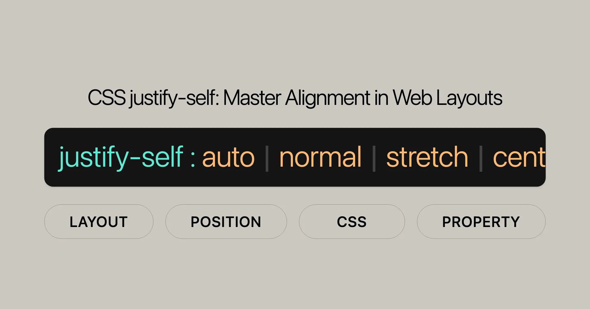
justify-self: auto;justify-self: normal;justify-self: stretch;justify-self: center;justify-self: start;justify-self: end;justify-self: flex-start;justify-self: flex-end;justify-self: self-start;justify-self: self-end;justify-self: left;justify-self: right;justify-self: baseline;justify-self: first baseline;justify-self: last baseline;justify-self: safe center;justify-self: unsafe center;justify-self: inherit;justify-self: initial;justify-self: revert;justify-self: revert-layer;justify-self: unset;The justify-self property can take different values:
- Basic Keywords: Values like
normal,auto, orstretch. - Baseline Alignment: Values like
baseline, optionally combined withfirstorlast. - Positional Alignment: Values like
center,start,end, with optionalsafeorunsafekeywords.
Using the right syntax and values, you can precisely control the alignment of elements within their containers.
Values
The justify-self property has various values that control the alignment of an item within its container. Here’s a breakdown:
Basic Keywords
auto: Uses the value of thejustify-itemsproperty of the parent box, unless the box has no parent or is absolutely positioned.normal: Behaves likestartin block-level layouts,startfor replaced elements in absolutely-positioned layouts, andstretchfor others. In grid layouts, it behaves likestretchbut likestartfor boxes with an aspect ratio or intrinsic sizes.stretch: If the combined size of the items is less than the container,auto-sized items grow equally to fill the container.
Positional Alignment
center: Centers the item within the container.start: Aligns the item to the start edge of the container.end: Aligns the item to the end edge of the container.flex-start: Equivalent tostart, butjustify-selfis ignored in flexbox layouts.flex-end: Equivalent toend, butjustify-selfis ignored in flexbox layouts.self-start: Aligns the item to the start side of itself within the container.self-end: Aligns the item to the end side of itself within the container.left: Aligns the item to the left edge of the container. If not parallel with the inline axis, behaves likestart.right: Aligns the item to the right edge of the container. If not parallel with the inline axis, behaves likestart.
Baseline Alignment
baseline: Aligns the item’s baseline with the corresponding baseline in the container.first baseline: Specifies participation in first-baseline alignment. Fallback isstart.last baseline: Specifies participation in last-baseline alignment. Fallback isend.
Overflow Alignment
safe: If the item overflows the container, it aligns as if the alignment mode werestart.unsafe: The given alignment value is honored regardless of overflow.
Global Values
inherit: Inherits the value from the parent.initial: Uses the initial value as defined by the CSS specification.revert: Reverts to the default value specified by the browser.revert-layer: Reverts to the value specified by the cascade layer.unset: Uses the inherited value if it inherits, or the initial value if it does not.
Using these values effectively can help you create more dynamic and visually appealing web designs.
Formal Definition
The justify-self property in CSS aligns a box within its container along the appropriate axis. Here are the formal definitions:
- Initial Value:
auto. - Applies To: Block-level boxes, absolutely-positioned boxes, and grid items.
- Inherited: No.
- Computed Value: As specified.
- Animation Type: Discrete.
The formal syntax for the justify-self property is:
justify-self =  auto                                                |  normal                                              |  stretch                                             |  <baseline-position>                                 |  <overflow-position>[<self-position> | left | right] |  anchor-center
<baseline-position> =  [first | last]? &&  baseline
<overflow-position> =  unsafe  |  safe
<self-position> =  center      |  start       |  end         |  self-start  |  self-end    |  flex-start  |  flex-end
This formal definition helps you understand how justify-self behaves and how to use it effectively in web development and design.
Examples
Simple Demonstration
Here’s a basic example of using justify-self in a grid layout:
<!DOCTYPE html><html lang="en"><head> <meta charset="UTF-8"> <meta name="viewport" content="width=device-width, initial-scale=1.0"> <title>Justify-Self Example</title> <style> .grid-container { display: grid; grid-template-columns: repeat(3, 1fr); grid-gap: 10px; padding: 10px; background-color: #f0f0f0; } .grid-item { background-color: #4CAF50; color: white; padding: 20px; text-align: center; } .item1 { justify-self: start; } .item2 { justify-self: center; } .item3 { justify-self: end; } </style></head><body> <div class="grid-container"> <div class="grid-item item1">Item 1</div> <div class="grid-item item2">Item 2</div> <div class="grid-item item3">Item 3</div> </div></body></html>In this example, we have a grid container with three items. Each item uses the justify-self property to align itself within its grid area. The first item is aligned to the start, the second item is centered, and the third item is aligned to the end.
Additional Examples
Block-Level Layout
.container {    display: block;    width: 300px;    height: 200px;    background-color: lightblue;    padding: 20px;}
.item {    width: 100px;    height: 100px;    background-color: darkblue;    color: white;    justify-self: start; /* Aligns the item to the start */}
Absolutely-Positioned Layout
.container {    position: relative;    width: 300px;    height: 200px;    background-color: lightcoral;}
.item {    position: absolute;    width: 100px;    height: 100px;    background-color: darkred;    color: white;    justify-self: center; /* Centers the item */}
These examples demonstrate how justify-self can be used in different layout contexts to achieve specific alignment effects. By understanding and utilizing these examples, you can create more dynamic and visually appealing web designs.
Example with Grid Layout
In this example, we’ll create a 2x2 grid layout. The grid container will use the justify-items property set to stretch (the default value), making the grid items stretch across the entire width of their cells. We’ll then apply different values of justify-self to some of the grid items to show how they override the justify-items value.
HTML
<article class="container"> <span>First child</span> <span>Second child</span> <span>Third child</span> <span>Fourth child</span></article>CSS
html {  font-family: helvetica, arial, sans-serif;  letter-spacing: 1px;}
article {  background-color: red;  display: grid;  grid-template-columns: 1fr 1fr;  grid-auto-rows: 40px;  grid-gap: 10px;  margin: 20px;  width: 300px;  justify-items: stretch;}
span:nth-child(2) {  justify-self: start;}
span:nth-child(3) {  justify-self: center;}
span:nth-child(4) {  justify-self: end;}
article span {  background-color: black;  color: white;  margin: 1px;  text-align: center;}
article, span {  padding: 10px;  border-radius: 7px;}
Result
In this example, the second grid item will be aligned to the start of its cell, the third grid item will be centered within its cell, and the fourth grid item will be aligned to the end of its cell. The first grid item will remain stretched across its cell due to the justify-items: stretch property on the container.
Browser Compatibility
The justify-self property is widely supported by modern web browsers. Here’s a quick overview of browser compatibility:
- Chrome: Supports
justify-selffrom version 57. - Firefox: Supports
justify-selffrom version 52. - Safari: Supports
justify-selffrom version 10.1. - Edge: Supports
justify-selffrom version 16. - Opera: Supports
justify-selffrom version 44.
For the most up-to-date information on browser compatibility, you can check resources like Can I Use.
Related CSS Properties
Here are some related CSS properties that you might find useful when working with justify-self:
justify-items: Aligns all items within a container.justify-content: Aligns the content within a container.align-self: Aligns a single item within a container along the block axis.align-items: Aligns all items within a container along the block axis.align-content: Aligns the content within a container along the block axis.
Understanding these related properties can help you create more flexible and responsive web designs.
Specifications
The justify-self property is defined in the CSS Box Alignment Module Level 3 specification. This specification outlines the behavior and usage of the justify-self property, ensuring consistency and standardization across different web browsers.
Specification Details
- Specification Name: CSS Box Alignment Module Level 3
- Property Reference:
justify-self - Link: CSS Box Alignment Module Level 3 - justify-self property
The CSS Box Alignment Module Level 3 specification provides detailed information about the justify-self property, including its syntax, values, and how it interacts with other CSS properties. This specification is maintained by the CSS Working Group, which ensures that the property is well-documented and widely supported.
Browser Compatibility
The justify-self property is supported by most modern web browsers, ensuring that developers can use it to create consistent and visually appealing web designs. Here is a summary of the browser compatibility for the justify-self property:
- Google Chrome: Full support
- Microsoft Edge: Full support
- Mozilla Firefox: Full support
- Opera: Full support
- Safari: Full support
For the most accurate and detailed information about browser compatibility, developers can refer to the MDN Web Docs Browser Compatibility Data. This resource provides up-to-date information on the support for the justify-self property across different browser versions.
See Also
For further exploration and understanding of related CSS properties, developers can refer to the following resources:
justify-itemsProperty: This property aligns all items within a container along the inline axis. It is useful for setting a default alignment for all items in a grid or flex container.- Box Alignment in CSS Grid Layouts: Learn more about how alignment works in CSS grid layouts. This resource provides detailed information about aligning items within grid containers.
- CSS Box Alignment Module: Explore the CSS Box Alignment module for a comprehensive overview of alignment properties in CSS. This module covers various alignment properties and their uses in different layouts.
These resources provide additional insights and details about related CSS properties and concepts, helping developers to create more sophisticated and visually appealing web designs. By understanding and utilizing these properties effectively, developers can enhance the overall user experience and create more dynamic and responsive web applications.
 Latest Blogs
  สร้างเว็บไซต์ 1 เว็บ ต้องใช้งบเท่าไหร่? เจาะลึกทุกองค์ประกอบ website development cost อยากสร้างเว็บไซต์แต่ไม่มั่นใจในเรื่องของงบประมาณ อ่านสรุปเจาะลึกตั้งแต่ดีไซน์, ฟังก์ชัน และการดูแล พร้อมตัวอย่างงบจริงจาก Till it’s done ที่แผนชัด งบไม่บานปลายแน่นอน
  Next.js สอน 14 ขั้นตอนเบื้องต้น: สร้างโปรเจกต์แรกใน 30 นาที เริ่มต้นกับ Next.js ใน 14 ขั้นตอนเพียงแค่ 30 นาที พร้อม SSR/SSG และ API Routes ด้วยตัวอย่างโค้ดง่าย ๆ อ่านต่อเพื่อสร้างโปรเจ็กต์แรกได้ทันทีที่นี่
  วิธีสมัคร Apple Developer Account เพื่อนำแอปขึ้น App Store ทีละขั้นตอน อยากปล่อยแอปบน App Store ระดับโลก มาอ่านคู่มือสมัคร Apple Developer Account พร้อมเคล็ดลับ TestFlight และวิธีอัปโหลดที่ง่ายในบทความเดียวนี้ได้เลย
  TypeScript Interface คืออะไร? อธิบายพร้อมวิธีใช้และข้อแตกต่างจาก Type เรียนรู้วิธีใช้ TypeScript Interface เพื่อสร้างโครงสร้างข้อมูลที่ปลอดภัยและเข้าใจง่าย พร้อมเปรียบเทียบข้อดีข้อแตกต่างกับ Type ที่คุณต้องรู้ ถูกรวมเอาไว้ในบทความนี้แล้ว
  Material-UI (MUI) คืออะไร อยากสร้าง UI สวยงามและเป็นมืออาชีพในเวลาอันรวดเร็วใช่ไหม มาทำความรู้จักกับ Material-UI (MUI) ที่ช่วยให้คุณพัฒนาแอปพลิเคชันบน React ได้ง่ายและดูดีในทุกอุปกรณ์
  เปรียบเทียบ 3 วิธีติดตั้ง install node js บน Ubuntu: NVM vs NodeSource vs Official Repo แบบไหนดีที่สุด? เรียนรู้วิธีติดตั้ง Node.js บน Ubuntu ด้วย NVM, NodeSource หรือ Official Repo เลือกวิธีที่เหมาะกับความต้องการของคุณ พร้อมเปรียบเทียบ เพื่อการพัฒนาที่มีประสิทธิภาพ!
 Talk with CEO
Explore our best articles, cover a wide variety of technologies 
 ReactJs
  Flutter
  Nodejs
  Nextjs
  TailwindCSS
  Typescript Golang AstroJs Jest Website development th Mobile application th Reactjs th Nextjs th Flutter th Software house th Nodejs th Typescript th
  CSS
CSS We'll be right here with you every step of the way.
We'll be here, prepared to commence this promising collaboration.


Whether you're curious about features, warranties, or shopping policies, we provide comprehensive answers to assist you.