
- Services
- Case Studies
- Technologies
- NextJs development
- Flutter development
- NodeJs development
- ReactJs development
- About
- Contact
- Tools
- Blogs
- FAQ
 Scroll to discover
 Tips for Building Responsive UI in Flutter
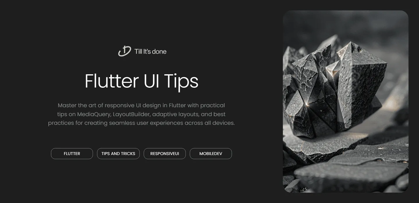
Tips for Building Responsive UI in Flutter: A Comprehensive Guide

Creating responsive user interfaces in Flutter is crucial for delivering a consistent user experience across different screen sizes and orientations. In this guide, we’ll explore practical tips and best practices to make your Flutter apps look great on any device.
Understanding Flutter’s Layout Philosophy
Flutter’s layout system is built on the principle of constraints and sizes. Each widget receives constraints from its parent and must determine its size within those constraints. This fundamental concept is key to building truly responsive UIs.

Essential Tips for Responsive Design
1. Leverage MediaQuery and LayoutBuilder
MediaQuery is your best friend when it comes to responsive design. It provides valuable information about the device’s screen size, orientation, and pixel density. Here’s how to use it effectively:
- Always use MediaQuery for dynamic sizing calculations
- Create custom breakpoints based on screen width
- Handle orientation changes gracefully
- Consider pixel density for proper scaling
LayoutBuilder takes responsiveness a step further by providing constraints from the parent widget, allowing for even more precise control over your layouts.
2. Master Flexible and Expanded Widgets
These widgets are essential tools in your responsive design toolkit:
- Use Flexible for proportional spacing
- Implement Expanded for filling available space
- Combine both for complex layouts that adapt naturally
3. Implement Adaptive Layouts

Create layouts that respond intelligently to different screen sizes:
- Design for both portrait and landscape orientations
- Use conditional rendering based on screen width
- Implement different layouts for mobile and tablet/desktop
- Consider navigation patterns that work across form factors
4. Embrace Custom Widgets
Build reusable widgets that automatically adapt:
- Create responsive text widgets that scale appropriately
- Develop adaptive containers that resize based on screen dimensions
- Design flexible card layouts that reflow content
5. Testing and Validation
Always test your responsive layouts thoroughly:
- Use Flutter’s Device Preview package
- Test on multiple real devices
- Verify behavior across different orientations
- Check edge cases with extreme screen sizes
Best Practices to Remember
- Avoid hard-coded dimensions whenever possible
- Use relative measurements instead of absolute pixels
- Implement min and max constraints to maintain usability
- Consider different aspect ratios when designing layouts
- Keep text readable across all screen sizes
Common Pitfalls to Avoid
- Don’t assume a fixed screen size
- Avoid overcomplicating layouts unnecessarily
- Don’t forget about keyboard insets
- Never ignore smaller screen sizes

Remember, responsive design in Flutter is not just about making things fit—it’s about creating interfaces that feel natural and intuitive across all devices. By following these tips and best practices, you’ll be well-equipped to create Flutter applications that provide an excellent user experience regardless of screen size or device type.
 Latest Blogs
  Flutter คืออะไร ฟรีมั้ย การพัฒนาแอปพลิเคชันในยุคดิจิทัลนี้ Flutter ได้กลายเป็นหนึ่งในเครื่องมือที่ได้รับความนิยมอย่างมากในวงการ แล้ว Flutter คืออะไร แล้วใช้งานฟรีหรือไม่?
  Company Website vs Corporate Website สิ่งสำคัญของเว็บไซต์บริษัทคืออะไร เรื่องต้องรู้ก่อนจ้างทีม การเลือกระหว่าง Company Website กับ Corporate Website มีผลต่อภาพลักษณ์และวัตถุประสงค์ขององค์กร ซึ่งบทความนี้จะช่วยอธิบายความแตกต่างและแนวทางที่เหมาะสม
  อยากสร้าง Mobile App จะเลือกใช้โปรแกรมเขียน Mobile App การเลือกโปรแกรมเขียน Mobile App มีเครื่องมือกับภาษาอะไรให้เลือกใช้งานกันมากมาย ควรพิจารณาอย่างไรเพื่อให้มีประสิทธิภาพและตรงตามความต้องการของโปรเจกต์
 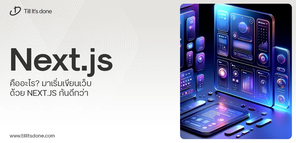 Next.js คืออะไร? มาเริ่มเขียนเว็บด้วย Next.js กันดีกว่า Next.js เป็น Framework สำหรับสร้างเว็บไซต์ด้วย React ที่ช่วยให้สามารถสร้างเว็บไซต์ที่มีประสิทธิภาพและใช้งานได้จริง และรองรับ SEO ได้ดีขึ้นอีกด้วย
  รู้จักกับ บริษัท Software House คืออะไร ทำอะไรบ้าง Software House คือศูนย์บริการที่ครบวงจรในการพัฒนาเทคโนโลยี ช่วยสนับสนุนธุรกิจในยุค 4.0 และสร้างโอกาสใหม่ ๆ ในตลาดการแข่งขันที่มีการเปลี่ยนแปลงอย่างรวดเร็ว
 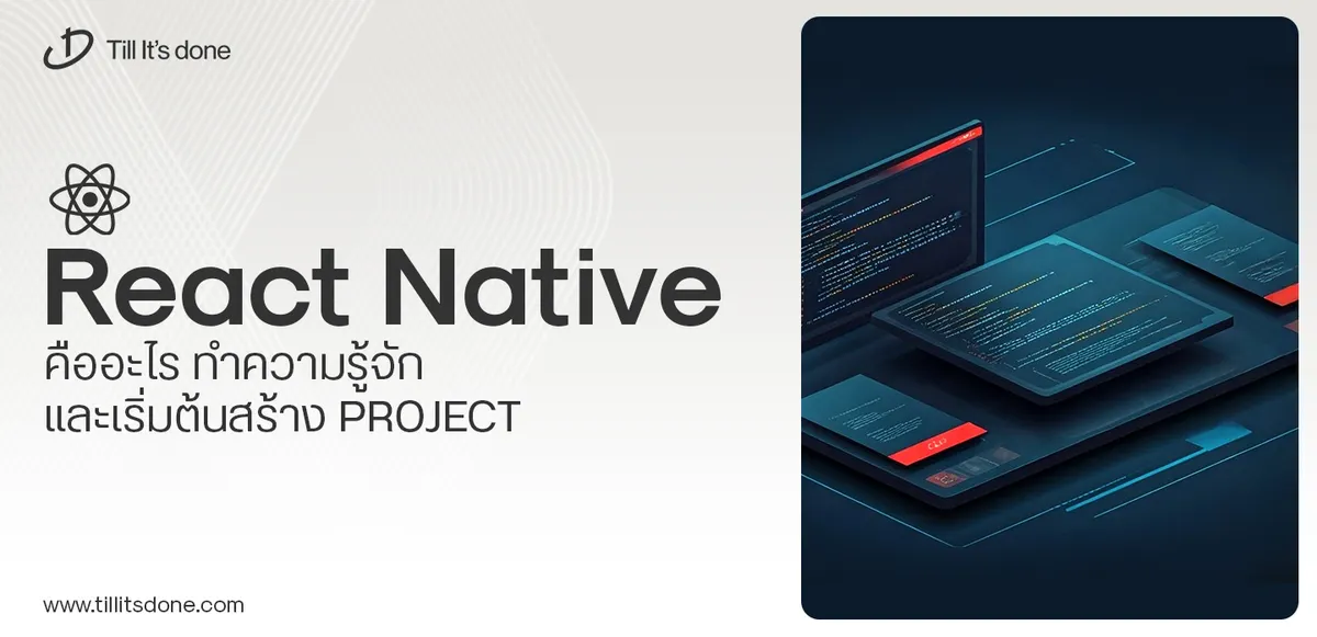 React Native คืออะไร ทำความรู้จัก และเริ่มต้นสร้าง Project React Native คือ Framework ที่ช่วยให้นักพัฒนาสร้างแอปมือถือ โดยมีประสิทธิภาพใกล้เคียงกับ Native App ซึ่งลดเวลาและค่าใช้จ่ายในการพัฒนา แต่ทำได้ยังไงกันนะ
Talk with CEO
Explore our best articles, cover a wide variety of technologies 
 ReactJs Flutter
  Nodejs
  Nextjs
  TailwindCSS
  Typescript Golang AstroJs Jest Mobile application th Reactjs th Website development th Flutter th Software house th Nextjs th
  CSS
CSS We'll be right here with you every step of the way.
We'll be here, prepared to commence this promising collaboration.


Whether you're curious about features, warranties, or shopping policies, we provide comprehensive answers to assist you.