
- Services
- Case Studies
- Technologies
- NextJs development
- Flutter development
- NodeJs development
- ReactJs development
- About
- Contact
- Tools
- Blogs
- FAQ
 Scroll to discover
 CSS shape-margin Property Enhance Layouts with Precision
Discover how to use it to set margins for CSS shapes, explore its various options, and enhance your web layouts.
Introduction
The shape-margin property in CSS is a handy tool for web designers. It lets you set a margin around a shape created with the shape-outside property. This feature has been around since January 2020 and works on many devices and browsers. By adjusting the space between the shape and surrounding content, shape-margin makes your web designs more flexible and visually appealing.
Specification
The shape-margin property is part of the CSS Shapes Module Level 1. This module allows you to define geometric shapes and use them to wrap content around.
Description
The shape-margin property sets a margin for a shape created with the shape-outside property. This margin adjusts the space between the shape and the surrounding content. It’s great for creating dynamic and visually appealing designs.
Syntax
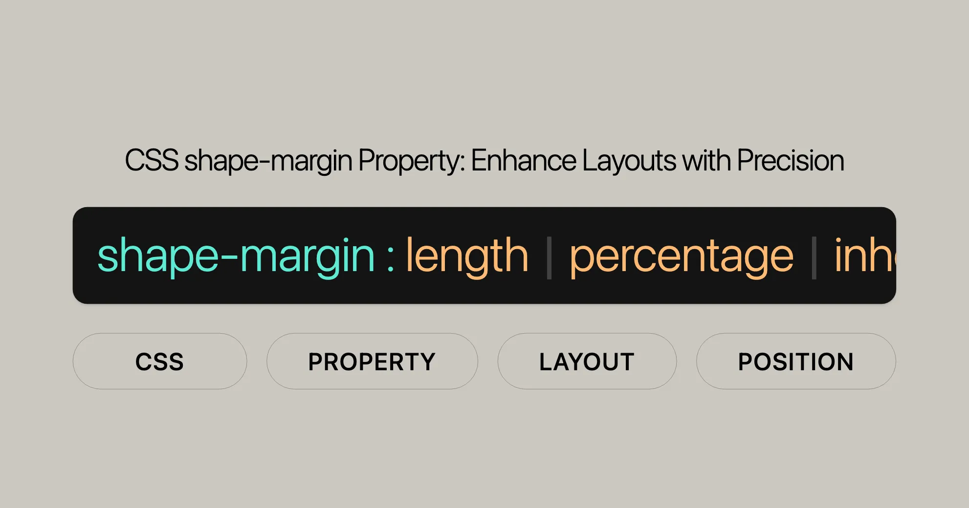
The shape-margin property is easy to use. It accepts lengths, percentages, and global values. Here’s the basic syntax:
shape-margin: <length> | <percentage>;Length Values
You can set the margin using specific lengths, like pixels (px) or millimeters (mm).
shape-margin: 10px;shape-margin: 20mm;Percentage Values
You can also set the margin as a percentage of the width of the element’s containing block.
shape-margin: 60%;Global Values
The shape-margin property supports global values like inherit, initial, revert, revert-layer, and unset.
shape-margin: inherit;shape-margin: initial;shape-margin: revert;shape-margin: revert-layer;shape-margin: unset;Values
The shape-margin property accepts a range of values, including lengths, percentages, and global values.
Length Values
<length>: Sets the margin to a specific length, like pixels (px) or millimeters (mm).shape-margin: 10px;shape-margin: 20mm;
Percentage Values
<percentage>: Sets the margin as a percentage of the width of the element’s containing block.shape-margin: 60%;
Global Values
inherit: Inherits the value from the parent element.shape-margin: inherit;initial: Sets the property to its initial value, which is0.shape-margin: initial;revert: Reverts the property to the user agent’s default stylesheet value.shape-margin: revert;revert-layer: Reverts the property to the value specified in the previous cascade layer.shape-margin: revert-layer;unset: Resets the property to its natural value, which means it acts asinitialif the property is not inherited, orinheritif it is.shape-margin: unset;
Formal Definition
The shape-margin property is formally defined with specific characteristics:
- Initial Value:
0 - Applies To: Floats
- Inherited: No
- Percentages: Refer to the width of the containing block
- Computed Value: As specified, but with relative lengths converted into absolute lengths
- Animation Type: A length, percentage, or
calc()
Formal Syntax
The formal syntax for the shape-margin property is:
shape-margin = <length-percentage [0,∞]>Where <length-percentage> can be:
<length>: A length value (e.g.,px,mm)<percentage>: A percentage value
Browser Compatibility
The shape-margin property is widely supported across various browsers:
- Google Chrome 37
- Firefox 62
- Safari 10.1
- Opera 24
See Also
- [CSS Shapes]WebsiteUrl
- [Overview of CSS Shapes]WebsiteUrl
- [
shape-outside]WebsiteUrl - [
shape-image-threshold]WebsiteUrl - [
<basic-shape>]WebsiteUrl
Examples
Adding a Margin to a Polygon
HTML
<section> <div class="shape"></div> We are not quite sure of any one thing in biology; our knowledge of geology is relatively very slight, and the economic laws of society are uncertain to every one except some individual who attempts to set them forth; but before the world was fashioned the square on the hypotenuse was equal to the sum of the squares on the other two sides of a right triangle, and it will be so after this world is dead; and the inhabitant of Mars, if one exists, probably knows its truth as we know it.</section>CSS
section {  max-width: 400px;}
.shape {  float: left;  width: 150px;  height: 150px;  background-color: maroon;  clip-path: polygon(0 0, 150px 150px, 0 150px);  shape-outside: polygon(0 0, 150px 150px, 0 150px);  shape-margin: 20px;}
Adding a Margin to a Circle
HTML
<section> <div class="circle"></div> The `shape-margin` property is a powerful tool for web development and design. It allows you to set a margin for a CSS shape created using the `shape-outside` property. This feature has been widely available since January 2020 and works across many devices and browser versions. By adjusting the distance between the edges of the shape and the surrounding content, `shape-margin` enhances the flexibility and visual appeal of your web designs.</section>CSS
section {  max-width: 400px;}
.circle {  float: left;  width: 150px;  height: 150px;  background-color: maroon;  border-radius: 50%;  shape-outside: circle(50%);  shape-margin: 20px;}
Adding a Margin to an Ellipse
HTML
<section> <div class="ellipse"></div> The `shape-margin` property provides greater control over the layout and appearance of your web pages. It allows you to fine-tune the spacing around custom shapes, ensuring that your content flows smoothly and looks polished.</section>CSS
section {  max-width: 400px;}
.ellipse {  float: left;  width: 200px;  height: 100px;  background-color: green;  clip-path: ellipse(50% 50% at 50% 50%);  shape-outside: ellipse(50% 50% at 50% 50%);  shape-margin: 15px;}
Using shape-margin for Spacing Around Shapes
HTML
<section> <div class="circle"></div> The `shape-margin` property provides greater control over the layout and appearance of your web pages. It allows you to fine-tune the spacing around custom shapes, ensuring that your content flows smoothly and looks polished.</section>CSS
section {  max-width: 400px;}
.circle {  float: left;  width: 100px;  height: 100px;  background-color: blue;  clip-path: circle(50%);  shape-outside: circle(50%);  shape-margin: 10px;}
These examples show how to use the shape-margin property to add margins around different shapes, enhancing the layout and readability of your content.
 Latest Blogs
  สร้างเว็บไซต์ 1 เว็บ ต้องใช้งบเท่าไหร่? เจาะลึกทุกองค์ประกอบ website development cost อยากสร้างเว็บไซต์แต่ไม่มั่นใจในเรื่องของงบประมาณ อ่านสรุปเจาะลึกตั้งแต่ดีไซน์, ฟังก์ชัน และการดูแล พร้อมตัวอย่างงบจริงจาก Till it’s done ที่แผนชัด งบไม่บานปลายแน่นอน
  Next.js สอน 14 ขั้นตอนเบื้องต้น: สร้างโปรเจกต์แรกใน 30 นาที เริ่มต้นกับ Next.js ใน 14 ขั้นตอนเพียงแค่ 30 นาที พร้อม SSR/SSG และ API Routes ด้วยตัวอย่างโค้ดง่าย ๆ อ่านต่อเพื่อสร้างโปรเจ็กต์แรกได้ทันทีที่นี่
  วิธีสมัคร Apple Developer Account เพื่อนำแอปขึ้น App Store ทีละขั้นตอน อยากปล่อยแอปบน App Store ระดับโลก มาอ่านคู่มือสมัคร Apple Developer Account พร้อมเคล็ดลับ TestFlight และวิธีอัปโหลดที่ง่ายในบทความเดียวนี้ได้เลย
  TypeScript Interface คืออะไร? อธิบายพร้อมวิธีใช้และข้อแตกต่างจาก Type เรียนรู้วิธีใช้ TypeScript Interface เพื่อสร้างโครงสร้างข้อมูลที่ปลอดภัยและเข้าใจง่าย พร้อมเปรียบเทียบข้อดีข้อแตกต่างกับ Type ที่คุณต้องรู้ ถูกรวมเอาไว้ในบทความนี้แล้ว
  Material-UI (MUI) คืออะไร อยากสร้าง UI สวยงามและเป็นมืออาชีพในเวลาอันรวดเร็วใช่ไหม มาทำความรู้จักกับ Material-UI (MUI) ที่ช่วยให้คุณพัฒนาแอปพลิเคชันบน React ได้ง่ายและดูดีในทุกอุปกรณ์
  เปรียบเทียบ 3 วิธีติดตั้ง install node js บน Ubuntu: NVM vs NodeSource vs Official Repo แบบไหนดีที่สุด? เรียนรู้วิธีติดตั้ง Node.js บน Ubuntu ด้วย NVM, NodeSource หรือ Official Repo เลือกวิธีที่เหมาะกับความต้องการของคุณ พร้อมเปรียบเทียบ เพื่อการพัฒนาที่มีประสิทธิภาพ!
 Talk with CEO
Explore our best articles, cover a wide variety of technologies 
 ReactJs
  Flutter
  Nodejs
  Nextjs
  TailwindCSS
  Typescript Golang AstroJs Jest Website development th Mobile application th Reactjs th Nextjs th Flutter th Software house th Nodejs th Typescript th
  CSS
CSS We'll be right here with you every step of the way.
We'll be here, prepared to commence this promising collaboration.


Whether you're curious about features, warranties, or shopping policies, we provide comprehensive answers to assist you.