
- Services
- Case Studies
- Technologies
- NextJs development
- Flutter development
- NodeJs development
- ReactJs development
- About
- Contact
- Tools
- Blogs
- FAQ
 Scroll to discover
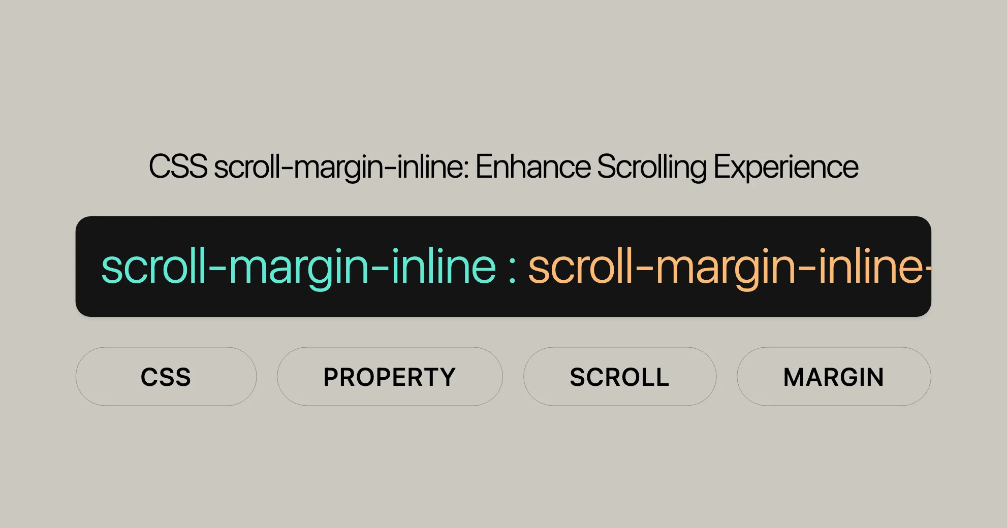
 CSS scroll-margin-inline Enhance Scrolling Experience
Set scroll margins for inline dimensions, improving user experience.
Learn about its values and usage.
Introduction
The scroll-margin-inline CSS property lets you set the scroll margins of an element in the inline dimension. This property combines scroll-margin-inline-start and scroll-margin-inline-end, making it easier to manage scroll margins for both the start and end sides of an element.
This property has been widely available since July 2019, making it a reliable tool for web developers. It’s supported across many devices and browsers, ensuring that your scrolling effects work smoothly for a broad audience.
Description
The scroll-margin-inline property sets the scroll margins of an element along the inline dimension. It’s a shorthand for scroll-margin-inline-start and scroll-margin-inline-end. These margins create outsets that determine the scroll snap area, which is used for snapping the element to the snapport.
In simpler terms, scroll-margin-inline helps you control the space around elements when they are scrolled into view. This can be particularly useful for creating smooth and visually appealing scrolling experiences in web applications and websites.
Constituent Properties
The scroll-margin-inline property combines two individual properties:
scroll-margin-inline-start: Sets the scroll margin at the start of the inline dimension. For horizontal writing modes likehorizontal-tb, this corresponds to the left side. For vertical writing modes likevertical-rlorvertical-lr, it corresponds to the top side.scroll-margin-inline-end: Sets the scroll margin at the end of the inline dimension. For horizontal writing modes, this corresponds to the right side. For vertical writing modes, it corresponds to the bottom side.
By using scroll-margin-inline, you can efficiently manage both the start and end scroll margins in a single declaration, making your CSS simpler and more maintainable.
Syntax
The syntax for scroll-margin-inline is straightforward:
/* <length> values */scroll-margin-inline: 10px;scroll-margin-inline: 1em 0.5em;
/* Global values */scroll-margin-inline: inherit;scroll-margin-inline: initial;scroll-margin-inline: revert;scroll-margin-inline: revert-layer;scroll-margin-inline: unset;
Values
The scroll-margin-inline property accepts the following types of values:
<length>: Values defined with length units likeem,px,rem,vh, etc. It specifies an outset from the corresponding edge of the scroll container.- Global Values: These include
inherit,initial,unset,revert, andrevert-layer. These values allow you to control the inheritance and resetting of the property.
Note: The scroll-margin-inline property does not accept percentage values as lengths.
Examples
Let’s dive into a practical example to better understand how scroll-margin-inline works. This example demonstrates how to create horizontally scrolling blocks that snap into place with specific margins.
HTML
The HTML structure is simple and represents four blocks:
<div class="scroller"> <div>1</div> <div>2</div> <div>3</div> <div>4</div></div>CSS
Now, let’s walk through the CSS. The outer container is styled as follows:
.scroller { text-align: left; width: 250px; height: 250px; overflow-x: scroll; display: flex; box-sizing: border-box; border: 1px solid #000; scroll-snap-type: x mandatory;}The key properties for scroll snapping are overflow-x: scroll, which ensures the contents will scroll, and scroll-snap-type: x mandatory, which dictates that scroll snapping must occur along the horizontal axis.
The child elements are styled as follows:
.scroller > div {  flex: 0 0 250px;  width: 250px;  background-color: #663399;  color: #fff;  font-size: 30px;  display: flex;  align-items: center;  justify-content: center;  scroll-snap-align: end;}
.scroller > div:nth-child(2n) {  background-color: #fff;  color: #663399;}
The scroll-snap-align: end property specifies that the right-hand edges are the designated snap points.
Finally, the scroll margin values are set for the second and third child elements:
.scroller > div:nth-child(2) {  scroll-margin-inline: 1rem;}
.scroller > div:nth-child(3) {  scroll-margin-inline: 2rem;}
This means that when scrolling past the middle child elements, the scrolling will snap to 1rem outside the inline end edge of the second <div>, and 2rems outside the inline end edge of the third <div>.
Result
Try it for yourself:
Specifications
The scroll-margin-inline property is defined in the CSS Scroll Snap Module Level 1.
Browser Compatibility
The scroll-margin-inline property is widely supported across modern browsers, ensuring a consistent user experience.
See Also
For more information, you can explore the following resources:
- CSS scroll snap
- [Well-controlled scrolling with CSS scroll snap]WebsiteUrl
Syntax
The scroll-margin-inline property in CSS is designed to set the scroll margins of an element in the inline dimension. Its syntax is straightforward and allows for various types of values. Here’s how you can use it:
/* <length> values */scroll-margin-inline: 10px;scroll-margin-inline: 1em 0.5em;
/* Global values */scroll-margin-inline: inherit;scroll-margin-inline: initial;scroll-margin-inline: revert;scroll-margin-inline: revert-layer;scroll-margin-inline: unset;
Values
The scroll-margin-inline property accepts the following types of values:
<length>: Values defined with length units likeem,px,rem,vh, etc.- Global Values: These include
inherit,initial,unset,revert, andrevert-layer.
Note: The scroll-margin-inline property does not accept percentage values as lengths.
Examples
Here’s an example to illustrate how scroll-margin-inline works:
HTML
<!DOCTYPE html><html><head>    <style>        .scroll {            width: 300px;            height: 300px;            overflow-x: scroll;            display: flex;            box-sizing: border-box;            scroll-snap-type: x mandatory;        }
        .scroll>div {            flex: 0 0 300px;            border: 1px solid #000;            background-color: #57e714;            color: #fff;            font-size: 30px;            display: flex;            align-items: center;            justify-content: center;            scroll-snap-align: end;        }
        .scroll>div:nth-child(2n) {            background-color: #fff;            color: #0fe962;        }
        .scroll>div:nth-child(2) {            scroll-margin-inline: 2rem;        }
.scroll>div:nth-child(3) { scroll-margin-inline: 3rem; } </style></head><body> <div class="scroll"> <div>Geek 1</div> <div>Geek 2</div> <div>Geek 3</div> <div>Geek 4</div> </div></body></html>Output:
![scrollingmargininline]WebsiteUrl
Supported Browsers
- Google Chrome 69
- Edge 79
- Firefox 68
- Opera 56
- Safari 14.1
Next Article
[CSS scroll-margin-inline-end property]WebsiteUrl
Specifications
The scroll-margin-inline property is defined in the CSS Scroll Snap Module Level 1.
Browser Compatibility
The scroll-margin-inline property is supported in:
- Google Chrome: Version 69 and later
- Microsoft Edge: Version 79 and later
- Mozilla Firefox: Version 68 and later
- Opera: Version 56 and later
- Safari: Version 14.1 and later
See Also
For more information, check out:
- [CSS scroll snap]WebsiteUrl
- [Well-controlled scrolling with CSS scroll snap]WebsiteUrl
 Latest Blogs
  สร้างเว็บไซต์ 1 เว็บ ต้องใช้งบเท่าไหร่? เจาะลึกทุกองค์ประกอบ website development cost อยากสร้างเว็บไซต์แต่ไม่มั่นใจในเรื่องของงบประมาณ อ่านสรุปเจาะลึกตั้งแต่ดีไซน์, ฟังก์ชัน และการดูแล พร้อมตัวอย่างงบจริงจาก Till it’s done ที่แผนชัด งบไม่บานปลายแน่นอน
  Next.js สอน 14 ขั้นตอนเบื้องต้น: สร้างโปรเจกต์แรกใน 30 นาที เริ่มต้นกับ Next.js ใน 14 ขั้นตอนเพียงแค่ 30 นาที พร้อม SSR/SSG และ API Routes ด้วยตัวอย่างโค้ดง่าย ๆ อ่านต่อเพื่อสร้างโปรเจ็กต์แรกได้ทันทีที่นี่
  วิธีสมัคร Apple Developer Account เพื่อนำแอปขึ้น App Store ทีละขั้นตอน อยากปล่อยแอปบน App Store ระดับโลก มาอ่านคู่มือสมัคร Apple Developer Account พร้อมเคล็ดลับ TestFlight และวิธีอัปโหลดที่ง่ายในบทความเดียวนี้ได้เลย
  TypeScript Interface คืออะไร? อธิบายพร้อมวิธีใช้และข้อแตกต่างจาก Type เรียนรู้วิธีใช้ TypeScript Interface เพื่อสร้างโครงสร้างข้อมูลที่ปลอดภัยและเข้าใจง่าย พร้อมเปรียบเทียบข้อดีข้อแตกต่างกับ Type ที่คุณต้องรู้ ถูกรวมเอาไว้ในบทความนี้แล้ว
  Material-UI (MUI) คืออะไร อยากสร้าง UI สวยงามและเป็นมืออาชีพในเวลาอันรวดเร็วใช่ไหม มาทำความรู้จักกับ Material-UI (MUI) ที่ช่วยให้คุณพัฒนาแอปพลิเคชันบน React ได้ง่ายและดูดีในทุกอุปกรณ์
  เปรียบเทียบ 3 วิธีติดตั้ง install node js บน Ubuntu: NVM vs NodeSource vs Official Repo แบบไหนดีที่สุด? เรียนรู้วิธีติดตั้ง Node.js บน Ubuntu ด้วย NVM, NodeSource หรือ Official Repo เลือกวิธีที่เหมาะกับความต้องการของคุณ พร้อมเปรียบเทียบ เพื่อการพัฒนาที่มีประสิทธิภาพ!
 Talk with CEO
Explore our best articles, cover a wide variety of technologies 
 ReactJs
  Flutter
  Nodejs
  Nextjs
  TailwindCSS
  Typescript Golang AstroJs Jest Website development th Mobile application th Reactjs th Nextjs th Flutter th Software house th Nodejs th Typescript th
  CSS
CSS We'll be right here with you every step of the way.
We'll be here, prepared to commence this promising collaboration.


Whether you're curious about features, warranties, or shopping policies, we provide comprehensive answers to assist you.