
- Services
- Case Studies
- Technologies
- NextJs development
- Flutter development
- NodeJs development
- ReactJs development
- About
- Contact
- Tools
- Blogs
- FAQ
 Scroll to discover
 CSS scroll-margin-block-end Enhance Scroll Behavior
It improves scrolling behavior with length and global values.
Introduction
The scroll-margin-block-end property is a handy CSS tool for making your web design and user experience better. It helps control how elements align within a scroll container, making navigation smoother. This feature works well across different browsers and devices, making it reliable for modern web development.
Baseline: Widely Available
The scroll-margin-block-end property has been around since July 2019 and is widely supported across many devices and browser versions. This makes it a reliable and versatile tool for web developers.
Description
The scroll-margin-block-end property in CSS defines the margin at the end of the block dimension for scroll snap areas. This is useful for controlling how elements snap to the snapport within the scroll container. By setting this margin, you can fine-tune the alignment and spacing of elements, making the scrolling experience smoother.
This property helps determine the scroll snap area by adding the specified margin to the transformed border box of the element. This creates a rectangular bounding box that aligns within the scroll container’s coordinate space. Adjusting this margin ensures elements snap into place exactly where you want them, improving the user experience.
Syntax
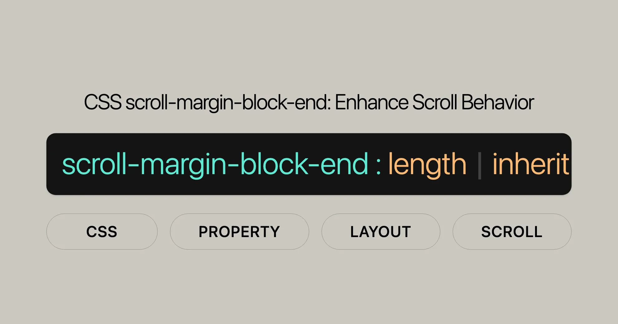
The scroll-margin-block-end property lets you specify the margin at the end of the block dimension for scroll snap areas. The syntax is simple and supports both length values and global CSS values. Here’s how to use it:
/* Length values */scroll-margin-block-end: 10px;scroll-margin-block-end: 1em;
/* Global values */scroll-margin-block-end: inherit;scroll-margin-block-end: initial;scroll-margin-block-end: revert;scroll-margin-block-end: revert-layer;scroll-margin-block-end: unset;
Explanation
- Length Values:
scroll-margin-block-end: 10px;scroll-margin-block-end: 1em;These specify the margin in fixed units like pixels (px) or relative units like em.
- Global Values:
scroll-margin-block-end: inherit;scroll-margin-block-end: initial;scroll-margin-block-end: revert;scroll-margin-block-end: revert-layer;scroll-margin-block-end: unset;These values let you inherit the property from the parent element, reset it to the initial value, or unset it to fall back to the default style.
Values
The scroll-margin-block-end property accepts various values to customize the margin at the end of the block dimension for scroll snap areas. These values can be length units or global CSS values. Here’s a breakdown:
Length Values
- Length (
<length>): Specifies the margin using a length unit like pixels (px), em (em), rem (rem), or viewport height (vh).scroll-margin-block-end: 10px;scroll-margin-block-end: 1em;
Global Values
- inherit: Inherits the
scroll-margin-block-endvalue from the parent element.scroll-margin-block-end: inherit; - initial: Sets the property to its initial value, which is
0.scroll-margin-block-end: initial; - revert: Resets the property to the default value as defined by the user agent’s stylesheet.
scroll-margin-block-end: revert;
- revert-layer: Resets the property to the value established by the user-agent stylesheet or by the user stylesheet.
scroll-margin-block-end: revert-layer;
- unset: Resets the property to its natural value. If the property is inherited, it acts like
inherit; otherwise, it acts likeinitial.scroll-margin-block-end: unset;
Example
.container {  scroll-snap-type: y mandatory;}
.item {  scroll-snap-align: start;  scroll-margin-block-end: 20px;}
In this example, the .container element has a mandatory vertical scroll snap type. Each .item element within the container will have a 20px margin at the end of the block dimension, ensuring they snap into place with the specified margin.
Supported Browsers
The scroll-margin-block-end property is widely supported across modern web browsers, making it reliable for enhancing the scrolling behavior of your web applications. Here are the browsers that support this property:
- Google Chrome: Supported since version 69.
- Microsoft Edge: Supported since version 79.
- Mozilla Firefox: Supported since version 68.
- Opera: Supported since version 56.
- Safari: Supported since version 14.1.
This broad compatibility ensures that you can use scroll-margin-block-end confidently, knowing it will work across a wide range of devices and browsers. Whether you’re developing for desktop or mobile, this property can help you create a smooth and intuitive scrolling experience for your users.
By using scroll-margin-block-end, you can fine-tune the alignment and spacing of elements within the scroll container, ensuring they snap into place exactly where you want them. This enhances the overall user experience and makes your web applications more visually appealing and user-friendly.
For detailed compatibility information, you can refer to browser compatibility tables and documentation to ensure that your implementation works seamlessly across different environments.
 Latest Blogs
  สร้างเว็บไซต์ 1 เว็บ ต้องใช้งบเท่าไหร่? เจาะลึกทุกองค์ประกอบ website development cost อยากสร้างเว็บไซต์แต่ไม่มั่นใจในเรื่องของงบประมาณ อ่านสรุปเจาะลึกตั้งแต่ดีไซน์, ฟังก์ชัน และการดูแล พร้อมตัวอย่างงบจริงจาก Till it’s done ที่แผนชัด งบไม่บานปลายแน่นอน
  Next.js สอน 14 ขั้นตอนเบื้องต้น: สร้างโปรเจกต์แรกใน 30 นาที เริ่มต้นกับ Next.js ใน 14 ขั้นตอนเพียงแค่ 30 นาที พร้อม SSR/SSG และ API Routes ด้วยตัวอย่างโค้ดง่าย ๆ อ่านต่อเพื่อสร้างโปรเจ็กต์แรกได้ทันทีที่นี่
  วิธีสมัคร Apple Developer Account เพื่อนำแอปขึ้น App Store ทีละขั้นตอน อยากปล่อยแอปบน App Store ระดับโลก มาอ่านคู่มือสมัคร Apple Developer Account พร้อมเคล็ดลับ TestFlight และวิธีอัปโหลดที่ง่ายในบทความเดียวนี้ได้เลย
  TypeScript Interface คืออะไร? อธิบายพร้อมวิธีใช้และข้อแตกต่างจาก Type เรียนรู้วิธีใช้ TypeScript Interface เพื่อสร้างโครงสร้างข้อมูลที่ปลอดภัยและเข้าใจง่าย พร้อมเปรียบเทียบข้อดีข้อแตกต่างกับ Type ที่คุณต้องรู้ ถูกรวมเอาไว้ในบทความนี้แล้ว
  Material-UI (MUI) คืออะไร อยากสร้าง UI สวยงามและเป็นมืออาชีพในเวลาอันรวดเร็วใช่ไหม มาทำความรู้จักกับ Material-UI (MUI) ที่ช่วยให้คุณพัฒนาแอปพลิเคชันบน React ได้ง่ายและดูดีในทุกอุปกรณ์
  เปรียบเทียบ 3 วิธีติดตั้ง install node js บน Ubuntu: NVM vs NodeSource vs Official Repo แบบไหนดีที่สุด? เรียนรู้วิธีติดตั้ง Node.js บน Ubuntu ด้วย NVM, NodeSource หรือ Official Repo เลือกวิธีที่เหมาะกับความต้องการของคุณ พร้อมเปรียบเทียบ เพื่อการพัฒนาที่มีประสิทธิภาพ!
 Talk with CEO
Explore our best articles, cover a wide variety of technologies 
 ReactJs
  Flutter
  Nodejs
  Nextjs
  TailwindCSS
  Typescript Golang AstroJs Jest Website development th Mobile application th Reactjs th Nextjs th Flutter th Software house th Nodejs th Typescript th
  CSS
CSS We'll be right here with you every step of the way.
We'll be here, prepared to commence this promising collaboration.


Whether you're curious about features, warranties, or shopping policies, we provide comprehensive answers to assist you.