
- Services
- Case Studies
- Technologies
- NextJs development
- Flutter development
- NodeJs development
- ReactJs development
- About
- Contact
- Tools
- Blogs
- FAQ
 Scroll to discover
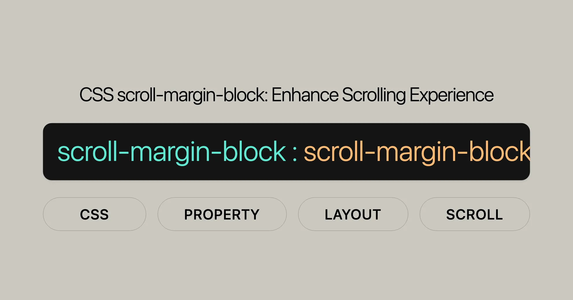
 CSS scroll-margin-block Enhance Scrolling Experience
Use it to control scroll snap areas and improve user experience.
Options include length values and global values like inherit and initial.
Introduction
The scroll-margin-block CSS property is a handy tool for web developers. It lets you set the scroll margins of an element along the block dimension, which is great for controlling the behavior of scroll snap areas. Introduced in July 2019, it’s widely supported across modern browsers, making it reliable for enhancing user experience on websites.
Baseline Availability
The scroll-margin-block property is well-supported across many devices and browser versions. It works in:
- Google Chrome
- Microsoft Edge
- Mozilla Firefox
- Opera
- Safari
Description
The scroll-margin-block property defines the scroll margins of an element in the block dimension. It’s useful for creating visually appealing and intuitive scrolling experiences. This property is a shorthand for scroll-margin-block-start and scroll-margin-block-end, allowing you to set both values in a single declaration.
Constituent Properties
The scroll-margin-block property is a shorthand for:
-
scroll-margin-block-start:
- Defines the scroll margin at the start of the block dimension.
- Syntax:
scroll-margin-block-start: <length> | inherit | initial | revert | revert-layer | unset;
-
scroll-margin-block-end:
- Defines the scroll margin at the end of the block dimension.
- Syntax:
scroll-margin-block-end: <length> | inherit | initial | revert | revert-layer | unset;
Syntax
Here is the syntax for scroll-margin-block:
/* <length> values */scroll-margin-block: 10px;scroll-margin-block: 1em 0.5em;
/* Global values */scroll-margin-block: inherit;scroll-margin-block: initial;scroll-margin-block: revert;scroll-margin-block: revert-layer;scroll-margin-block: unset;
Values
The scroll-margin-block property accepts the following values:
-
<length>:
- Specifies the outset from the corresponding edge of the scroll container.
- Example:
scroll-margin-block: 10px;
-
Global Values:
- inherit: Inherits the value from the parent element.
- initial: Sets the property to its initial value, which is
0. - revert: Reverts the property to the default value as specified by the user agent.
- revert-layer: Reverts the property to the default value as specified by the cascade layer.
- unset: Resets the property to its natural value.
- Example:
scroll-margin-block: inherit;
Formal Definition
The scroll-margin-block property is formally defined as a shorthand for setting the scroll margins of an element in the block dimension. Here are the key characteristics:
- Initial Value:
scroll-margin-block-start:0scroll-margin-block-end:0
- Applies To: All elements.
- Inherited: No.
- Computed Value:
scroll-margin-block-start: as specifiedscroll-margin-block-end: as specified
- Animation Type: By computed value type.
- Formal Syntax:
scroll-margin-block = <length>[{1,2}]
Specifications
The scroll-margin-block property is defined in the CSS Scroll Snap Module Level 1 specification. This module outlines the behavior and usage of scroll snap properties.
- Specification: [CSS Scroll Snap Module Level 1]WebsiteUrl
Browser Compatibility
The scroll-margin-block property is widely supported across modern browsers:
- Google Chrome: Supported since version 69.
- Microsoft Edge: Supported since version 79.
- Mozilla Firefox: Supported since version 68.
- Opera: Supported since version 56.
- Safari: Supported since version 14.1.
Example
Here’s a simple example to demonstrate the use of the scroll-margin-block property:
HTML
<!DOCTYPE html><html><head>    <style>        .page {            width: 278px;            height: 296px;            box-sizing: border-box;            color: white;            font-size: 60px;            display: flex;            align-items: center;            justify-content: center;            scroll-snap-align: end none;        }
        .container {            width: 300px;            height: 300px;            overflow-x: hidden;            overflow-y: auto;            white-space: nowrap;            scroll-snap-type: y mandatory;        }    </style></head><body>    <div class="container">        <div class="page" style="background-color: rgb(95, 236, 14); scroll-margin-block: 90px;">            Geeks        </div>        <div class="page" style="background-color: rgb(25, 143, 25); scroll-margin-block: 90px;">            for        </div>        <div class="page" style="background-color: rgb(110, 228, 129); scroll-margin-block: 90px;">            Geeks        </div>        <div class="page" style="color: black; scroll-margin-block: 90px;">            for        </div>        <div class="page" style="background-color: rgb(25, 143, 25); scroll-margin-block: 90px;">            Geeks        </div>    </div></body></html>
In this example, scrolling through the container will snap to each .page element with a defined margin of 90px at the block start and end, creating a visually appealing and intuitive scrolling experience.
Related Topics
To further enhance your understanding and usage of the scroll-margin-block property, consider exploring these related topics:
- CSS Scroll Snap: Learn more about the CSS scroll snap module, which includes properties like
scroll-snap-type,scroll-snap-align, andscroll-snap-stop. - Well-controlled Scrolling with CSS Scroll Snap: Explore practical examples and best practices for using CSS scroll snap to create intuitive and visually appealing scrolling interfaces.
- CSS Shorthand Properties: Understand the concept of shorthand properties in CSS, which allow you to set multiple related properties in a single declaration, making your code more concise and easier to manage.
- CSS Length Units: Familiarize yourself with the various length units available in CSS, such as
px,em,rem,vh, etc., and learn how to use them effectively to control the layout and appearance of your elements. - CSS Box Model: Deepen your understanding of the CSS box model, which defines the rectangular boxes that are generated for elements in the document tree. This knowledge is crucial for effectively using properties like
scroll-margin-block. - CSS Writing Modes: Learn about CSS writing modes, which control the direction of text flow. Understanding writing modes is essential for correctly applying
scroll-margin-block-startandscroll-margin-block-end. - CSS Flexbox and Grid Layouts: Explore how
scroll-margin-blockcan be integrated with CSS Flexbox and Grid layouts to create more complex and responsive designs.
By delving into these related topics, you can gain a more comprehensive understanding of CSS and how to use it effectively to create engaging and user-friendly web experiences.
 Latest Blogs
  สร้างเว็บไซต์ 1 เว็บ ต้องใช้งบเท่าไหร่? เจาะลึกทุกองค์ประกอบ website development cost อยากสร้างเว็บไซต์แต่ไม่มั่นใจในเรื่องของงบประมาณ อ่านสรุปเจาะลึกตั้งแต่ดีไซน์, ฟังก์ชัน และการดูแล พร้อมตัวอย่างงบจริงจาก Till it’s done ที่แผนชัด งบไม่บานปลายแน่นอน
  Next.js สอน 14 ขั้นตอนเบื้องต้น: สร้างโปรเจกต์แรกใน 30 นาที เริ่มต้นกับ Next.js ใน 14 ขั้นตอนเพียงแค่ 30 นาที พร้อม SSR/SSG และ API Routes ด้วยตัวอย่างโค้ดง่าย ๆ อ่านต่อเพื่อสร้างโปรเจ็กต์แรกได้ทันทีที่นี่
  วิธีสมัคร Apple Developer Account เพื่อนำแอปขึ้น App Store ทีละขั้นตอน อยากปล่อยแอปบน App Store ระดับโลก มาอ่านคู่มือสมัคร Apple Developer Account พร้อมเคล็ดลับ TestFlight และวิธีอัปโหลดที่ง่ายในบทความเดียวนี้ได้เลย
  TypeScript Interface คืออะไร? อธิบายพร้อมวิธีใช้และข้อแตกต่างจาก Type เรียนรู้วิธีใช้ TypeScript Interface เพื่อสร้างโครงสร้างข้อมูลที่ปลอดภัยและเข้าใจง่าย พร้อมเปรียบเทียบข้อดีข้อแตกต่างกับ Type ที่คุณต้องรู้ ถูกรวมเอาไว้ในบทความนี้แล้ว
  Material-UI (MUI) คืออะไร อยากสร้าง UI สวยงามและเป็นมืออาชีพในเวลาอันรวดเร็วใช่ไหม มาทำความรู้จักกับ Material-UI (MUI) ที่ช่วยให้คุณพัฒนาแอปพลิเคชันบน React ได้ง่ายและดูดีในทุกอุปกรณ์
  เปรียบเทียบ 3 วิธีติดตั้ง install node js บน Ubuntu: NVM vs NodeSource vs Official Repo แบบไหนดีที่สุด? เรียนรู้วิธีติดตั้ง Node.js บน Ubuntu ด้วย NVM, NodeSource หรือ Official Repo เลือกวิธีที่เหมาะกับความต้องการของคุณ พร้อมเปรียบเทียบ เพื่อการพัฒนาที่มีประสิทธิภาพ!
 Talk with CEO
Explore our best articles, cover a wide variety of technologies 
 ReactJs
  Flutter
  Nodejs
  Nextjs
  TailwindCSS
  Typescript Golang AstroJs Jest Website development th Mobile application th Reactjs th Nextjs th Flutter th Software house th Nodejs th Typescript th
  CSS
CSS We'll be right here with you every step of the way.
We'll be here, prepared to commence this promising collaboration.


Whether you're curious about features, warranties, or shopping policies, we provide comprehensive answers to assist you.