
- Services
- Case Studies
- Technologies
- NextJs development
- Flutter development
- NodeJs development
- ReactJs development
- About
- Contact
- Tools
- Blogs
- FAQ
 Scroll to discover
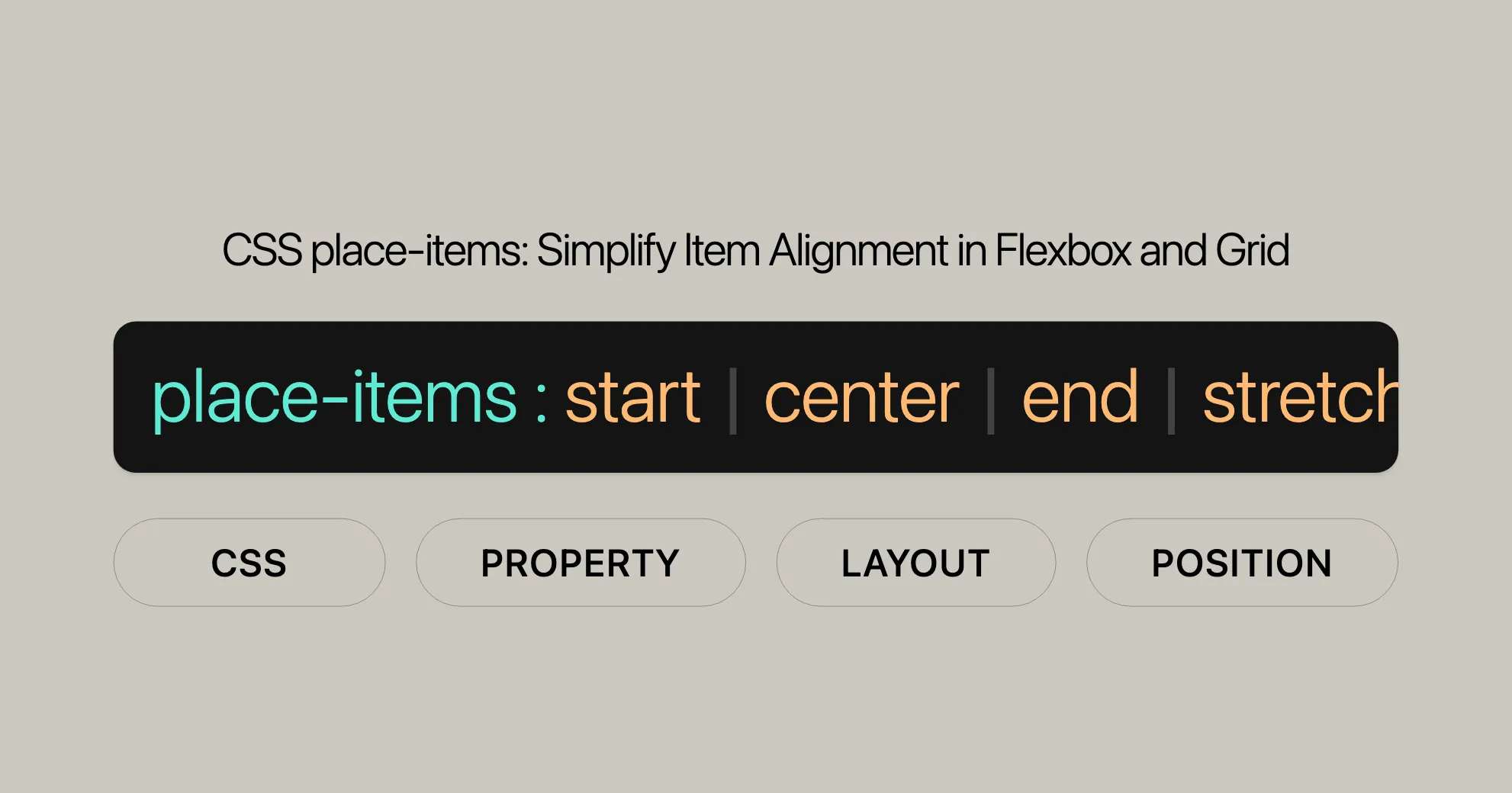
 CSS place-items Simplify Item Alignment in Flexbox and Grid
This shorthand property combines align-items and justify-items, offering various alignment options like start, center, end, and stretch.
Introduction
The CSS place-items property is a handy shorthand that lets you align items in both block and inline directions at once. It combines align-items and justify-items, making it super useful for web developers. By using place-items, you can streamline your CSS and make your layouts look great with less effort.
Specification
The place-items property is defined in the CSS Box Alignment Module Level 3 specification. This ensures that it works consistently across different browsers and platforms. Following this specification helps developers create reliable and predictable web designs.
Constituent Properties
The place-items property combines two individual CSS properties:
align-items: This property aligns items along the block axis (usually vertical).justify-items: This property aligns items along the inline axis (usually horizontal).
Using place-items, you can set both align-items and justify-items with one declaration. If you provide one value, it applies to both. If you provide two values, the first applies to align-items and the second to justify-items.
Syntax
The place-items property has a straightforward syntax:
/* Positional alignment */place-items: center;place-items: normal start;place-items: center normal;place-items: start legacy;place-items: end normal;place-items: self-start legacy;place-items: self-end normal;place-items: flex-start legacy;place-items: flex-end normal;place-items: anchor-center;
/* Baseline alignment */place-items: baseline normal;place-items: first baseline legacy;place-items: last baseline normal;place-items: stretch legacy;
/* Global values */place-items: inherit;place-items: initial;place-items: revert;place-items: revert-layer;place-items: unset;
Key Points:
- Single Value Syntax: If you provide a single value, it applies to both
align-itemsandjustify-items.place-items: center; /* Aligns items to the center in both directions */ - Two-Value Syntax: If you provide two values, the first applies to
align-itemsand the second tojustify-items.place-items: center normal; /* Aligns items to the center in the block direction and to the normal position in the inline direction */
Values
The place-items property can take one or two values to determine the alignment of items.
One-Value Syntax
If you provide a single value, it applies to both align-items and justify-items.
place-items: center; /* Aligns items to the center in both directions */Two-Value Syntax
If you provide two values, the first applies to align-items and the second to justify-items.
place-items: center normal; /* Aligns items to the center in the block direction and to the normal position in the inline direction */Possible Values
normal: Default alignment.start: Aligns items to the start of the container.end: Aligns items to the end of the container.center: Aligns items to the center.flex-start: Aligns items to the start of the flex container.flex-end: Aligns items to the end of the flex container.self-start: Aligns items to the start of their own alignment container.self-end: Aligns items to the end of their own alignment container.baseline: Aligns items based on their baseline.first baseline: Aligns items based on the first baseline.last baseline: Aligns items based on the last baseline.stretch: Stretches items to fill the container.auto: Default alignment based on the item’s properties.inherit: Inherits the alignment from the parent.initial: Sets the alignment to its initial value.revert: Reverts the alignment to the user agent’s default.revert-layer: Reverts the alignment to the user agent’s default for a specific layer.unset: Resets the alignment to its inherited value if it inherits, or to its initial value if not.
Examples
place-items: start center; /* Aligns items to the start in the block direction and to the center in the inline direction */place-items: end normal; /* Aligns items to the end in the block direction and to the normal position in the inline direction */place-items: flex-start stretch; /* Aligns items to the start of the flex container and stretches them to fill the container */place-items: baseline auto; /* Aligns items based on their baseline and uses the default alignment for the inline direction */Formal Syntax
The place-items property in CSS follows this formal syntax:
place-items =  [<'align-items'>]WebsiteUrl [<'justify-items'>]WebsiteUrl[?]
<align-items> =  normal  stretch  <baseline-position>  [<overflow-position>? <self-position>]  anchor-center
<justify-items> =  normal  stretch  <baseline-position>  <overflow-position>? [<self-position> | left | right]  legacy  legacy && [left | right | center]  anchor-center
<baseline-position> =  [first | last]?  baseline
<overflow-position> =  unsafe  safe
<self-position> =  center  start  end  self-start  self-end  flex-start  flex-end
Key Points:
align-itemsandjustify-items: These properties define howplace-itemsworks.normal,stretch,baseline,anchor-center: Specific alignment values.overflow-position: Handles overflow withunsafeorsafe.self-position: Defines item position within their alignment container.
Examples
Here are some examples showing how to use place-items in both Flexbox and Grid containers.
Placing Items in a Flex Container
In Flexbox, place-items can align items within a flex container. Note that justify-self and justify-items do not apply in Flexbox because items are treated as a group on the main axis. Therefore, the second value will be ignored.
Placing Items in a Grid Container
In a Grid container, place-items can align items within the grid cells. This is particularly useful when items are smaller than their grid areas.
HTML
<div class="grid-container"> <div>Item 1</div> <div>Item 2</div> <div>Item 3</div></div>CSS
.grid-container { display: grid; grid-template-columns: repeat(3, 1fr); place-items: center; /* Centers items both vertically and horizontally */}This setup centers all items within the grid cells, making the layout clean and balanced. Using place-items simplifies your CSS and helps you create visually appealing designs with ease.
Using place-items to Align Items in Grid and Flex Containers
The place-items property in CSS allows you to control the alignment of items within Grid and Flex containers. This makes your layouts more dynamic and visually appealing. Here’s how you can use it:
HTML
<div id="gridcontainer">  <div id="item1">1</div>  <div id="item2">2</div>  <div id="item3">3</div>  <div id="item4">4</div>  <div id="item5">5</div></div>
<div class="row">  <label for="gridvalues">Place Items: </label>  <select id="gridvalues">    <option value="stretch">stretch</option>    <option value="start">start</option>    <option value="center">center</option>    <option value="end">end</option>    <option value="left">left</option>    <option value="right">right</option>    <option value="auto center">auto center</option>    <option value="normal start">normal start</option>    <option value="center normal">center normal</option>    <option value="start auto">start auto</option>    <option value="end normal">end normal</option>    <option value="self-start auto">self-start auto</option>    <option value="self-end normal">self-end normal</option>    <option value="flex-start auto">flex-start auto</option>    <option value="flex-end normal">flex-end normal</option>    <option value="left auto">left auto</option>    <option value="right normal">right normal</option>    <option value="baseline normal">baseline normal</option>    <option value="first baseline auto">first baseline auto</option>    <option value="last baseline normal">last baseline normal</option>    <option value="stretch auto">stretch auto</option>  </select></div>
CSS
#gridcontainer {  height: 200px;  width: 240px;  place-items: stretch; /* Change this value by selecting an option from the list */  background-color: #8c8c8c;  display: grid;  grid-template-columns: repeat(3, 1fr);}
#gridcontainer > div {  box-sizing: border-box;  border: 2px solid #8c8c8c;  width: 50px;}
#item1 {  background-color: #8cffa0;  min-height: 30px;  font-size: 2em;}
#item2 {  background-color: #a0c8ff;  min-height: 50px;}
#item3 {  background-color: #ffa08c;  min-height: 40px;}
#item4 {  background-color: #ffff8c;  min-height: 60px;}
#item5 {  background-color: #ff8cff;  min-height: 70px;}
select {  font-size: 16px;}
.row {  margin-top: 10px;}
JavaScript
const values = document.getElementById("gridvalues");const container = document.getElementById("gridcontainer");
values.addEventListener("change", (evt) => {  container.style.placeItems = evt.target.value;});
Using place-items in a Flex Container
In a Flexbox container, place-items aligns items along both the block and inline directions. Note that justify-self and justify-items do not apply in Flexbox, so the second value in place-items will be ignored.
HTML
<div id="container">  <div id="item1">1</div>  <div id="item2">2</div>  <div id="item3">3</div></div>
<div class="row">  <label for="values">Place Items: </label>  <select id="values">    <option value="stretch">stretch</option>    <option value="start">start</option>    <option value="center">center</option>    <option value="end">end</option>    <option value="left">left</option>    <option value="right">right</option>    <option value="auto center">auto center</option>    <option value="normal start">normal start</option>    <option value="center normal">center normal</option>    <option value="start auto">start auto</option>    <option value="end normal">end normal</option>    <option value="self-start auto">self-start auto</option>    <option value="self-end normal">self-end normal</option>    <option value="flex-start auto">flex-start auto</option>    <option value="flex-end normal">flex-end normal</option>    <option value="left auto">left auto</option>    <option value="right normal">right normal</option>    <option value="baseline normal">baseline normal</option>    <option value="first baseline auto">first baseline auto</option>    <option value="last baseline normal">last baseline normal</option>    <option value="stretch auto">stretch auto</option>  </select></div>
CSS
#container {  height: 200px;  width: 240px;  place-items: stretch; /* Change this value by selecting an option from the list */  background-color: #8c8c8c;  display: flex;}
#container > div {  box-sizing: border-box;  border: 2px solid #8c8c8c;  width: 50px;  display: flex;  align-items: center;  justify-content: center;}
#item1 {  background-color: #8cffa0;  min-height: 30px;  font-size: 2em;}
#item2 {  background-color: #a0c8ff;  min-height: 50px;}
#item3 {  background-color: #ffa08c;  min-height: 40px;}
select {  font-size: 16px;}
.row {  margin-top: 10px;}
JavaScript
const values = document.getElementById("values");const container = document.getElementById("container");
values.addEventListener("change", (evt) => {  container.style.placeItems = evt.target.value;});
Using place-items in a Grid Container
In a Grid container, place-items aligns items within their grid cells. This is particularly useful when items are smaller than their grid areas.
HTML
<div id="gridcontainer">  <div id="item1">1</div>  <div id="item2">2</div>  <div id="item3">3</div>  <div id="item4">4</div>  <div id="item5">5</div></div>
<div class="row">  <label for="gridvalues">Place Items: </label>  <select id="gridvalues">    <option value="stretch">stretch</option>    <option value="start">start</option>    <option value="center">center</option>    <option value="end">end</option>    <option value="left">left</option>    <option value="right">right</option>    <option value="auto center">auto center</option>    <option value="normal start">normal start</option>    <option value="center normal">center normal</option>    <option value="start auto">start auto</option>    <option value="end normal">end normal</option>    <option value="self-start auto">self-start auto</option>    <option value="self-end normal">self-end normal</option>    <option value="flex-start auto">flex-start auto</option>    <option value="flex-end normal">flex-end normal</option>    <option value="left auto">left auto</option>    <option value="right normal">right normal</option>    <option value="baseline normal">baseline normal</option>    <option value="first baseline auto">first baseline auto</option>    <option value="last baseline normal">last baseline normal</option>    <option value="stretch auto">stretch auto</option>  </select></div>
CSS
#gridcontainer {  height: 200px;  width: 240px;  place-items: stretch; /* Change this value by selecting an option from the list */  background-color: #8c8c8c;  display: grid;  grid-template-columns: repeat(3, 1fr);}
#gridcontainer > div {  box-sizing: border-box;  border: 2px solid #8c8c8c;  width: 50px;}
#item1 {  background-color: #8cffa0;  min-height: 30px;  font-size: 2em;}
#item2 {  background-color: #a0c8ff;  min-height: 50px;}
#item3 {  background-color: #ffa08c;  min-height: 40px;}
#item4 {  background-color: #ffff8c;  min-height: 60px;}
#item5 {  background-color: #ff8cff;  min-height: 70px;}
select {  font-size: 16px;}
.row {  margin-top: 10px;}
JavaScript
const values = document.getElementById("gridvalues");const container = document.getElementById("gridcontainer");
values.addEventListener("change", (evt) => {  container.style.placeItems = evt.target.value;});
Result
This example shows how to use the place-items property to align items within Grid and Flex containers. By changing the place-items value, you can control the alignment of items in both block and inline directions, making your layouts more flexible and visually appealing.
Understanding the place-items Property
The place-items property is part of the CSS Box Alignment Module Level 3, which helps align items within a container. This module ensures that alignment works consistently across different web browsers and platforms.
Key Specifications
- CSS Box Alignment Module Level 3: Defines
place-itemsand related properties likealign-itemsandjustify-items. - CSS Grid Layout Module Level 1: Specifies the CSS Grid layout system and how it uses
place-items. - CSS Flexible Box Layout Module Level 1: Specifies the CSS Flexbox layout system and how it uses
place-items.
These specifications help web developers create reliable and predictable web designs that work seamlessly across different devices and environments.
References
- CSS Box Alignment Module Level 3
- CSS Grid Layout Module Level 1
- CSS Flexible Box Layout Module Level 1
Browser Compatibility
The place-items property is widely supported across modern web browsers, ensuring consistent display across different platforms and devices.
Desktop Browsers
- Google Chrome: Supported since version 59.
- Mozilla Firefox: Supported since version 45.
- Microsoft Edge: Supported since version 79.
- Safari: Supported since version 11.
- Opera: Supported since version 46.
Mobile Browsers
- Chrome for Android: Supported since version 59.
- Firefox for Android: Supported since version 45.
- Safari on iOS: Supported since version 11.
- Opera Mobile: Supported since version 46.
- Samsung Internet: Supported since version 7.2.
Notes on Compatibility
- Internet Explorer: Not supported in any version.
- Older Versions: Some older browsers may not fully support
place-items.
Checking Browser Compatibility
Use tools like Can I use or refer to resources like MDN Web Docs to check browser compatibility.
Best Practices
- Progressive Enhancement: Ensure your designs degrade gracefully in older browsers.
- Feature Detection: Use libraries like Modernizr to check for support.
- Testing: Regularly test your designs across different browsers and devices.
Resources
See Also
For further exploration of CSS alignment properties:
align-items: Aligns items along the block axis in a flex or grid container.align-self: Overridesalign-itemsfor individual flex or grid items.justify-items: Aligns items along the inline axis in a grid container.justify-self: Overridesjustify-itemsfor individual grid items.- Basic concepts of flexbox: Foundational understanding of flexbox.
- Aligning items in a flex container: Align items within a flex container.
- Box alignment in CSS grid layouts: Details of box alignment in CSS grid layouts.
- CSS box alignment: Overview of alignment properties and their uses.
These resources provide valuable insights into CSS alignment properties and can help you master the techniques for creating well-aligned and visually appealing web designs.
 Latest Blogs
  สร้างเว็บไซต์ 1 เว็บ ต้องใช้งบเท่าไหร่? เจาะลึกทุกองค์ประกอบ website development cost อยากสร้างเว็บไซต์แต่ไม่มั่นใจในเรื่องของงบประมาณ อ่านสรุปเจาะลึกตั้งแต่ดีไซน์, ฟังก์ชัน และการดูแล พร้อมตัวอย่างงบจริงจาก Till it’s done ที่แผนชัด งบไม่บานปลายแน่นอน
  Next.js สอน 14 ขั้นตอนเบื้องต้น: สร้างโปรเจกต์แรกใน 30 นาที เริ่มต้นกับ Next.js ใน 14 ขั้นตอนเพียงแค่ 30 นาที พร้อม SSR/SSG และ API Routes ด้วยตัวอย่างโค้ดง่าย ๆ อ่านต่อเพื่อสร้างโปรเจ็กต์แรกได้ทันทีที่นี่
  วิธีสมัคร Apple Developer Account เพื่อนำแอปขึ้น App Store ทีละขั้นตอน อยากปล่อยแอปบน App Store ระดับโลก มาอ่านคู่มือสมัคร Apple Developer Account พร้อมเคล็ดลับ TestFlight และวิธีอัปโหลดที่ง่ายในบทความเดียวนี้ได้เลย
  TypeScript Interface คืออะไร? อธิบายพร้อมวิธีใช้และข้อแตกต่างจาก Type เรียนรู้วิธีใช้ TypeScript Interface เพื่อสร้างโครงสร้างข้อมูลที่ปลอดภัยและเข้าใจง่าย พร้อมเปรียบเทียบข้อดีข้อแตกต่างกับ Type ที่คุณต้องรู้ ถูกรวมเอาไว้ในบทความนี้แล้ว
  Material-UI (MUI) คืออะไร อยากสร้าง UI สวยงามและเป็นมืออาชีพในเวลาอันรวดเร็วใช่ไหม มาทำความรู้จักกับ Material-UI (MUI) ที่ช่วยให้คุณพัฒนาแอปพลิเคชันบน React ได้ง่ายและดูดีในทุกอุปกรณ์
  เปรียบเทียบ 3 วิธีติดตั้ง install node js บน Ubuntu: NVM vs NodeSource vs Official Repo แบบไหนดีที่สุด? เรียนรู้วิธีติดตั้ง Node.js บน Ubuntu ด้วย NVM, NodeSource หรือ Official Repo เลือกวิธีที่เหมาะกับความต้องการของคุณ พร้อมเปรียบเทียบ เพื่อการพัฒนาที่มีประสิทธิภาพ!
 Talk with CEO
Explore our best articles, cover a wide variety of technologies 
 ReactJs
  Flutter
  Nodejs
  Nextjs
  TailwindCSS
  Typescript Golang AstroJs Jest Website development th Mobile application th Reactjs th Nextjs th Flutter th Software house th Nodejs th Typescript th
  CSS
CSS We'll be right here with you every step of the way.
We'll be here, prepared to commence this promising collaboration.


Whether you're curious about features, warranties, or shopping policies, we provide comprehensive answers to assist you.