
- Services
- Case Studies
- Technologies
- NextJs development
- Flutter development
- NodeJs development
- ReactJs development
- About
- Contact
- Tools
- Blogs
- FAQ
 Scroll to discover
 CSS place-content Simplify Alignment in Flexbox and Grid
Explore available options like center, start, end, and distribute space.
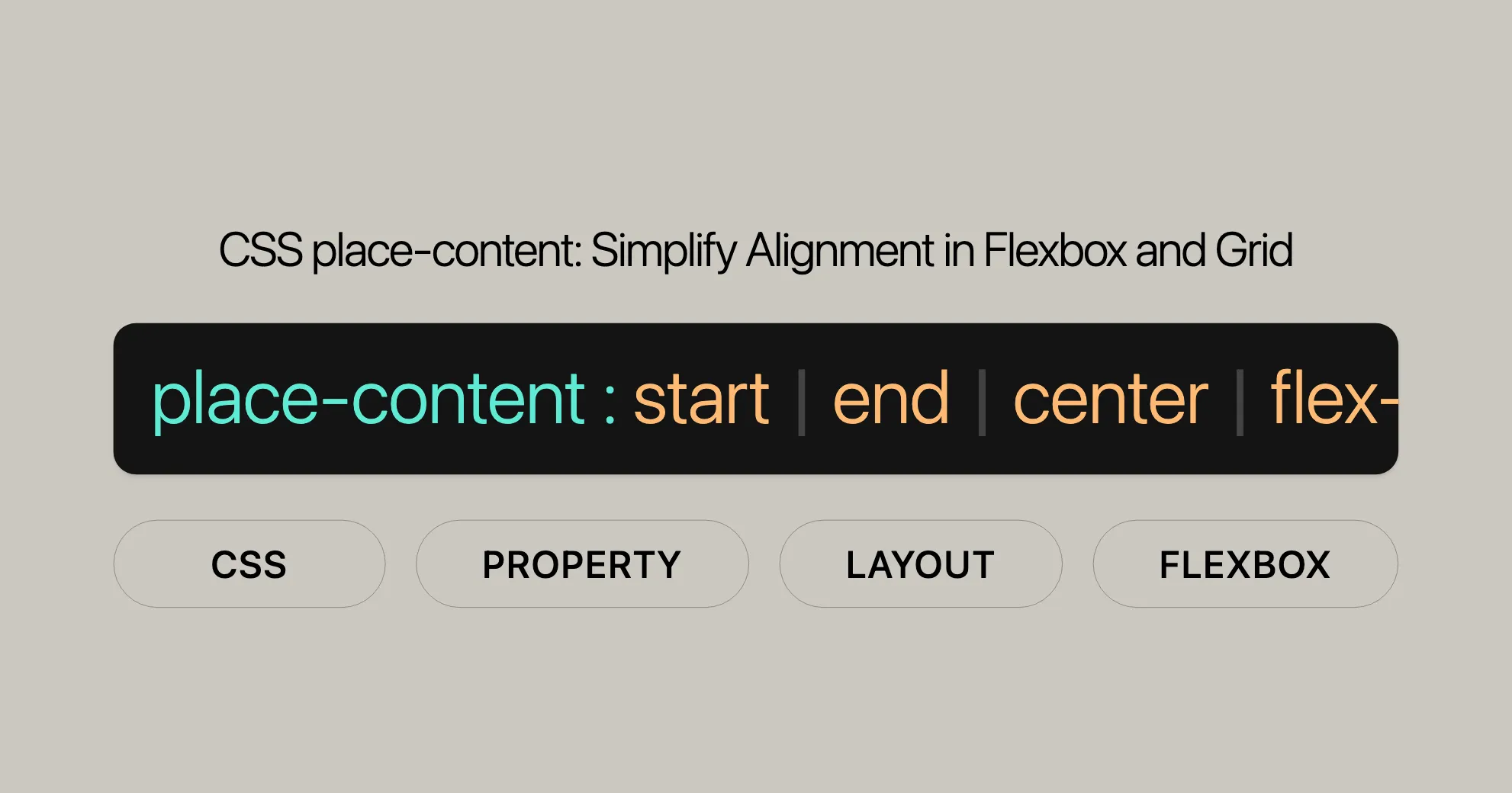
Syntax
The place-content CSS property simplifies aligning content both vertically (block direction) and horizontally (inline direction). Its syntax is straightforward:
place-content: <align-content> <justify-content>;<align-content>: Sets the vertical alignment.<justify-content>: Sets the horizontal alignment.
Example Usage
/* Positional alignment */place-content: center start;place-content: start center;place-content: end left;place-content: flex-start center;place-content: flex-end center;
/* Baseline alignment */place-content: baseline center;place-content: first baseline space-evenly;place-content: last baseline right;
/* Distributed alignment */place-content: space-between space-evenly;place-content: space-around space-evenly;place-content: space-evenly stretch;place-content: stretch space-evenly;
/* Global values */place-content: inherit;place-content: initial;place-content: revert;place-content: revert-layer;place-content: unset;
Values
The place-content property accepts various values, which can be categorized into positional alignment, baseline alignment, distributed alignment, and global values.
Positional Alignment Values
- start: Aligns items to the start of the container.
- end: Aligns items to the end of the container.
- flex-start: Aligns items to the start of the flex container.
- flex-end: Aligns items to the end of the flex container.
- center: Centers items within the container.
- left: Aligns items to the left edge of the container.
- right: Aligns items to the right edge of the container.
Baseline Alignment Values
- baseline: Aligns items based on their first or last baseline.
- first baseline: Aligns items to the first baseline of the container.
- last baseline: Aligns items to the last baseline of the container.
Distributed Alignment Values
- space-between: Distributes items evenly with equal space between them.
- space-around: Distributes items evenly with half-sized spaces at the edges.
- space-evenly: Distributes items evenly with equal space between them and at the edges.
- stretch: Stretches items to fill the container, respecting max-height and max-width constraints.
Global Values
- inherit: Inherits the value from the parent element.
- initial: Sets the value to its initial default.
- revert: Reverts the value to the user-agent default.
- revert-layer: Reverts the value to the user-agent default for the specific layer.
- unset: Resets the value to its inherited value if it is inheritable, or to its initial value if not.
Formal Definition
| Property | Value |
|---|---|
| Initial value | align-content: normal, justify-content: normal |
| Applies to | Multi-line flex containers |
| Inherited | No |
| Computed value | As specified for each constituent property |
| Animation type | Discrete |
Formal Syntax
place-content = <align-content> [<justify-content>]?Where:
<align-content>can be any valid value for thealign-contentproperty.<justify-content>can be any valid value for thejustify-contentproperty.
Constituent Properties
The place-content property is a shorthand for:
- [
align-content]WebsiteUrl - [
justify-content]WebsiteUrl
Examples
Positional Alignment
place-content: center start;place-content: start center;place-content: end left;place-content: flex-start center;place-content: flex-end center;Baseline Alignment
place-content: baseline center;place-content: first baseline space-evenly;place-content: last baseline right;Distributed Alignment
place-content: space-between space-evenly;place-content: space-around space-evenly;place-content: space-evenly stretch;place-content: stretch space-evenly;Global Values
place-content: inherit;place-content: initial;place-content: revert;place-content: revert-layer;place-content: unset;Important Notes
- The first value corresponds to the
align-contentproperty, and the second value corresponds to thejustify-contentproperty. - If only one value is provided, it will be used for both
align-contentandjustify-content, provided it is valid for both properties. If the value is not valid for either property, the entire value will be invalid.
Example Usage
HTML
<div id="container"> <div class="small">Lorem</div> <div class="small">Lorem<br />ipsum</div> <div class="large">Lorem</div> <div class="large">Lorem<br />ipsum</div> <div class="large"></div> <div class="large"></div></div>CSS
#container {  display: flex;  height: 240px;  width: 240px;  flex-wrap: wrap;  background-color: #8c8c8c;  place-content: flex-end center; /* Adjust this value to see different alignments */}
div > div {  border: 2px solid #8c8c8c;  width: 50px;  background-color: #a0c8ff;}
.small {  font-size: 12px;  height: 40px;}
.large {  font-size: 14px;  height: 50px;}
Example 1: Flex-Start Center
Using place-content: flex-start center; to align content.
HTML
<!DOCTYPE html><html><head> <title>CSS place-content Property</title> <style> h1 { color: green; } #container { display: flex; height: 200px; width: 460px; flex-wrap: wrap; background-color: gray; place-content: flex-start center; } div > div { border: 2px solid black; width: 60px; background-color: green; color: white; } .short { font-size: 12px; height: 30px; } .tall { font-size: 14px; height: 40px; } </style></head><body> <center> <h1>Website</h1> <b>CSS place-content Property</b> <div id="container"> <div class="short">Geeks</div> <div class="short">Computer<br />Science</div> <div class="tall">Geeks<br />for</div> <div class="tall">Portal<br />for</div> <div class="tall"></div> </div> </center></body></html>Example 2: Flex-Start Start
Using place-content: flex-start start; to align content.
HTML
<!DOCTYPE html><html><head> <title>CSS place-content Property</title> <style> h1 { color: green; } #container { display: flex; height: 100px; width: 460px; flex-wrap: wrap; background-color: gray; place-content: flex-start start; } div > div { border: 2px solid black; width: 60px; background-color: green; color: white; } .short { font-size: 12px; height: 30px; } .tall { font-size: 14px; height: 40px; } </style></head><body> <center> <h1>Website</h1> <b>CSS place-content Property</b> <div id="container"> <div class="short">Geeks</div> <div class="short">Computer<br />Science</div> <div class="tall">Geeks<br />for</div> <div class="tall">Portal<br />for</div> <div class="tall"></div> </div> </center></body></html>Example 3: Flex-End End
Using place-content: flex-end end; to align content.
HTML
<!DOCTYPE html><html><head> <title>CSS place-content Property</title> <style> h1 { color: green; } #container { display: flex; height: 100px; width: 460px; flex-wrap: wrap; background-color: gray; place-content: flex-end end; } div > div { border: 2px solid black; width: 60px; background-color: green; color: white; } .short { font-size: 12px; height: 30px; } .tall { font-size: 14px; height: 40px; } </style></head><body> <center> <h1>Website</h1> <b>CSS place-content Property</b> <div id="container"> <div class="short">Geeks</div> <div class="short">Computer<br />Science</div> <div class="tall">Geeks<br />for</div> <div class="tall">Portal<br />for</div> <div class="tall"></div> </div> </center></body></html>Browser Compatibility
The place-content property is widely supported across modern web browsers. Here’s a quick summary:
| Browser | Version |
|---|---|
| Google Chrome | 59+ |
| Microsoft Edge | 79+ |
| Mozilla Firefox | 45+ |
| Opera | 46+ |
| Safari | 9+ |
Using the place-content Property
Before using the place-content property, make sure to test your website across different browsers to ensure consistent behavior. Although most modern browsers support it, some older ones might not. In those cases, you might need to provide fallbacks or alternative solutions.
Conclusion
The place-content property is a powerful tool for aligning content within a container, making it essential for modern web development. Its wide browser support ensures you can use it confidently in your projects, creating well-structured and visually appealing layouts that work seamlessly across different devices and platforms.
For more detailed information on browser compatibility, you can refer to MDN Web Docs or Can I Use.
See Also
To enhance your understanding and usage of the place-content property, you might find the following related resources and properties helpful:
- [
align-content]WebsiteUrl: Specifies how lines inside a flexible container are aligned when items don’t use all the available space. - [
justify-content]WebsiteUrl: Defines how the browser distributes space between and around content items along the inline direction. - [Basic concepts of flexbox]WebsiteUrl: A comprehensive guide on the fundamentals of flexbox, essential for understanding how the
place-contentproperty works within this layout system. - [Aligning items in a flex container]WebsiteUrl: Detailed information on how to align items within a flex container using various CSS properties, including
place-content. - [Box alignment in CSS grid layouts]WebsiteUrl: An in-depth look at how to align boxes within a grid layout, another context where the
place-contentproperty can be applied. - [CSS box alignment module]WebsiteUrl: A module dedicated to the alignment of boxes in CSS, which includes properties like
place-content.
These resources provide a deeper dive into the concepts and practices related to the place-content property, helping you make the most of this powerful CSS tool in your web development and design projects. By understanding the related properties and concepts, you can create more dynamic, responsive, and visually appealing web designs.
 Latest Blogs
  สร้างเว็บไซต์ 1 เว็บ ต้องใช้งบเท่าไหร่? เจาะลึกทุกองค์ประกอบ website development cost อยากสร้างเว็บไซต์แต่ไม่มั่นใจในเรื่องของงบประมาณ อ่านสรุปเจาะลึกตั้งแต่ดีไซน์, ฟังก์ชัน และการดูแล พร้อมตัวอย่างงบจริงจาก Till it’s done ที่แผนชัด งบไม่บานปลายแน่นอน
  Next.js สอน 14 ขั้นตอนเบื้องต้น: สร้างโปรเจกต์แรกใน 30 นาที เริ่มต้นกับ Next.js ใน 14 ขั้นตอนเพียงแค่ 30 นาที พร้อม SSR/SSG และ API Routes ด้วยตัวอย่างโค้ดง่าย ๆ อ่านต่อเพื่อสร้างโปรเจ็กต์แรกได้ทันทีที่นี่
  วิธีสมัคร Apple Developer Account เพื่อนำแอปขึ้น App Store ทีละขั้นตอน อยากปล่อยแอปบน App Store ระดับโลก มาอ่านคู่มือสมัคร Apple Developer Account พร้อมเคล็ดลับ TestFlight และวิธีอัปโหลดที่ง่ายในบทความเดียวนี้ได้เลย
  TypeScript Interface คืออะไร? อธิบายพร้อมวิธีใช้และข้อแตกต่างจาก Type เรียนรู้วิธีใช้ TypeScript Interface เพื่อสร้างโครงสร้างข้อมูลที่ปลอดภัยและเข้าใจง่าย พร้อมเปรียบเทียบข้อดีข้อแตกต่างกับ Type ที่คุณต้องรู้ ถูกรวมเอาไว้ในบทความนี้แล้ว
  Material-UI (MUI) คืออะไร อยากสร้าง UI สวยงามและเป็นมืออาชีพในเวลาอันรวดเร็วใช่ไหม มาทำความรู้จักกับ Material-UI (MUI) ที่ช่วยให้คุณพัฒนาแอปพลิเคชันบน React ได้ง่ายและดูดีในทุกอุปกรณ์
  เปรียบเทียบ 3 วิธีติดตั้ง install node js บน Ubuntu: NVM vs NodeSource vs Official Repo แบบไหนดีที่สุด? เรียนรู้วิธีติดตั้ง Node.js บน Ubuntu ด้วย NVM, NodeSource หรือ Official Repo เลือกวิธีที่เหมาะกับความต้องการของคุณ พร้อมเปรียบเทียบ เพื่อการพัฒนาที่มีประสิทธิภาพ!
 Talk with CEO
Explore our best articles, cover a wide variety of technologies 
 ReactJs
  Flutter
  Nodejs
  Nextjs
  TailwindCSS
  Typescript Golang AstroJs Jest Website development th Mobile application th Reactjs th Nextjs th Flutter th Software house th Nodejs th Typescript th
  CSS
CSS We'll be right here with you every step of the way.
We'll be here, prepared to commence this promising collaboration.


Whether you're curious about features, warranties, or shopping policies, we provide comprehensive answers to assist you.