
- Services
- Case Studies
- Technologies
- NextJs development
- Flutter development
- NodeJs development
- ReactJs development
- About
- Contact
- Tools
- Blogs
- FAQ
 Scroll to discover
 CSS Perspective-Origin Enhancing 3D Transformations
Learn syntax, values, and examples to apply this property effectively.
Introduction
The perspective-origin CSS property defines the viewer’s position in 3D space, creating a realistic depth effect for transformed elements. By using perspective-origin, you can control how 3D objects look on your web page, making your designs more engaging. This feature is widely supported across browsers, ensuring your 3D effects work for a broad audience.
Description
The perspective-origin CSS property determines the position from which the viewer is looking at a 3D-transformed element. This position acts as the vanishing point, influencing how the perspective is rendered by the perspective property. Unlike the perspective() transform function, which is applied directly to the element being transformed, the perspective-origin and perspective properties are applied to the parent element. This allows you to control the perspective of child elements in a 3D space, creating visually appealing and dynamic effects.
Syntax
The perspective-origin CSS property can be defined using one or two values to set the x-position and y-position of the vanishing point. Here’s how you can use it:
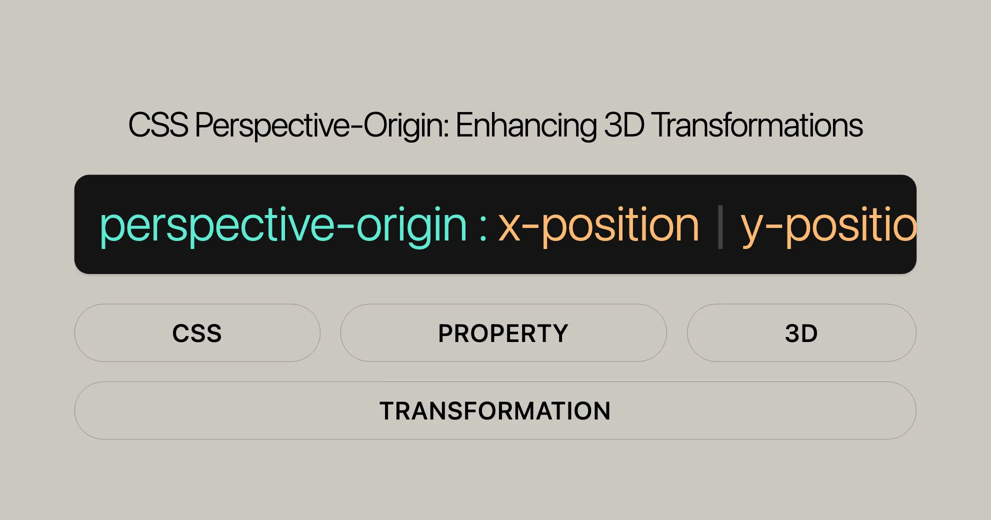
/* One-value syntax */perspective-origin: x-position;
/* Two-value syntax */perspective-origin: x-position y-position;
/* When both x-position and y-position are keywords, the following is also valid */perspective-origin: y-position x-position;
/* Global values */perspective-origin: inherit;perspective-origin: initial;perspective-origin: revert;perspective-origin: revert-layer;perspective-origin: unset;
Values
x-position
The x-position value indicates the horizontal position of the vanishing point. It can be specified using the following values:
<length-percentage>: An absolute length value or a percentage relative to the width of the element. This value can be negative.left: A keyword that is a shortcut for the0length value.center: A keyword that is a shortcut for the50%percentage value.right: A keyword that is a shortcut for the100%percentage value.
y-position
The y-position value indicates the vertical position of the vanishing point. It can be specified using the following values:
<length-percentage>: An absolute length value or a percentage relative to the height of the element. This value can be negative.top: A keyword that is a shortcut for the0length value.center: A keyword that is a shortcut for the50%percentage value.bottom: A keyword that is a shortcut for the100%percentage value.
Global Values
In addition to the specific position values, the perspective-origin property supports several global values:
inherit: Inherits the value from the parent element.initial: Sets the value to its default value, which is50% 50%.revert: Resets the value to the user agent’s default value.revert-layer: Resets the value to the default value of the nearest ancestor with a specified value, if any.unset: Resets the value to its inherited value if it inherits, or to its initial value if it does not.
Examples
Changing the Perspective Origin
<!DOCTYPE html><html lang="en"><head>  <meta charset="UTF-8">  <meta name="viewport" content="width=device-width, initial-scale=1.0">  <title>Perspective Origin Example</title>  <style>    .container {      perspective: 500px;      perspective-origin: center center;      width: 300px;      height: 300px;      border: 1px solid #ccc;      margin: 50px auto;    }
    .box {      width: 100px;      height: 100px;      background-color: lightblue;      transform: rotateX(45deg) rotateY(45deg);      margin: 100px auto;    }  </style></head><body>  <div class="container">    <div class="box">Rotated Box</div>  </div></body></html>
Adjusting the Perspective Origin with Keywords
<!DOCTYPE html><html lang="en"><head>  <meta charset="UTF-8">  <meta name="viewport" content="width=device-width, initial-scale=1.0">  <title>Perspective Origin with Keywords</title>  <style>    .container {      perspective: 500px;      perspective-origin: left top;      width: 300px;      height: 300px;      border: 1px solid #ccc;      margin: 50px auto;    }
    .box {      width: 100px;      height: 100px;      background-color: lightblue;      transform: rotateX(45deg) rotateY(45deg);      margin: 100px auto;    }  </style></head><body>  <div class="container">    <div class="box">Rotated Box</div>  </div></body></html>
Using Length and Percentage Values
<!DOCTYPE html><html lang="en"><head>  <meta charset="UTF-8">  <meta name="viewport" content="width=device-width, initial-scale=1.0">  <title>Perspective Origin with Length and Percentage</title>  <style>    .container {      perspective: 500px;      perspective-origin: 50% 50%;      width: 300px;      height: 300px;      border: 1px solid #ccc;      margin: 50px auto;    }
    .box {      width: 100px;      height: 100px;      background-color: lightblue;      transform: rotateX(45deg) rotateY(45deg);      margin: 100px auto;    }  </style></head><body>  <div class="container">    <div class="box">Rotated Box</div>  </div></body></html>
Specifications
The perspective-origin CSS property is part of the CSS Transforms Module Level 2. This module defines the properties and transform functions used to create 3D transformations on web elements. The specifications for the perspective-origin property can be found in the official CSS Transforms Module Level 2 documentation.
CSS Transforms Module Level 2
| Specification |
|---|
| [CSS Transforms Module Level 2 - perspective-origin property]WebsiteUrl |
Browser Compatibility
The perspective-origin property is widely supported across different browsers, ensuring consistent 3D transformations for a broad audience. Here’s a quick overview:
| Browser | Version | Release Date |
|---|---|---|
| Chrome | 36.0 | Jul 2014 |
| Firefox | 16.0 | Oct 2012 |
| IE/Edge | 10.0 | Sep 2012 |
| Opera | 23.0 | Jul 2013 |
| Safari | 9.0 | Sep 2015 |
For the latest compatibility details, check the Browser Compatibility Data (BCD) tables on MDN Web Docs.
See Also
To dive deeper into CSS transforms and enhance your web design skills, here are some helpful resources:
- Using CSS Transforms: Discover how to apply 2D and 3D transformations to elements. WebsiteUrl
transform-style: Learn to control how nested elements are rendered in 3D space. WebsiteUrl<transform-function>: Explore various transform functions likerotate,scale, andtranslate. WebsiteUrlperspective: Understand how theperspectiveproperty works withperspective-originto create depth effects. WebsiteUrltransform: perspective(): Dive into theperspective()transform function. WebsiteUrl
 Latest Blogs
  สร้างเว็บไซต์ 1 เว็บ ต้องใช้งบเท่าไหร่? เจาะลึกทุกองค์ประกอบ website development cost อยากสร้างเว็บไซต์แต่ไม่มั่นใจในเรื่องของงบประมาณ อ่านสรุปเจาะลึกตั้งแต่ดีไซน์, ฟังก์ชัน และการดูแล พร้อมตัวอย่างงบจริงจาก Till it’s done ที่แผนชัด งบไม่บานปลายแน่นอน
  Next.js สอน 14 ขั้นตอนเบื้องต้น: สร้างโปรเจกต์แรกใน 30 นาที เริ่มต้นกับ Next.js ใน 14 ขั้นตอนเพียงแค่ 30 นาที พร้อม SSR/SSG และ API Routes ด้วยตัวอย่างโค้ดง่าย ๆ อ่านต่อเพื่อสร้างโปรเจ็กต์แรกได้ทันทีที่นี่
  วิธีสมัคร Apple Developer Account เพื่อนำแอปขึ้น App Store ทีละขั้นตอน อยากปล่อยแอปบน App Store ระดับโลก มาอ่านคู่มือสมัคร Apple Developer Account พร้อมเคล็ดลับ TestFlight และวิธีอัปโหลดที่ง่ายในบทความเดียวนี้ได้เลย
  TypeScript Interface คืออะไร? อธิบายพร้อมวิธีใช้และข้อแตกต่างจาก Type เรียนรู้วิธีใช้ TypeScript Interface เพื่อสร้างโครงสร้างข้อมูลที่ปลอดภัยและเข้าใจง่าย พร้อมเปรียบเทียบข้อดีข้อแตกต่างกับ Type ที่คุณต้องรู้ ถูกรวมเอาไว้ในบทความนี้แล้ว
  Material-UI (MUI) คืออะไร อยากสร้าง UI สวยงามและเป็นมืออาชีพในเวลาอันรวดเร็วใช่ไหม มาทำความรู้จักกับ Material-UI (MUI) ที่ช่วยให้คุณพัฒนาแอปพลิเคชันบน React ได้ง่ายและดูดีในทุกอุปกรณ์
  เปรียบเทียบ 3 วิธีติดตั้ง install node js บน Ubuntu: NVM vs NodeSource vs Official Repo แบบไหนดีที่สุด? เรียนรู้วิธีติดตั้ง Node.js บน Ubuntu ด้วย NVM, NodeSource หรือ Official Repo เลือกวิธีที่เหมาะกับความต้องการของคุณ พร้อมเปรียบเทียบ เพื่อการพัฒนาที่มีประสิทธิภาพ!
 Talk with CEO
Explore our best articles, cover a wide variety of technologies 
 ReactJs
  Flutter
  Nodejs
  Nextjs
  TailwindCSS
  Typescript Golang AstroJs Jest Website development th Mobile application th Reactjs th Nextjs th Flutter th Software house th Nodejs th Typescript th
  CSS
CSS We'll be right here with you every step of the way.
We'll be here, prepared to commence this promising collaboration.


Whether you're curious about features, warranties, or shopping policies, we provide comprehensive answers to assist you.