
- Services
- Case Studies
- Technologies
- NextJs development
- Flutter development
- NodeJs development
- ReactJs development
- About
- Contact
- Tools
- Blogs
- FAQ
 Scroll to discover
 CSS min-inline-size Set Minimum Size Along Inline Axis
Options include lengths, percentages, and keywords like auto, min-content, and max-content.
Introduction
The CSS min-inline-size property sets the minimum size of an element along its inline axis, depending on the writing mode. This property is particularly useful for creating flexible and responsive designs, especially when dealing with different text orientations. The min-inline-size property has been widely supported across major browsers since September 2021.
What is min-inline-size?
The min-inline-size CSS property defines the minimum size of an element along its inline axis, depending on its writing mode. In horizontal writing modes, min-inline-size is equivalent to the min-width property. In vertical writing modes, it corresponds to the min-height property. This adaptability makes min-inline-size a versatile tool for ensuring that elements maintain a minimum size, regardless of the text direction.
Syntax
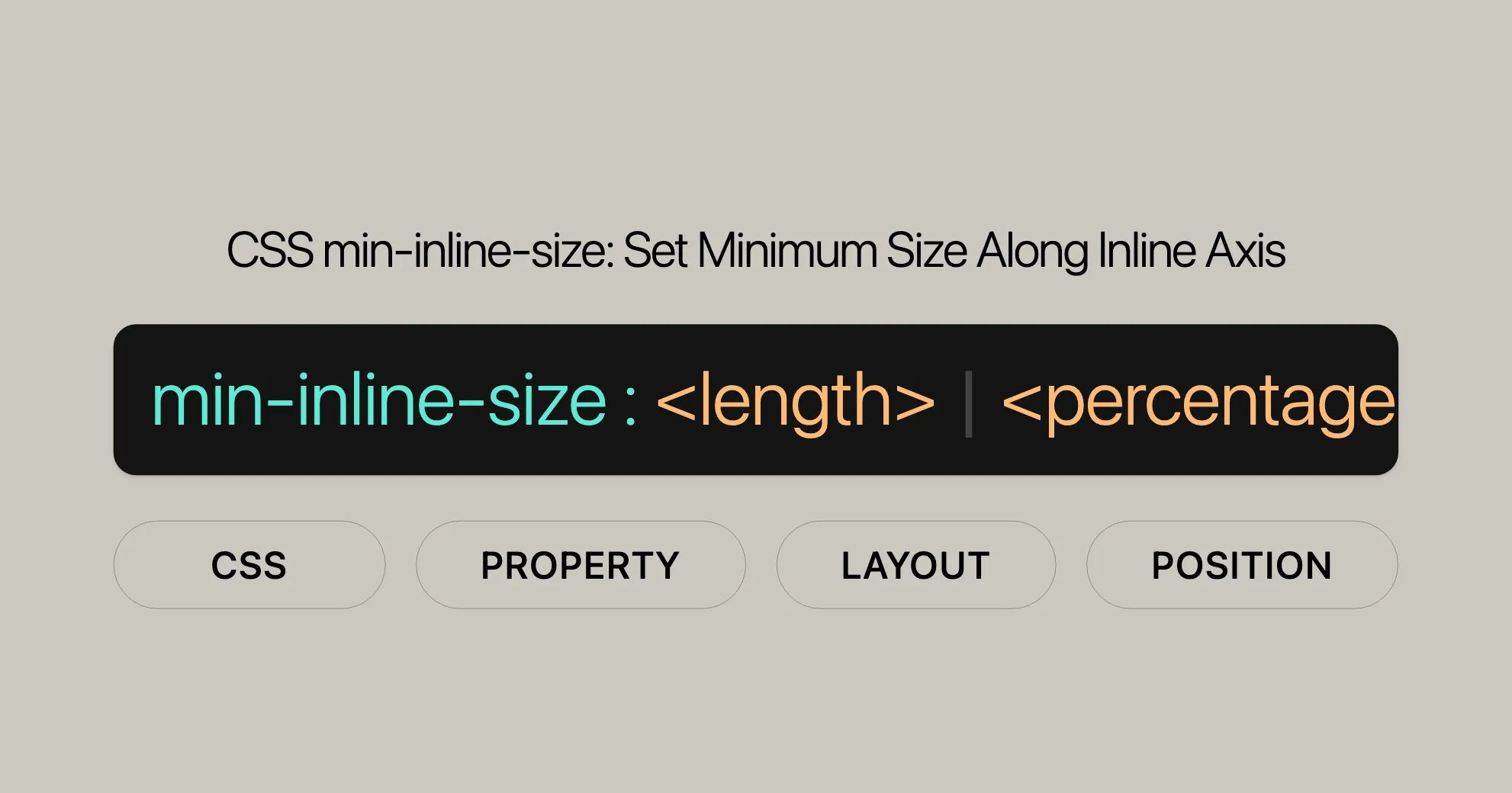
The min-inline-size property in CSS allows you to specify the minimum size of an element along its inline axis. The syntax for this property is straightforward and supports a variety of values, including lengths, percentages, and keywords.
min-inline-size: <length> | <percentage> | auto | none | min-content | max-content | fit-content | inherit | initial | unset;Values
The min-inline-size property accepts a variety of values, providing flexibility for defining the minimum size of an element along its inline axis.
- <length>: Specifies a fixed value for the minimum size, using units such as pixels (px), centimeters (cm), or points (pt).
- <percentage>: Sets the minimum size as a percentage of the containing block’s size.
- auto: Allows the browser to determine the minimum size based on the content and layout constraints.
- none: Specifies that there is no minimum size constraint.
- min-content: Sets the minimum size to the smallest possible size that can contain the content.
- max-content: Sets the minimum size to the largest possible size that can contain the content.
- fit-content: Allows the size to be determined by the content size, with the option to specify a fallback length.
- inherit: Inherits the
min-inline-sizevalue from the parent element. - initial: Resets the property to its default value.
- unset: Resets the property to its natural value.
- revert: Resets the property to the browser’s default value.
- revert-layer: Resets the property to the value that would have been applied if the current layer of cascade had not been applied.
Formal Definition
The min-inline-size property is formally defined to set the minimum size of an element along its inline axis, depending on the writing mode.
| Property | Value |
|---|---|
| Initial Value | 0 |
| Applies to | Same as [width]WebsiteUrl and [height]WebsiteUrl |
| Inherited | No |
| Percentages | Relative to the inline-size of the containing block |
| Computed Value | Same as [min-width]WebsiteUrl and [min-height]WebsiteUrl |
| Animation Type | A [length]WebsiteUrl, [percentage]WebsiteUrl, or calc() |
Formal Syntax
min-inline-size =  <'min-width'>
<'min-width'> =  auto                                      /* Single bar: exactly one of the entities must be present */  <length-percentage [0,∞]>                 /* Single bar: exactly one of the entities must be present */  min-content                               /* Single bar: exactly one of the entities must be present */  max-content                               /* Single bar: exactly one of the entities must be present */  fit-content( <length-percentage [0,∞]> )  /* Single bar: exactly one of the entities must be present */  <calc-size()>                             /* Single bar: exactly one of the entities must be present */  <anchor-size()>
<length-percentage> =  [<length>]WebsiteUrl     /* Single bar: exactly one of the entities must be present */  [<percentage>]WebsiteUrl
<calc-size()> =  calc-size( <calc-size-basis> , <calc-sum> )
<anchor-size()> =  anchor-size( [[ <anchor-element> || <anchor-size> ]? , <length-percentage>? )
<calc-size-basis> =  [<intrinsic-size-keyword>]WebsiteUrl /* Single bar: exactly one of the entities must be present */  <calc-size()>                             /* Single bar: exactly one of the entities must be present */  any                                       /* Single bar: exactly one of the entities must be present */  <calc-sum>
<calc-sum> =  <calc-product> [ [ '+' | '-' ] <calc-product> ]*
<anchor-element> =  [<dashed-ident>]WebsiteUrl
<anchor-size> =  width        /* Single bar: exactly one of the entities must be present */  height       /* Single bar: exactly one of the entities must be present */  block        /* Single bar: exactly one of the entities must be present */  inline       /* Single bar: exactly one of the entities must be present */  self-block   /* Single bar: exactly one of the entities must be present */  self-inline
<calc-product> =  <calc-value> [ [ '*' | '/' ] <calc-value> ]*
<calc-value> =  [<number>]WebsiteUrl        /* Single bar: exactly one of the entities must be present */  [<dimension>]WebsiteUrl     /* Single bar: exactly one of the entities must be present */  [<percentage>]WebsiteUrl    /* Single bar: exactly one of the entities must be present */  <calc-keyword>                                /* Single bar: exactly one of the entities must be present */  ( <calc-sum> )
<calc-keyword> =  e          /* Single bar: exactly one of the entities must be present */  pi         /* Single bar: exactly one of the entities must be present */  infinity   /* Single bar: exactly one of the entities must be present */  -infinity  /* Single bar: exactly one of the entities must be present */  NaN
Examples
Setting Minimum Inline Size for Horizontal Text
HTML
<div class="horizontal-text"> This is some horizontal text.</div>CSS
.horizontal-text { writing-mode: horizontal-tb; min-inline-size: 200px; border: 1px solid black;}Setting Minimum Inline Size for Vertical Text
HTML
<div class="vertical-text"> This is some vertical text.</div>CSS
.vertical-text { writing-mode: vertical-lr; min-inline-size: 100px; border: 1px solid black;}Using Percentages
HTML
<div class="percentage-text"> This is some text with a percentage-based minimum size.</div>CSS
.percentage-text { min-inline-size: 50%; border: 1px solid black;}Using Keywords
HTML
<div class="keyword-text"> This is some text with a keyword-based minimum size.</div>CSS
.keyword-text { min-inline-size: min-content; border: 1px solid black;}Browser Compatibility
The min-inline-size property is widely supported across modern web browsers:
- Firefox: Supported since version 41+
- Google Chrome: Supported since version 57+
- Edge: Supported since version 79+
- Opera: Supported since version 44+
- Safari: Supported since version 12.1+
See Also
- [
min-width]WebsiteUrl: Sets the minimum width of an element. - [
min-height]WebsiteUrl: Sets the minimum height of an element. - [
writing-mode]WebsiteUrl: Defines the writing mode of an element.
 Latest Blogs
  สร้างเว็บไซต์ 1 เว็บ ต้องใช้งบเท่าไหร่? เจาะลึกทุกองค์ประกอบ website development cost อยากสร้างเว็บไซต์แต่ไม่มั่นใจในเรื่องของงบประมาณ อ่านสรุปเจาะลึกตั้งแต่ดีไซน์, ฟังก์ชัน และการดูแล พร้อมตัวอย่างงบจริงจาก Till it’s done ที่แผนชัด งบไม่บานปลายแน่นอน
  Next.js สอน 14 ขั้นตอนเบื้องต้น: สร้างโปรเจกต์แรกใน 30 นาที เริ่มต้นกับ Next.js ใน 14 ขั้นตอนเพียงแค่ 30 นาที พร้อม SSR/SSG และ API Routes ด้วยตัวอย่างโค้ดง่าย ๆ อ่านต่อเพื่อสร้างโปรเจ็กต์แรกได้ทันทีที่นี่
  วิธีสมัคร Apple Developer Account เพื่อนำแอปขึ้น App Store ทีละขั้นตอน อยากปล่อยแอปบน App Store ระดับโลก มาอ่านคู่มือสมัคร Apple Developer Account พร้อมเคล็ดลับ TestFlight และวิธีอัปโหลดที่ง่ายในบทความเดียวนี้ได้เลย
  TypeScript Interface คืออะไร? อธิบายพร้อมวิธีใช้และข้อแตกต่างจาก Type เรียนรู้วิธีใช้ TypeScript Interface เพื่อสร้างโครงสร้างข้อมูลที่ปลอดภัยและเข้าใจง่าย พร้อมเปรียบเทียบข้อดีข้อแตกต่างกับ Type ที่คุณต้องรู้ ถูกรวมเอาไว้ในบทความนี้แล้ว
  Material-UI (MUI) คืออะไร อยากสร้าง UI สวยงามและเป็นมืออาชีพในเวลาอันรวดเร็วใช่ไหม มาทำความรู้จักกับ Material-UI (MUI) ที่ช่วยให้คุณพัฒนาแอปพลิเคชันบน React ได้ง่ายและดูดีในทุกอุปกรณ์
  เปรียบเทียบ 3 วิธีติดตั้ง install node js บน Ubuntu: NVM vs NodeSource vs Official Repo แบบไหนดีที่สุด? เรียนรู้วิธีติดตั้ง Node.js บน Ubuntu ด้วย NVM, NodeSource หรือ Official Repo เลือกวิธีที่เหมาะกับความต้องการของคุณ พร้อมเปรียบเทียบ เพื่อการพัฒนาที่มีประสิทธิภาพ!
 Talk with CEO
Explore our best articles, cover a wide variety of technologies 
 ReactJs
  Flutter
  Nodejs
  Nextjs
  TailwindCSS
  Typescript Golang AstroJs Jest Website development th Mobile application th Reactjs th Nextjs th Flutter th Software house th Nodejs th Typescript th
  CSS
CSS We'll be right here with you every step of the way.
We'll be here, prepared to commence this promising collaboration.


Whether you're curious about features, warranties, or shopping policies, we provide comprehensive answers to assist you.