
- Services
- Case Studies
- Technologies
- NextJs development
- Flutter development
- NodeJs development
- ReactJs development
- About
- Contact
- Tools
- Blogs
- FAQ
 Scroll to discover
 CSS min-block-size Enhancing Responsive Design
Discover available options and use cases.
Introduction
The min-block-size CSS property sets the minimum size of an element’s block dimension based on its writing mode. This feature is useful for responsive design.
Description
The min-block-size property sets the minimum size of an element’s block dimension, depending on the writing mode. For vertical writing modes (like Japanese or Chinese), it affects the minimum width. For horizontal writing modes (like English), it affects the minimum height. This property is useful for creating responsive designs that adapt to different screen sizes and orientations.
Syntax
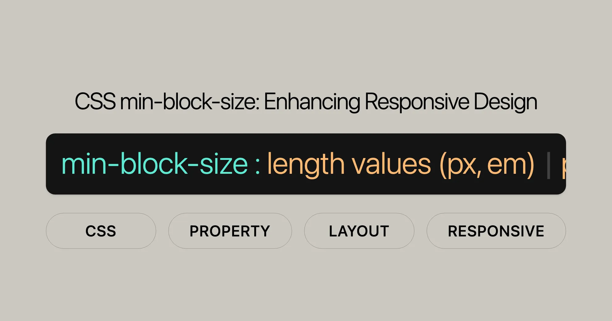
/* <length> values */min-block-size: 100px;min-block-size: 5em;
/* <percentage> values */min-block-size: 10%;
/* Keyword values */min-block-size: max-content;min-block-size: min-content;min-block-size: fit-content;min-block-size: fit-content(20em);
/* Global values */min-block-size: inherit;min-block-size: initial;min-block-size: revert;min-block-size: unset;
Values
- Length Values: Specific lengths like pixels (
px) or ems (em).- Example:
min-block-size: 100px;
- Example:
- Percentage Values: A percentage of the containing block’s size.
- Example:
min-block-size: 10%;
- Example:
- Keyword Values:
max-content: Sets the size to the largest content size.min-content: Sets the size to the smallest content size.fit-content: Adjusts the size to fit the content within a specified range.- Example:
min-block-size: fit-content(20em);
- Global Values:
inherit: Inherits the value from the parent element.initial: Sets the value to its initial state.revert: Reverts the property to the user agent’s default.unset: Resets the property to its natural value.- Example:
min-block-size: initial;
Examples
Setting Minimum Block Size for Horizontal Text
HTML:
<div class="exampleText">Example text</div>CSS:
.exampleText { background-color: lightblue; min-block-size: 150px;}Setting Minimum Block Size for Vertical Text
HTML:
<p class="exampleTextVertical">Example text</p>CSS:
.exampleTextVertical { writing-mode: vertical-rl; background-color: lightgreen; min-block-size: 200px;}Using Percentage Values
HTML:
<div class="examplePercentage">Example text</div>CSS:
.examplePercentage { background-color: lightcoral; min-block-size: 50%;}Using Keyword Values
HTML:
<div class="exampleMaxContent">Example text</div>CSS:
.exampleMaxContent { background-color: lightyellow; min-block-size: max-content;}Using fit-content
HTML:
<div class="exampleFitContent">Example text</div>CSS:
.exampleFitContent { background-color: lightpink; min-block-size: fit-content(20em);}Specifications
The min-block-size property is defined in:
- [CSS Logical Properties and Values Level 1]WebsiteUrl
- [CSS Box Sizing Module Level 4]WebsiteUrl
Browser Compatibility
| Browser | Version |
|---|---|
| Firefox | 41+ |
| Google Chrome | 57+ |
| Microsoft Edge | 79+ |
| Opera | 44+ |
| Safari | 12.1+ |
See Also
- [
min-width]WebsiteUrl - [
min-height]WebsiteUrl - [
writing-mode]WebsiteUrl
Formal Definition
| Property | Description |
|---|---|
| Initial Value | 0 |
| Applies to | Same as [width]WebsiteUrl and [height]WebsiteUrl |
| Inherited | No |
| Percentages | Relative to the block-size of the containing block |
| Computed Value | Same as [min-width]WebsiteUrl and [min-height]WebsiteUrl |
| Animation Type | A [length]WebsiteUrl, [percentage]WebsiteUrl, or calc() |
Formal Syntax
min-block-size =  <'min-width'>
<min-width> =  auto                                      |  <length-percentage [0,∞]>                 |  min-content                               |  max-content                               |  fit-content( <length-percentage [0,∞]> )  |  <calc-size()>                             |  <anchor-size()>
<length-percentage> =  <length>      |  <percentage>
<calc-size()> =  calc-size( <calc-size-basis> , <calc-sum> )
<anchor-size()> =  anchor-size( [ <anchor-element> || <anchor-size> ]?, <length-percentage>? )
<calc-size-basis> =  <intrinsic-size-keyword>  |  <calc-size()>             |  any                       |  <calc-sum>
<calc-sum> =  <calc-product> [ [ '+' | '-' ] <calc-product> ]*
<anchor-element> =  <dashed-ident>
<anchor-size> =  width        |  height       |  block        |  inline       |  self-block   |  self-inline
<calc-product> =  <calc-value> [ [ '*' | '/' ] <calc-value> ]*
<calc-value> =  <number>        |  <dimension>     |  <percentage>    |  <calc-keyword>  |  ( <calc-sum> )
<calc-keyword> =  e          |  pi         |  infinity   |  -infinity  |  NaN
Practical Use Cases
- Multilingual Websites:
- For websites supporting multiple languages, including vertical text, setting a minimum block size ensures consistent layout across languages.
- Responsive Design:
- In responsive web design, using the
min-block-sizeproperty ensures text containers adapt well to different screen sizes without compromising readability.
- In responsive web design, using the
- Typography Enhancements:
- Designers can use the
min-block-sizeproperty to create visually appealing typographic layouts, ensuring text containers have consistent size and spacing.
- Designers can use the
Example Code
<!DOCTYPE html><html lang="en"><head> <meta charset="UTF-8"> <meta name="viewport" content="width=device-width, initial-scale=1.0"> <title>Min-Block-Size Example</title> <style> .exampleText { writing-mode: vertical-rl; background-color: yellow; min-block-size: 200px; } </style></head><body> <p class="exampleText">Example text</p></body></html>By understanding and utilizing the min-block-size property effectively, you can create more adaptable and visually appealing web designs that are compatible with a wide range of browsers and devices.
 Latest Blogs
  สร้างเว็บไซต์ 1 เว็บ ต้องใช้งบเท่าไหร่? เจาะลึกทุกองค์ประกอบ website development cost อยากสร้างเว็บไซต์แต่ไม่มั่นใจในเรื่องของงบประมาณ อ่านสรุปเจาะลึกตั้งแต่ดีไซน์, ฟังก์ชัน และการดูแล พร้อมตัวอย่างงบจริงจาก Till it’s done ที่แผนชัด งบไม่บานปลายแน่นอน
  Next.js สอน 14 ขั้นตอนเบื้องต้น: สร้างโปรเจกต์แรกใน 30 นาที เริ่มต้นกับ Next.js ใน 14 ขั้นตอนเพียงแค่ 30 นาที พร้อม SSR/SSG และ API Routes ด้วยตัวอย่างโค้ดง่าย ๆ อ่านต่อเพื่อสร้างโปรเจ็กต์แรกได้ทันทีที่นี่
  วิธีสมัคร Apple Developer Account เพื่อนำแอปขึ้น App Store ทีละขั้นตอน อยากปล่อยแอปบน App Store ระดับโลก มาอ่านคู่มือสมัคร Apple Developer Account พร้อมเคล็ดลับ TestFlight และวิธีอัปโหลดที่ง่ายในบทความเดียวนี้ได้เลย
  TypeScript Interface คืออะไร? อธิบายพร้อมวิธีใช้และข้อแตกต่างจาก Type เรียนรู้วิธีใช้ TypeScript Interface เพื่อสร้างโครงสร้างข้อมูลที่ปลอดภัยและเข้าใจง่าย พร้อมเปรียบเทียบข้อดีข้อแตกต่างกับ Type ที่คุณต้องรู้ ถูกรวมเอาไว้ในบทความนี้แล้ว
  Material-UI (MUI) คืออะไร อยากสร้าง UI สวยงามและเป็นมืออาชีพในเวลาอันรวดเร็วใช่ไหม มาทำความรู้จักกับ Material-UI (MUI) ที่ช่วยให้คุณพัฒนาแอปพลิเคชันบน React ได้ง่ายและดูดีในทุกอุปกรณ์
  เปรียบเทียบ 3 วิธีติดตั้ง install node js บน Ubuntu: NVM vs NodeSource vs Official Repo แบบไหนดีที่สุด? เรียนรู้วิธีติดตั้ง Node.js บน Ubuntu ด้วย NVM, NodeSource หรือ Official Repo เลือกวิธีที่เหมาะกับความต้องการของคุณ พร้อมเปรียบเทียบ เพื่อการพัฒนาที่มีประสิทธิภาพ!
 Talk with CEO
Explore our best articles, cover a wide variety of technologies 
 ReactJs
  Flutter
  Nodejs
  Nextjs
  TailwindCSS
  Typescript Golang AstroJs Jest Website development th Mobile application th Reactjs th Nextjs th Flutter th Software house th Nodejs th Typescript th
  CSS
CSS We'll be right here with you every step of the way.
We'll be here, prepared to commence this promising collaboration.


Whether you're curious about features, warranties, or shopping policies, we provide comprehensive answers to assist you.