
- Services
- Case Studies
- Technologies
- NextJs development
- Flutter development
- NodeJs development
- ReactJs development
- About
- Contact
- Tools
- Blogs
- FAQ
 Scroll to discover
 CSS max-width Controlling Element Width for Responsive Design
Introduction
The max-width CSS property is an essential tool for web developers. It helps control the maximum width of an element, making your designs responsive and adaptable. By setting a max-width, you ensure that elements don’t get too wide, keeping your content visually appealing and user-friendly across different devices.
Description
The max-width CSS property sets the maximum width of an element, ensuring it doesn’t exceed a specified value. This is crucial for responsive designs, preventing elements from stretching too wide and ensuring they fit nicely within their containers.
max-width works alongside width and min-width. While width sets a fixed size and min-width sets a minimum size, max-width defines the upper limit. This way, if an element’s width exceeds the max-width, it will be constrained to that value.
This property is particularly useful for maintaining consistent and visually appealing designs across various screen sizes. For example, you can use max-width to ensure text blocks or images don’t stretch too wide on large screens, making the content more readable and aesthetically pleasing.
In summary, the max-width property gives you precise control over the maximum width of elements, helping you create flexible, responsive, and user-friendly web layouts.
Syntax
The max-width property in CSS is straightforward. Here’s the basic syntax:
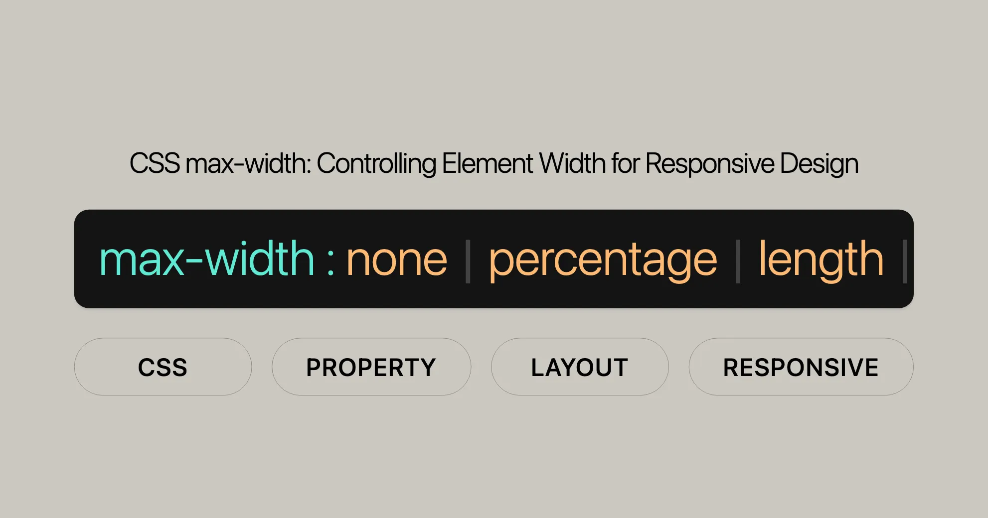
max-width: value;Property Values
max-width can accept various values, including lengths, percentages, and keywords. Here are the common values you can use:
<length>: Specifies the maximum width using units like pixels (px), centimeters (cm), or ems (em).max-width: 300px;max-width: 10em;<percentage>: Sets the maximum width as a percentage of the containing element’s width.max-width: 75%;none: Removes any maximum width constraint.max-width: none;- Keyword values: Includes
max-content,min-content,fit-content, andstretch.max-width: max-content;max-width: min-content;max-width: fit-content;max-width: fit-content(20em);max-width: stretch; - Global values: Includes
inherit,initial,revert,revert-layer, andunset.max-width: inherit;max-width: initial;max-width: revert;max-width: revert-layer;max-width: unset;
Values
The max-width property can take various values to control the maximum width of an element. Understanding these values is crucial for creating responsive designs.
<length>
Specifies the maximum width using a specific length unit, such as pixels (px), centimeters (cm), or ems (em).
max-width: 300px;max-width: 10em;<percentage>
Sets the maximum width as a percentage of the containing element’s width.
max-width: 75%;none
Removes any maximum width constraint.
max-width: none;Keyword Values
max-content
Sets the maximum width to the intrinsic preferred width of the element’s content.
max-width: max-content;min-content
Sets the maximum width to the intrinsic minimum width of the element’s content.
max-width: min-content;fit-content
Allows the element to use the available space but not exceed the max-content value.
max-width: fit-content;max-width: fit-content(20em);stretch
Limits the maximum width of the element’s margin box to the width of its containing block.
max-width: stretch;Global Values
inherit
Inherits the max-width value from the parent element.
max-width: inherit;initial
Sets the max-width property to its default value (none).
max-width: initial;revert
Resets the max-width property to the value specified by the browser’s default stylesheet.
max-width: revert;revert-layer
Resets the max-width property to the value specified by the browser’s default stylesheet at the current cascade layer.
max-width: revert-layer;unset
Acts as a shorthand for initial if the property is not inherited, or inherit if it is.
max-width: unset;Formal Definition
The max-width property in CSS is formally defined to specify the maximum width of an element. It sets an upper limit on the width of an element, preventing it from exceeding a specified value.
Initial Value
The initial value of the max-width property is none. This means that by default, there is no maximum width constraint on an element.
Applies To
The max-width property applies to all elements except non-replaced inline elements, table rows, and row groups.
Inherited
The max-width property is not inherited. You need to explicitly set the max-width for each element if you want them to have the same maximum width constraint.
Percentages
When using percentages with the max-width property, the value is calculated based on the width of the containing block. This allows for responsive design, where the element’s width adjusts dynamically based on the size of its container.
Computed Value
The computed value of the max-width property is either the specified percentage or the absolute length value. If the property is set to none, the computed value is also none.
Animation Type
The max-width property can be animated using CSS animations. The animation type for max-width is a length, percentage, or calc() value.
Formal Syntax
max-width: none | <length-percentage> | min-content | max-content | fit-content | fit-content(<length-percentage>) | <calc-size()> | <anchor-size()> | inherit | initial | revert | revert-layer | unset;Examples
Here are practical examples demonstrating how to use the max-width property in various scenarios.
Setting max-width in pixels
.container { max-width: 300px; background-color: lightblue; padding: 20px;}Setting max-width in percentages
.container { max-width: 75%; background-color: lightblue; padding: 20px;}Using keyword values
.container { max-width: max-content; background-color: lightblue; padding: 20px;}Global values
.container { max-width: inherit; background-color: lightblue; padding: 20px;}By understanding and utilizing the max-width property effectively, you can create more responsive and visually appealing web designs.
Accessibility
Ensuring accessibility is crucial in web development, and the max-width property plays a significant role. Here are some key considerations and best practices to make your content accessible.
Key Accessibility Considerations
- Readability: Make sure elements with a
max-widthare not truncated or hidden when the page is zoomed. This helps users with visual impairments who rely on zooming to read content. - Responsive Design: Use
max-widthwith other CSS properties to create responsive layouts. This ensures your content is accessible on various devices and screen sizes. - Adequate Spacing: Ensure there is enough space around text and interactive elements. Adequate spacing improves readability and makes it easier for users to interact with your web page.
Best Practices
- Use Percentages and Relative Units: When setting
max-width, use percentages or relative units likeemorreminstead of fixed units like pixels. This makes your design more flexible and adaptable..container {max-width: 80%;} - Test with Screen Readers: Ensure content within elements with a
max-widthis accessible to screen readers. - Avoid Overlapping Content: Make sure elements with a
max-widthdo not overlap with other content, especially when the page is zoomed. - Provide Alternatives: For images or other visual elements with a
max-width, provide alternative text (alt text) to ensure accessibility for users with visual impairments.<img src="image.jpg" alt="Description of the image" style="max-width: 100%;">
Guidelines and Resources
- WCAG Guidelines: Refer to the Web Content Accessibility Guidelines (WCAG) for detailed information on making your web content accessible. Specifically, WCAG 1.4 focuses on making content easier to see and hear, including guidelines for text resizing and contrast.
- [WCAG 1.4: Make it easier for users to see and hear content]WebsiteUrl
- [Understanding Success Criterion 1.4.4: Resize text]WebsiteUrl
- ARIA Roles: Use ARIA (Accessible Rich Internet Applications) roles and properties to enhance the accessibility of elements with a
max-width. ARIA provides additional semantic information to assistive technologies.
Example
Here’s an example of how to use the max-width property while considering accessibility:
HTML
<div class="accessible-container"> <p>This is a paragraph with a maximum width to ensure readability and accessibility.</p> <img src="image.jpg" alt="Description of the image" class="accessible-image"></div>CSS
.accessible-container {  max-width: 80%;  margin: 0 auto;  padding: 20px;  background-color: #f0f0f0;}
.accessible-image {  max-width: 100%;  height: auto;}
Conclusion
By focusing on accessibility when using the max-width property, you can create web pages that are both visually appealing and usable for all users. Following accessibility guidelines and best practices ensures that your content is inclusive and compliant with accessibility standards.
Related Properties
The max-width property is one of many CSS properties that help control the size and layout of elements on a web page. Understanding related properties can help you create more complex and responsive designs.
width
The width property sets the width of an element. Unlike max-width, which sets an upper limit, width defines a specific width for the element. This property is often used in conjunction with max-width to ensure that elements do not exceed a certain size.
.container { width: 500px; max-width: 80%;}min-width
The min-width property sets the minimum width of an element. It ensures that the element does not become smaller than the specified value. Using min-width in combination with max-width allows you to define a range within which the element’s width can vary.
.container { min-width: 300px; max-width: 80%;}box-sizing
The box-sizing property defines how the total width and height of an element are calculated. It can be set to content-box (the default) or border-box. When using border-box, the padding and border are included in the element’s total width and height, making it easier to control the overall size of the element.
.container { box-sizing: border-box; max-width: 500px;}max-height
The max-height property sets the maximum height of an element. Similar to max-width, it ensures that the element does not exceed a specified height. This property is useful for controlling the vertical space an element can occupy.
.container { max-width: 500px; max-height: 300px;}min-height
The min-height property sets the minimum height of an element. It ensures that the element does not become smaller than the specified value. Using min-height in combination with max-height allows you to define a range within which the element’s height can vary.
.container { min-height: 200px; max-height: 300px;}max-inline-size and max-block-size
These properties are logical alternatives to max-width and max-height, respectively. They are used to define the maximum size of an element in the inline (horizontal) or block (vertical) direction, depending on the writing mode of the document.
.container { max-inline-size: 500px; max-block-size: 300px;}flex-basis
In the context of flexbox layouts, the flex-basis property sets the initial main size of a flex item. It is often used in conjunction with max-width to control the size of flex items within a flex container.
.flex-container {  display: flex;}
.flex-item {  flex-basis: 200px;  max-width: 300px;}
grid-template-columns
In CSS Grid layouts, the grid-template-columns property defines the columns of the grid. Using max-width within grid items can help control the size of columns, ensuring that they do not exceed a specified width.
FAQs
What is the purpose of the max-width property in CSS?
The max-width property sets the maximum width of an element, preventing it from growing beyond a specified value. This is great for responsive designs, ensuring elements fit nicely within their containers.
How do I use max-width for responsive design?
To create a responsive design, set max-width using percentages or viewport units (e.g., max-width: 100%; or max-width: 80vw;). This makes your content adaptable to different screen sizes.
Can max-width override width in CSS?
Yes, max-width can override the width property if the width exceeds the specified max-width. For example, if width: 500px; and max-width: 300px; are applied, the element will be limited to 300 pixels in width.
Is max-width supported in all browsers?
Yes, max-width is widely supported across all modern browsers, including Chrome, Firefox, Safari, Edge, and Internet Explorer 8 and above.
What’s the difference between max-width and width?
The width property sets a fixed width for an element, while max-width sets a maximum width the element can grow to. Max-width allows the element to be more flexible and responsive.
How does max-width work with min-width?
The min-width property sets the minimum width of an element. When used together with max-width, these properties define a range within which the element’s width can vary. Min-width overrides max-width if there is a conflict.
Can I use max-width with percentages?
Yes, you can use max-width with percentages to set the maximum width of an element relative to its container. For example, max-width: 75%; ensures that the element will not exceed 75% of the width of its container.
What is the fit-content value for max-width?
The fit-content value allows the element to use available space but not exceed the max-content value. It’s a shorthand for min(max-content, max(min-content, stretch)). You can also specify a length or percentage with fit-content to control the available space.
How do I ensure accessibility when using max-width?
Ensure elements set with max-width are not truncated and do not obscure other content when the page is zoomed. Use percentages and relative units to make your design flexible. Provide alternative text for images and test your designs with screen readers to ensure accessibility.
What are some related properties to max-width?
Some related properties to max-width include width, min-width, box-sizing, max-height, min-height, max-inline-size, max-block-size, flex-basis, and grid-template-columns. These properties help control the size and layout of elements and can be used with max-width to create more responsive designs.
By understanding these frequently asked questions, you can gain a deeper insight into the max-width property and its practical applications in web development. This knowledge will help you create more flexible, responsive, and accessible web designs.
 Latest Blogs
  สร้างเว็บไซต์ 1 เว็บ ต้องใช้งบเท่าไหร่? เจาะลึกทุกองค์ประกอบ website development cost อยากสร้างเว็บไซต์แต่ไม่มั่นใจในเรื่องของงบประมาณ อ่านสรุปเจาะลึกตั้งแต่ดีไซน์, ฟังก์ชัน และการดูแล พร้อมตัวอย่างงบจริงจาก Till it’s done ที่แผนชัด งบไม่บานปลายแน่นอน
  Next.js สอน 14 ขั้นตอนเบื้องต้น: สร้างโปรเจกต์แรกใน 30 นาที เริ่มต้นกับ Next.js ใน 14 ขั้นตอนเพียงแค่ 30 นาที พร้อม SSR/SSG และ API Routes ด้วยตัวอย่างโค้ดง่าย ๆ อ่านต่อเพื่อสร้างโปรเจ็กต์แรกได้ทันทีที่นี่
  วิธีสมัคร Apple Developer Account เพื่อนำแอปขึ้น App Store ทีละขั้นตอน อยากปล่อยแอปบน App Store ระดับโลก มาอ่านคู่มือสมัคร Apple Developer Account พร้อมเคล็ดลับ TestFlight และวิธีอัปโหลดที่ง่ายในบทความเดียวนี้ได้เลย
  TypeScript Interface คืออะไร? อธิบายพร้อมวิธีใช้และข้อแตกต่างจาก Type เรียนรู้วิธีใช้ TypeScript Interface เพื่อสร้างโครงสร้างข้อมูลที่ปลอดภัยและเข้าใจง่าย พร้อมเปรียบเทียบข้อดีข้อแตกต่างกับ Type ที่คุณต้องรู้ ถูกรวมเอาไว้ในบทความนี้แล้ว
  Material-UI (MUI) คืออะไร อยากสร้าง UI สวยงามและเป็นมืออาชีพในเวลาอันรวดเร็วใช่ไหม มาทำความรู้จักกับ Material-UI (MUI) ที่ช่วยให้คุณพัฒนาแอปพลิเคชันบน React ได้ง่ายและดูดีในทุกอุปกรณ์
  เปรียบเทียบ 3 วิธีติดตั้ง install node js บน Ubuntu: NVM vs NodeSource vs Official Repo แบบไหนดีที่สุด? เรียนรู้วิธีติดตั้ง Node.js บน Ubuntu ด้วย NVM, NodeSource หรือ Official Repo เลือกวิธีที่เหมาะกับความต้องการของคุณ พร้อมเปรียบเทียบ เพื่อการพัฒนาที่มีประสิทธิภาพ!
 Talk with CEO
Explore our best articles, cover a wide variety of technologies 
 ReactJs
  Flutter
  Nodejs
  Nextjs
  TailwindCSS
  Typescript Golang AstroJs Jest Website development th Mobile application th Reactjs th Nextjs th Flutter th Software house th Nodejs th Typescript th
  CSS
CSS We'll be right here with you every step of the way.
We'll be here, prepared to commence this promising collaboration.


Whether you're curious about features, warranties, or shopping policies, we provide comprehensive answers to assist you.