
- Services
- Case Studies
- Technologies
- NextJs development
- Flutter development
- NodeJs development
- ReactJs development
- About
- Contact
- Tools
- Blogs
- FAQ
 Scroll to discover
 Understanding CSS margin-inline-end for Responsive Design
It adapts to writing modes and text orientations, offering lengths, percentages, and keyword values for flexible design.
Introduction
The margin-inline-end property in CSS is a handy tool for managing the spacing at the logical end of an element’s inline direction. It adapts to the writing mode, directionality, and text orientation of the element, making it great for responsive and adaptable web designs. This property has been around since September 2021 and is well-supported across various browsers.
Specification
The margin-inline-end property is part of the CSS Logical Properties and Values Level 1 specification. This specification helps create more flexible layouts, especially useful for different languages and text orientations. It’s an essential tool for developing inclusive and responsive web designs.
Description
The margin-inline-end property defines the logical inline end margin of an element. It adjusts based on the writing mode, directionality, and text orientation, corresponding to margin-top, margin-right, margin-bottom, or margin-left. This makes it useful for creating adaptable designs that accommodate various text directions.
Syntax
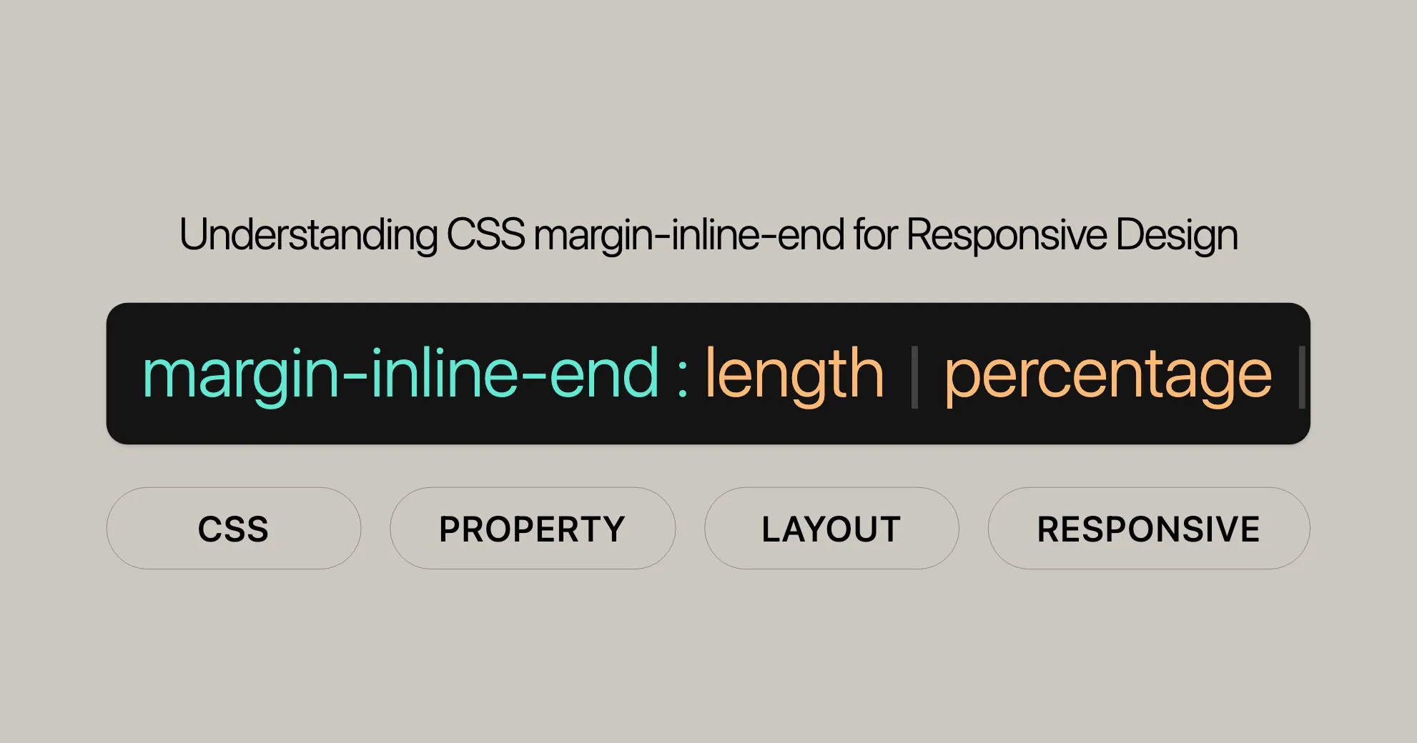
The syntax for margin-inline-end is straightforward and supports various values:
/* <length> values */margin-inline-end: 10px; /* Absolute length */margin-inline-end: 1em;  /* Relative to text size */margin-inline-end: 5%;    /* Relative to container width */
/* Keyword values */margin-inline-end: auto; /* Browser determines margin */
/* Global values */margin-inline-end: inherit;  /* Inherits from parent */margin-inline-end: initial;  /* Default value */margin-inline-end: revert;   /* Reverts to user-agent stylesheet */margin-inline-end: revert-layer; /* Reverts to previous cascade layer */margin-inline-end: unset;    /* Resets to inherited or initial */
Values
The margin-inline-end property accepts lengths, percentages, and keywords:
- Lengths: Absolute (e.g.,
px,cm) or relative (e.g.,em,rem). Negative values are allowed. - Percentages: Relative to the width of the nearest block container.
- Auto: Browser determines the margin size based on context.
- Global Values:
inherit,initial,revert,revert-layer,unset.
Formal Definition
The margin-inline-end property sets the logical inline end margin of an element:
- Initial Value:
0 - Applies To: All elements
- Inherited: No
- Percentages: Depend on the layout model
- Computed Value: Absolute length, percentage, or
auto - Animation Type: Length
Formal Syntax
margin-inline-end =  <length-percentage> |  auto
<length-percentage> =  <length> |  <percentage>
<length> =  <absolute-length> |  <relative-length>
<absolute-length> =  px | cm | pt | ...
<relative-length> =  em | rem | ...
<percentage> =  <number>%
Examples
Example 1: Setting a Fixed Margin
HTML:
<!DOCTYPE html><html><head> <title>CSS | margin-inline-end Property</title> <style> h1 { color: green; } div { background-color: yellow; width: 120px; height: 120px; } .exampleText { writing-mode: vertical-lr; margin-inline-end: 20px; background-color: #c8c800; } </style></head><body> <center> <h1>Website</h1> <b>CSS | margin-inline-end Property</b> <br><br> <div> <p class="exampleText">Example text</p> </div> </center></body></html>Result:
The text inside .exampleText will have a 20px margin at the end of its inline direction.
Example 2: Using the auto Keyword
HTML:
<!DOCTYPE html><html><head> <title>CSS | margin-inline-end Property</title> <style> h1 { color: green; } div { background-color: yellow; width: 120px; height: 120px; } .exampleText { writing-mode: vertical-lr; margin-inline-end: auto; background-color: #c8c800; } </style></head><body> <center> <h1>Website</h1> <b>CSS | margin-inline-end Property</b> <br><br> <div> <p class="exampleText">Example text</p> </div> </center></body></html>Result:
The text inside .exampleText will have an automatically determined margin at the end of its inline direction.
Browser Compatibility
The margin-inline-end property is supported across modern web browsers:
- Google Chrome: Supported since version 87.
- Microsoft Edge: Supported since version 87.
- Mozilla Firefox: Supported since version 41.
- Opera: Supported since version 73.
- Safari: Supported since version 12.1.
See Also
For more information, check out these related topics:
- CSS Logical Properties and Values: Learn more about logical properties and values.
margin-inline-start: The counterpart tomargin-inline-end.- Mapped Physical Properties: Understand the relationship between logical and physical properties.
writing-mode: Determines the direction of text flow.direction: Sets the directionality of text.text-orientation: Controls the orientation of text within a line box.
Supported Browsers
The margin-inline-end property is supported by:
- Google Chrome: Version 87 and above.
- Microsoft Edge: Version 87 and above.
- Mozilla Firefox: Version 41 and above.
- Opera: Version 73 and above.
- Safari: Version 12.1 and above.
This ensures consistent display across different platforms and devices.
 Latest Blogs
  สร้างเว็บไซต์ 1 เว็บ ต้องใช้งบเท่าไหร่? เจาะลึกทุกองค์ประกอบ website development cost อยากสร้างเว็บไซต์แต่ไม่มั่นใจในเรื่องของงบประมาณ อ่านสรุปเจาะลึกตั้งแต่ดีไซน์, ฟังก์ชัน และการดูแล พร้อมตัวอย่างงบจริงจาก Till it’s done ที่แผนชัด งบไม่บานปลายแน่นอน
  Next.js สอน 14 ขั้นตอนเบื้องต้น: สร้างโปรเจกต์แรกใน 30 นาที เริ่มต้นกับ Next.js ใน 14 ขั้นตอนเพียงแค่ 30 นาที พร้อม SSR/SSG และ API Routes ด้วยตัวอย่างโค้ดง่าย ๆ อ่านต่อเพื่อสร้างโปรเจ็กต์แรกได้ทันทีที่นี่
  วิธีสมัคร Apple Developer Account เพื่อนำแอปขึ้น App Store ทีละขั้นตอน อยากปล่อยแอปบน App Store ระดับโลก มาอ่านคู่มือสมัคร Apple Developer Account พร้อมเคล็ดลับ TestFlight และวิธีอัปโหลดที่ง่ายในบทความเดียวนี้ได้เลย
  TypeScript Interface คืออะไร? อธิบายพร้อมวิธีใช้และข้อแตกต่างจาก Type เรียนรู้วิธีใช้ TypeScript Interface เพื่อสร้างโครงสร้างข้อมูลที่ปลอดภัยและเข้าใจง่าย พร้อมเปรียบเทียบข้อดีข้อแตกต่างกับ Type ที่คุณต้องรู้ ถูกรวมเอาไว้ในบทความนี้แล้ว
  Material-UI (MUI) คืออะไร อยากสร้าง UI สวยงามและเป็นมืออาชีพในเวลาอันรวดเร็วใช่ไหม มาทำความรู้จักกับ Material-UI (MUI) ที่ช่วยให้คุณพัฒนาแอปพลิเคชันบน React ได้ง่ายและดูดีในทุกอุปกรณ์
  เปรียบเทียบ 3 วิธีติดตั้ง install node js บน Ubuntu: NVM vs NodeSource vs Official Repo แบบไหนดีที่สุด? เรียนรู้วิธีติดตั้ง Node.js บน Ubuntu ด้วย NVM, NodeSource หรือ Official Repo เลือกวิธีที่เหมาะกับความต้องการของคุณ พร้อมเปรียบเทียบ เพื่อการพัฒนาที่มีประสิทธิภาพ!
 Talk with CEO
Explore our best articles, cover a wide variety of technologies 
 ReactJs
  Flutter
  Nodejs
  Nextjs
  TailwindCSS
  Typescript Golang AstroJs Jest Website development th Mobile application th Reactjs th Nextjs th Flutter th Software house th Nodejs th Typescript th
  CSS
CSS We'll be right here with you every step of the way.
We'll be here, prepared to commence this promising collaboration.


Whether you're curious about features, warranties, or shopping policies, we provide comprehensive answers to assist you.