
- Services
- Case Studies
- Technologies
- NextJs development
- Flutter development
- NodeJs development
- ReactJs development
- About
- Contact
- Tools
- Blogs
- FAQ
 Scroll to discover
 Mastering CSS justify-items for Grid Layouts
Explore positional, baseline, overflow, and legacy alignment options.
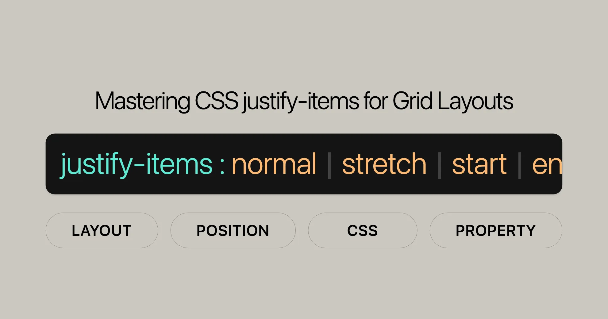
CSS justify-items Property
The justify-items property in CSS helps align items within a grid container along the inline (row) axis. Similar to align-items for flex containers, justify-items lets you control the alignment of grid items when they don’t have an explicit position. This property is great for creating well-organized and visually appealing layouts in web development.
Syntax and Basic Keywords
The syntax for justify-items is straightforward:
justify-items: normal | stretch | <baseline-position> | <overflow-position>? [ <self-position> | left | right ] | legacy | positional alignment | initial | inherit | unset;Here are the basic keywords:
-
normal:- Aligns items based on their context, usually behaving like
stretch.
justify-items: normal; - Aligns items based on their context, usually behaving like
-
stretch:- The default value; stretches items to fill their cells.
justify-items: stretch; -
Positional Alignment:
start: Aligns items to the start of their cells.end: Aligns items to the end of their cells.center: Centers items within their cells.left: Aligns items to the left.right: Aligns items to the right.
justify-items: start | end | center | left | right; -
Baseline Alignment:
baseline: Aligns items along their baseline.first baseline: Aligns items along their first baseline.last baseline: Aligns items along their last baseline.
justify-items: baseline | first baseline | last baseline; -
Overflow Alignment:
safe: Ensures items are visible if they overflow.unsafe: Keeps the alignment even if items overflow.
justify-items: safe | unsafe; -
Legacy Alignment:
legacy: Combines directional keywords with inheritance.
justify-items: legacy left | legacy center | legacy right; -
Global Values:
inherit: Inherits the value from the parent element.initial: Sets the property to its default value.unset: Resets to inherit from the parent or defaults to initial value.
justify-items: inherit | initial | unset;
Examples
HTML
<!DOCTYPE html><html lang="en"><head> <meta charset="UTF-8"> <meta name="viewport" content="width=device-width, initial-scale=1.0"> <title>CSS justify-items Property</title> <style> .container { display: grid; grid-template-columns: 1fr 1fr; gap: 10px; margin: 20px; width: 300px; } .item { background-color: lightblue; padding: 20px; border: 1px solid #ccc; } #start { justify-items: start; } #end { justify-items: end; } #center { justify-items: center; } #left { justify-items: left; } #right { justify-items: right; } #baseline { justify-items: baseline; } #first-baseline { justify-items: first baseline; } #last-baseline { justify-items: last baseline; } #safe-center { justify-items: safe center; } #unsafe-center { justify-items: unsafe center; } #legacy-left { justify-items: legacy left; } #legacy-center { justify-items: legacy center; } #legacy-right { justify-items: legacy right; } </style></head><body> <h1>CSS justify-items Property</h1> <div id="start" class="container"> <div class="item">Start</div> <div class="item">Start</div> </div> <div id="end" class="container"> <div class="item">End</div> <div class="item">End</div> </div> <div id="center" class="container"> <div class="item">Center</div> <div class="item">Center</div> </div> <div id="left" class="container"> <div class="item">Left</div> <div class="item">Left</div> </div> <div id="right" class="container"> <div class="item">Right</div> <div class="item">Right</div> </div> <div id="baseline" class="container"> <div class="item">Baseline Aligned</div> <div class="item">Baseline Aligned</div> </div> <div id="first-baseline" class="container"> <div class="item">First Baseline Aligned</div> <div class="item">First Baseline Aligned</div> </div> <div id="last-baseline" class="container"> <div class="item">Last Baseline Aligned</div> <div class="item">Last Baseline Aligned</div> </div> <div id="safe-center" class="container"> <div class="item">Safe Center</div> <div class="item">Safe Center</div> </div> <div id="unsafe-center" class="container"> <div class="item">Unsafe Center</div> <div class="item">Unsafe Center</div> </div> <div id="legacy-left" class="container"> <div class="item">Legacy Left</div> <div class="item">Legacy Left</div> </div> <div id="legacy-center" class="container"> <div class="item">Legacy Center</div> <div class="item">Legacy Center</div> </div> <div id="legacy-right" class="container"> <div class="item">Legacy Right</div> <div class="item">Legacy Right</div> </div></body></html>Explanation
-
Positional Alignment:
start: Aligns items to the start of their cells.end: Aligns items to the end of their cells.center: Centers items within their cells.left: Aligns items to the left.right: Aligns items to the right.
-
Baseline Alignment:
baseline: Aligns items along their baseline.first baseline: Aligns items along their first baseline.last baseline: Aligns items along their last baseline.
-
Overflow Alignment:
safe: Ensures items are visible if they overflow.unsafe: Keeps the alignment even if items overflow.
-
Legacy Alignment:
legacy left: Aligns items to the left within grid cells.legacy center: Centers items within grid cells.legacy right: Aligns items to the right within grid cells.
Browser Compatibility
The justify-items property is well-supported across modern web browsers, ensuring that your grid layouts work consistently across different platforms and devices. Here’s a quick overview of browser compatibility:
- Google Chrome: Supported since version 52.0.
- Microsoft Edge: Supported since version 12.0.
- Internet Explorer: Supported since version 11.0.
- Firefox: Supported since version 20.0.
- Opera: Supported since version 12.1.
- Safari: Supported since version 9.0.
Compatibility Table
| Browser | Version |
|---|---|
| Google Chrome | 52.0 |
| Microsoft Edge | 12.0 |
| Internet Explorer | 11.0 |
| Firefox | 20.0 |
| Opera | 12.1 |
| Safari | 9.0 |
Best Practices
To ensure the best compatibility and user experience, consider the following best practices:
- Use Feature Detection: Use the
@supportsrule to check if a browser supportsjustify-itemsbefore applying it. - Provide Fallbacks: Offer fallback styles for older browsers that don’t support
justify-items. - Test Across Browsers: Regularly test your web designs across different browsers and devices to identify and fix compatibility issues.
By following these best practices, you can ensure that your use of the justify-items property is robust and reliable, providing a consistent user experience across different platforms and devices.
See Also
To further enhance your understanding and usage of CSS alignment properties, explore these related resources:
justify-self: This property allows you to specify the alignment for an individual grid item along the inline (row) axis.align-items: Similar tojustify-items, but used for aligning items along the block (column) axis in flex containers.place-items: A shorthand property that sets both thealign-itemsandjustify-itemsproperties in a single declaration.- Box alignment in CSS grid layouts: A detailed guide on how to use box alignment properties within grid layouts.
- CSS box alignment: The module that defines properties for aligning boxes within their containers, including
justify-items.
These resources will help you gain a deeper understanding of CSS alignment properties and how they can be used to create well-organized and visually appealing layouts in your web development projects.
 Latest Blogs
  สร้างเว็บไซต์ 1 เว็บ ต้องใช้งบเท่าไหร่? เจาะลึกทุกองค์ประกอบ website development cost อยากสร้างเว็บไซต์แต่ไม่มั่นใจในเรื่องของงบประมาณ อ่านสรุปเจาะลึกตั้งแต่ดีไซน์, ฟังก์ชัน และการดูแล พร้อมตัวอย่างงบจริงจาก Till it’s done ที่แผนชัด งบไม่บานปลายแน่นอน
  Next.js สอน 14 ขั้นตอนเบื้องต้น: สร้างโปรเจกต์แรกใน 30 นาที เริ่มต้นกับ Next.js ใน 14 ขั้นตอนเพียงแค่ 30 นาที พร้อม SSR/SSG และ API Routes ด้วยตัวอย่างโค้ดง่าย ๆ อ่านต่อเพื่อสร้างโปรเจ็กต์แรกได้ทันทีที่นี่
  วิธีสมัคร Apple Developer Account เพื่อนำแอปขึ้น App Store ทีละขั้นตอน อยากปล่อยแอปบน App Store ระดับโลก มาอ่านคู่มือสมัคร Apple Developer Account พร้อมเคล็ดลับ TestFlight และวิธีอัปโหลดที่ง่ายในบทความเดียวนี้ได้เลย
  TypeScript Interface คืออะไร? อธิบายพร้อมวิธีใช้และข้อแตกต่างจาก Type เรียนรู้วิธีใช้ TypeScript Interface เพื่อสร้างโครงสร้างข้อมูลที่ปลอดภัยและเข้าใจง่าย พร้อมเปรียบเทียบข้อดีข้อแตกต่างกับ Type ที่คุณต้องรู้ ถูกรวมเอาไว้ในบทความนี้แล้ว
  Material-UI (MUI) คืออะไร อยากสร้าง UI สวยงามและเป็นมืออาชีพในเวลาอันรวดเร็วใช่ไหม มาทำความรู้จักกับ Material-UI (MUI) ที่ช่วยให้คุณพัฒนาแอปพลิเคชันบน React ได้ง่ายและดูดีในทุกอุปกรณ์
  เปรียบเทียบ 3 วิธีติดตั้ง install node js บน Ubuntu: NVM vs NodeSource vs Official Repo แบบไหนดีที่สุด? เรียนรู้วิธีติดตั้ง Node.js บน Ubuntu ด้วย NVM, NodeSource หรือ Official Repo เลือกวิธีที่เหมาะกับความต้องการของคุณ พร้อมเปรียบเทียบ เพื่อการพัฒนาที่มีประสิทธิภาพ!
 Talk with CEO
Explore our best articles, cover a wide variety of technologies 
 ReactJs
  Flutter
  Nodejs
  Nextjs
  TailwindCSS
  Typescript Golang AstroJs Jest Website development th Mobile application th Reactjs th Nextjs th Flutter th Software house th Nodejs th Typescript th
  CSS
CSS We'll be right here with you every step of the way.
We'll be here, prepared to commence this promising collaboration.


Whether you're curious about features, warranties, or shopping policies, we provide comprehensive answers to assist you.