
- Services
- Case Studies
- Technologies
- NextJs development
- Flutter development
- NodeJs development
- ReactJs development
- About
- Contact
- Tools
- Blogs
- FAQ
 Scroll to discover
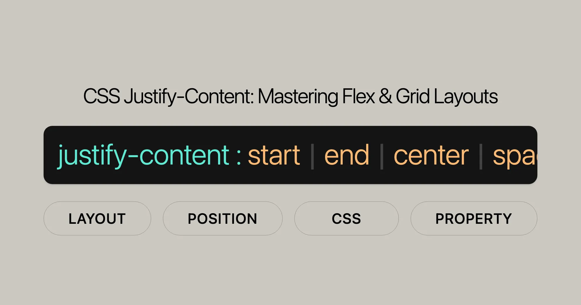
 CSS Justify-Content Mastering Flex & Grid Layouts
Discover use cases and available options like start, end, center, space-between, and more.
Introduction
The justify-content property in CSS is a handy tool for developers to control the spacing and alignment of items within flex, grid, or multicol containers. It helps create flexible and responsive layouts by managing the distribution of space between and around items.
Understanding justify-content is crucial for effective web design and development. It allows precise control over the spacing and alignment of elements, making your designs functional and visually appealing.
This article will walk you through the various values and applications of justify-content, with practical examples to illustrate its usage. By the end, you’ll have a solid grasp of how to use justify-content to enhance your web development projects.
Specification
The justify-content property is defined in the CSS Box Alignment Module Level 3 and the CSS Flexible Box Layout Module Level 1. These specifications ensure consistency and predictability across web browsers.
- CSS Box Alignment Module Level 3: Describes how
justify-contentworks in multicol, flex, and grid containers, distributing space along the main axis. - CSS Flexible Box Layout Module Level 1: Focuses on
justify-contentin flex containers, detailing how it distributes positive free space between or around flex items along the main axis.
By following these specifications, you can confidently use justify-content to create responsive layouts that work well across different devices and browsers.
Description
The justify-content property in CSS controls the alignment and distribution of space between and around items within flex, grid, or multicol containers. It’s essential for creating well-structured and visually appealing layouts.
In flex containers, justify-content determines how the positive free space is distributed between or around the flex items. This can include aligning items to the start, end, or center of the container.
For grid containers, justify-content controls the alignment of the grid along the inline axis, distributing space between or around grid columns. This is particularly useful when the grid container is larger than the grid itself.
In multicol containers, justify-content can stretch auto track sizes to fill the container, ensuring that the columns take up any remaining space.
Understanding and effectively using justify-content allows developers to create flexible, responsive, and aesthetically pleasing layouts that adapt to different screen sizes and devices.
Syntax
The justify-content property in CSS controls the alignment and distribution of space between and around items within a flex, grid, or multicol container. The syntax is straightforward and includes various values that define different alignment behaviors.
Here is the basic syntax for the justify-content property:
/* Positional alignment */justify-content: center;justify-content: start;justify-content: end;justify-content: flex-start;justify-content: flex-end;justify-content: left;justify-content: right;
/* Normal alignment */justify-content: normal;
/* Distributed alignment */justify-content: space-between;justify-content: space-around;justify-content: space-evenly;justify-content: stretch;
/* Overflow alignment */justify-content: safe center;justify-content: unsafe center;
/* Global values */justify-content: inherit;justify-content: initial;justify-content: revert;justify-content: revert-layer;justify-content: unset;
Each value serves a specific purpose in defining how items are aligned within the container. For example:
centeraligns items to the center of the container.startaligns items to the start of the container.endaligns items to the end of the container.space-betweendistributes items evenly with the first item at the start and the last item at the end.space-arounddistributes items with equal spacing before, between, and after each item.space-evenlydistributes items with equal spacing between them, including the space from the container’s edges.stretchstretchesauto-sized items to fill the container.
Understanding the syntax and the various values of justify-content is crucial for effectively using this property in your web design projects. By applying the appropriate value, you can achieve the desired alignment and spacing of items within your containers, creating well-structured and visually appealing layouts.
Values
The justify-content property in CSS offers various values that control the alignment and distribution of space between and around items within a flex, grid, or multicol container. Each value serves a specific purpose, allowing for precise control over the layout. Here are the key values for the justify-content property:
Positional Alignment
start: Aligns items to the start of the container.end: Aligns items to the end of the container.flex-start: Aligns items to the start of the flex container.flex-end: Aligns items to the end of the flex container.center: Aligns items to the center of the container.left: Aligns items to the left edge of the container.right: Aligns items to the right edge of the container.
Normal Alignment
normal: Behaves asstretchin most cases, except in multi-column containers with a non-autocolumn-width, where the columns take their specified width rather than stretching to fill the container. In flex containers,normalbehaves asstart.
Distributed Alignment
space-between: Distributes items evenly with the first item at the start and the last item at the end.space-around: Distributes items with equal spacing before, between, and after each item.space-evenly: Distributes items with equal spacing between them, including the space from the container’s edges.stretch: Stretchesauto-sized items to fill the container.
Overflow Alignment
safe: If the item overflows the container, it aligns as if the alignment mode isstart.unsafe: Even if the item overflows the container, the desired alignment will be implemented.
Global Values
inherit: Inherits the value from its parent element.initial: Sets the property to its default value.revert: Reverts the property to the browser’s default styling.revert-layer: Reverts the property to the browser’s default styling for the current cascade layer.unset: Resets the property to its natural value.
Understanding these values allows web developers to effectively control the alignment and distribution of items within containers, creating flexible and responsive layouts that enhance the overall user experience.
Examples
To better understand how the justify-content property works, let’s explore some practical examples. These examples will demonstrate the different effects of the various justify-content values within flex and grid containers.
Basic Flex Container Example
In this example, we will create a simple flex container with multiple items and use different justify-content values to see how they affect the layout.
HTML
<div class="flex-container"> <div class="flex-item">Item 1</div> <div class="flex-item">Item 2</div> <div class="flex-item">Item 3</div></div>CSS
.flex-container {  display: flex;  border: 1px solid #000;  height: 200px;}
.flex-item {  background-color: lightgreen;  margin: 5px;  text-align: center;  line-height: 50px;}
Applying Different justify-content Values
start: Aligns items at the start of the container..flex-container {justify-content: start;}end: Aligns items at the end of the container..flex-container {justify-content: end;}center: Aligns items at the center of the container..flex-container {justify-content: center;}space-between: Distributes items evenly with the first item at the start and the last item at the end..flex-container {justify-content: space-between;}space-around: Distributes items with equal spacing before, between, and after each item..flex-container {justify-content: space-around;}space-evenly: Distributes items with equal spacing between them, including the space from the container’s edges..flex-container {justify-content: space-evenly;}
Basic Grid Container Example
In this example, we will create a grid container with multiple items and use different justify-content values to see how they affect the layout.
HTML
<div class="grid-container"> <div class="grid-item">Item 1</div> <div class="grid-item">Item 2</div> <div class="grid-item">Item 3</div> <div class="grid-item">Item 4</div></div>CSS
.grid-container {  display: grid;  grid-template-columns: repeat(2, 1fr);  border: 1px solid #000;  height: 200px;}
.grid-item {  background-color: lightgreen;  margin: 5px;  text-align: center;  line-height: 90px;}
Applying Different justify-content Values
start: Aligns items at the start of the container..grid-container {justify-content: start;}end: Aligns items at the end of the container..grid-container {justify-content: end;}center: Aligns items at the center of the container..grid-container {justify-content: center;}space-between: Distributes items evenly with the first item at the start and the last item at the end..grid-container {justify-content: space-between;}space-around: Distributes items with equal spacing before, between, and after each item..grid-container {justify-content: space-around;}space-evenly: Distributes items with equal spacing between them, including the space from the container’s edges..grid-container {justify-content: space-evenly;}
The safe Keyterm Example
This example demonstrates the safe keyterm. We specify four centered flex items that are not allowed to wrap, and as a result, they overflow their single flex-line container. By adding safe to center in the justify-content property, overflowing content behaves as if the alignment mode is start.
HTML
<p><code>justify-content: center;</code></p><section class="container safe"> <div>A</div> <div>B</div> <div>C</div> <div>D</div></section><p><code>justify-content: safe center;</code></p><section class="container safe-center"> <div>A</div> <div>B</div> <div>C</div> <div>D</div></section><p><code>justify-content: safe center;</code> with 3 items</p><section class="container safe-center"> <div>A</div> <div>B</div> <div>C</div></section>CSS
.container {  margin: 5px auto;  border: 1px dashed;  box-sizing: border-box;  background-color: lightblue;}
div {  line-height: 1em;  border: 1px solid;  box-sizing: border-box;  text-align: center;  background-color: pink;}
.container {  align-items: baseline;  display: flex;  width: 350px;  height: 2em;}
.safe {  justify-content: center;}
.safe-center {  justify-content: safe center;}
div {  flex: 0 0 100px;}
Result
As an item overflows the alignment container, with safe included, the alignment mode behaves as start, and the center alignment is not implemented. The safe keyterm has no effect if the items do not overflow the container.
Visualizing Flex Item Distribution
This example includes a multi-line wrapping flex layout. The second flex item has a positive flex growth factor, consuming all the available free space in the first flex line.
HTML
<div class="container"> <div>1</div> <div>2</div> <div>3</div> <div>4</div> <div>5</div></div>CSS
.container {  display: flex;  flex-wrap: wrap;  width: 400px;  border: 1px solid;}
.container div {  border: 1px solid;  width: 100px;  box-sizing: border-box;}
.container div:nth-child(2) {  flex-grow: 1;}
Result
The second flex item consumes all the available free space in the first flex line, demonstrating the distribution of space within a flex container.
Browser Compatibility
The justify-content property is widely supported across modern web browsers, making it a reliable tool for web developers to control the alignment and distribution of items within containers. Here is an overview of the browser compatibility for the justify-content property:
Desktop Browsers
- Google Chrome: Supported since version 29.0 (August 2013).
- Mozilla Firefox: Supported since version 28.0 (March 2014).
- Internet Explorer: Supported since version 11.0 (October 2013).
- Microsoft Edge: Supported since version 12.0 (the initial release of Edge in July 2015).
- Opera: Supported since version 17.0 (August 2013).
- Safari: Supported since version 9.0 (September 2015).
Mobile Browsers
- Chrome for Android: Supported since version 29.0.
- Firefox for Android: Supported since version 28.0.
- Safari on iOS: Supported since iOS 9.0.
- Opera Mobile: Supported since version 17.0.
- Samsung Internet: Supported since version 3.0.
Browser Compatibility Table
| Browser | Version | Initial Support Date |
|---|---|---|
| Chrome | 29.0 | August 2013 |
| Firefox | 28.0 | March 2014 |
| Internet Explorer | 11.0 | October 2013 |
| Edge | 12.0 | July 2015 |
| Opera | 17.0 | August 2013 |
| Safari | 9.0 | September 2015 |
| Chrome Android | 29.0 | August 2013 |
| Firefox Android | 28.0 | March 2014 |
| Safari iOS | 9.0 | September 2015 |
| Opera Mobile | 17.0 | August 2013 |
| Samsung Internet | 3.0 | - |
Notes on Compatibility
- Internet Explorer 11: While Internet Explorer 11 supports the
justify-contentproperty, it may have some quirks and limitations compared to more modern browsers. Developers should test their layouts thoroughly in IE11 to ensure compatibility. - Opera: Opera’s support for
justify-contentis consistent with other browsers, making it a reliable choice for web developers. - Safari: Safari’s support for
justify-contentis robust, but developers should be aware of any potential updates or changes in newer versions of the browser.
Ensuring Cross-Browser Compatibility
To ensure that your web designs work seamlessly across different browsers, it is essential to:
- Test your layouts in various browsers and devices.
- Use fallback methods for older browsers that may not fully support
justify-content. - Stay updated with browser release notes and updates to identify any changes that could affect your designs.
By following these guidelines, you can create consistent, predictable, and visually appealing layouts that work seamlessly across different devices and browsers.
Best Practices for Using justify-content
- Test Thoroughly: Always test your layouts in multiple browsers and devices to catch and fix any issues.
- Use Feature Queries: Use CSS feature queries to apply
justify-contentonly when it’s supported. - Provide Fallbacks: Ensure a consistent user experience by providing fallback styles for older browsers.
By following these practices, you can create flexible and visually appealing layouts that work well across different platforms and devices.
Additional Resources
For more information on CSS properties and concepts, check out these helpful resources:
- Basic Concepts of Flexbox: Learn the core concepts of the flexbox layout model.
- Aligning Items in a Flex Container: Discover how to align items within a flex container.
- Box Alignment in CSS Grid Layouts: Understand how to align and distribute grid items effectively.
- CSS Box Alignment Module: Learn about box alignment properties, including
justify-contentandalign-content. - CSS Flexible Box Layout Module: Dive deep into the flexbox layout model.
- CSS Grid Layout Module: Explore the CSS Grid layout system for complex and responsive grid layouts.
These resources offer detailed explanations and examples to help you master CSS layouts and alignment, ensuring you create sophisticated and responsive web designs.
 Latest Blogs
  สร้างเว็บไซต์ 1 เว็บ ต้องใช้งบเท่าไหร่? เจาะลึกทุกองค์ประกอบ website development cost อยากสร้างเว็บไซต์แต่ไม่มั่นใจในเรื่องของงบประมาณ อ่านสรุปเจาะลึกตั้งแต่ดีไซน์, ฟังก์ชัน และการดูแล พร้อมตัวอย่างงบจริงจาก Till it’s done ที่แผนชัด งบไม่บานปลายแน่นอน
  Next.js สอน 14 ขั้นตอนเบื้องต้น: สร้างโปรเจกต์แรกใน 30 นาที เริ่มต้นกับ Next.js ใน 14 ขั้นตอนเพียงแค่ 30 นาที พร้อม SSR/SSG และ API Routes ด้วยตัวอย่างโค้ดง่าย ๆ อ่านต่อเพื่อสร้างโปรเจ็กต์แรกได้ทันทีที่นี่
  วิธีสมัคร Apple Developer Account เพื่อนำแอปขึ้น App Store ทีละขั้นตอน อยากปล่อยแอปบน App Store ระดับโลก มาอ่านคู่มือสมัคร Apple Developer Account พร้อมเคล็ดลับ TestFlight และวิธีอัปโหลดที่ง่ายในบทความเดียวนี้ได้เลย
  TypeScript Interface คืออะไร? อธิบายพร้อมวิธีใช้และข้อแตกต่างจาก Type เรียนรู้วิธีใช้ TypeScript Interface เพื่อสร้างโครงสร้างข้อมูลที่ปลอดภัยและเข้าใจง่าย พร้อมเปรียบเทียบข้อดีข้อแตกต่างกับ Type ที่คุณต้องรู้ ถูกรวมเอาไว้ในบทความนี้แล้ว
  Material-UI (MUI) คืออะไร อยากสร้าง UI สวยงามและเป็นมืออาชีพในเวลาอันรวดเร็วใช่ไหม มาทำความรู้จักกับ Material-UI (MUI) ที่ช่วยให้คุณพัฒนาแอปพลิเคชันบน React ได้ง่ายและดูดีในทุกอุปกรณ์
  เปรียบเทียบ 3 วิธีติดตั้ง install node js บน Ubuntu: NVM vs NodeSource vs Official Repo แบบไหนดีที่สุด? เรียนรู้วิธีติดตั้ง Node.js บน Ubuntu ด้วย NVM, NodeSource หรือ Official Repo เลือกวิธีที่เหมาะกับความต้องการของคุณ พร้อมเปรียบเทียบ เพื่อการพัฒนาที่มีประสิทธิภาพ!
 Talk with CEO
Explore our best articles, cover a wide variety of technologies 
 ReactJs
  Flutter
  Nodejs
  Nextjs
  TailwindCSS
  Typescript Golang AstroJs Jest Website development th Mobile application th Reactjs th Nextjs th Flutter th Software house th Nodejs th Typescript th
  CSS
CSS We'll be right here with you every step of the way.
We'll be here, prepared to commence this promising collaboration.


Whether you're curious about features, warranties, or shopping policies, we provide comprehensive answers to assist you.