
- Services
- Case Studies
- Technologies
- NextJs development
- Flutter development
- NodeJs development
- ReactJs development
- About
- Contact
- Tools
- Blogs
- FAQ
 Scroll to discover
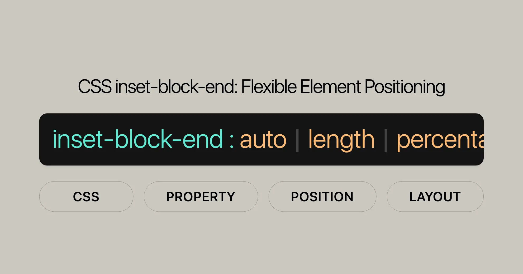
 CSS inset-block-end Flexible Element Positioning
It adapts to writing modes and text orientation, offering options like length, percentage, and auto.
Introduction
The inset-block-end CSS property defines the logical block end offset of an element, which can be the physical top, right, bottom, or left property. Introduced in September 2021, this property is widely supported across various browsers. It helps achieve precise control over element positioning, improving user experience and design aesthetics.
Specification
The inset-block-end property is part of the CSS Logical Properties and Values Level 1 specification. This spec aims to provide logical properties and values that adapt to different writing modes, making CSS more intuitive and flexible for internationalization. The inset-block-end property is defined in the section on position properties within this specification.
The formal specification can be found here: CSS Logical Properties and Values Level 1 - Position Properties.
Description
The inset-block-end CSS property defines the logical block end offset of an element. It’s useful for positioning elements relative to their containing block, adapting to the element’s writing mode, directionality, and text orientation. Unlike traditional properties such as top, right, bottom, and left, which are fixed to the physical layout, inset-block-end provides a more flexible and intuitive approach to positioning.
This property is essential for creating responsive and adaptable web designs, especially for websites that support multiple languages or require complex layouts. By using inset-block-end, developers can ensure that the positioning of elements remains consistent and logical, regardless of the writing direction or text orientation.
The inset-block-end property has no effect on non-positioned elements, meaning it only applies to elements that have been positioned using CSS properties like relative, absolute, fixed, or sticky.
Syntax
The inset-block-end property in CSS specifies the logical block end offset of an element. The syntax is straightforward and allows for various values, including lengths, percentages, and keywords. Here’s the basic syntax:
/* <length> values */inset-block-end: 3px;inset-block-end: 2.4em;
/* <percentage> values of the width or height of the containing block */inset-block-end: 10%;
/* Keyword value */inset-block-end: auto;
/* Global values */inset-block-end: inherit;inset-block-end: initial;inset-block-end: revert;inset-block-end: revert-layer;inset-block-end: unset;
Values
The inset-block-end property accepts the following values:
<length>: Specifies the offset using a fixed length value (e.g.,px,em,cm). Negative values are also allowed.inset-block-end: 3px;inset-block-end: 2.4em;<percentage>: Specifies the offset as a percentage of the containing block’s logical height.inset-block-end: 10%;auto: Allows the browser to determine the offset. This is the default value.inset-block-end: auto;inherit: Inherits theinset-block-endvalue from the parent element.inset-block-end: inherit;initial: Sets theinset-block-endproperty to its default value.inset-block-end: initial;revert: Reverts theinset-block-endproperty to the value specified by the user agent’s default stylesheet.inset-block-end: revert;revert-layer: Reverts theinset-block-endproperty to the value specified by the user agent’s default stylesheet for the current cascade layer.inset-block-end: revert-layer;unset: Resets theinset-block-endproperty to its inherited value if it inherits, or to its initial value if not.inset-block-end: unset;
Formal Definition
The inset-block-end property in CSS is formally defined to specify the logical block end offset of an element. This property is crucial for positioning elements relative to their containing block, adapting to the element’s writing mode, directionality, and text orientation. Here is a detailed breakdown of its formal definition:
- Initial Value:
autoThe default value forinset-block-endisauto, which allows the browser to determine the offset automatically. - Applies to: Positioned elements
This property only affects elements that have been positioned using CSS properties like
relative,absolute,fixed, orsticky. - Inherited: No
The
inset-block-endproperty is not inherited from the parent element by default. - Percentages: Logical height of the containing block When using percentage values, the offset is calculated based on the logical height of the containing block.
- Computed Value: Same as box offsets, but logical
The computed value of
inset-block-endcorresponds to the physical offset properties (top,right,bottom,left), but with logical directions. - Animation Type: Length, percentage, or
calc()Theinset-block-endproperty can be animated using length, percentage, orcalc()values.
Formal Syntax
The formal syntax for the inset-block-end property is as follows:
inset-block-end =  auto  | <length-percentage>
<length-percentage> = <length> | <percentage>auto: Allows the browser to determine the offset.<length-percentage>: Specifies the offset using a fixed length or a percentage of the containing block’s logical height.
Examples
Basic Usage
HTML:
<div> <p class="exampleText">Example text</p></div>CSS:
div {  background-color: yellow;  width: 120px;  height: 120px;}
.exampleText {  position: relative;  inset-block-end: 20px;  background-color: #c8c800;}
Result: The paragraph element will be positioned 20 pixels from the end of the block in the logical direction, which in this case is the bottom of the div.
Vertical Writing Mode
HTML:
<div> <p class="exampleText">Example text</p></div>CSS:
div {  background-color: yellow;  width: 120px;  height: 120px;}
.exampleText {  writing-mode: vertical-rl;  position: relative;  inset-block-end: 20px;  background-color: #c8c800;}
Result: The paragraph element will be positioned 20 pixels from the end of the block in the logical direction, which in this case is the right side of the div due to the vertical-rl writing mode.
Using Percentage Values
HTML:
<div> <p class="exampleText">Example text</p></div>CSS:
div {  background-color: yellow;  width: 120px;  height: 120px;}
.exampleText {  position: relative;  inset-block-end: 10%;  background-color: #c8c800;}
Result: The paragraph element will be positioned 10% from the end of the block in the logical direction, which in this case is the bottom of the div.
Browser Compatibility
The inset-block-end property is well-supported across many modern browsers, making it a reliable choice for web developers. Introduced in September 2021, this feature has become widely available, ensuring seamless functionality across different devices and browser versions.
- Firefox: Supported from version 63 and above.
- Google Chrome: Supported from version 87 and above.
- Edge: Supported from version 87 and above.
- Opera: Supported from version 73 and above.
- Safari: Supported from version 14.1 and above.
For the latest information, check out the MDN Web Docs.
See Also
To learn more about related CSS properties, check out:
-
Other Inset Properties:
inset-block-start: Sets the logical block start offset of an element.inset-inline-start: Sets the logical inline start offset of an element.inset-inline-end: Sets the logical inline end offset of an element.
-
Mapped Physical Properties:
-
Related Properties:
writing-mode: Sets the writing mode of an element.direction: Sets the text direction of an element.text-orientation: Sets the orientation of text within an element.
For more details and examples, visit the MDN Web Docs.
 Latest Blogs
  สร้างเว็บไซต์ 1 เว็บ ต้องใช้งบเท่าไหร่? เจาะลึกทุกองค์ประกอบ website development cost อยากสร้างเว็บไซต์แต่ไม่มั่นใจในเรื่องของงบประมาณ อ่านสรุปเจาะลึกตั้งแต่ดีไซน์, ฟังก์ชัน และการดูแล พร้อมตัวอย่างงบจริงจาก Till it’s done ที่แผนชัด งบไม่บานปลายแน่นอน
  Next.js สอน 14 ขั้นตอนเบื้องต้น: สร้างโปรเจกต์แรกใน 30 นาที เริ่มต้นกับ Next.js ใน 14 ขั้นตอนเพียงแค่ 30 นาที พร้อม SSR/SSG และ API Routes ด้วยตัวอย่างโค้ดง่าย ๆ อ่านต่อเพื่อสร้างโปรเจ็กต์แรกได้ทันทีที่นี่
  วิธีสมัคร Apple Developer Account เพื่อนำแอปขึ้น App Store ทีละขั้นตอน อยากปล่อยแอปบน App Store ระดับโลก มาอ่านคู่มือสมัคร Apple Developer Account พร้อมเคล็ดลับ TestFlight และวิธีอัปโหลดที่ง่ายในบทความเดียวนี้ได้เลย
  TypeScript Interface คืออะไร? อธิบายพร้อมวิธีใช้และข้อแตกต่างจาก Type เรียนรู้วิธีใช้ TypeScript Interface เพื่อสร้างโครงสร้างข้อมูลที่ปลอดภัยและเข้าใจง่าย พร้อมเปรียบเทียบข้อดีข้อแตกต่างกับ Type ที่คุณต้องรู้ ถูกรวมเอาไว้ในบทความนี้แล้ว
  Material-UI (MUI) คืออะไร อยากสร้าง UI สวยงามและเป็นมืออาชีพในเวลาอันรวดเร็วใช่ไหม มาทำความรู้จักกับ Material-UI (MUI) ที่ช่วยให้คุณพัฒนาแอปพลิเคชันบน React ได้ง่ายและดูดีในทุกอุปกรณ์
  เปรียบเทียบ 3 วิธีติดตั้ง install node js บน Ubuntu: NVM vs NodeSource vs Official Repo แบบไหนดีที่สุด? เรียนรู้วิธีติดตั้ง Node.js บน Ubuntu ด้วย NVM, NodeSource หรือ Official Repo เลือกวิธีที่เหมาะกับความต้องการของคุณ พร้อมเปรียบเทียบ เพื่อการพัฒนาที่มีประสิทธิภาพ!
 Talk with CEO
Explore our best articles, cover a wide variety of technologies 
 ReactJs
  Flutter
  Nodejs
  Nextjs
  TailwindCSS
  Typescript Golang AstroJs Jest Website development th Mobile application th Reactjs th Nextjs th Flutter th Software house th Nodejs th Typescript th
  CSS
CSS We'll be right here with you every step of the way.
We'll be here, prepared to commence this promising collaboration.


Whether you're curious about features, warranties, or shopping policies, we provide comprehensive answers to assist you.