
- Services
- Case Studies
- Technologies
- NextJs development
- Flutter development
- NodeJs development
- ReactJs development
- About
- Contact
- Tools
- Blogs
- FAQ
 Scroll to discover
 Mastering CSS inset-block for Responsive Layouts
Discover available options and use cases.
The inset-block CSS Property
The inset-block CSS property sets the logical block start and end offsets of an element. It makes layouts more flexible and responsive by adjusting elements based on logical directions rather than physical ones. This is great for different languages and writing systems.
Syntax
The inset-block property can take various values, including lengths, percentages, and keywords. Here’s the syntax:
/* <length> values */inset-block: 3px 10px;inset-block: 2.4em 3em;inset-block: 10px; /* value applied to start and end */
/* <percentage> values */inset-block: 10% 5%;
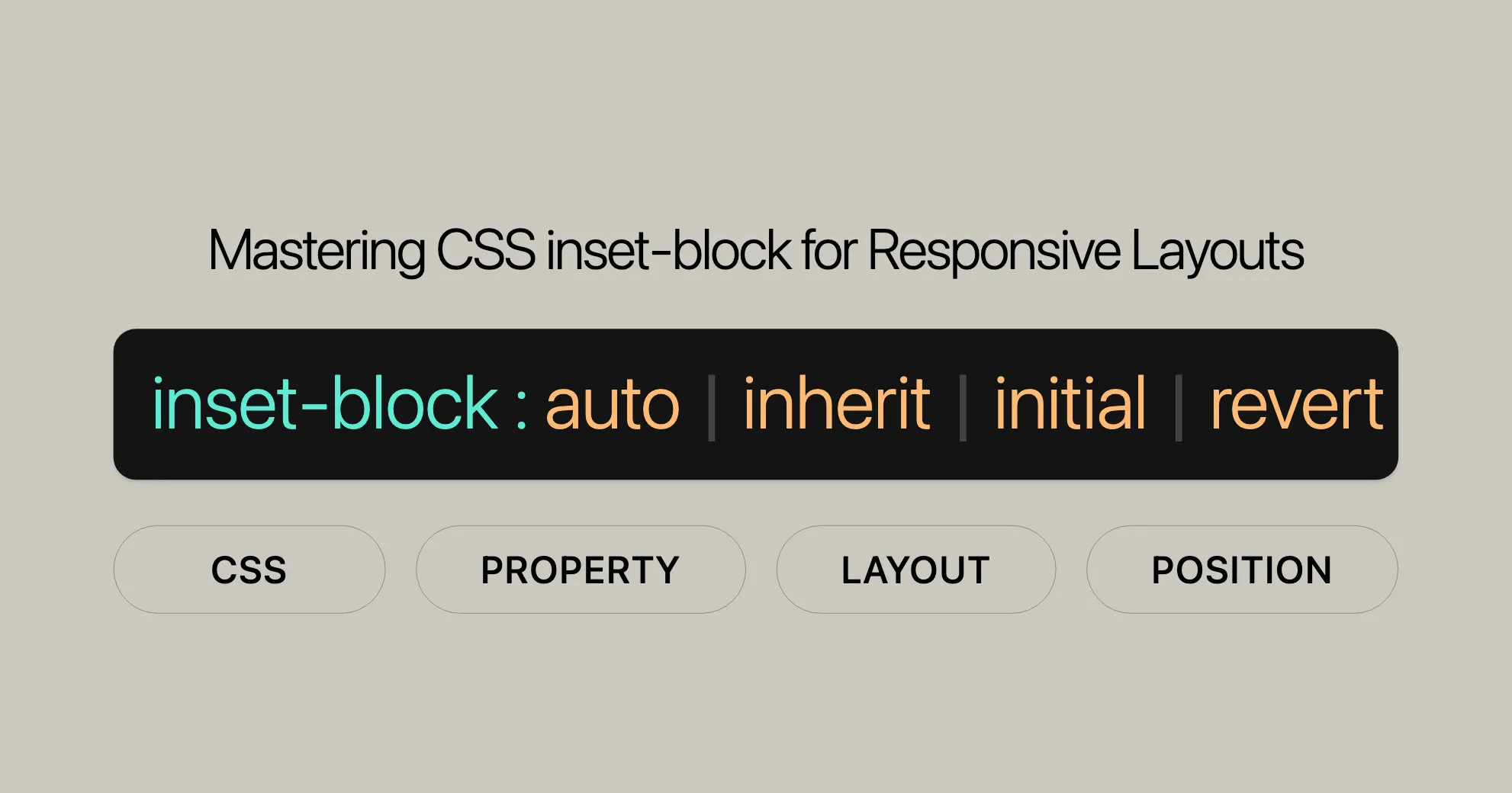
/* Keyword value */inset-block: auto;
/* Global values */inset-block: inherit;inset-block: initial;inset-block: revert;inset-block: revert-layer;inset-block: unset;Values
- Lengths: Use units like
px,em, etc. - Percentages: Set as a percentage of the container’s logical height.
- Keywords:
auto: Browser determines the value.inherit: Inherits from the parent element.initial: Sets to default value.revert: Reverts to user agent’s default.revert-layer: Reverts to previous layer’s default.unset: Unsets the value.
Formal Definition
- Initial value:
autofor bothinset-block-startandinset-block-end. - Applies to: Positioned elements.
- Inherited: No.
- Percentages: Logical height of the containing block.
- Computed value: Same as box offsets but logical.
- Animation type: A length, percentage, or
calc().
Examples
Example: Basic Usage
HTML:
<div> <p class="exampleText">Example text</p></div>CSS:
div {  background-color: yellow;  width: 120px;  height: 120px;}
.exampleText {  writing-mode: vertical-lr; /* Vertical text from left to right */  position: relative;  inset-block: 20px 50px; /* 20px from the block start, 50px from the block end */  background-color: #c8c800;}
Example: Using Percentages
HTML:
<div> <p class="exampleText">Example text</p></div>CSS:
div {  background-color: yellow;  width: 120px;  height: 120px;}
.exampleText {  writing-mode: vertical-lr; /* Vertical text from left to right */  position: relative;  inset-block: 10% 20%; /* 10% from the block start, 20% from the block end */  background-color: #c8c800;}
Example: Using Auto and Anchor
HTML:
<div> <p class="exampleText">Example text</p></div>CSS:
div {  background-color: yellow;  width: 120px;  height: 120px;}
.exampleText {  writing-mode: vertical-lr; /* Vertical text from left to right */  position: relative;  inset-block: auto anchor(start 10px); /* Auto for block start, anchor for block end */  background-color: #c8c800;}
Example Combining Related Properties
HTML:
<div> <p class="exampleText">Example text</p></div>CSS:
div {  background-color: yellow;  width: 120px;  height: 120px;}
.exampleText {  writing-mode: vertical-lr; /* Vertical text from left to right */  position: relative;  inset-block: 20px 50px; /* 20px from the block start, 50px from the block end */  inset-inline: 10px 30px; /* 10px from the inline start, 30px from the inline end */  background-color: #c8c800;}
Browser Compatibility
The inset-block property is widely supported:
- Firefox: 63+
- Google Chrome: 87+
- Microsoft Edge: 87+
- Opera: 73+
- Safari: 14.1+
Check the MDN Web Docs Browser Compatibility Table for detailed information.
Related Properties
top,right,bottom,left: Define physical offsets.inset: Shorthand fortop,right,bottom,left.inset-inline: Defines logical inline start and end offsets.writing-mode,direction,text-orientation: Define text direction and orientation.
Conclusion
The inset-block property, along with related properties, helps web developers create flexible and responsive layouts. By using these properties, you can ensure your web designs are user-friendly and optimized for different languages and writing systems.
See Also
To learn more about the inset-block property and related CSS features, check out these resources:
Related CSS Properties
top,right,bottom,left- These properties define the physical offsets of an element relative to its containing block.
inset- The
insetproperty is a shorthand for setting thetop,right,bottom, andleftproperties all at once.
- The
inset-inline- The
inset-inlineproperty defines the logical inline start and end offsets of an element.
- The
writing-mode,direction,text-orientation- These properties define the writing mode, text direction, and text orientation of an element.
Learning Resources
- MDN Web Docs - CSS Logical Properties and Values
- This guide covers logical properties and values in CSS with detailed explanations and examples.
- CSS Tricks - Logical Properties
- CSS Tricks offers practical examples and tips for using logical properties.
- W3C CSS Logical Properties and Values Specification
- The official specification provides authoritative details on CSS logical properties and values.
Tutorials and Courses
- FreeCodeCamp - CSS Certification
- FreeCodeCamp offers a free certification course in responsive web design.
- Codecademy - Learn CSS
- Codecademy provides an interactive course on CSS, including modules on logical properties.
- Udemy - Advanced CSS and Sass
- This advanced course covers advanced CSS techniques, including logical properties.
By exploring these resources, you can deepen your understanding of the inset-block property and related CSS features, helping you create more sophisticated and adaptable web layouts. Happy coding!
 Latest Blogs
  สร้างเว็บไซต์ 1 เว็บ ต้องใช้งบเท่าไหร่? เจาะลึกทุกองค์ประกอบ website development cost อยากสร้างเว็บไซต์แต่ไม่มั่นใจในเรื่องของงบประมาณ อ่านสรุปเจาะลึกตั้งแต่ดีไซน์, ฟังก์ชัน และการดูแล พร้อมตัวอย่างงบจริงจาก Till it’s done ที่แผนชัด งบไม่บานปลายแน่นอน
  Next.js สอน 14 ขั้นตอนเบื้องต้น: สร้างโปรเจกต์แรกใน 30 นาที เริ่มต้นกับ Next.js ใน 14 ขั้นตอนเพียงแค่ 30 นาที พร้อม SSR/SSG และ API Routes ด้วยตัวอย่างโค้ดง่าย ๆ อ่านต่อเพื่อสร้างโปรเจ็กต์แรกได้ทันทีที่นี่
  วิธีสมัคร Apple Developer Account เพื่อนำแอปขึ้น App Store ทีละขั้นตอน อยากปล่อยแอปบน App Store ระดับโลก มาอ่านคู่มือสมัคร Apple Developer Account พร้อมเคล็ดลับ TestFlight และวิธีอัปโหลดที่ง่ายในบทความเดียวนี้ได้เลย
  TypeScript Interface คืออะไร? อธิบายพร้อมวิธีใช้และข้อแตกต่างจาก Type เรียนรู้วิธีใช้ TypeScript Interface เพื่อสร้างโครงสร้างข้อมูลที่ปลอดภัยและเข้าใจง่าย พร้อมเปรียบเทียบข้อดีข้อแตกต่างกับ Type ที่คุณต้องรู้ ถูกรวมเอาไว้ในบทความนี้แล้ว
  Material-UI (MUI) คืออะไร อยากสร้าง UI สวยงามและเป็นมืออาชีพในเวลาอันรวดเร็วใช่ไหม มาทำความรู้จักกับ Material-UI (MUI) ที่ช่วยให้คุณพัฒนาแอปพลิเคชันบน React ได้ง่ายและดูดีในทุกอุปกรณ์
  เปรียบเทียบ 3 วิธีติดตั้ง install node js บน Ubuntu: NVM vs NodeSource vs Official Repo แบบไหนดีที่สุด? เรียนรู้วิธีติดตั้ง Node.js บน Ubuntu ด้วย NVM, NodeSource หรือ Official Repo เลือกวิธีที่เหมาะกับความต้องการของคุณ พร้อมเปรียบเทียบ เพื่อการพัฒนาที่มีประสิทธิภาพ!
 Talk with CEO
Explore our best articles, cover a wide variety of technologies 
 ReactJs
  Flutter
  Nodejs
  Nextjs
  TailwindCSS
  Typescript Golang AstroJs Jest Website development th Mobile application th Reactjs th Nextjs th Flutter th Software house th Nodejs th Typescript th
  CSS
CSS We'll be right here with you every step of the way.
We'll be here, prepared to commence this promising collaboration.


Whether you're curious about features, warranties, or shopping policies, we provide comprehensive answers to assist you.