
- Services
- Case Studies
- Technologies
- NextJs development
- Flutter development
- NodeJs development
- ReactJs development
- About
- Contact
- Tools
- Blogs
- FAQ
 Scroll to discover
 CSS Inline-Size A Versatile Property for Responsive Design
Adjust based on writing mode, with options like pixels, percentages, and keywords.
Enhance your web design with this flexible tool.
Introduction
The inline-size CSS property defines the horizontal or vertical size of an element, depending on the writing mode. It’s similar to the width or height properties but adapts based on the writing-mode. Introduced in September 2021, inline-size is widely supported and essential for creating responsive layouts.
Definition
The inline-size property sets the size of an element along the inline axis, which can be horizontal or vertical depending on the writing-mode. If the writing mode is vertical (vertical-rl or vertical-lr), inline-size corresponds to the height. If it’s horizontal (horizontal-tb), inline-size corresponds to the width.
Relationship to Writing Mode
The inline-size property works with the writing-mode property, which determines text direction. In vertical modes (vertical-rl or vertical-lr), inline-size sets the height. In horizontal mode (horizontal-tb), it sets the width. This relationship makes inline-size adaptable for different text directions.
Syntax
/* <length> values */inline-size: 300px;inline-size: 25em;inline-size: anchor-size(width);inline-size: anchor-size(--myAnchor inline);
/* <percentage> values */inline-size: 75%;
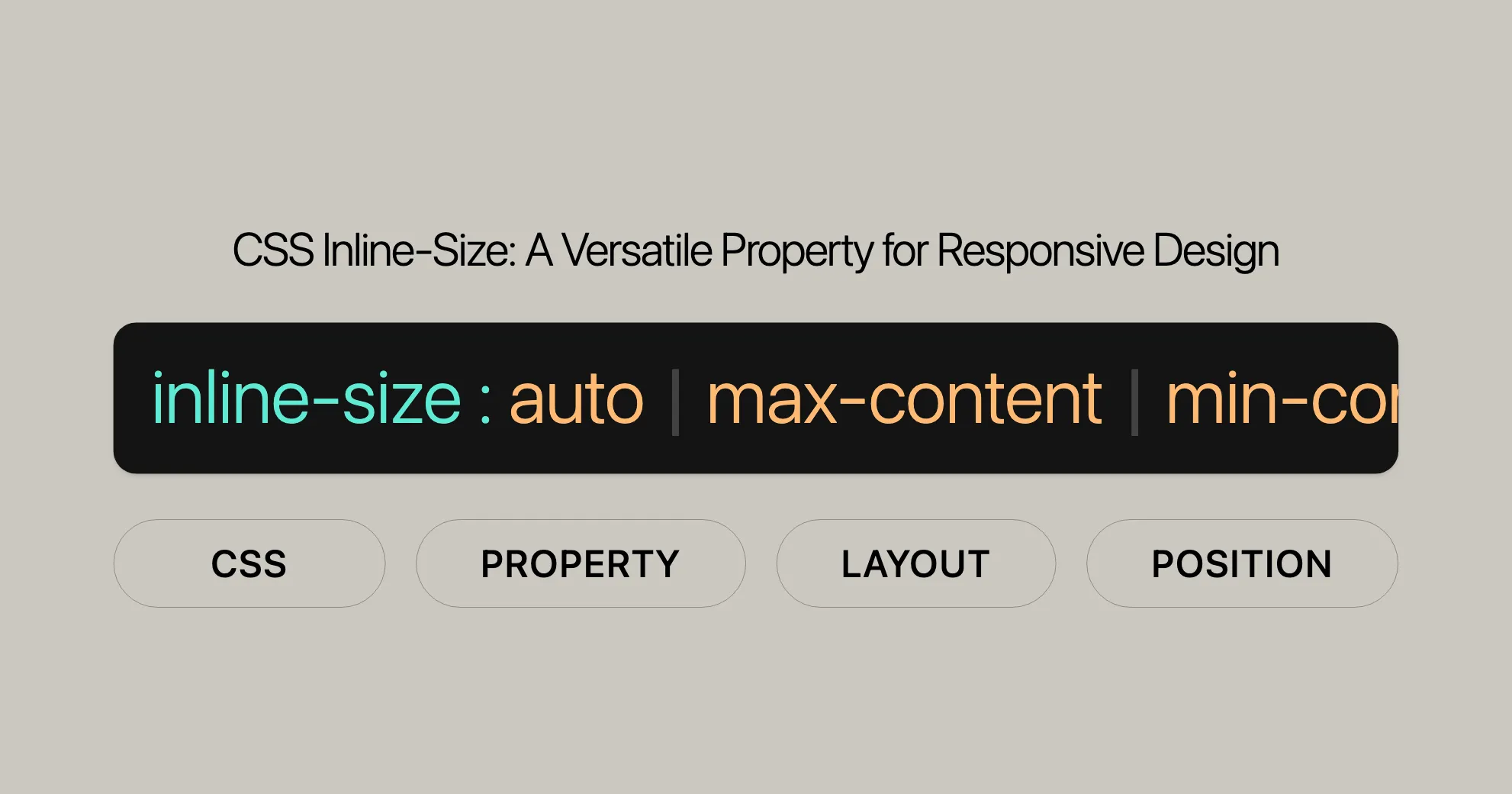
/* Keyword values */inline-size: max-content;inline-size: min-content;inline-size: fit-content;inline-size: fit-content(20em);inline-size: auto;
/* Global values */inline-size: inherit;inline-size: initial;inline-size: revert;inline-size: revert-layer;inline-size: unset;Values
Length Values
- Examples:
300px,25em - Description: Fixed sizes using units like pixels (
px) or ems (em).
Percentage Values
- Examples:
75% - Description: Size relative to the containing block.
Keyword Values
- Examples:
max-content,min-content,fit-content,auto - Description: Predefined keywords for specific purposes:
auto: Browser calculates the size.max-content: Size based on the largest content.min-content: Size based on the smallest content.fit-content: Size based on available space, with an optional maximum.
Global Values
- Examples:
inherit,initial,revert,unset - Description: Control inheritance and reset values:
inherit: Inherits from parent.initial: Uses the initial value.revert: Reverts to default value.unset: Resets to natural value.
Formal Definition
| Property | Value |
|---|---|
| Initial Value | auto |
| Applies To | Same as width and height |
| Inherited | No |
| Percentages | Inline size of the containing block |
| Computed Value | Same as width and height |
| Animation Type | A length, percentage, or calc() |
Formal Syntax
inline-size = <width>
<width> =  auto |  <length-percentage [0,∞]> |  min-content |  max-content |  fit-content( <length-percentage [0,∞]> ) |  <calc-size()> |  <anchor-size()>
<length-percentage> =  <length> |  <percentage>
<calc-size()> =  calc-size( <calc-size-basis> , <calc-sum> )
<anchor-size()> =  anchor-size( [ <anchor-element> || <anchor-size> ]? , <length-percentage>? )
<calc-size-basis> =  <intrinsic-size-keyword> |  <calc-size()> |  any |  <calc-sum>
<anchor-element> =  <dashed-ident>
<anchor-size> =  width |  height |  block |  inline |  self-block |  self-inline
<calc-sum> =  <calc-product> [ [ '+' | '-' ] <calc-product> ]*
<calc-product> =  <calc-value> [ [ '*' | '/' ] <calc-value> ]*
<calc-value> =  <number> |  <dimension> |  <percentage> |  <calc-keyword> |  ( <calc-sum> )
<calc-keyword> =  e |  pi |  infinity |  -infinity |  NaN
Examples
Setting Inline Size in Pixels
HTML:
<p class="exampleText">Example text</p>CSS:
.exampleText { writing-mode: vertical-rl; background-color: yellow; inline-size: 110px;}Setting Inline Size with Percentage
HTML:
<p class="exampleText">Example text</p>CSS:
.exampleText { writing-mode: horizontal-tb; background-color: lightblue; inline-size: 50%;}Setting Inline Size with fit-content
HTML:
<p class="exampleText">Example text</p>CSS:
.exampleText { writing-mode: horizontal-tb; background-color: lightgreen; inline-size: fit-content(20em);}Specifications
| Specification |
|---|
| CSS Logical Properties and Values Level 1 - Dimension Properties |
| CSS Box Sizing Module Level 4 - Sizing Values |
Browser Compatibility
- Google Chrome: Supported since version 57.
- Microsoft Edge: Supported since version 79.
- Mozilla Firefox: Supported since version 41.
- Opera: Supported since version 44.
- Safari: Supported since version 12.1.
See Also
- The mapped physical properties:
widthandheight writing-mode
References
 Latest Blogs
  สร้างเว็บไซต์ 1 เว็บ ต้องใช้งบเท่าไหร่? เจาะลึกทุกองค์ประกอบ website development cost อยากสร้างเว็บไซต์แต่ไม่มั่นใจในเรื่องของงบประมาณ อ่านสรุปเจาะลึกตั้งแต่ดีไซน์, ฟังก์ชัน และการดูแล พร้อมตัวอย่างงบจริงจาก Till it’s done ที่แผนชัด งบไม่บานปลายแน่นอน
  Next.js สอน 14 ขั้นตอนเบื้องต้น: สร้างโปรเจกต์แรกใน 30 นาที เริ่มต้นกับ Next.js ใน 14 ขั้นตอนเพียงแค่ 30 นาที พร้อม SSR/SSG และ API Routes ด้วยตัวอย่างโค้ดง่าย ๆ อ่านต่อเพื่อสร้างโปรเจ็กต์แรกได้ทันทีที่นี่
  วิธีสมัคร Apple Developer Account เพื่อนำแอปขึ้น App Store ทีละขั้นตอน อยากปล่อยแอปบน App Store ระดับโลก มาอ่านคู่มือสมัคร Apple Developer Account พร้อมเคล็ดลับ TestFlight และวิธีอัปโหลดที่ง่ายในบทความเดียวนี้ได้เลย
  TypeScript Interface คืออะไร? อธิบายพร้อมวิธีใช้และข้อแตกต่างจาก Type เรียนรู้วิธีใช้ TypeScript Interface เพื่อสร้างโครงสร้างข้อมูลที่ปลอดภัยและเข้าใจง่าย พร้อมเปรียบเทียบข้อดีข้อแตกต่างกับ Type ที่คุณต้องรู้ ถูกรวมเอาไว้ในบทความนี้แล้ว
  Material-UI (MUI) คืออะไร อยากสร้าง UI สวยงามและเป็นมืออาชีพในเวลาอันรวดเร็วใช่ไหม มาทำความรู้จักกับ Material-UI (MUI) ที่ช่วยให้คุณพัฒนาแอปพลิเคชันบน React ได้ง่ายและดูดีในทุกอุปกรณ์
  เปรียบเทียบ 3 วิธีติดตั้ง install node js บน Ubuntu: NVM vs NodeSource vs Official Repo แบบไหนดีที่สุด? เรียนรู้วิธีติดตั้ง Node.js บน Ubuntu ด้วย NVM, NodeSource หรือ Official Repo เลือกวิธีที่เหมาะกับความต้องการของคุณ พร้อมเปรียบเทียบ เพื่อการพัฒนาที่มีประสิทธิภาพ!
 Talk with CEO
Explore our best articles, cover a wide variety of technologies 
 ReactJs
  Flutter
  Nodejs
  Nextjs
  TailwindCSS
  Typescript Golang AstroJs Jest Website development th Mobile application th Reactjs th Nextjs th Flutter th Software house th Nodejs th Typescript th
  CSS
CSS We'll be right here with you every step of the way.
We'll be here, prepared to commence this promising collaboration.


Whether you're curious about features, warranties, or shopping policies, we provide comprehensive answers to assist you.