
- Services
- Case Studies
- Technologies
- NextJs development
- Flutter development
- NodeJs development
- ReactJs development
- About
- Contact
- Tools
- Blogs
- FAQ
 Scroll to discover
 CSS grid-column-start A Comprehensive Guide
It allows for flexible and responsive layouts by defining the block-start edge of the grid area.
Options include auto, custom identifiers, integers, and span values.
Introduction
The grid-column-start property in CSS helps you control where a grid item starts within a grid layout. It’s a powerful tool for web developers, allowing for precise and flexible layout designs.
Definition
The grid-column-start property defines the starting position of a grid item within a grid column. It can specify a line, a span, or use automatic placement. This property is essential for creating flexible and responsive grid layouts.
Syntax
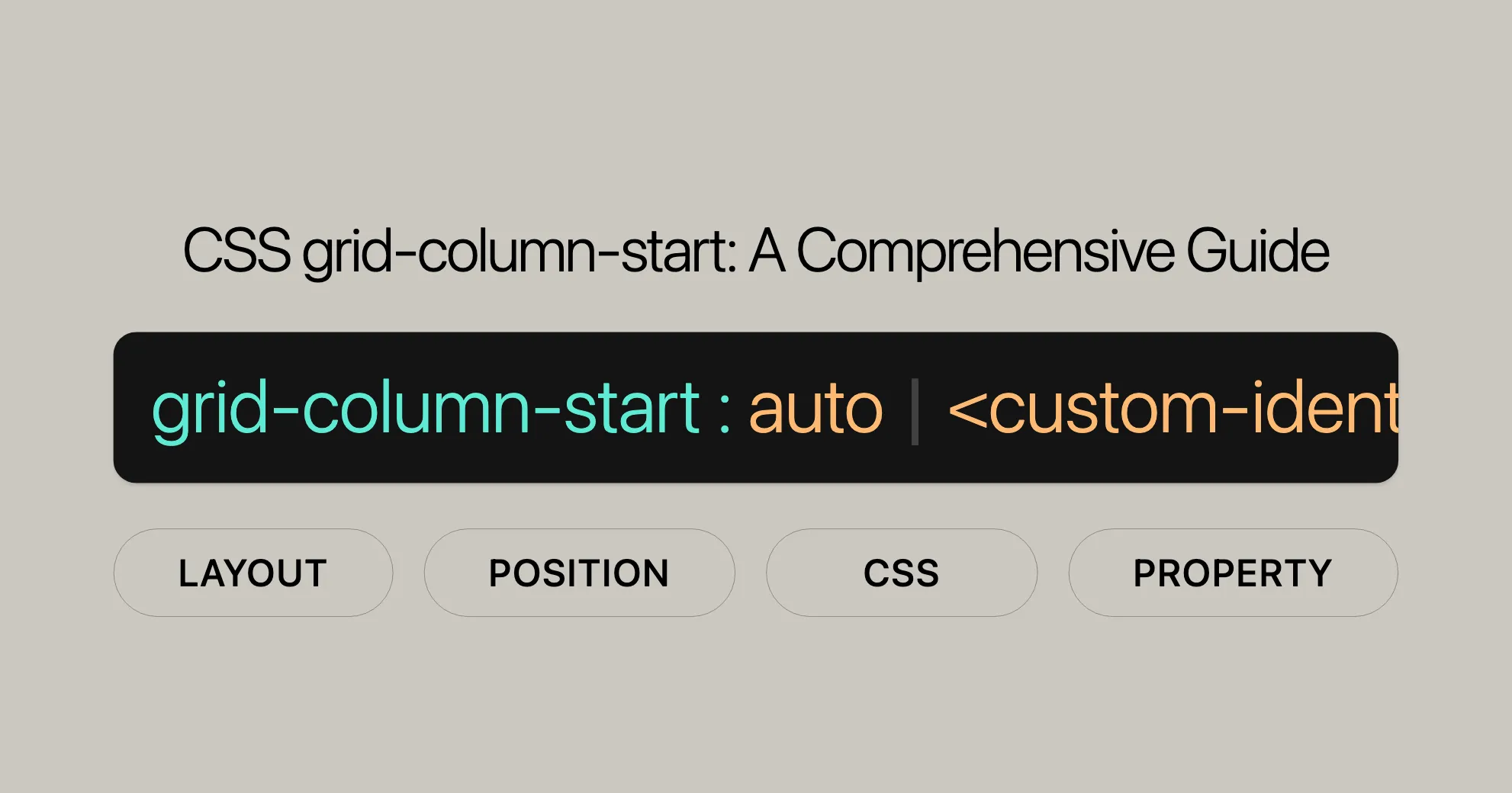
Here’s how to use the grid-column-start property in CSS:
/* Keyword value */grid-column-start: auto;
/* Custom identifier value */grid-column-start: somegridarea;
/* Integer value */grid-column-start: 2;grid-column-start: somegridarea 4;
/* Span value */grid-column-start: span 3;grid-column-start: span somegridarea;grid-column-start: span somegridarea 5;
/* Global values */grid-column-start: inherit;grid-column-start: initial;grid-column-start: revert;grid-column-start: revert-layer;grid-column-start: unset;
Values
The grid-column-start property can take several values:
auto
The default value, indicating automatic placement.
grid-column-start: auto;<custom-ident>
Specifies a named line within the grid.
grid-column-start: somegridarea;<integer> && <custom-ident>?
Specifies a specific grid line, optionally with a custom identifier.
grid-column-start: 2;grid-column-start: somegridarea 4;An <integer> value of 0 is invalid.
span && [ <integer> || <custom-ident> ]
Defines a span across multiple columns.
grid-column-start: span 3;grid-column-start: span somegridarea;grid-column-start: span somegridarea 5;If the <integer> is omitted, it defaults to 1. Negative integers and 0 are invalid.
Formal Definition
Here is a formal definition of the grid-column-start property:
| Initial value | auto |
|---|---|
| Applies to | Grid items and absolutely-positioned boxes within a grid container |
| Inherited | No |
| Computed value | As specified |
| Animation type | Discrete |
Formal Syntax
grid-column-start = <grid-line>
<grid-line> =  auto                                                |  <custom-ident>                                      |  [ <integer [-∞,-1]> | <integer [1,∞]> ] [ && <custom-ident>? ] |  span [ && [ <integer [1,∞]> || <custom-ident> ] ]
Examples
Setting Column Start for a Grid Item
HTML
<div class="wrapper"> <div class="box1">One</div> <div class="box2">Two</div> <div class="box3">Three</div></div>CSS
.wrapper {  display: grid;  grid-template-columns: repeat(3, 1fr);  grid-auto-rows: 100px;}
.box1 {  grid-column-start: 1;  grid-column-end: 4;  grid-row-start: 1;  grid-row-end: 3;}
.box2 {  grid-column-start: 1;  grid-row-start: 3;  grid-row-end: 5;}
Using Named Lines with grid-column-start
HTML
<div class="wrapper"> <div class="box1">One</div> <div class="box2">Two</div> <div class="box3">Three</div></div>CSS
.wrapper {  display: grid;  grid-template-columns: [start] 1fr [middle] 1fr [end] 1fr;  grid-auto-rows: 100px;}
.box1 {  grid-column: start;  background-color: lightblue;}
.box2 {  grid-column: middle;  background-color: lightcoral;}
.box3 {  grid-column: end;  background-color: lightgreen;}
Specifications
| Specification |
|---|
| CSS Grid Layout Module Level 2 # line-placement |
Browser Compatibility
The grid-column-start property is widely supported across many devices and browser versions. This ensures your grid layouts work consistently across different platforms and browsers.
Browser Compatibility Summary
- Google Chrome: Supported since version 57 (March 2017).
- Mozilla Firefox: Supported since version 52 (March 2017).
- Microsoft Edge: Supported since version 16 (September 2017).
- Opera: Supported since version 44 (March 2017).
- Safari: Supported since version 10.1 (September 2016).
FAQs
What does the grid-column-start property do in CSS?
The grid-column-start property specifies the starting grid line for a grid item, determining where the item should begin within the grid container.
How do I position an item at a specific column line?
You can set grid-column-start to a specific line number like this: grid-column-start: 2; which positions the item starting at the 2nd grid line.
What is the difference between grid-column-start and grid-column-end?
grid-column-start sets where the item begins horizontally, while grid-column-end specifies where it stops. Together, they define how much space the item spans across the grid.
Can I use span with grid-column-start?
No, span is typically used with grid-column-end to define the span across multiple columns. grid-column-start only sets the starting position.
How does grid-column-start relate to grid-template-columns?
grid-column-start respects the column structure defined by grid-template-columns, ensuring that items align according to the sizes and positions specified in the grid template.
By understanding and utilizing the grid-column-start property, developers can create sophisticated and responsive web designs that perform well across a range of devices and browsers. This baseline availability makes grid-column-start an essential tool for any web development project.
 Latest Blogs
  สร้างเว็บไซต์ 1 เว็บ ต้องใช้งบเท่าไหร่? เจาะลึกทุกองค์ประกอบ website development cost อยากสร้างเว็บไซต์แต่ไม่มั่นใจในเรื่องของงบประมาณ อ่านสรุปเจาะลึกตั้งแต่ดีไซน์, ฟังก์ชัน และการดูแล พร้อมตัวอย่างงบจริงจาก Till it’s done ที่แผนชัด งบไม่บานปลายแน่นอน
  Next.js สอน 14 ขั้นตอนเบื้องต้น: สร้างโปรเจกต์แรกใน 30 นาที เริ่มต้นกับ Next.js ใน 14 ขั้นตอนเพียงแค่ 30 นาที พร้อม SSR/SSG และ API Routes ด้วยตัวอย่างโค้ดง่าย ๆ อ่านต่อเพื่อสร้างโปรเจ็กต์แรกได้ทันทีที่นี่
  วิธีสมัคร Apple Developer Account เพื่อนำแอปขึ้น App Store ทีละขั้นตอน อยากปล่อยแอปบน App Store ระดับโลก มาอ่านคู่มือสมัคร Apple Developer Account พร้อมเคล็ดลับ TestFlight และวิธีอัปโหลดที่ง่ายในบทความเดียวนี้ได้เลย
  TypeScript Interface คืออะไร? อธิบายพร้อมวิธีใช้และข้อแตกต่างจาก Type เรียนรู้วิธีใช้ TypeScript Interface เพื่อสร้างโครงสร้างข้อมูลที่ปลอดภัยและเข้าใจง่าย พร้อมเปรียบเทียบข้อดีข้อแตกต่างกับ Type ที่คุณต้องรู้ ถูกรวมเอาไว้ในบทความนี้แล้ว
  Material-UI (MUI) คืออะไร อยากสร้าง UI สวยงามและเป็นมืออาชีพในเวลาอันรวดเร็วใช่ไหม มาทำความรู้จักกับ Material-UI (MUI) ที่ช่วยให้คุณพัฒนาแอปพลิเคชันบน React ได้ง่ายและดูดีในทุกอุปกรณ์
  เปรียบเทียบ 3 วิธีติดตั้ง install node js บน Ubuntu: NVM vs NodeSource vs Official Repo แบบไหนดีที่สุด? เรียนรู้วิธีติดตั้ง Node.js บน Ubuntu ด้วย NVM, NodeSource หรือ Official Repo เลือกวิธีที่เหมาะกับความต้องการของคุณ พร้อมเปรียบเทียบ เพื่อการพัฒนาที่มีประสิทธิภาพ!
 Talk with CEO
Explore our best articles, cover a wide variety of technologies 
 ReactJs
  Flutter
  Nodejs
  Nextjs
  TailwindCSS
  Typescript Golang AstroJs Jest Website development th Mobile application th Reactjs th Nextjs th Flutter th Software house th Nodejs th Typescript th
  CSS
CSS We'll be right here with you every step of the way.
We'll be here, prepared to commence this promising collaboration.


Whether you're curious about features, warranties, or shopping policies, we provide comprehensive answers to assist you.