
- Services
- Case Studies
- Technologies
- NextJs development
- Flutter development
- NodeJs development
- ReactJs development
- About
- Contact
- Tools
- Blogs
- FAQ
 Scroll to discover
 CSS Flex Simplified Guide to Flexbox Layouts
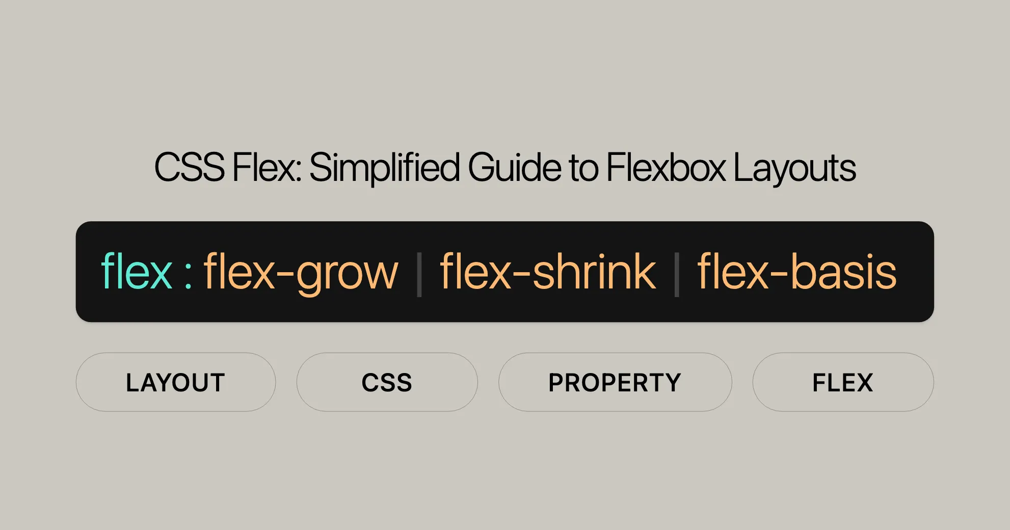
It combines flex-grow, flex-shrink, and flex-basis to control item growth, shrinkage, and initial size.
Using Flex
The flex property in CSS is a powerful tool for creating flexible and responsive layouts. It combines flex-grow, flex-shrink, and flex-basis to control how items grow, shrink, and set their initial size within a flex container. This makes your web designs adaptable and user-friendly.
Browser Support
The flex property is well-supported across all modern browsers:
- Google Chrome: Since version 29.0 (August 2013).
- Firefox: Since version 28.0 (March 2014).
- IE/Edge: Since version 11.0 (October 2013).
- Opera: Since version 17.0 (August 2013).
- Safari: Since version 9.0 (September 2015).
Benefits of Using Flex
- Responsive Design:
- The
flexproperty helps create layouts that adjust dynamically to available space, perfect for responsive web design.
- The
- Simplified Layout Management:
- Easily control the distribution of space among flex items, simplifying complex layouts.
- Flexible Growth and Shrinkage:
- Determine how flex items grow and shrink relative to each other.
- Initial Size Control:
- Set the initial size of flex items before distributing any remaining space.
Basic Usage
The flex property can be specified using one, two, or three values:
-
One-value syntax:
- Value: A valid value for
<flex-grow>or<flex-basis>. - Example:
flex: 2; /* Equivalent to flex: 2 1 0% */flex: auto; /* Equivalent to flex: 1 1 auto */flex: 10em; /* Equivalent to flex: 1 1 10em */flex: 30%;flex: min-content;
- Explanation: If a single value is provided, it is interpreted as either
flex-groworflex-basis.
- Value: A valid value for
-
Two-value syntax:
- Value: The first value is
<flex-grow>, the second can be either<flex-shrink>or<flex-basis>. - Example:
flex: 1 30px; /* Equivalent to flex: 1 1 30px */flex: 2 2; /* Equivalent to flex: 2 2 0% */
- Explanation: If two values are provided, the first value is always
flex-grow. The second value can be eitherflex-shrinkorflex-basis.
- Value: The first value is
-
Three-value syntax:
- Value: The values must be in the following order:
<flex-grow>,<flex-shrink>, and<flex-basis>. - Example:
flex: 2 2 10%;
- Explanation: If three values are provided, they are interpreted as
flex-grow,flex-shrink, andflex-basis, respectively.
- Value: The values must be in the following order:
Common Scenarios
Equal-Width Items
Create flex items that have equal widths and grow to fill the available space:
.container {  display: flex;}
.item {  flex: 1;}
Fixed Width with Growth
Set a fixed initial size but allow items to grow:
.container {  display: flex;}
.item {  flex: 1 1 200px; /* Initial size is 200px, but can grow and shrink */}
Inflexible Items
Make a flex item inflexible, so it won’t grow or shrink:
.container {  display: flex;}
.item {  flex: none; /* Item will not grow or shrink */}
Practical Example
Here’s a simple layout with three flex items that adjust dynamically based on the available space:
HTML
<!DOCTYPE html><html><head>  <title>Flex Example</title>  <style>    .container {      display: flex;      width: 100%;      height: 200px;      border: 1px solid #ccc;    }
    .item {      flex: 1;      border: 1px solid #000;      margin: 5px;      padding: 10px;    }
    .item1 { background-color: lightblue; }    .item2 { background-color: lightgreen; }    .item3 { background-color: lightcoral; }  </style></head><body>  <h2>Flex Example</h2>  <div class="container">    <div class="item item1">Item 1</div>    <div class="item item2">Item 2</div>    <div class="item item3">Item 3</div>  </div></body></html>
CSS
.container {  display: flex;  width: 100%;  height: 200px;  border: 1px solid #ccc;}
.item {  flex: 1;  border: 1px solid #000;  margin: 5px;  padding: 10px;}
.item1 { background-color: lightblue; }.item2 { background-color: lightgreen; }.item3 { background-color: lightcoral; }
Explanation
- HTML Structure: The container
.containeris a flex container. Inside, there are three div elements with class namesitem,item1,item2, anditem3. - CSS Styling: The container has a width of 100%, a height of 200px, and a border. Each child div has
flex: 1;, meaning each item will grow equally to fill the available space. The background colors are set to different shades for each div.
Result
Open this HTML file in a browser and you’ll see a container with three equal-width columns. Each column adjusts its size dynamically based on the available space within the container. This demonstrates how the flex property creates a simple and responsive layout.
Browser Compatibility
The flex property is widely supported across modern browsers:
- Google Chrome: Since version 29.0 (August 2013).
- Mozilla Firefox: Since version 28.0 (March 2014).
- Microsoft Edge: Since version 12.0 (July 2015).
- Internet Explorer: Since version 11.0 (October 2013).
- Safari: Since version 9.0 (September 2015).
- Opera: Since version 17.0 (July 2013).
See Also
For more information and resources related to the flex property and CSS Flexbox, check out these links:
- CSS Flexbox and Its Properties
- CSS
flex-growProperty Reference - CSS
flex-shrinkProperty Reference - CSS
flex-basisProperty Reference - CSS Flexbox Tutorial
- Basic concepts of flexbox
- Controlling ratios of flex items along the main axis
 Latest Blogs
  สร้างเว็บไซต์ 1 เว็บ ต้องใช้งบเท่าไหร่? เจาะลึกทุกองค์ประกอบ website development cost อยากสร้างเว็บไซต์แต่ไม่มั่นใจในเรื่องของงบประมาณ อ่านสรุปเจาะลึกตั้งแต่ดีไซน์, ฟังก์ชัน และการดูแล พร้อมตัวอย่างงบจริงจาก Till it’s done ที่แผนชัด งบไม่บานปลายแน่นอน
  Next.js สอน 14 ขั้นตอนเบื้องต้น: สร้างโปรเจกต์แรกใน 30 นาที เริ่มต้นกับ Next.js ใน 14 ขั้นตอนเพียงแค่ 30 นาที พร้อม SSR/SSG และ API Routes ด้วยตัวอย่างโค้ดง่าย ๆ อ่านต่อเพื่อสร้างโปรเจ็กต์แรกได้ทันทีที่นี่
  วิธีสมัคร Apple Developer Account เพื่อนำแอปขึ้น App Store ทีละขั้นตอน อยากปล่อยแอปบน App Store ระดับโลก มาอ่านคู่มือสมัคร Apple Developer Account พร้อมเคล็ดลับ TestFlight และวิธีอัปโหลดที่ง่ายในบทความเดียวนี้ได้เลย
  TypeScript Interface คืออะไร? อธิบายพร้อมวิธีใช้และข้อแตกต่างจาก Type เรียนรู้วิธีใช้ TypeScript Interface เพื่อสร้างโครงสร้างข้อมูลที่ปลอดภัยและเข้าใจง่าย พร้อมเปรียบเทียบข้อดีข้อแตกต่างกับ Type ที่คุณต้องรู้ ถูกรวมเอาไว้ในบทความนี้แล้ว
  Material-UI (MUI) คืออะไร อยากสร้าง UI สวยงามและเป็นมืออาชีพในเวลาอันรวดเร็วใช่ไหม มาทำความรู้จักกับ Material-UI (MUI) ที่ช่วยให้คุณพัฒนาแอปพลิเคชันบน React ได้ง่ายและดูดีในทุกอุปกรณ์
  เปรียบเทียบ 3 วิธีติดตั้ง install node js บน Ubuntu: NVM vs NodeSource vs Official Repo แบบไหนดีที่สุด? เรียนรู้วิธีติดตั้ง Node.js บน Ubuntu ด้วย NVM, NodeSource หรือ Official Repo เลือกวิธีที่เหมาะกับความต้องการของคุณ พร้อมเปรียบเทียบ เพื่อการพัฒนาที่มีประสิทธิภาพ!
 Talk with CEO
Explore our best articles, cover a wide variety of technologies 
 ReactJs
  Flutter
  Nodejs
  Nextjs
  TailwindCSS
  Typescript Golang AstroJs Jest Website development th Mobile application th Reactjs th Nextjs th Flutter th Software house th Nodejs th Typescript th
  CSS
CSS We'll be right here with you every step of the way.
We'll be here, prepared to commence this promising collaboration.


Whether you're curious about features, warranties, or shopping policies, we provide comprehensive answers to assist you.