- Services
- Case Studies
- Technologies
- NextJs development
- Flutter development
- NodeJs development
- ReactJs development
- About
- Contact
- Tools
- Blogs
- FAQ
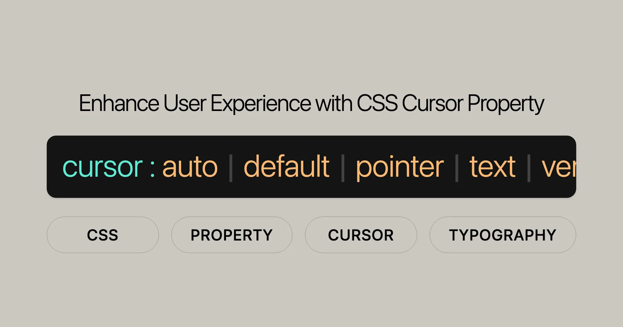
Enhance User Experience with CSS Cursor Property
Discover available cursor types and how to use custom images for a unique experience.
Introduction
The cursor property in CSS is a powerful tool for enhancing user experience by specifying the type of mouse cursor displayed when hovering over an element. This property not only changes the appearance of the cursor but also provides visual cues to users about the actions they can perform on the element. Whether it’s selecting text, resizing elements, or clicking a link, the cursor property informs users about the interactive nature of the content.
By setting the cursor property, web developers can customize the cursor to match the context of the element, making the interface more intuitive and user-friendly. This property supports a wide range of predefined cursor types, such as pointer for clickable elements, text for text selection, and move for draggable items. Additionally, developers can use custom images as cursors, providing a unique and branded experience.
Understanding and effectively using the cursor property is crucial for creating a seamless and engaging web experience. This article will guide you through the essential aspects of the cursor property, including its syntax, values, usage, and best practices. We will also explore how to set cursor types, use custom cursors, and ensure browser compatibility, making this a comprehensive resource for web developers and designers.
Overview of CSS Cursor Property
The CSS cursor property is a versatile tool that allows web developers to control the appearance of the mouse cursor when it hovers over an element. This property is essential for providing visual feedback to users about the interactive possibilities of an element, such as clicking, resizing, or selecting text.
The cursor property can be set using predefined keywords or custom images. The keywords represent standard cursor types that are commonly recognized across different operating systems and browsers. Examples of these keywords include pointer for indicating a clickable element, text for text selection, and move for draggable items.
In addition to keywords, the cursor property supports the use of custom cursor images. Developers can specify the URL of an image file to be used as the cursor, along with optional coordinates to define the cursor’s hotspot. This feature allows for a high degree of customization, enabling developers to create a unique and branded user experience.
By effectively utilizing the cursor property, web developers can enhance the usability and accessibility of their websites. This property ensures that users receive clear visual cues about the actions they can perform, making the interface more intuitive and user-friendly.
In the following sections, we will delve deeper into the syntax, values, and usage of the cursor property, providing practical examples and best practices for web developers and designers.
Setting Cursor Types
Setting the type of cursor in CSS is straightforward and involves using specific keywords that represent different cursor styles. These keywords provide visual cues to users about the actions they can perform on an element. Below is a breakdown of the most commonly used cursor types and their typical applications:
Basic Cursor Types
auto: The browser determines the cursor to display based on the current context. For example, it may show a text-select cursor when hovering over text.default: The platform-dependent default cursor, usually an arrow.pointer: A pointing hand cursor, typically used for clickable elements like links.text: A text-select cursor, indicating that the text can be selected.vertical-text: A vertical text-select cursor, indicating that vertical text can be selected.none: No cursor is displayed, making the element invisible to the mouse cursor.
Context-Specific Cursors
context-menu: Indicates that a context menu is available for the element.help: Indicates that help information is available for the element.progress: Indicates that the program is busy but still interactive.wait: Indicates that the program is busy and the user should wait.
Selection Cursors
cell: Indicates that a cell (or set of cells) can be selected, often used in tables.crosshair: Displays a crosshair cursor, commonly used for selecting areas in a bitmap.
Drag and Drop Cursors
alias: Indicates that an alias or shortcut is to be created.copy: Indicates that something is to be copied.move: Indicates that something can be moved.no-drop: Indicates that an item cannot be dropped at the current location.not-allowed: Indicates that the requested action will not be carried out.grab: Indicates that something can be grabbed (dragged to be moved).grabbing: Indicates that something is being grabbed (dragged to be moved).
Resizing and Scrolling Cursors
all-scroll: Indicates that the element can be scrolled in any direction.col-resize: Indicates that the column can be resized horizontally.row-resize: Indicates that the row can be resized vertically.n-resize: Indicates that the edge of a box is to be moved upwards.e-resize: Indicates that the edge of a box is to be moved to the right.s-resize: Indicates that the edge of a box is to be moved downwards.w-resize: Indicates that the edge of a box is to be moved to the left.ne-resize: Indicates that the edge of a box is to be moved up and right.nw-resize: Indicates that the edge of a box is to be moved up and left.se-resize: Indicates that the edge of a box is to be moved down and right.sw-resize: Indicates that the edge of a box is to be moved down and left.ew-resize: Bidirectional resize cursor, indicating resize left-right.ns-resize: Bidirectional resize cursor, indicating resize up-down.nesw-resize: Bidirectional resize cursor, indicating resize north-east and south-west.nwse-resize: Bidirectional resize cursor, indicating resize north-west and south-east.
Zooming Cursors
zoom-in: Indicates that something can be zoomed in.zoom-out: Indicates that something can be zoomed out.
Example Usage
Here is an example of how to set different cursor types using the cursor property:
/* Basic cursor types */.default {  cursor: default;}
.pointer {  cursor: pointer;}
.text {  cursor: text;}
/* Context-specific cursors */.context-menu {  cursor: context-menu;}
.help {  cursor: help;}
.progress {  cursor: progress;}
.wait {  cursor: wait;}
/* Selection cursors */.cell {  cursor: cell;}
.crosshair {  cursor: crosshair;}
/* Drag and drop cursors */.alias {  cursor: alias;}
.copy {  cursor: copy;}
.move {  cursor: move;}
.no-drop {  cursor: no-drop;}
.not-allowed {  cursor: not-allowed;}
.grab {  cursor: grab;}
.grabbing {  cursor: grabbing;}
/* Resizing and scrolling cursors */.all-scroll {  cursor: all-scroll;}
.col-resize {  cursor: col-resize;}
.row-resize {  cursor: row-resize;}
.n-resize {  cursor: n-resize;}
.e-resize {  cursor: e-resize;}
.s-resize {  cursor: s-resize;}
.w-resize {  cursor: w-resize;}
.ne-resize {  cursor: ne-resize;}
.nw-resize {  cursor: nw-resize;}
.se-resize {  cursor: se-resize;}
.sw-resize {  cursor: sw-resize;}
.ew-resize {  cursor: ew-resize;}
.ns-resize {  cursor: ns-resize;}
.nesw-resize {  cursor: nesw-resize;}
.nwse-resize {  cursor: nwse-resize;}
/* Zooming cursors */.zoom-in {  cursor: zoom-in;}
.zoom-out {  cursor: zoom-out;}
These cursor types provide a clear and intuitive way to communicate the interactivity of elements to users, enhancing the overall user experience.
Using Custom Cursors
In addition to predefined cursor types, CSS allows developers to use custom cursors to create a unique and branded experience. Custom cursors are defined using the url() function, which specifies the path to an image file. This feature enables developers to tailor the cursor to match the design and theme of their website.
Syntax for Custom Cursors
The syntax for using custom cursors is straightforward. You specify the URL of the image file, followed by optional coordinates to define the cursor’s hotspot. The hotspot is the precise position within the cursor that is being pointed to. Additionally, a fallback keyword is mandatory to ensure that a standard cursor is displayed if the custom image cannot be loaded.
Here is the basic syntax for using custom cursors:
cursor: url(path/to/image.png), fallback-keyword;Example Usage
Let’s look at an example of how to set a custom cursor:
/* Using a custom cursor image with a fallback */.custom-cursor {  cursor: url('custom-cursor.png'), pointer;}
/* Using a custom cursor image with hotspot coordinates */.custom-cursor-hotspot {  cursor: url('custom-cursor.png') 4 12, auto;}
In this example:
url('custom-cursor.png')specifies the path to the custom cursor image.pointeris the fallback keyword, ensuring that a standard pointer cursor is displayed if the custom image cannot be loaded.4 12are the coordinates of the hotspot, relative to the top-left corner of the image.
Multiple Custom Cursors as Fallbacks
You can also specify multiple custom cursor images as fallbacks. If the first image cannot be loaded, the browser will attempt to load the next image in the list. This is useful for ensuring compatibility across different browsers and devices.
/* Using multiple custom cursor images with fallbacks */.custom-cursor-fallback { cursor: url('custom-cursor.png'), url('fallback-cursor.png'), auto;}In this example, if custom-cursor.png cannot be loaded, the browser will try to load fallback-cursor.png. If neither image can be loaded, the browser will display the default cursor specified by the auto keyword.
Supported Image Formats
When using custom cursors, it’s important to be aware of the supported image formats. The CSS specification requires support for PNG files and SVG v1.1 files in secure static mode that contain a natural size. Desktop browsers also broadly support the .cur file format.
Additionally, user agents should support SVG v1.1 files in secure animated mode and any other animated image file formats they support for images in other properties.
Icon Size Limits
While the CSS specification does not impose limits on the size of custom cursor images, user agents commonly restrict them to prevent misuse. For example, Firefox and Chromium restrict cursor images to 128x128 pixels by default, but it is recommended to limit the cursor image size to 32x32 pixels. Cursor changes using images that are larger than the user-agent maximum supported size will generally be ignored.
Example: Custom Cursor with Fallbacks
Here is a complete example demonstrating the use of custom cursors with fallbacks:
/* Using a custom cursor image with a fallback */.custom-cursor {  cursor: url('custom-cursor.png') 4 12, pointer;}
/* Using multiple custom cursor images with fallbacks */.custom-cursor-fallback {  cursor: url('custom-cursor.png') 4 12, url('fallback-cursor.png'), auto;}
In this example:
url('custom-cursor.png') 4 12specifies the primary custom cursor image and its hotspot coordinates.url('fallback-cursor.png')is the fallback custom cursor image.autois the final fallback keyword, ensuring that a default cursor is displayed if none of the custom images can be loaded.
By using custom cursors, developers can create a more engaging and visually appealing user experience. This feature allows for a high degree of customization, enabling developers to tailor the cursor to match the design and theme of their website.
Cursor Keywords
The CSS cursor property supports a wide range of predefined keywords that represent standard cursor types. These keywords are recognized across different operating systems and browsers, providing a consistent user experience. Each keyword is associated with a specific cursor style that conveys the type of interaction available for the element. Below is a comprehensive list of cursor keywords along with their descriptions and typical applications.
General Cursors
auto: The browser determines the cursor to display based on the current context. For example, it may show a text-select cursor when hovering over text.default: The platform-dependent default cursor, usually an arrow. This is the standard cursor used for most elements.none: No cursor is displayed, making the element invisible to the mouse cursor. This can be useful for creating custom interactive experiences.
Links and Status Cursors
context-menu: Indicates that a context menu is available for the element. This cursor is typically shown when the user can right-click to access additional options.help: Indicates that help information is available for the element. This cursor is often displayed as a question mark next to an arrow.pointer: A pointing hand cursor, typically used for clickable elements like links. This cursor suggests that the element is interactive and can be clicked.progress: Indicates that the program is busy but still interactive. This cursor is often shown as an hourglass or a spinning wheel.wait: Indicates that the program is busy and the user should wait. This cursor is typically displayed as an hourglass or a spinning wheel.
Selection Cursors
cell: Indicates that a cell (or set of cells) can be selected, often used in tables.crosshair: Displays a crosshair cursor, commonly used for selecting areas in a bitmap.
Drag and Drop Cursors
alias: Indicates that an alias or shortcut is to be created.copy: Indicates that something is to be copied.move: Indicates that something can be moved.no-drop: Indicates that an item cannot be dropped at the current location.not-allowed: Indicates that the requested action will not be carried out.grab: Indicates that something can be grabbed (dragged to be moved).grabbing: Indicates that something is being grabbed (dragged to be moved).
Resizing and Scrolling Cursors
all-scroll: Indicates that the element can be scrolled in any direction.col-resize: Indicates that the column can be resized horizontally.row-resize: Indicates that the row can be resized vertically.n-resize: Indicates that the edge of a box is to be moved upwards.e-resize: Indicates that the edge of a box is to be moved to the right.s-resize: Indicates that the edge of a box is to be moved downwards.w-resize: Indicates that the edge of a box is to be moved to the left.ne-resize: Indicates that the edge of a box is to be moved up and right.nw-resize: Indicates that the edge of a box is to be moved up and left.se-resize: Indicates that the edge of a box is to be moved down and right.sw-resize: Indicates that the edge of a box is to be moved down and left.ew-resize: Bidirectional resize cursor, indicating resize left-right.ns-resize: Bidirectional resize cursor, indicating resize up-down.nesw-resize: Bidirectional resize cursor, indicating resize north-east and south-west.nwse-resize: Bidirectional resize cursor, indicating resize north-west and south-east.
Zooming Cursors
zoom-in: Indicates that something can be zoomed in.zoom-out: Indicates that something can be zoomed out.
Example Usage
Here is an example of how to set different cursor types using the cursor property:
/* Basic cursor types */.default {  cursor: default;}
.pointer {  cursor: pointer;}
.text {  cursor: text;}
/* Context-specific cursors */.context-menu {  cursor: context-menu;}
.help {  cursor: help;}
.progress {  cursor: progress;}
.wait {  cursor: wait;}
/* Selection cursors */.cell {  cursor: cell;}
.crosshair {  cursor: crosshair;}
/* Drag and drop cursors */.alias {  cursor: alias;}
.copy {  cursor: copy;}
.move {  cursor: move;}
.no-drop {  cursor: no-drop;}
.not-allowed {  cursor: not-allowed;}
.grab {  cursor: grab;}
.grabbing {  cursor: grabbing;}
/* Resizing and scrolling cursors */.all-scroll {  cursor: all-scroll;}
.col-resize {  cursor: col-resize;}
.row-resize {  cursor: row-resize;}
.n-resize {  cursor: n-resize;}
.e-resize {  cursor: e-resize;}
.s-resize {  cursor: s-resize;}
.w-resize {  cursor: w-resize;}
.ne-resize {  cursor: ne-resize;}
.nw-resize {  cursor: nw-resize;}
.se-resize {  cursor: se-resize;}
.sw-resize {  cursor: sw-resize;}
.ew-resize {  cursor: ew-resize;}
.ns-resize {  cursor: ns-resize;}
.nesw-resize {  cursor: nesw-resize;}
.nwse-resize {  cursor: nwse-resize;}
/* Zooming cursors */.zoom-in {  cursor: zoom-in;}
.zoom-out {  cursor: zoom-out;}
These cursor types provide a clear and intuitive way to communicate the interactivity of elements to users, enhancing the overall user experience. Sure! Here’s a simplified and more accessible version:
CSS Cursor Property
The cursor property in CSS lets you change the mouse cursor’s appearance when it hovers over an element. This can make your web pages more interactive and user-friendly.
Basic Cursor Types
cell: A plus sign cursor, often used for selecting cells in tables.crosshair: A crosshair cursor, useful for precision tasks.text: A vertical I-beam cursor, indicating text can be selected.vertical-text: A horizontal I-beam cursor, for selecting vertical text.
Drag and Drop Cursors
alias: Indicates an alias or shortcut is to be created.copy: Shows that something can be copied.move: Indicates that something can be moved.no-drop: Shows that an item cannot be dropped.not-allowed: Indicates an action is not allowed.grab: An open hand cursor, showing something can be grabbed.grabbing: A closed hand cursor, showing something is being grabbed.
Resizing and Scrolling Cursors
all-scroll: Indicates an element can be scrolled in any direction.col-resize: Shows a column can be resized horizontally.row-resize: Shows a row can be resized vertically.n-resize: Moves the edge of a box upwards.e-resize: Moves the edge of a box to the right.s-resize: Moves the edge of a box downwards.w-resize: Moves the edge of a box to the left.ne-resize: Moves the edge of a box up and right.nw-resize: Moves the edge of a box up and left.se-resize: Moves the edge of a box down and right.sw-resize: Moves the edge of a box down and left.ew-resize: Bidirectional resize cursor, indicating resize left-right.ns-resize: Bidirectional resize cursor, indicating resize up-down.nesw-resize: Bidirectional resize cursor, indicating resize north-east and south-west.nwse-resize: Bidirectional resize cursor, indicating resize north-west and south-east.
Zooming Cursors
zoom-in: Indicates something can be zoomed in.zoom-out: Indicates something can be zoomed out.
Example Usage
Here’s how to set different cursor types using the cursor property:
/* Basic cursor types */.default {  cursor: default;}
.pointer {  cursor: pointer;}
.text {  cursor: text;}
/* Context-specific cursors */.context-menu {  cursor: context-menu;}
.help {  cursor: help;}
.progress {  cursor: progress;}
.wait {  cursor: wait;}
/* Selection cursors */.cell {  cursor: cell;}
.crosshair {  cursor: crosshair;}
/* Drag and drop cursors */.alias {  cursor: alias;}
.copy {  cursor: copy;}
.move {  cursor: move;}
.no-drop {  cursor: no-drop;}
.not-allowed {  cursor: not-allowed;}
.grab {  cursor: grab;}
.grabbing {  cursor: grabbing;}
/* Resizing and scrolling cursors */.all-scroll {  cursor: all-scroll;}
.col-resize {  cursor: col-resize;}
.row-resize {  cursor: row-resize;}
.n-resize {  cursor: n-resize;}
.e-resize {  cursor: e-resize;}
.s-resize {  cursor: s-resize;}
.w-resize {  cursor: w-resize;}
.ne-resize {  cursor: ne-resize;}
.nw-resize {  cursor: nw-resize;}
.se-resize {  cursor: se-resize;}
.sw-resize {  cursor: sw-resize;}
.ew-resize {  cursor: ew-resize;}
.ns-resize {  cursor: ns-resize;}
.nesw-resize {  cursor: nesw-resize;}
.nwse-resize {  cursor: nwse-resize;}
/* Zooming cursors */.zoom-in {  cursor: zoom-in;}
.zoom-out {  cursor: zoom-out;}
Browser Compatibility
Ensure your cursors work across different browsers. Most cursor keywords are widely supported in modern browsers like Google Chrome, Mozilla Firefox, Microsoft Edge, Safari, and Opera.
Custom Cursors
- Image Formats: Use PNG, SVG, or CUR formats.
- Size Limits: Keep cursor images small, ideally 32x32 pixels.
- Fallback: Always provide a fallback keyword.
Example:
/* Using a custom cursor image with a fallback */.custom-cursor {  cursor: url('custom-cursor.png') 4 12, pointer;}
/* Using multiple custom cursor images with fallbacks */.custom-cursor-fallback {  cursor: url('custom-cursor.png') 4 12, url('fallback-cursor.png'), auto;}
Best Practices
- Test Across Browsers: Make sure your cursor works in different browsers.
- Provide Fallbacks: Use fallback keywords to ensure a standard cursor is displayed.
- Limit Image Size: Keep custom cursor images small.
- Use Supported Formats: Stick to PNG, SVG, and CUR formats.
Examples
Basic Cursor Types
<!DOCTYPE html><html lang="en"><head> <meta charset="UTF-8"> <meta name="viewport" content="width=device-width, initial-scale=1.0"> <title>Cursor Examples</title> <style> .default { cursor: default; } .pointer { cursor: pointer; } .text { cursor: text; } .none { cursor: none; } </style></head><body> <div class="default">Default Cursor</div> <div class="pointer">Pointer Cursor</div> <div class="text">Text Cursor</div> <div class="none">No Cursor</div></body></html>Context-Specific Cursors
<!DOCTYPE html><html lang="en"><head> <meta charset="UTF-8"> <meta name="viewport" content="width=device-width, initial-scale=1.0"> <title>Cursor Examples</title> <style> .context-menu { cursor: context-menu; } .help { cursor: help; } .progress { cursor: progress; } .wait { cursor: wait; } </style></head><body> <div class="context-menu">Context Menu Cursor</div> <div class="help">Help Cursor</div> <div class="progress">Progress Cursor</div> <div class="wait">Wait Cursor</div></body></html>Using the cursor property effectively can enhance user interaction and make your web pages more intuitive. Happy coding!
Using CSS Cursors
Cursors provide visual hints to users about actions they can perform, like opening a context menu or waiting for a process to finish.
Selection Cursors
Here’s how to set selection cursors:
<!DOCTYPE html><html lang="en"><head> <meta charset="UTF-8"> <meta name="viewport" content="width=device-width, initial-scale=1.0"> <title>Cursor Examples</title> <style> .cell { cursor: cell; } .crosshair { cursor: crosshair; } .text { cursor: text; } .vertical-text { cursor: vertical-text; } </style></head><body> <div class="cell">Cell Cursor</div> <div class="crosshair">Crosshair Cursor</div> <div class="text">Text Cursor</div> <div class="vertical-text">Vertical Text Cursor</div></body></html>These cursors help in selecting text or table cells.
Drag and Drop Cursors
Here’s how to set drag and drop cursors:
<!DOCTYPE html><html lang="en"><head> <meta charset="UTF-8"> <meta name="viewport" content="width=device-width, initial-scale=1.0"> <title>Cursor Examples</title> <style> .alias { cursor: alias; } .copy { cursor: copy; } .move { cursor: move; } .no-drop { cursor: no-drop; } .not-allowed { cursor: not-allowed; } .grab { cursor: grab; } .grabbing { cursor: grabbing; } </style></head><body> <div class="alias">Alias Cursor</div> <div class="copy">Copy Cursor</div> <div class="move">Move Cursor</div> <div class="no-drop">No Drop Cursor</div> <div class="not-allowed">Not Allowed Cursor</div> <div class="grab">Grab Cursor</div> <div class="grabbing">Grabbing Cursor</div></body></html>These cursors give feedback during drag and drop actions.
Resizing and Scrolling Cursors
Here’s how to set resizing and scrolling cursors:
<!DOCTYPE html><html lang="en"><head> <meta charset="UTF-8"> <meta name="viewport" content="width=device-width, initial-scale=1.0"> <title>Cursor Examples</title> <style> .all-scroll { cursor: all-scroll; } .col-resize { cursor: col-resize; } .row-resize { cursor: row-resize; } .n-resize { cursor: n-resize; } .e-resize { cursor: e-resize; } .s-resize { cursor: s-resize; } .w-resize { cursor: w-resize; } .ne-resize { cursor: ne-resize; } .nw-resize { cursor: nw-resize; } .se-resize { cursor: se-resize; } .sw-resize { cursor: sw-resize; } .ew-resize { cursor: ew-resize; } .ns-resize { cursor: ns-resize; } .nesw-resize { cursor: nesw-resize; } .nwse-resize { cursor: nwse-resize; } </style></head><body> <div class="all-scroll">All Scroll Cursor</div> <div class="col-resize">Column Resize Cursor</div> <div class="row-resize">Row Resize Cursor</div> <div class="n-resize">North Resize Cursor</div> <div class="e-resize">East Resize Cursor</div> <div class="s-resize">South Resize Cursor</div> <div class="w-resize">West Resize Cursor</div> <div class="ne-resize">North-East Resize Cursor</div> <div class="nw-resize">North-West Resize Cursor</div> <div class="se-resize">South-East Resize Cursor</div> <div class="sw-resize">South-West Resize Cursor</div> <div class="ew-resize">East-West Resize Cursor</div> <div class="ns-resize">North-South Resize Cursor</div> <div class="nesw-resize">North-East-South-West Resize Cursor</div> <div class="nwse-resize">North-West-South-East Resize Cursor</div></body></html>These cursors help with resizing elements or scrolling.
Zooming Cursors
Here’s how to set zooming cursors:
<!DOCTYPE html><html lang="en"><head> <meta charset="UTF-8"> <meta name="viewport" content="width=device-width, initial-scale=1.0"> <title>Cursor Examples</title> <style> .zoom-in { cursor: zoom-in; } .zoom-out { cursor: zoom-out; } </style></head><body> <div class="zoom-in">Zoom In Cursor</div> <div class="zoom-out">Zoom Out Cursor</div></body></html>These cursors give feedback for zooming in and out.
Using Custom Cursors
Here’s how to set custom cursors using the url() function:
<!DOCTYPE html><html lang="en"><head> <meta charset="UTF-8"> <meta name="viewport" content="width=device-width, initial-scale=1.0"> <title>Custom Cursor Examples</title> <style> .custom-cursor { cursor: url('custom-cursor.png'), pointer; } .custom-cursor-hotspot { cursor: url('custom-cursor.png') 4 12, auto; } .custom-cursor-fallback { cursor: url('custom-cursor.png'), url('fallback-cursor.png'), auto; } </style></head><body> <div class="custom-cursor">Custom Cursor</div> <div class="custom-cursor-hotspot">Custom Cursor with Hotspot</div> <div class="custom-cursor-fallback">Custom Cursor with Fallback</div></body></html>In these examples, custom cursor images are used with fallback keywords to ensure compatibility.
Usage Notes
While the cursor property in CSS is a powerful tool, here are some tips to ensure effective and consistent usage:
Icon Size Limits
- Size Restrictions: Keep custom cursor images within the recommended size limits (32x32 pixels) to ensure compatibility across all browsers.
- Best Practices: Test custom cursor images across different browsers.
Supported Image File Formats
- Supported Formats: Use commonly supported formats like PNG, SVG, and CUR for custom cursors.
- Animated Images: User agents may support static and animated SVG images, as well as other animated image formats.
iPadOS Support
- iPadOS Cursor: iPadOS supports pointer devices like trackpads and mice. By default, the iPad cursor is a circle, and only the
textvalue changes its appearance. - Best Practices: Test your website on iPadOS to ensure a consistent user experience.
Other Notes
- Cursor Changes in Toolbar Areas: Cursor changes may be blocked in toolbar areas to prevent spoofing.
- Accessibility Considerations: Ensure the cursor provides clear visual cues and maintain a consistent cursor style across similar interactive elements.
- Testing Across Browsers: Always test your website across different browsers and use fallback keywords to ensure compatibility.
Example: Usage Notes in Practice
Here’s an example demonstrating best practices for using the cursor property:
/* Using a custom cursor image with a fallback */.custom-cursor {  cursor: url('custom-cursor.png') 4 12, pointer;}
/* Using multiple custom cursor images with fallbacks */.custom-cursor-fallback {  cursor: url('custom-cursor.png') 4 12, url('fallback-cursor.png'), auto;}
In this example:
url('custom-cursor.png') 4 12specifies the primary custom cursor image and its hotspot coordinates.url('fallback-cursor.png')is the fallback custom cursor image.autois the final fallback keyword, ensuring that a default cursor is displayed if none of the custom images can be loaded.
By following these best practices, you can ensure that the cursor property provides a consistent and engaging user experience across different browsers and devices.
Supported Image File Formats
Using custom cursor images can really enhance the look and feel of your website. But it’s important to know which image formats are supported to make sure they work well across different browsers and devices. Here’s a guide to help you understand the supported formats and how to use them effectively.
Supported Formats
-
PNG (Portable Network Graphics):
- Description: PNG is a widely-used format that supports lossless compression. It’s great for images with sharp contrasts and large areas of uniform color.
- Compatibility: PNG files are supported by all major browsers.
-
SVG (Scalable Vector Graphics):
- Description: SVG is an XML-based vector image format. It’s perfect for scalable images that can be resized without losing quality.
- Compatibility: Most modern browsers support SVG files.
-
CUR (Cursor File):
- Description: The .cur format is designed specifically for cursor images. It supports both monochrome and color cursors.
- Compatibility: The .cur format is broadly supported by desktop browsers.
-
Other Non-Animated Image Formats:
- Description: Browsers may support other non-animated image formats that they support for images in other properties.
- Compatibility: Check the specific browser documentation to confirm support for additional image formats.
Best Practices for Using Custom Cursors
- Use Common Formats: Stick to commonly supported formats like PNG, SVG, and CUR to ensure compatibility across different browsers and devices.
- Test Across Browsers: Always test your custom cursor images in various browsers to ensure they display correctly.
- Provide Fallbacks: Use fallback keywords to ensure that a standard cursor is displayed if the custom cursor image cannot be loaded.
- Keep Images Small: Limit your custom cursor images to 32x32 pixels to ensure they are supported across all browsers and do not interfere with the user experience.
Example: Using Supported Image Formats
Here’s how to set custom cursors using different supported image formats:
/* Using a PNG image for the custom cursor */.custom-cursor-png {  cursor: url('custom-cursor.png') 4 12, pointer;}
/* Using an SVG image for the custom cursor */.custom-cursor-svg {  cursor: url('custom-cursor.svg') 4 12, pointer;}
/* Using a CUR file for the custom cursor */.custom-cursor-cur {  cursor: url('custom-cursor.cur') 4 12, pointer;}
In these examples:
url('custom-cursor.png') 4 12specifies the path to a custom cursor image in PNG format and its hotspot coordinates.url('custom-cursor.svg') 4 12specifies the path to a custom cursor image in SVG format and its hotspot coordinates.url('custom-cursor.cur') 4 12specifies the path to a custom cursor image in CUR format and its hotspot coordinates.pointeris the fallback keyword, ensuring that a standard pointer cursor is displayed if the custom image cannot be loaded.
iPadOS
iPadOS, the operating system for Apple’s iPad devices, has a unique approach to cursor interaction. Understanding how the cursor behaves on iPadOS is crucial for web developers aiming to provide a seamless and consistent user experience across all devices.
Default Cursor Behavior
By default, the cursor on iPadOS is displayed as a circle. This circular cursor can be customized in various ways, but the platform imposes certain limitations to ensure a consistent user experience.
Supported Cursor Types
text: The only cursor type that changes the appearance of the pointer is thetextcursor. When thecursor: text;property is applied, the circular cursor transforms into an I-beam, indicating that text can be selected.- Custom Cursors: While iPadOS supports custom cursors to some extent, the visual presentation may not always align with the custom image provided. It’s essential to test custom cursors on iPadOS to ensure they meet your design expectations.
Example: Using the text Cursor on iPadOS
Here’s how to use the text cursor on iPadOS:
.text-cursor { cursor: text;}<!DOCTYPE html><html lang="en"><head> <meta charset="UTF-8"> <meta name="viewport" content="width=device-width, initial-scale=1.0"> <title>iPadOS Cursor Example</title> <style> .text-cursor { cursor: text; } </style></head><body> <div class="text-cursor">Hover over this text to see the text cursor.</div></body></html>In this example, hovering over the text within the div element will display the I-beam cursor, indicating that the text can be selected.
Best Practices for iPadOS
- Test Thoroughly: Always test your website on iPadOS to ensure that the cursor behaves as expected. The visual presentation of the cursor may differ from other platforms, so thorough testing is essential.
- Use Fallbacks: Provide fallback keywords to ensure that a standard cursor is displayed if the custom cursor image cannot be loaded or if the custom cursor behavior is not supported.
- Limit Custom Cursors: Be cautious with custom cursors on iPadOS. The platform may not fully support all custom cursor images, so it’s important to test and ensure that the user experience is not negatively impacted.
Example: Using Custom Cursors on iPadOS
Here’s how to use custom cursors on iPadOS, with a fallback to ensure compatibility:
.custom-cursor { cursor: url('custom-cursor.png') 4 12, text;}<!DOCTYPE html><html lang="en"><head> <meta charset="UTF-8"> <meta name="viewport" content="width=device-width, initial-scale=1.0"> <title>iPadOS Custom Cursor Example</title> <style> .custom-cursor { cursor: url('custom-cursor.png') 4 12, text; } </style></head><body> <div class="custom-cursor">Hover over this area to see the custom cursor.</div></body></html>In this example:
url('custom-cursor.png') 4 12specifies the path to a custom cursor image and its hotspot coordinates.textis the fallback keyword, ensuring that the I-beam cursor is displayed if the custom image cannot be loaded or if the custom cursor behavior is not supported on iPadOS.
Other Notes
When working with the CSS cursor property, there are several additional considerations to keep in mind to ensure the best possible user experience. This section covers some important points and best practices that can help you avoid common pitfalls and enhance the usability of your web applications.
Toolbar Area Cursor Changes
Cursor Changes in Toolbar Areas: Cursor changes that intersect toolbar areas are commonly blocked to avoid spoofing. This means that the cursor may not change as expected when hovering over certain areas of the webpage, particularly near browser toolbars or other sensitive UI elements. This restriction helps prevent malicious websites from disguising the cursor to trick users into performing unwanted actions.
Best Practices:
- Avoid Critical Areas: Be cautious when applying cursor changes near browser toolbars or other critical UI elements. Ensure that the cursor changes are applied only to the intended interactive areas of your webpage.
- Test Thoroughly: Always test your cursor changes across different browsers and devices to ensure they behave as expected and do not interfere with the user experience.
Accessibility Considerations
Accessibility: Accessibility is a crucial aspect of web development. Ensure that your custom cursors are not only visually appealing but also accessible to users with disabilities.
Best Practices:
- Use Standard Cursors: For essential interactive elements, use standard cursor types that are widely recognized by users.
- Provide Alternatives: Offer alternative ways to interact with your website for users who may have difficulty using a mouse or trackpad.
- Test with Screen Readers: Ensure that your website works well with screen readers and other assistive technologies.
By adhering to these size limits and best practices, you can ensure that your custom cursors provide a consistent and engaging user experience across different browsers and devices. Providing Clear Visual Cues: Make sure the cursor gives clear signs about what users can do. Consistent cursor changes help users understand what actions are possible, making your web app easier to use.
Maintaining Consistency:
Keep the cursor style the same for similar interactive elements to avoid confusion. For example, use the pointer cursor for all clickable items and the text cursor for text selection areas.
Accessible Cursor Sizes: Custom cursors can make your site look better, but make sure they’re easy for everyone to see and use. Avoid cursors that are too small or too large.
Testing Across Browsers
Ensuring Compatibility: Always test your website in different browsers to make sure the cursor works as expected. Browsers may support custom cursors differently.
Using Fallbacks: Provide fallback keywords so a standard cursor is shown if the custom cursor can’t be loaded. This keeps the user experience consistent.
Example: Best Practices in Action
Here’s how to use the cursor property effectively:
/* Using a custom cursor image with a fallback */.custom-cursor {  cursor: url('custom-cursor.png') 4 12, pointer;}
/* Using multiple custom cursor images with fallbacks */.custom-cursor-fallback {  cursor: url('custom-cursor.png') 4 12, url('fallback-cursor.png'), auto;}
In this example:
url('custom-cursor.png') 4 12sets a custom cursor image and its hotspot coordinates.url('fallback-cursor.png')is a fallback custom cursor image.autois the final fallback, ensuring a default cursor is shown if none of the custom images load.
Additional Tips
- Performance Considerations:
- Avoid large custom cursor images as they can slow down performance.
- Optimize custom cursor images to reduce file size and improve loading times.
- User Experience:
- Make sure cursor changes give clear and useful signs about what users can do.
- Avoid too many cursor changes, which can confuse users.
- Documentation:
- Check official browser documentation for the latest info on cursor support and best practices.
- Stay updated on browser changes that might affect cursor behavior.
By following these tips, you can ensure the cursor property provides a consistent, engaging, and user-friendly experience across different browsers and devices. Testing and attention to detail are key to a smooth and intuitive user interface.
See Also
For more learning, check out these related topics:
- CSS Pointer Events: Control which elements can be the target of pointer events.
- CSS Image Sprites: Improve performance with CSS image sprites.
- CSS Animation: Create dynamic web experiences with CSS animations.
- CSS Flexbox: Create flexible and responsive layouts.
- CSS Grid Layout: Design complex and responsive web layouts.
- Web Accessibility: Make your web apps inclusive and usable by all.
- CSS Transitions: Create smooth transitions between element states.
- CSS Variables: Create maintainable and scalable stylesheets.
- CSS Media Queries: Design responsive layouts that adapt to different screen sizes.
These resources will help you learn more about CSS and related web development topics, enabling you to create better web applications. Happy coding!
 สร้างเว็บไซต์ 1 เว็บ ต้องใช้งบเท่าไหร่? เจาะลึกทุกองค์ประกอบ website development cost อยากสร้างเว็บไซต์แต่ไม่มั่นใจในเรื่องของงบประมาณ อ่านสรุปเจาะลึกตั้งแต่ดีไซน์, ฟังก์ชัน และการดูแล พร้อมตัวอย่างงบจริงจาก Till it’s done ที่แผนชัด งบไม่บานปลายแน่นอน
  Next.js สอน 14 ขั้นตอนเบื้องต้น: สร้างโปรเจกต์แรกใน 30 นาที เริ่มต้นกับ Next.js ใน 14 ขั้นตอนเพียงแค่ 30 นาที พร้อม SSR/SSG และ API Routes ด้วยตัวอย่างโค้ดง่าย ๆ อ่านต่อเพื่อสร้างโปรเจ็กต์แรกได้ทันทีที่นี่
  วิธีสมัคร Apple Developer Account เพื่อนำแอปขึ้น App Store ทีละขั้นตอน อยากปล่อยแอปบน App Store ระดับโลก มาอ่านคู่มือสมัคร Apple Developer Account พร้อมเคล็ดลับ TestFlight และวิธีอัปโหลดที่ง่ายในบทความเดียวนี้ได้เลย
  TypeScript Interface คืออะไร? อธิบายพร้อมวิธีใช้และข้อแตกต่างจาก Type เรียนรู้วิธีใช้ TypeScript Interface เพื่อสร้างโครงสร้างข้อมูลที่ปลอดภัยและเข้าใจง่าย พร้อมเปรียบเทียบข้อดีข้อแตกต่างกับ Type ที่คุณต้องรู้ ถูกรวมเอาไว้ในบทความนี้แล้ว
  Material-UI (MUI) คืออะไร อยากสร้าง UI สวยงามและเป็นมืออาชีพในเวลาอันรวดเร็วใช่ไหม มาทำความรู้จักกับ Material-UI (MUI) ที่ช่วยให้คุณพัฒนาแอปพลิเคชันบน React ได้ง่ายและดูดีในทุกอุปกรณ์
  เปรียบเทียบ 3 วิธีติดตั้ง install node js บน Ubuntu: NVM vs NodeSource vs Official Repo แบบไหนดีที่สุด? เรียนรู้วิธีติดตั้ง Node.js บน Ubuntu ด้วย NVM, NodeSource หรือ Official Repo เลือกวิธีที่เหมาะกับความต้องการของคุณ พร้อมเปรียบเทียบ เพื่อการพัฒนาที่มีประสิทธิภาพ!
 Talk with CEO
We'll be right here with you every step of the way.
We'll be here, prepared to commence this promising collaboration.
Whether you're curious about features, warranties, or shopping policies, we provide comprehensive answers to assist you.

