
- Services
- Case Studies
- Technologies
- NextJs development
- Flutter development
- NodeJs development
- ReactJs development
- About
- Contact
- Tools
- Blogs
- FAQ
 Scroll to discover
 CSS Column-Rule Customize Multi-Column Layouts
Options include width, style, and color for better visual separation.
Introduction
The column-rule property in CSS is a shorthand for setting the width, style, and color of the line drawn between columns in a multi-column layout. This property helps you add visual separation between columns, improving the overall look and readability of your content.
Specification
The column-rule property is part of the CSS Multi-column Layout Module Level 1 specification. This specification ensures consistency and interoperability across different web browsers, making it easier to create robust and visually appealing multi-column layouts.
Syntax
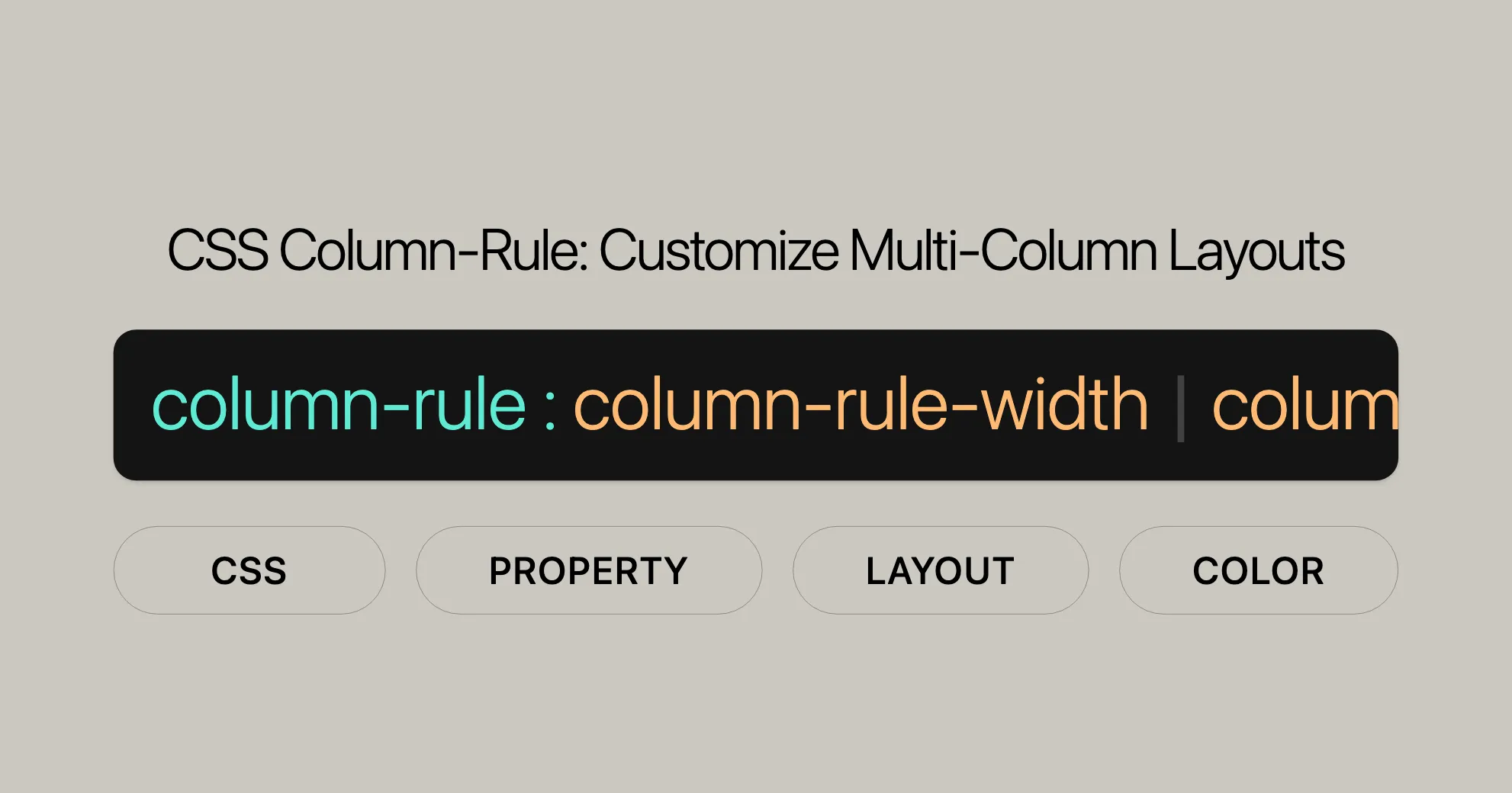
The column-rule property can be defined using a simple syntax:
column-rule: column-rule-width column-rule-style column-rule-color;Here’s a breakdown:
column-rule-width: Specifies the width of the dividing line (e.g.,px,emor keywords likethin,medium,thick).column-rule-style: Defines the style of the line (e.g.,solid,dotted,dashed).column-rule-color: Sets the color of the line (e.g.,blue,#0000FF).
You can also use global values like inherit, initial, revert, revert-layer, and unset.
Values
The column-rule property accepts values for width, style, and color:
<'column-rule-width'>: Length value (e.g.,px,em) or keywords (thin,medium,thick).<'column-rule-style'>: Styles likenone,hidden,dotted,dashed,solid,double,groove,ridge,inset,outset.<'column-rule-color'>: Any valid CSS color value.
Examples of Usage
Basic Usage
HTML:
<p class="content-box"> This is a bunch of text split into three columns.</p>CSS:
.content-box { padding: 0.3em; background: #ff7; column-count: 3; column-rule: dotted 2px #33f;}Customizing Width, Style, and Color
CSS:
.content-box { padding: 0.3em; background: #ff7; column-count: 3; column-rule: solid 5px red;}Using Different Styles
CSS:
.content-box { padding: 0.3em; background: #ff7; column-count: 3; column-rule: dashed 3px green;}Combining Constituent Properties
CSS:
.content-box { padding: 0.3em; background: #ff7; column-count: 3; column-rule-width: 2px; column-rule-style: dotted; column-rule-color: #33f;}Constituent Properties
The column-rule property is a shorthand for:
column-rule-width: Sets the width of the line.column-rule-style: Defines the style of the line.column-rule-color: Sets the color of the line.
Browser Compatibility
The column-rule property is well-supported across modern web browsers:
- Google Chrome: Supported since version 50.0.
- Mozilla Firefox: Supported since version 52.0.
- Internet Explorer: Supported since version 10.0.
- Microsoft Edge: Supported since the initial release.
- Opera: Supported since version 37.0.
- Safari: Supported since version 9.0.
Browser Compatibility Table
| Browser | Version | Release Date |
|---|---|---|
| Google Chrome | 50.0 | April 2016 |
| Mozilla Firefox | 52.0 | March 2017 |
| Internet Explorer | 10.0 | September 2012 |
| Microsoft Edge | Initial | N/A |
| Opera | 37.0 | May 2016 |
| Safari | 9.0 | September 2015 |
Browser-Specific Prefixes
In some older versions of browsers, you might need to use vendor-specific prefixes:
-webkit-column-rule: solid 5px red;-moz-column-rule: solid 5px red;column-rule: solid 5px red;Testing for Compatibility
It’s important to test your web designs in different browsers to ensure consistency. Tools like BrowserStack or cross-browser testing extensions can help you check that your multi-column layouts and the column-rule property work correctly everywhere.
Ensuring Graceful Degradation
For older browsers that don’t support the column-rule property, you can use fallback styles or progressive enhancement techniques. This ensures that the layout stays functional and looks good, even if it’s simpler.
See Also
For more on CSS properties related to multi-column layouts, check out these resources:
- Multiple-column Layout: This guide covers how to create and style multi-column layouts using CSS.
column-rule-style: Learn about thecolumn-rule-styleproperty, which sets the style of the line between columns.column-rule-width: Discover how to adjust the width of the line between columns using thecolumn-rule-widthproperty.column-rule-color: Explore thecolumn-rule-colorproperty, which sets the color of the line between columns.- CSS Border Properties: Understand the various CSS border properties for styling other elements on your webpage.
- CSS Multi-column Layout Module Level 1: Dive into the official specification for multi-column layouts, including detailed info about the
column-ruleproperty and related properties.
 Latest Blogs
  สร้างเว็บไซต์ 1 เว็บ ต้องใช้งบเท่าไหร่? เจาะลึกทุกองค์ประกอบ website development cost อยากสร้างเว็บไซต์แต่ไม่มั่นใจในเรื่องของงบประมาณ อ่านสรุปเจาะลึกตั้งแต่ดีไซน์, ฟังก์ชัน และการดูแล พร้อมตัวอย่างงบจริงจาก Till it’s done ที่แผนชัด งบไม่บานปลายแน่นอน
  Next.js สอน 14 ขั้นตอนเบื้องต้น: สร้างโปรเจกต์แรกใน 30 นาที เริ่มต้นกับ Next.js ใน 14 ขั้นตอนเพียงแค่ 30 นาที พร้อม SSR/SSG และ API Routes ด้วยตัวอย่างโค้ดง่าย ๆ อ่านต่อเพื่อสร้างโปรเจ็กต์แรกได้ทันทีที่นี่
  วิธีสมัคร Apple Developer Account เพื่อนำแอปขึ้น App Store ทีละขั้นตอน อยากปล่อยแอปบน App Store ระดับโลก มาอ่านคู่มือสมัคร Apple Developer Account พร้อมเคล็ดลับ TestFlight และวิธีอัปโหลดที่ง่ายในบทความเดียวนี้ได้เลย
  TypeScript Interface คืออะไร? อธิบายพร้อมวิธีใช้และข้อแตกต่างจาก Type เรียนรู้วิธีใช้ TypeScript Interface เพื่อสร้างโครงสร้างข้อมูลที่ปลอดภัยและเข้าใจง่าย พร้อมเปรียบเทียบข้อดีข้อแตกต่างกับ Type ที่คุณต้องรู้ ถูกรวมเอาไว้ในบทความนี้แล้ว
  Material-UI (MUI) คืออะไร อยากสร้าง UI สวยงามและเป็นมืออาชีพในเวลาอันรวดเร็วใช่ไหม มาทำความรู้จักกับ Material-UI (MUI) ที่ช่วยให้คุณพัฒนาแอปพลิเคชันบน React ได้ง่ายและดูดีในทุกอุปกรณ์
  เปรียบเทียบ 3 วิธีติดตั้ง install node js บน Ubuntu: NVM vs NodeSource vs Official Repo แบบไหนดีที่สุด? เรียนรู้วิธีติดตั้ง Node.js บน Ubuntu ด้วย NVM, NodeSource หรือ Official Repo เลือกวิธีที่เหมาะกับความต้องการของคุณ พร้อมเปรียบเทียบ เพื่อการพัฒนาที่มีประสิทธิภาพ!
 Talk with CEO
Explore our best articles, cover a wide variety of technologies 
 ReactJs
  Flutter
  Nodejs
  Nextjs
  TailwindCSS
  Typescript Golang AstroJs Jest Website development th Mobile application th Reactjs th Nextjs th Flutter th Software house th Nodejs th Typescript th
  CSS
CSS We'll be right here with you every step of the way.
We'll be here, prepared to commence this promising collaboration.


Whether you're curious about features, warranties, or shopping policies, we provide comprehensive answers to assist you.