
- Services
- Case Studies
- Technologies
- NextJs development
- Flutter development
- NodeJs development
- ReactJs development
- About
- Contact
- Tools
- Blogs
- FAQ
 Scroll to discover
 Mastering CSS Clip-Path for Creative Web Design
Learn about basic shapes, geometry boxes, and practical use cases.
Introduction
The clip-path property in CSS lets you define a visible region for an element, hiding the rest. It’s great for creating unique designs without extra graphics. This article covers the basics, shapes, geometry boxes, examples, and browser compatibility.
Specification
The clip-path property is defined in these CSS specifications:
- CSS Masking Module Level 1:
- Defines
clip-pathand its values. - CSS Masking Module Level 1
- Defines
- CSS Shapes Module Level 1:
- Provides details on supported shapes.
- CSS Shapes Module Level 1
Syntax and Values
The clip-path property is specified using a combination of values that define the clipping region.
Syntax
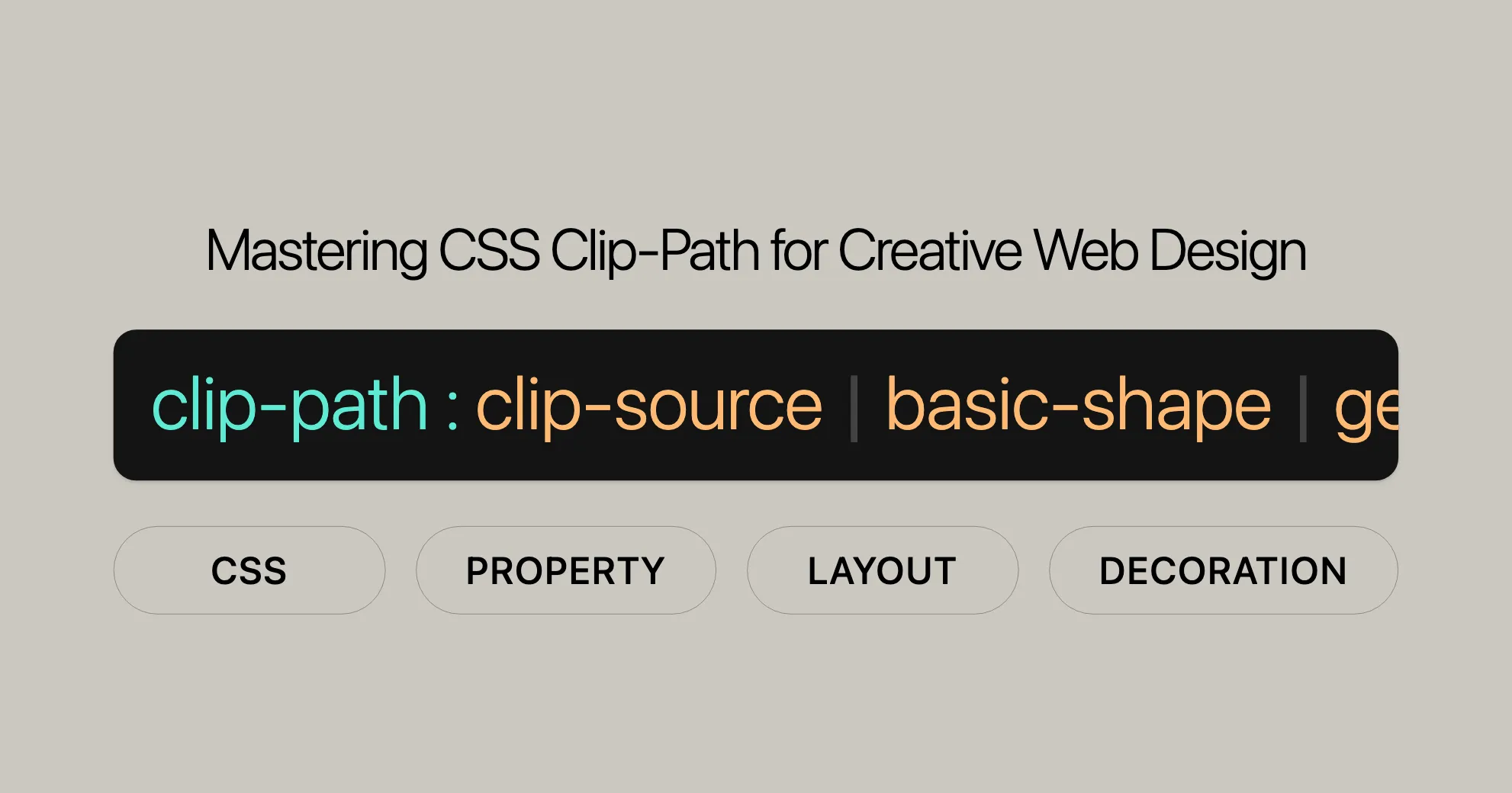
clip-path: <clip-source> | <basic-shape> | <geometry-box> | none;Values
-
<clip-source>:- A URL referencing an SVG
<clipPath>element.
clip-path: url(resources.svg#c1); - A URL referencing an SVG
-
<basic-shape>:- Defines a basic shape. If no geometry box is specified,
border-boxis used. inset():- Defines an inset rectangle.
clip-path: inset(100px 50px);circle():- Defines a circle using a radius and a position.
clip-path: circle(50px at 0 100px);ellipse():- Defines an ellipse using two radii and a position.
clip-path: ellipse(50px 60px at 0 10% 20%);polygon():- Defines a polygon using a set of vertices.
clip-path: polygon(50% 0%, 100% 50%, 50% 100%, 0% 50%);path():- Defines a shape using an SVG path definition.
clip-path: path("M0.5,1 C0.5,1,0,0.7,0,0.3 A0.25,0.25,1,1,1,0.5,0.3 A0.25,0.25,1,1,1,1,0.3 C1,0.7,0.5,1,0.5,1 Z");rect():- Defines a rectangle using specified distances from the edges.
clip-path: rect(5px 5px 160px 145px round 20%);xywh():- Defines a rectangle using specified distances from the top and left edges, and specified width and height.
clip-path: xywh(0 5px 100% 75% round 15% 0);
- Defines a basic shape. If no geometry box is specified,
-
<geometry-box>:- Defines the reference box for the basic shape.
margin-box: Uses the margin box.clip-path: margin-box;border-box: Uses the border box.clip-path: border-box;padding-box: Uses the padding box.clip-path: padding-box;content-box: Uses the content box.clip-path: content-box;fill-box: Uses the object bounding box (for SVG).clip-path: fill-box;stroke-box: Uses the stroke bounding box (for SVG).clip-path: stroke-box;view-box: Uses the nearest SVG viewport.clip-path: view-box;
-
none:- No clipping path is created. This is the default value.
clip-path: none;
Basic Shapes
The clip-path property lets you define various basic shapes for clipping.
Circle
Defines a circle using a radius and a position.
clip-path: circle(radius at x y);Example:
clip-path: circle(50px at 0 100px);Ellipse
Defines an ellipse using two radii and a position.
clip-path: ellipse(radius-x radius-y at x y);Example:
clip-path: ellipse(50px 60px at 0 10% 20%);Polygon
Defines a polygon using a set of vertices.
clip-path: polygon(x1 y1, x2 y2, ...);Example:
clip-path: polygon(50% 0%, 100% 50%, 50% 100%, 0% 50%);Inset
Defines an inset rectangle.
clip-path: inset(top right bottom left round border-radius);Example:
clip-path: inset(100px 50px);Path
Defines a shape using an SVG path definition.
clip-path: path("SVG path data");Example:
clip-path: path( "M0.5,1 C0.5,1,0,0.7,0,0.3 A0.25,0.25,1,1,1,0.5,0.3 A0.25,0.25,1,1,1,1,0.3 C1,0.7,0.5,1,0.5,1 Z");Rect
Defines a rectangle using specified distances from the edges.
clip-path: rect(top right bottom left round border-radius);Example:
clip-path: rect(5px 5px 160px 145px round 20%);xywh
Defines a rectangle using specified distances from the top and left edges, and specified width and height.
clip-path: xywh(x y width height round border-radius);Example:
clip-path: xywh(0 5px 100% 75% round 15% 0);Geometry Boxes
The clip-path property lets you define a clipping region based on different geometry boxes. These boxes determine the reference area used for clipping.
Geometry Box Values
-
margin-box:- Uses the margin box.
clip-path: margin-box; -
border-box:- Uses the border box.
clip-path: border-box; -
padding-box:- Uses the padding box.
clip-path: padding-box; -
content-box:- Uses the content box.
clip-path: content-box; -
fill-box:- Uses the object bounding box (for SVG).
clip-path: fill-box; -
stroke-box:- Uses the stroke bounding box (for SVG).
clip-path: stroke-box; -
view-box:- Uses the nearest SVG viewport.
clip-path: view-box;
Combining Geometry Boxes with Basic Shapes
You can combine these geometry boxes with basic shapes to create more complex clipping effects.
Example:
clip-path: padding-box circle(50px at 0 100px);In this example, the circle shape is applied within the padding-box of the element.
Examples and Use Cases
The clip-path property in CSS is a powerful tool for creating visually appealing designs by defining clipping regions. These regions determine which parts of an element are visible, allowing for creative and unique layouts.
Examples
1. Basic Shapes
One of the simplest and most common uses of clip-path is to clip elements into basic shapes like circles, ellipses, and polygons.
HTML:
<div class="shape circle"></div><div class="shape ellipse"></div><div class="shape polygon"></div>CSS:
.shape {  width: 200px;  height: 200px;  background-color: #3498db;  margin: 20px;}
.circle {  clip-path: circle(50%);}
.ellipse {  clip-path: ellipse(50% 30% at 50% 50%);}
.polygon {  clip-path: polygon(50% 0%, 100% 50%, 50% 100%, 0% 50%);}
2. Inset Rectangles
The inset() function allows you to create inset rectangles, which can be useful for creating unique layouts.
HTML:
<div class="inset"></div>CSS:
.inset { width: 300px; height: 300px; background-color: #e74c3c; clip-path: inset(20px 30px 40px 50px);}3. Clipping with SVG Paths
You can use complex SVG paths to create more intricate clipping effects.
HTML:
<div class="svg-path"></div>CSS:
.svg-path { width: 300px; height: 300px; background-color: #2ecc71; clip-path: path("M0.5,1 C0.5,1,0,0.7,0,0.3 A0.25,0.25,1,1,1,0.5,0.3 A0.25,0.25,1,1,1,1,0.3 C1,0.7,0.5,1,0.5,1 Z");}4. Combining Geometry Boxes with Basic Shapes
Combining geometry boxes with basic shapes allows for more precise and customized clipping effects.
HTML:
<div class="combined-shape"></div>CSS:
.combined-shape { width: 300px; height: 300px; background-color: #9b59b6; clip-path: padding-box circle(50px at 50% 50%);}Use Cases
1. Clipping Images
The clip-path property can be used to clip images into various shapes, enhancing the visual appeal of a website.
HTML:
<img src="image.jpg" alt="Clipped Image" class="clipped-image">CSS:
.clipped-image { width: 300px; height: 300px; clip-path: polygon(50% 0%, 100% 50%, 50% 100%, 0% 50%);}2. Clipping Text
Clipping text can create visually engaging typography effects.
HTML:
<p class="clipped-text">I LOVE CLIPPING</p>CSS:
.clipped-text { font-family: Arial, sans-serif; font-size: 36px; background-color: #f39c12; color: white; padding: 20px; clip-path: inset(10px 20px 30px 40px);}Browser Compatibility
The clip-path property is widely supported across modern web browsers, making it a reliable tool for web developers. However, there are some variations in support for different features and syntax.
Compatibility Table
| Browser | Version | Supported Since |
|---|---|---|
| Chrome | 55 | December 2016 |
| Firefox | 54 | June 2017 |
| Edge | 12 | July 2015 |
| Opera | 42 | December 2016 |
| Safari | 9.1 | March 2016 |
Tips for Ensuring Compatibility
- Use Fallbacks: To ensure compatibility across all browsers, consider using fallbacks or alternative methods for clipping effects. For example, you can use background images or other CSS properties to achieve similar visual effects.
- Test Across Browsers: Always test your
clip-pathimplementations across different browsers and devices to ensure consistent rendering. - Stay Up-to-Date: Keep your browser knowledge up-to-date by checking the latest compatibility tables and browser release notes.
Conclusion
The clip-path property is a powerful tool for creating visually appealing and unique designs in web development. With wide support across modern browsers, you can confidently use clip-path to enhance your web projects. By understanding the browser compatibility and implementing best practices, you can ensure that your designs are consistent and accessible to all users.
See Also
For more information on CSS properties and browser compatibility, you can refer to the following resources:
 Latest Blogs
  สร้างเว็บไซต์ 1 เว็บ ต้องใช้งบเท่าไหร่? เจาะลึกทุกองค์ประกอบ website development cost อยากสร้างเว็บไซต์แต่ไม่มั่นใจในเรื่องของงบประมาณ อ่านสรุปเจาะลึกตั้งแต่ดีไซน์, ฟังก์ชัน และการดูแล พร้อมตัวอย่างงบจริงจาก Till it’s done ที่แผนชัด งบไม่บานปลายแน่นอน
  Next.js สอน 14 ขั้นตอนเบื้องต้น: สร้างโปรเจกต์แรกใน 30 นาที เริ่มต้นกับ Next.js ใน 14 ขั้นตอนเพียงแค่ 30 นาที พร้อม SSR/SSG และ API Routes ด้วยตัวอย่างโค้ดง่าย ๆ อ่านต่อเพื่อสร้างโปรเจ็กต์แรกได้ทันทีที่นี่
  วิธีสมัคร Apple Developer Account เพื่อนำแอปขึ้น App Store ทีละขั้นตอน อยากปล่อยแอปบน App Store ระดับโลก มาอ่านคู่มือสมัคร Apple Developer Account พร้อมเคล็ดลับ TestFlight และวิธีอัปโหลดที่ง่ายในบทความเดียวนี้ได้เลย
  TypeScript Interface คืออะไร? อธิบายพร้อมวิธีใช้และข้อแตกต่างจาก Type เรียนรู้วิธีใช้ TypeScript Interface เพื่อสร้างโครงสร้างข้อมูลที่ปลอดภัยและเข้าใจง่าย พร้อมเปรียบเทียบข้อดีข้อแตกต่างกับ Type ที่คุณต้องรู้ ถูกรวมเอาไว้ในบทความนี้แล้ว
  Material-UI (MUI) คืออะไร อยากสร้าง UI สวยงามและเป็นมืออาชีพในเวลาอันรวดเร็วใช่ไหม มาทำความรู้จักกับ Material-UI (MUI) ที่ช่วยให้คุณพัฒนาแอปพลิเคชันบน React ได้ง่ายและดูดีในทุกอุปกรณ์
  เปรียบเทียบ 3 วิธีติดตั้ง install node js บน Ubuntu: NVM vs NodeSource vs Official Repo แบบไหนดีที่สุด? เรียนรู้วิธีติดตั้ง Node.js บน Ubuntu ด้วย NVM, NodeSource หรือ Official Repo เลือกวิธีที่เหมาะกับความต้องการของคุณ พร้อมเปรียบเทียบ เพื่อการพัฒนาที่มีประสิทธิภาพ!
 Talk with CEO
Explore our best articles, cover a wide variety of technologies 
 ReactJs
  Flutter
  Nodejs
  Nextjs
  TailwindCSS
  Typescript Golang AstroJs Jest Website development th Mobile application th Reactjs th Nextjs th Flutter th Software house th Nodejs th Typescript th
  CSS
CSS We'll be right here with you every step of the way.
We'll be here, prepared to commence this promising collaboration.


Whether you're curious about features, warranties, or shopping policies, we provide comprehensive answers to assist you.