
- Services
- Case Studies
- Technologies
- NextJs development
- Flutter development
- NodeJs development
- ReactJs development
- About
- Contact
- Tools
- Blogs
- FAQ
 Scroll to discover
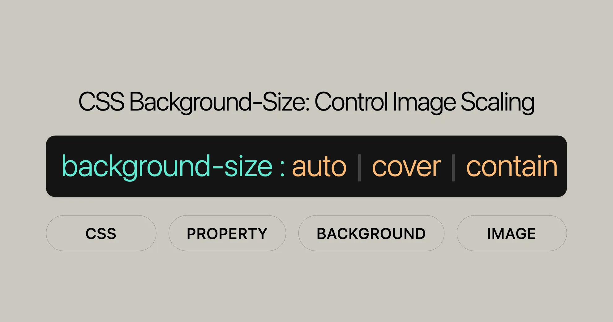
 CSS Background-Size Control Image Scaling
Discover options like cover, contain, and custom dimensions.
Enhance your web design with responsive background images.
Setting Background Image Size in CSS
The background-size property in CSS allows you to control the size of background images. Here’s how to use it effectively:
Setting Specific Dimensions
You can set the width and height of the background image to specific pixel values:
HTML:
<div class="specificSize"></div>CSS:
.specificSize { background-image: url('...'); background-size: 400px 450px; width: 500px; height: 500px; border: 2px solid;}Result: The background image will be scaled to 400 pixels wide and 450 pixels tall within the container.
Using Percentage Values
You can also set the width and height using percentage values relative to the container:
HTML:
<div class="percentageSize"></div>CSS:
.percentageSize { background-image: url('...'); background-size: 50%; width: 500px; height: 500px; border: 2px solid;}Result: The background image will be scaled to 50% of the container’s width and height.
Setting Background Size to Cover
The cover keyword ensures the background image covers the entire container, maintaining its aspect ratio but possibly cropping the image:
HTML:
<div class="coverSize"></div>CSS:
.coverSize { background-image: url('...'); background-size: cover; width: 500px; height: 500px; border: 2px solid;}Result: The background image will cover the entire container, maintaining its aspect ratio.
Setting Background Size to Contain
The contain keyword ensures the background image fits within the container, maintaining its aspect ratio but possibly leaving empty space:
HTML:
<div class="containSize"></div>CSS:
.containSize { background-image: url('...'); background-size: contain; width: 500px; height: 500px; border: 2px solid;}Result: The background image will fit within the container, maintaining its aspect ratio.
Using Multiple Backgrounds
You can set the size of multiple background images by separating the values with a comma:
HTML:
<div class="multipleBackgrounds"></div>CSS:
.multipleBackgrounds { background-image: url('image1.png'), url('image2.png'), url('image3.png'); background-size: 50%, 25%, cover; width: 500px; height: 500px; border: 2px solid;}Result: Each background image will be scaled according to the specified sizes, creating a layered effect.
Using Global Values
Global values like inherit, initial, revert, revert-layer, and unset provide additional flexibility in managing background image sizes:
HTML:
<div class="globalValues"></div>CSS:
.globalValues { background-image: url('...'); background-size: inherit; /* Inherits the background-size from the parent element */ width: 500px; height: 500px; border: 2px solid;}Result: The background image size will be inherited from the parent element.
Practical Use Case
For a responsive design where the background image needs to adapt to different screen sizes, use the background-size property:
HTML:
<div class="responsiveBackground"></div>CSS:
.responsiveBackground { width: 100%; height: 400px; background-image: url('path/to/your/image.jpg'); background-size: cover; /* Ensures the image covers the entire container */ background-repeat: no-repeat; background-position: center;}Result: The background image will cover the entire container, maintaining its aspect ratio and ensuring it looks good on any screen size.
Specifications and Formal Syntax
The background-size property is defined in the CSS Backgrounds and Borders Module Level 3 specification. The formal syntax is:
background-size = <bg-size>#
<bg-size> = [ <length-percentage> | auto ]{1,2} | cover | contain
<length-percentage> = <length> | <percentage>
Browser Compatibility
The background-size property is widely supported by modern browsers, including Google Chrome, Mozilla Firefox, Microsoft Edge, Safari, and Opera. However, older versions of Internet Explorer (before version 9) and Opera Mini do not support this property.
Fallback Example
For browsers that do not support the background-size property, use CSS feature queries:
.container { background-image: url('path/to/your/image.jpg'); background-size: cover; /* Modern browsers */ background-size: 100% auto; /* Fallback for non-supporting browsers */ background-repeat: no-repeat; background-position: center;}Related Properties
background-image: Sets the background image.background-repeat: Controls image repetition.background-position: Positions the background image.background-attachment: Determines if the image scrolls with content.background-origin: Defines the origin of the background positioning area.background-clip: Specifies where the background extends.background: Shorthand for all background properties.background-color: Sets the background color.
Conclusion
The background-size property is a powerful tool for controlling the size of background images. With wide support across modern browsers, you can use it confidently to create visually appealing designs. By understanding and utilizing related properties, you can achieve a wide range of visual effects and ensure that background images look great on any device.
This version combines duplicate sections and rearranges the content for better clarity and accessibility. If you need further simplification or additional details, feel free to let me know!
 Latest Blogs
  สร้างเว็บไซต์ 1 เว็บ ต้องใช้งบเท่าไหร่? เจาะลึกทุกองค์ประกอบ website development cost อยากสร้างเว็บไซต์แต่ไม่มั่นใจในเรื่องของงบประมาณ อ่านสรุปเจาะลึกตั้งแต่ดีไซน์, ฟังก์ชัน และการดูแล พร้อมตัวอย่างงบจริงจาก Till it’s done ที่แผนชัด งบไม่บานปลายแน่นอน
  Next.js สอน 14 ขั้นตอนเบื้องต้น: สร้างโปรเจกต์แรกใน 30 นาที เริ่มต้นกับ Next.js ใน 14 ขั้นตอนเพียงแค่ 30 นาที พร้อม SSR/SSG และ API Routes ด้วยตัวอย่างโค้ดง่าย ๆ อ่านต่อเพื่อสร้างโปรเจ็กต์แรกได้ทันทีที่นี่
  วิธีสมัคร Apple Developer Account เพื่อนำแอปขึ้น App Store ทีละขั้นตอน อยากปล่อยแอปบน App Store ระดับโลก มาอ่านคู่มือสมัคร Apple Developer Account พร้อมเคล็ดลับ TestFlight และวิธีอัปโหลดที่ง่ายในบทความเดียวนี้ได้เลย
  TypeScript Interface คืออะไร? อธิบายพร้อมวิธีใช้และข้อแตกต่างจาก Type เรียนรู้วิธีใช้ TypeScript Interface เพื่อสร้างโครงสร้างข้อมูลที่ปลอดภัยและเข้าใจง่าย พร้อมเปรียบเทียบข้อดีข้อแตกต่างกับ Type ที่คุณต้องรู้ ถูกรวมเอาไว้ในบทความนี้แล้ว
  Material-UI (MUI) คืออะไร อยากสร้าง UI สวยงามและเป็นมืออาชีพในเวลาอันรวดเร็วใช่ไหม มาทำความรู้จักกับ Material-UI (MUI) ที่ช่วยให้คุณพัฒนาแอปพลิเคชันบน React ได้ง่ายและดูดีในทุกอุปกรณ์
  เปรียบเทียบ 3 วิธีติดตั้ง install node js บน Ubuntu: NVM vs NodeSource vs Official Repo แบบไหนดีที่สุด? เรียนรู้วิธีติดตั้ง Node.js บน Ubuntu ด้วย NVM, NodeSource หรือ Official Repo เลือกวิธีที่เหมาะกับความต้องการของคุณ พร้อมเปรียบเทียบ เพื่อการพัฒนาที่มีประสิทธิภาพ!
 Talk with CEO
Explore our best articles, cover a wide variety of technologies 
 ReactJs
  Flutter
  Nodejs
  Nextjs
  TailwindCSS
  Typescript Golang AstroJs Jest Website development th Mobile application th Reactjs th Nextjs th Flutter th Software house th Nodejs th Typescript th
  CSS
CSS We'll be right here with you every step of the way.
We'll be here, prepared to commence this promising collaboration.


Whether you're curious about features, warranties, or shopping policies, we provide comprehensive answers to assist you.