
- Services
- Case Studies
- Technologies
- NextJs development
- Flutter development
- NodeJs development
- ReactJs development
- About
- Contact
- Tools
- Blogs
- FAQ
 Scroll to discover
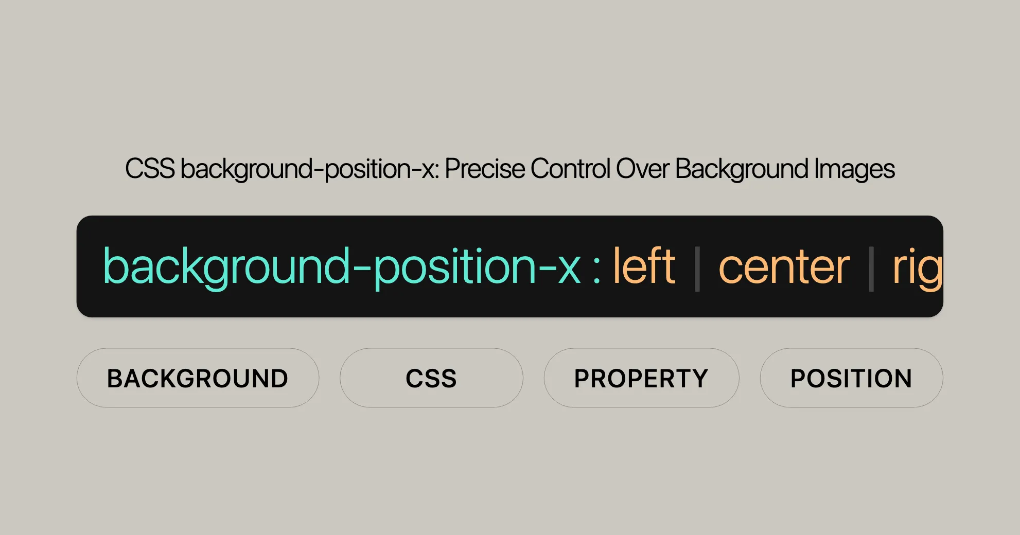
 CSS background-position-x Precise Control Over Background Images
It offers flexibility with keywords (`left`, `center`, `right`), percentages, and lengths.
This property is crucial for web design, enabling precise control and enhancing user experience.
CSS background-position-x Property
The background-position-x property in CSS allows you to control the horizontal position of a background image. This property is crucial for achieving precise and visually appealing designs. This guide covers the formal syntax, examples, and browser compatibility of the background-position-x property.
Formal Syntax
The formal syntax for the background-position-x property ensures precise and consistent usage. It allows for various values, including keywords, lengths, and percentages, to control horizontal positioning.
Syntax Definition
background-position-x =  [ center | [ left | right | x-start | x-end ] <length-percentage>? ]#
<length-percentage> =  <length> | <percentage>
Explanation of Formal Syntax:
center: Centers the background image horizontally.left,right,x-start,x-end: Aligns the background image relative to the specified edges.leftaligns to the left edge.rightaligns to the right edge.x-startandx-endare similar toleftandright, respectively.
<length-percentage>: Defines an offset from the specified edge using length units or percentages.<length>: Units like pixels (px), centimeters (cm), or em.<percentage>: Percentage of the width of the background positioning area.
Global Values:
inherit: Inherits the value from the parent element.initial: Sets the value to its default (0%).revert: Resets the value to the user-agent default.revert-layer: Resets the value to the previous layer’s value.unset: Resets the property to its natural value.
Examples
Basic Example
HTML
<div></div>CSS
div { width: 300px; height: 300px; background-color: seagreen; background-image: url('https://mdn.dev/archives/media/attachments/2020/07/29/17350/3b4892b7e820122ac6dd7678891d4507/firefox.png'); background-repeat: no-repeat; background-position-x: center; background-position-y: bottom;}Result
In this example, the background image is centered horizontally (background-position-x: center) and positioned at the bottom vertically (background-position-y: bottom).
Side-relative Values
HTML
<div></div>CSS
div { width: 300px; height: 300px; background-color: seagreen; background-image: url('https://mdn.dev/archives/media/attachments/2020/07/29/17350/3b4892b7e820122ac6dd7678891d4507/firefox.png'); background-repeat: no-repeat; background-position-x: right 20px; background-position-y: bottom 10px;}Result
The background image is offset 20 pixels from the right edge horizontally (background-position-x: right 20px) and 10 pixels from the bottom edge vertically (background-position-y: bottom 10px).
Additional Examples
HTML
<div class="example1"></div><div class="example2"></div>CSS
.example1 {  width: 300px;  height: 300px;  background-color: lightblue;  background-image: url('https://mdn.dev/archives/media/attachments/2020/07/29/17350/3b4892b7e820122ac6dd7678891d4507/firefox.png');  background-repeat: no-repeat;  background-position-x: left 50px;  background-position-y: top 30px;}
.example2 {  width: 300px;  height: 300px;  background-color: lightcoral;  background-image: url('https://mdn.dev/archives/media/attachments/2020/07/29/17350/3b4892b7e820122ac6dd7678891d4507/firefox.png');  background-repeat: no-repeat;  background-position-x: right 10%;  background-position-y: bottom 20%;}
Result
- Example 1: The background image is offset 50 pixels from the left edge horizontally (
background-position-x: left 50px) and 30 pixels from the top edge vertically (background-position-y: top 30px). - Example 2: The background image is offset 10% from the right edge horizontally (
background-position-x: right 10%) and 20% from the bottom edge vertically (background-position-y: bottom 20%).
Multiple Background Images
HTML
<div></div>CSS
div { width: 300px; height: 300px; background-color: lightgray; background-image: url('https://mdn.dev/archives/media/attachments/2020/07/29/17350/3b4892b7e820122ac6dd7678891d4507/firefox.png'), url('https://mdn.dev/archives/media/attachments/2020/07/29/17350/3b4892b7e820122ac6dd7678891d4507/firefox.png'); background-repeat: no-repeat, no-repeat; background-position-x: left, right; background-position-y: top, bottom;}Result
In this example, the first background image is positioned at the left top, and the second background image is positioned at the right bottom.
Specifications
The background-position-x property is defined in the CSS Backgrounds and Borders Module Level 4 specification.
Key Specification Details:
- Module: CSS Backgrounds and Borders Module Level 4
- Section:
background-position-longhands - Purpose: Defines the longhand properties for background positioning, including
background-position-x.
Specification Link:
Browser Compatibility
The background-position-x property is well-supported across modern web browsers, ensuring that web developers can use this property to control the horizontal positioning of background images confidently.
Compatibility Table
| Browser | Version |
|---|---|
| Google Chrome | 1 |
| Microsoft Edge | 12 |
| Mozilla Firefox | 49 |
| Opera | 15 |
| Safari | 1 |
Notes on Compatibility
- Google Chrome:
- Full support from version 1 onwards.
- Microsoft Edge:
- Full support from version 12 onwards.
- Mozilla Firefox:
- Full support from version 49 onwards.
- Opera:
- Full support from version 15 onwards.
- Safari:
- Full support from version 1 onwards.
Best Practices for Ensuring Compatibility
- Testing: Always test your web design across different browsers and versions to ensure consistent behavior.
- Fallbacks: Use CSS fallbacks and progressive enhancement techniques to ensure that older browsers still display your web pages correctly, even if they do not fully support the
background-position-xproperty. - Polyfills: Consider using polyfills or JavaScript libraries to provide support for the
background-position-xproperty in older browsers, if necessary.
Example of Browser Compatibility Consideration
HTML
<div class="compatible-example"></div>CSS
.compatible-example { width: 300px; height: 300px; background-color: skyblue; background-image: url('https://mdn.dev/archives/media/attachments/2020/07/29/17350/3b4892b7e820122ac6dd7678891d4507/firefox.png'); background-repeat: no-repeat; background-position-x: center; background-position-y: bottom;}Result
In this example, the background image is centered horizontally (background-position-x: center) and positioned at the bottom vertically (background-position-y: bottom). This design should work consistently across all modern browsers that support the background-position-x property.
See Also
To further enhance your understanding and usage of the background-position-x property, you might find the following related topics and properties useful:
background-position:- The shorthand property for setting both the horizontal and vertical positions of a background image.
- MDN Web Docs -
background-position
background-position-y:- The longhand property for setting the initial vertical position of a background image.
- MDN Web Docs -
background-position-y
- Using Multiple Backgrounds:
- A guide on how to use multiple background images in CSS, including positioning them individually.
- MDN Web Docs - Using multiple backgrounds
- CSS Backgrounds and Borders Module:
- The official specification for background and border properties in CSS, including detailed information on the
background-position-xproperty. - CSS Backgrounds and Borders Module Level 4
- The official specification for background and border properties in CSS, including detailed information on the
- CSS Positioning:
- A comprehensive guide on various CSS positioning techniques and properties.
- MDN Web Docs - CSS Positioning
Additional Resources
- CSS-Tricks: A popular web development blog with numerous articles and tutorials on CSS, including advanced techniques for background positioning.
- W3Schools: An educational website offering free coding tutorials and references, including detailed explanations and examples of CSS properties.
Community and Support
- Stack Overflow: A Q&A platform where you can ask questions, share knowledge, and find solutions related to CSS and web development.
- MDN Web Docs Community: A community-driven platform where you can contribute to documentation, ask questions, and share your knowledge.
Conclusion
Exploring these related topics and resources will help you gain a deeper understanding of CSS background positioning and enable you to create more sophisticated and visually appealing web designs. By leveraging the background-position-x property along with other CSS properties and techniques, you can achieve precise control over the positioning of background images, enhancing the overall user experience of your web pages.
Key Points:
- Purpose: Sets the horizontal position of a background image.
- Relative Positioning: The position is relative to the background position layer set by
background-origin. - Overrides: The value of this property can be overridden by any subsequent declaration of the
backgroundorbackground-positionshorthand properties.
Importance in Web Development:
- Precision: Allows for precise control over the horizontal placement of background images.
- Flexibility: Supports various values including keywords (
left,center,right), percentages, and lengths. - Compatibility: Ensures compatibility with modern web design practices and enhances the overall user experience.
By understanding and utilizing the background-position-x property, web developers can create more engaging and visually appealing web designs, ensuring that background images are positioned exactly where they are needed for optimal user experience.
 Latest Blogs
  สร้างเว็บไซต์ 1 เว็บ ต้องใช้งบเท่าไหร่? เจาะลึกทุกองค์ประกอบ website development cost อยากสร้างเว็บไซต์แต่ไม่มั่นใจในเรื่องของงบประมาณ อ่านสรุปเจาะลึกตั้งแต่ดีไซน์, ฟังก์ชัน และการดูแล พร้อมตัวอย่างงบจริงจาก Till it’s done ที่แผนชัด งบไม่บานปลายแน่นอน
  Next.js สอน 14 ขั้นตอนเบื้องต้น: สร้างโปรเจกต์แรกใน 30 นาที เริ่มต้นกับ Next.js ใน 14 ขั้นตอนเพียงแค่ 30 นาที พร้อม SSR/SSG และ API Routes ด้วยตัวอย่างโค้ดง่าย ๆ อ่านต่อเพื่อสร้างโปรเจ็กต์แรกได้ทันทีที่นี่
  วิธีสมัคร Apple Developer Account เพื่อนำแอปขึ้น App Store ทีละขั้นตอน อยากปล่อยแอปบน App Store ระดับโลก มาอ่านคู่มือสมัคร Apple Developer Account พร้อมเคล็ดลับ TestFlight และวิธีอัปโหลดที่ง่ายในบทความเดียวนี้ได้เลย
  TypeScript Interface คืออะไร? อธิบายพร้อมวิธีใช้และข้อแตกต่างจาก Type เรียนรู้วิธีใช้ TypeScript Interface เพื่อสร้างโครงสร้างข้อมูลที่ปลอดภัยและเข้าใจง่าย พร้อมเปรียบเทียบข้อดีข้อแตกต่างกับ Type ที่คุณต้องรู้ ถูกรวมเอาไว้ในบทความนี้แล้ว
  Material-UI (MUI) คืออะไร อยากสร้าง UI สวยงามและเป็นมืออาชีพในเวลาอันรวดเร็วใช่ไหม มาทำความรู้จักกับ Material-UI (MUI) ที่ช่วยให้คุณพัฒนาแอปพลิเคชันบน React ได้ง่ายและดูดีในทุกอุปกรณ์
  เปรียบเทียบ 3 วิธีติดตั้ง install node js บน Ubuntu: NVM vs NodeSource vs Official Repo แบบไหนดีที่สุด? เรียนรู้วิธีติดตั้ง Node.js บน Ubuntu ด้วย NVM, NodeSource หรือ Official Repo เลือกวิธีที่เหมาะกับความต้องการของคุณ พร้อมเปรียบเทียบ เพื่อการพัฒนาที่มีประสิทธิภาพ!
 Talk with CEO
Explore our best articles, cover a wide variety of technologies 
 ReactJs
  Flutter
  Nodejs
  Nextjs
  TailwindCSS
  Typescript Golang AstroJs Jest Website development th Mobile application th Reactjs th Nextjs th Flutter th Software house th Nodejs th Typescript th
  CSS
CSS We'll be right here with you every step of the way.
We'll be here, prepared to commence this promising collaboration.


Whether you're curious about features, warranties, or shopping policies, we provide comprehensive answers to assist you.