
- Services
- Case Studies
- Technologies
- NextJs development
- Flutter development
- NodeJs development
- ReactJs development
- About
- Contact
- Tools
- Blogs
- FAQ
 Scroll to discover
 Mastering CSS Animation-Timing-Function for Dynamic Web Design
Explore options like linear, cubic-bezier, and step functions for smooth transitions.
Introduction to animation-timing-function in CSS
The animation-timing-function property in CSS allows you to control how animations progress over time. By setting this property, you can make animations speed up, slow down, or maintain a steady pace, enhancing the visual appeal of your website.
Specification
The animation-timing-function property is part of the CSS Animations Level 1 specification. It defines how animations progress, offering various predefined timing functions like ease, linear, ease-in, ease-out, and ease-in-out. You can also create custom timing functions using cubic-bezier and steps.
Description
The animation-timing-function property specifies how an animation’s values are calculated over time. It defines the speed curve of the animation, determining how it progresses from start to finish. This property is essential for creating smooth and dynamic animations.
Easing functions control the rate of change of the animation. You can make animations start slow and speed up, maintain a constant speed, or slow down towards the end. This flexibility allows you to tailor the animation’s behavior to match the desired effect.
Syntax
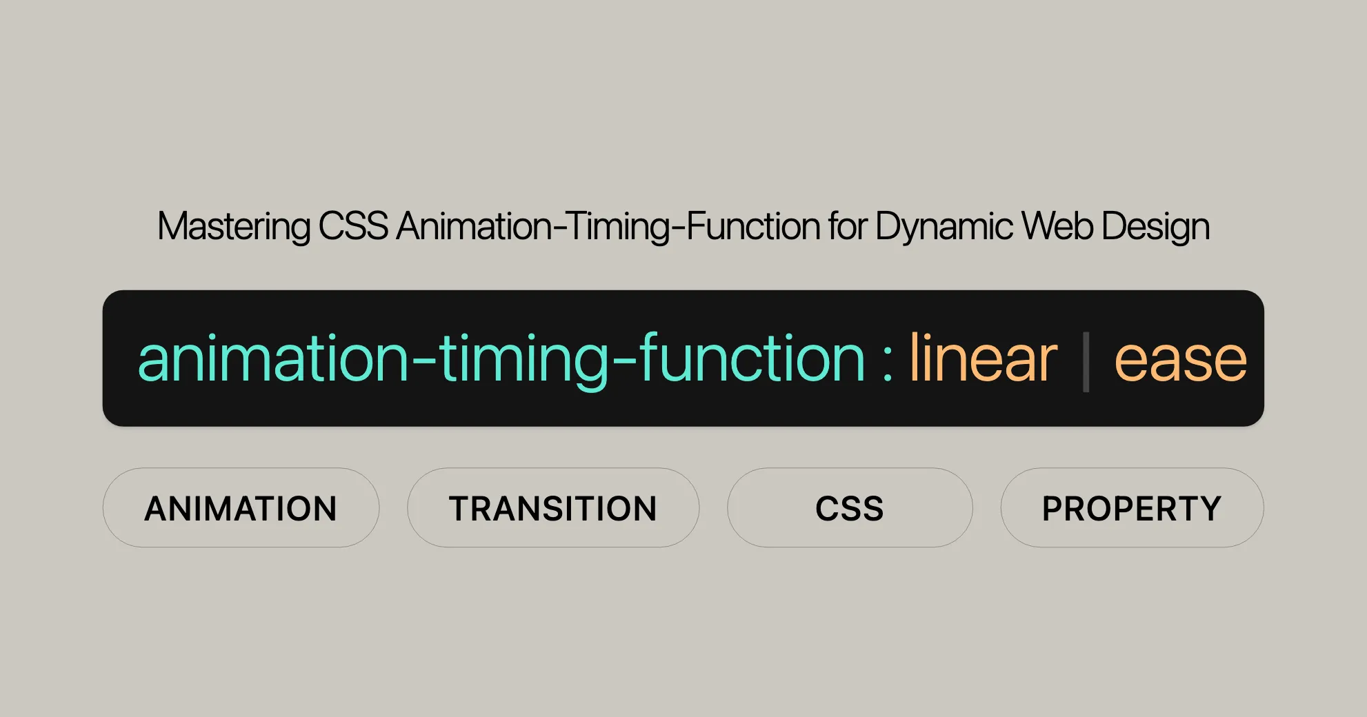
The syntax for the animation-timing-function property is straightforward:
animation-timing-function: linear | ease | ease-in | ease-out | ease-in-out | step-start | step-end | steps(int, start | end) | cubic-bezier(n, n, n, n) | initial | inherit;Explanation of Syntax
linear: The animation maintains a constant speed.ease: The animation starts slowly, speeds up in the middle, and then slows down at the end (default).ease-in: The animation starts slowly and then speeds up.ease-out: The animation starts quickly and then slows down.ease-in-out: The animation starts slowly, speeds up in the middle, and then slows down at the end.step-start: The animation jumps immediately to the end state at the start of the keyframe animation.step-end: The animation jumps to the end state at the end of the keyframe animation.steps(int, start | end): Specifies a stepping function with the number of steps and the position of the start or end.cubic-bezier(n, n, n, n): Defines a custom timing function using a cubic-bezier curve.initial: Sets the property to its default value.inherit: Inherits the property from its parent element.
Example Usage
Linear Easing Function
This example shows how to use the linear easing function to create an animation that progresses at a constant speed.
<!DOCTYPE html><html><head>    <style>        .linear-animation {            width: 0;            height: 50px;            background-color: lime;            animation: widthAnimation 5s linear forwards;        }
        @keyframes widthAnimation {            from {                width: 0;            }            to {                width: 100%;            }        }    </style></head><body>    <div class="linear-animation"></div></body></html>
Cubic-Bézier Easing Function
This example showcases how to use the cubic-bezier easing function to create a custom animation timing curve.
<!DOCTYPE html><html><head>    <style>        .custom-easing {            width: 0;            height: 50px;            background-color: orange;            animation: widthAnimation 5s cubic-bezier(0.17, 0.67, 0.83, 0.67) forwards;        }
        @keyframes widthAnimation {            from {                width: 0;            }            to {                width: 100%;            }        }    </style></head><body>    <div class="custom-easing"></div></body></html>
Step Easing Function
This example demonstrates how to use the steps easing function to create an animation that progresses in discrete steps.
<!DOCTYPE html><html><head>    <style>        .step-animation {            width: 0;            height: 50px;            background-color: red;            animation: widthAnimation 5s steps(4, end) forwards;        }
        @keyframes widthAnimation {            from {                width: 0;            }            to {                width: 100%;            }        }    </style></head><body>    <div class="step-animation"></div></body></html>
Comparing Easing Functions
This example compares the effects of different easing functions on the same animation.
<!DOCTYPE html><html><head>    <style>        .linear-animation {            width: 0;            height: 50px;            background-color: lime;            animation: widthAnimation 5s linear forwards;        }
        .custom-easing {            width: 0;            height: 50px;            background-color: orange;            animation: widthAnimation 5s cubic-bezier(0.17, 0.67, 0.83, 0.67) forwards;        }
        .step-animation {            width: 0;            height: 50px;            background-color: red;            animation: widthAnimation 5s steps(4, end) forwards;        }
        @keyframes widthAnimation {            from {                width: 0;            }            to {                width: 100%;            }        }    </style></head><body>    <div class="linear-animation"></div>    <div class="custom-easing"></div>    <div class="step-animation"></div></body></html>
Complex Animation with Multiple Keyframes
This example demonstrates a more complex animation using multiple keyframes and the linear easing function.
<!DOCTYPE html><html><head>    <style>        .complex-linear-animation {            width: 0;            height: 50px;            background-color: lime;            animation: complexWidthAnimation 10s linear forwards;        }
        @keyframes complexWidthAnimation {            0% {                width: 0;                background-color: lime;            }            25% {                width: 25%;                background-color: yellow;            }            50% {                width: 50%;                background-color: orange;            }            75% {                width: 75%;                background-color: red;            }            100% {                width: 100%;                background-color: purple;            }        }    </style></head><body>    <div class="complex-linear-animation"></div></body></html>
Formal Definition
The animation-timing-function property in CSS is formally defined in the CSS Animations Level 1 specification. This property specifies the speed curve of an animation, determining how the animation progresses over its duration. It defines the timing of intermediate keyframes and the pacing of the animation.
Formal Syntax
The formal syntax for the animation-timing-function property is as follows:
animation-timing-function =  <easing-function> [, <easing-function>]*
<easing-function> =  <linear-easing-function> |  <cubic-bezier-easing-function> |  <step-easing-function>
<linear-easing-function> =  linear |  <linear()>
<cubic-bezier-easing-function> =  ease | ease-in | ease-out | ease-in-out |  <cubic-bezier()>
<step-easing-function> =  step-start | step-end |  <steps()>
<linear()> =  linear( [<number> <percentage>]{1,2} [, <number> <percentage>]* )
<cubic-bezier()> =  cubic-bezier( [<number [0,1]> , <number> , <number [0,1]> , <number>] )
<steps()> =  steps( <integer> , <step-position>? )
<step-position> =  jump-start | jump-end | jump-none | jump-both | start | end
Explanation of Syntax
<easing-function>: Represents the various easing functions that can be used to control the animation’s timing.<linear-easing-function>: Represents functions that interpolate linearly between provided easing stop points.<cubic-bezier-easing-function>: Represents functions that define a custom timing curve using a cubic-bezier curve.<step-easing-function>: Represents functions that divide the input time into a specified number of equal-length intervals.
<linear-easing-function>
linear: Equivalent tocubic-bezier(0.0, 0.0, 1.0, 1.0), the animation maintains a constant speed.<linear()>: Interpolates linearly between provided easing stop points. Each stop point is a pair of an output progress and an input percentage.
<cubic-bezier-easing-function>
ease: Equivalent tocubic-bezier(0.25, 0.1, 0.25, 1.0), the animation starts slowly, speeds up in the middle, and then slows down at the end (default).ease-in: Equivalent tocubic-bezier(0.42, 0, 1.0, 1.0), the animation starts slowly and then speeds up.ease-out: Equivalent tocubic-bezier(0, 0, 0.58, 1.0), the animation starts quickly and then slows down.ease-in-out: Equivalent tocubic-bezier(0.42, 0, 0.58, 1.0), the animation starts slowly, speeds up in the middle, and then slows down at the end.<cubic-bezier()>: Defines a custom timing function using a cubic-bezier curve. The four values represent the coordinates of two control points that define the curve.
<step-easing-function>
step-start: Equivalent tosteps(1, jump-start), the animation jumps immediately to the end state at the start of the keyframe animation.step-end: Equivalent tosteps(1, jump-end), the animation jumps to the end state at the end of the keyframe animation.<steps()>: Specifies a stepping function with the number of steps and the position of the start or end.
Initial Value
The initial value for the animation-timing-function property is ease.
Applies To
The animation-timing-function property applies to all elements, including the ::before and ::after pseudo-elements.
Inherited
The animation-timing-function property is not inherited.
Computed Value
The computed value is as specified.
Animation Type
The animation-timing-function property is not animatable.
Formal Syntax
animation-timing-function =  <easing-function> [, <easing-function>]*
<easing-function> =  <linear-easing-function> |  <cubic-bezier-easing-function> |  <step-easing-function>
<linear-easing-function> =  linear |  <linear()>
<cubic-bezier-easing-function> =  ease | ease-in | ease-out | ease-in-out |  <cubic-bezier()>
<step-easing-function> =  step-start | step-end |  <steps()>
<linear()> =  linear( [<number> <percentage>]{1,2} [, <number> <percentage>]* )
<cubic-bezier()> =  cubic-bezier( [<number [0,1]> , <number> , <number [0,1]> , <number>] )
<steps()> =  steps( <integer> , <step-position>? )
<step-position> =  jump-start | jump-end | jump-none | jump-both | start | end
By understanding the formal definition and syntax of the animation-timing-function property, web developers can effectively utilize this property to create smooth, dynamic, and engaging animations for their web projects.
 Latest Blogs
  สร้างเว็บไซต์ 1 เว็บ ต้องใช้งบเท่าไหร่? เจาะลึกทุกองค์ประกอบ website development cost อยากสร้างเว็บไซต์แต่ไม่มั่นใจในเรื่องของงบประมาณ อ่านสรุปเจาะลึกตั้งแต่ดีไซน์, ฟังก์ชัน และการดูแล พร้อมตัวอย่างงบจริงจาก Till it’s done ที่แผนชัด งบไม่บานปลายแน่นอน
  Next.js สอน 14 ขั้นตอนเบื้องต้น: สร้างโปรเจกต์แรกใน 30 นาที เริ่มต้นกับ Next.js ใน 14 ขั้นตอนเพียงแค่ 30 นาที พร้อม SSR/SSG และ API Routes ด้วยตัวอย่างโค้ดง่าย ๆ อ่านต่อเพื่อสร้างโปรเจ็กต์แรกได้ทันทีที่นี่
  วิธีสมัคร Apple Developer Account เพื่อนำแอปขึ้น App Store ทีละขั้นตอน อยากปล่อยแอปบน App Store ระดับโลก มาอ่านคู่มือสมัคร Apple Developer Account พร้อมเคล็ดลับ TestFlight และวิธีอัปโหลดที่ง่ายในบทความเดียวนี้ได้เลย
  TypeScript Interface คืออะไร? อธิบายพร้อมวิธีใช้และข้อแตกต่างจาก Type เรียนรู้วิธีใช้ TypeScript Interface เพื่อสร้างโครงสร้างข้อมูลที่ปลอดภัยและเข้าใจง่าย พร้อมเปรียบเทียบข้อดีข้อแตกต่างกับ Type ที่คุณต้องรู้ ถูกรวมเอาไว้ในบทความนี้แล้ว
  Material-UI (MUI) คืออะไร อยากสร้าง UI สวยงามและเป็นมืออาชีพในเวลาอันรวดเร็วใช่ไหม มาทำความรู้จักกับ Material-UI (MUI) ที่ช่วยให้คุณพัฒนาแอปพลิเคชันบน React ได้ง่ายและดูดีในทุกอุปกรณ์
  เปรียบเทียบ 3 วิธีติดตั้ง install node js บน Ubuntu: NVM vs NodeSource vs Official Repo แบบไหนดีที่สุด? เรียนรู้วิธีติดตั้ง Node.js บน Ubuntu ด้วย NVM, NodeSource หรือ Official Repo เลือกวิธีที่เหมาะกับความต้องการของคุณ พร้อมเปรียบเทียบ เพื่อการพัฒนาที่มีประสิทธิภาพ!
 Talk with CEO
Explore our best articles, cover a wide variety of technologies 
 ReactJs
  Flutter
  Nodejs
  Nextjs
  TailwindCSS
  Typescript Golang AstroJs Jest Website development th Mobile application th Reactjs th Nextjs th Flutter th Software house th Nodejs th Typescript th
  CSS
CSS We'll be right here with you every step of the way.
We'll be here, prepared to commence this promising collaboration.


Whether you're curious about features, warranties, or shopping policies, we provide comprehensive answers to assist you.