
- Services
- Case Studies
- Technologies
- NextJs development
- Flutter development
- NodeJs development
- ReactJs development
- About
- Contact
- Tools
- Blogs
- FAQ
 Scroll to discover
 Mastering CSS Animation-Direction for Dynamic Web Design
Explore options like normal, reverse, alternate, and alternate-reverse.
Introduction
The animation-direction CSS property is a valuable tool for controlling how animations play. It allows you to determine if animations should play forward, backward, or alternate between the two. By leveraging this property, you can create visually appealing and interactive animations that enhance the user experience on your web pages.
Syntax
The syntax for using animation-direction is straightforward:
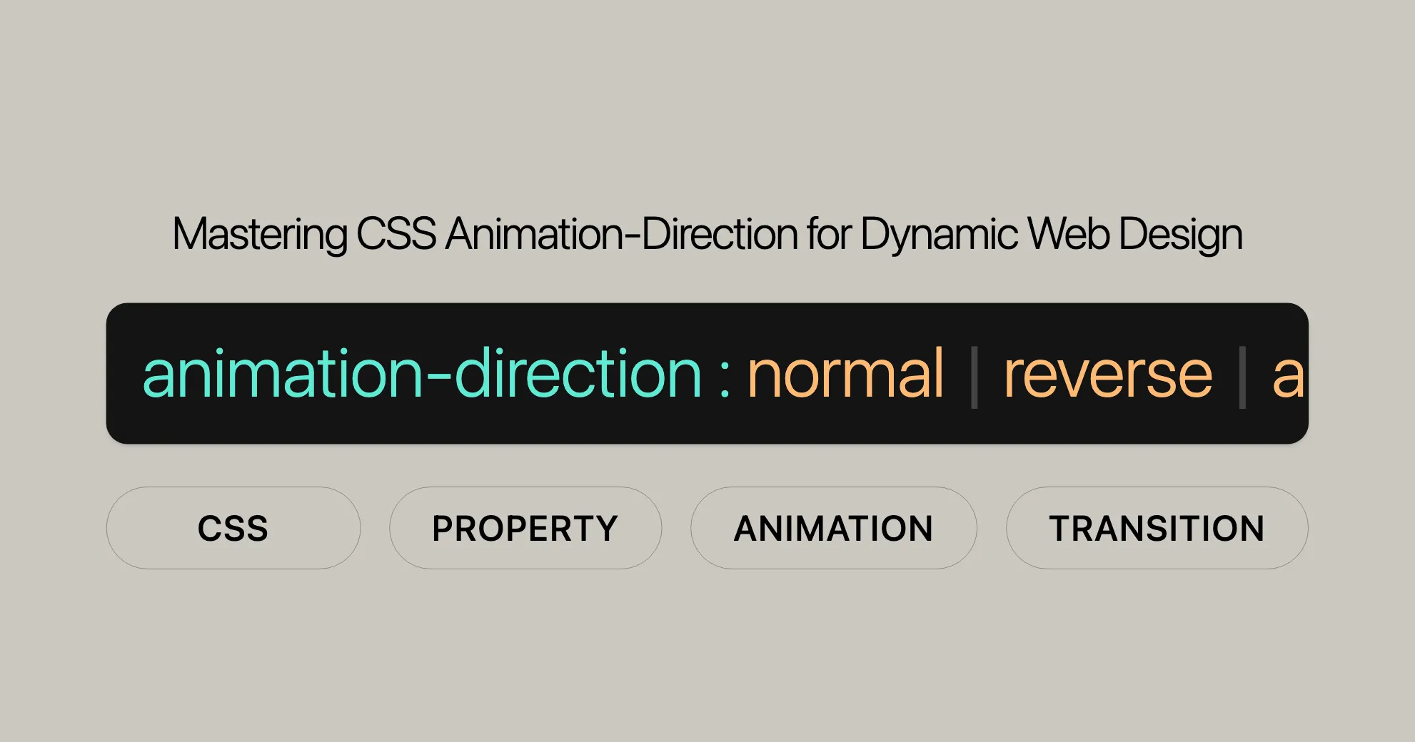
/* Single animation */animation-direction: normal;animation-direction: reverse;animation-direction: alternate;animation-direction: alternate-reverse;
/* Multiple animations */animation-direction: normal, reverse;animation-direction: alternate, reverse, normal;
/* Global values */animation-direction: inherit;animation-direction: initial;animation-direction: revert;animation-direction: revert-layer;animation-direction: unset;
Values
The animation-direction property has several values that control how animations play:
normal: The animation plays forward each cycle. This is the default behavior.reverse: The animation plays backward each cycle, starting from the end and moving to the beginning.alternate: The animation plays forward on the first cycle and backward on the next, alternating directions.alternate-reverse: The animation plays backward on the first cycle and forward on the next, alternating directions.
Global Values
In addition to the specific animation directions, the animation-direction property can take global CSS values:
inherit: Inherits theanimation-directionvalue from the parent element.initial: Sets theanimation-directionto its default value (normal).revert: Resets the property to the value defined by the user stylesheet.revert-layer: Resets the property to the value defined by the user stylesheet for the current cascade layer.unset: Resets the property to its natural value, which means it behaves as though the property is not set and is therefore not inherited.
Examples
Let’s look at some practical examples to see how animation-direction works.
Example: Normal Animation Direction
HTML:
<div class="box"></div>CSS:
.box {  background-color: rebeccapurple;  border-radius: 10px;  width: 100px;  height: 100px;}
.box:hover {  animation-name: rotate;  animation-duration: 0.7s;  animation-direction: normal;}
@keyframes rotate {  0% {    transform: rotate(0);  }  100% {    transform: rotate(360deg);  }}
Result: When you hover over the box, it will rotate 360 degrees in a forward direction.
Example: Reverse Animation Direction
HTML:
<div class="box"></div>CSS:
.box {  background-color: rebeccapurple;  border-radius: 10px;  width: 100px;  height: 100px;}
.box:hover {  animation-name: rotate;  animation-duration: 0.7s;  animation-direction: reverse;}
@keyframes rotate {  0% {    transform: rotate(0);  }  100% {    transform: rotate(360deg);  }}
Result: When you hover over the box, it will rotate 360 degrees in a reverse direction.
Example: Alternate Animation Direction
HTML:
<div class="box"></div>CSS:
.box {  background-color: rebeccapurple;  border-radius: 10px;  width: 100px;  height: 100px;}
.box:hover {  animation-name: rotate;  animation-duration: 0.7s;  animation-direction: alternate;}
@keyframes rotate {  0% {    transform: rotate(0);  }  100% {    transform: rotate(360deg);  }}
Result: When you hover over the box, it will rotate 360 degrees forward and then backward in an alternating manner.
Example: Alternate-Reverse Animation Direction
HTML:
<div class="box"></div>CSS:
.box {  background-color: rebeccapurple;  border-radius: 10px;  width: 100px;  height: 100px;}
.box:hover {  animation-name: rotate;  animation-duration: 0.7s;  animation-direction: alternate-reverse;}
@keyframes rotate {  0% {    transform: rotate(0);  }  100% {    transform: rotate(360deg);  }}
Result: When you hover over the box, it will rotate 360 degrees backward first and then forward in an alternating manner.
Browser Compatibility
To ensure your animations work across different browsers, it’s important to know the compatibility of the animation-direction property. Here’s a quick overview:
- Google Chrome: Supported since version 43.0 (May 2015).
- Microsoft Edge: Supported since version 12.0 (July 2015).
- Mozilla Firefox: Supported since version 16.0 (October 2012).
- Safari: Supported since version 9.0 (September 2015).
- Opera: Supported since version 30.0 (June 2015).
Ensuring Compatibility
To ensure your animations work across all major browsers, test your web pages on multiple browsers and versions. You can also use polyfills or fallbacks for older browsers that may not fully support the animation-direction property.
Specifications
The animation-direction property is defined in the CSS Animations Level 1 specification. This specification outlines how animations should be handled, including direction, duration, timing, and more.
Key Specifications
- CSS Animations Level 1: The primary specification that defines the
animation-directionproperty. It provides detailed information about how animations should be implemented.
Relevant Documents
- CSS Animations Level 1: CSS Animations Level 1 Specification
Importance of Specifications
Understanding the specifications for the animation-direction property is crucial for web developers. The specifications provide a clear guide on how the property should be implemented and how it interacts with other CSS properties. This ensures consistency and predictability in the behavior of animations across different web browsers.
Staying Updated
The CSS Animations Level 1 specification is regularly updated to reflect changes and improvements in web technologies. Staying informed about these updates is essential for leveraging the latest features and best practices in CSS animations.
By adhering to the specifications, you can create animations that are not only visually appealing but also reliable and consistent across different browsers and devices. This ensures a better user experience and enhances the overall quality of your web projects.
Using with Other Animation Properties
The animation-direction property is just one part of creating dynamic and engaging animations. To make the most of CSS animations, you often need to use animation-direction with other animation properties. Let’s see how to combine them to create complex and visually appealing animations.
Key Animation Properties
-
animation-name- Description: Specifies the name of the keyframes animation to apply.
- Usage: Combine with
animation-directionto define the animation and its direction.
.box {animation-name: rotate;animation-duration: 2s;animation-direction: alternate;}@keyframes rotate {0% { transform: rotate(0); }100% { transform: rotate(360deg); }} -
animation-duration- Description: Sets the duration for one cycle of the animation.
- Usage: Use with
animation-directionto control the speed and direction of the animation.
.box {animation-name: rotate;animation-duration: 2s;animation-direction: alternate;} -
animation-iteration-count- Description: Specifies the number of times the animation should play.
- Usage: Combine with
animation-directionto create looping animations with specific directions.
.box {animation-name: rotate;animation-duration: 2s;animation-direction: alternate;animation-iteration-count: 3;} -
animation-timing-function- Description: Defines the acceleration curve of the animation.
- Usage: Use with
animation-directionto control the easing of the animation.
.box {animation-name: rotate;animation-duration: 2s;animation-direction: alternate;animation-timing-function: ease-in-out;} -
animation-fill-mode- Description: Specifies how a CSS animation should apply styles to its target before and after it is executing.
- Usage: Combine with
animation-directionto control the state of the animation before and after its execution.
.box {animation-name: rotate;animation-duration: 2s;animation-direction: alternate;animation-fill-mode: forwards;} -
animation-delay- Description: Sets the delay before the animation starts.
- Usage: Use with
animation-directionto control the timing of the animation.
.box {animation-name: rotate;animation-duration: 2s;animation-direction: alternate;animation-delay: 1s;}
Combining Properties in Practice
Here’s an example that combines multiple animation properties to create a complex and engaging animation:
HTML:
<div class="box"></div>CSS:
.box {  background-color: rebeccapurple;  border-radius: 10px;  width: 100px;  height: 100px;  animation-name: rotate;  animation-duration: 2s;  animation-direction: alternate;  animation-iteration-count: infinite;  animation-timing-function: ease-in-out;  animation-fill-mode: forwards;  animation-delay: 1s;}
@keyframes rotate {  0% { transform: rotate(0); }  100% { transform: rotate(360deg); }}
Result: The box will start rotating after a 1-second delay, rotating 360 degrees forward and then backward in an alternating manner, with an easing function applied to the animation. The animation will loop infinitely.
Benefits of Combining Properties
- Enhanced Control: By combining multiple animation properties, you gain fine-grained control over the behavior and appearance of your animations.
- Visual Appeal: Creating complex animations with multiple properties can make your web pages more visually appealing and engaging.
- User Experience: Smooth and well-controlled animations can enhance the user experience by making interactions more intuitive and enjoyable.
By understanding how to use animation-direction in conjunction with other animation properties, you can create dynamic and engaging animations that elevate the visual appeal and interactivity of your web projects.
Formal Definition
Understanding the formal definition of the animation-direction property is essential for web developers who want to master CSS animations. This section provides detailed information about the property’s initial value, inheritance, computed value, and animation type.
Initial Value
- Initial Value:
normal- The default value for
animation-directionisnormal, which means the animation will play forward each cycle.
- The default value for
Applies To
- Applies To: All elements, including
::beforeand::afterpseudo-elements.
Inherited
- Inherited: No
- The
animation-directionproperty is not inherited from parent elements. Each element must have its ownanimation-directionspecified.
- The
Computed Value
- Computed Value: As specified
- The computed value of the
animation-directionproperty is the value specified in the CSS.
- The computed value of the
Animation Type
- Animation Type: Not animatable
- The
animation-directionproperty itself is not animatable, meaning you cannot animate the transition between differentanimation-directionvalues.
- The
Formal Syntax
animation-direction =  <single-animation-direction>[#](/en-US/docs/Web/CSS/Value_definition_syntax#hash_mark "Hash mark: the entity is repeated one or several times, each occurrence separated by a comma")
<single-animation-direction> =  normal             [|](/en-US/docs/Web/CSS/Value_definition_syntax#single_bar "Single bar: exactly one of the entities must be present")  reverse            [|](/en-US/docs/Web/CSS/Value_definition_syntax#single_bar "Single bar: exactly one of the entities must be present")  alternate          [|](/en-US/docs/Web/CSS/Value_definition_syntax#single_bar "Single bar: exactly one of the entities must be present")  alternate-reverse
Summary
The animation-direction property is a powerful tool in CSS animations, allowing you to control the direction in which animations play. By understanding its formal definition, initial value, inheritance, computed value, and animation type, you can effectively utilize this property to create dynamic and engaging animations.
Specifications
The animation-direction property is defined in the CSS Animations Level 1 specification, which outlines the standards and behaviors for CSS animations. This specification is maintained by the CSS Working Group and is part of the broader CSS standard.
Importance of Specifications
Understanding the specifications for the animation-direction property is crucial for web developers and designers. The specifications provide a clear and detailed guide on how the property should be implemented and how it interacts with other CSS properties. This ensures consistency and predictability in the behavior of animations across different web browsers.
Staying Updated
The CSS Animations Level 1 specification is regularly updated to reflect changes and improvements in web technologies. Staying informed about these updates is essential for web developers and designers who want to leverage the latest features and best practices in CSS animations.
By adhering to the specifications, you can create animations that are not only visually appealing but also reliable and consistent across different browsers and devices. This ensures a better user experience and enhances the overall quality of your web projects.
 Latest Blogs
  สร้างเว็บไซต์ 1 เว็บ ต้องใช้งบเท่าไหร่? เจาะลึกทุกองค์ประกอบ website development cost อยากสร้างเว็บไซต์แต่ไม่มั่นใจในเรื่องของงบประมาณ อ่านสรุปเจาะลึกตั้งแต่ดีไซน์, ฟังก์ชัน และการดูแล พร้อมตัวอย่างงบจริงจาก Till it’s done ที่แผนชัด งบไม่บานปลายแน่นอน
  Next.js สอน 14 ขั้นตอนเบื้องต้น: สร้างโปรเจกต์แรกใน 30 นาที เริ่มต้นกับ Next.js ใน 14 ขั้นตอนเพียงแค่ 30 นาที พร้อม SSR/SSG และ API Routes ด้วยตัวอย่างโค้ดง่าย ๆ อ่านต่อเพื่อสร้างโปรเจ็กต์แรกได้ทันทีที่นี่
  วิธีสมัคร Apple Developer Account เพื่อนำแอปขึ้น App Store ทีละขั้นตอน อยากปล่อยแอปบน App Store ระดับโลก มาอ่านคู่มือสมัคร Apple Developer Account พร้อมเคล็ดลับ TestFlight และวิธีอัปโหลดที่ง่ายในบทความเดียวนี้ได้เลย
  TypeScript Interface คืออะไร? อธิบายพร้อมวิธีใช้และข้อแตกต่างจาก Type เรียนรู้วิธีใช้ TypeScript Interface เพื่อสร้างโครงสร้างข้อมูลที่ปลอดภัยและเข้าใจง่าย พร้อมเปรียบเทียบข้อดีข้อแตกต่างกับ Type ที่คุณต้องรู้ ถูกรวมเอาไว้ในบทความนี้แล้ว
  Material-UI (MUI) คืออะไร อยากสร้าง UI สวยงามและเป็นมืออาชีพในเวลาอันรวดเร็วใช่ไหม มาทำความรู้จักกับ Material-UI (MUI) ที่ช่วยให้คุณพัฒนาแอปพลิเคชันบน React ได้ง่ายและดูดีในทุกอุปกรณ์
  เปรียบเทียบ 3 วิธีติดตั้ง install node js บน Ubuntu: NVM vs NodeSource vs Official Repo แบบไหนดีที่สุด? เรียนรู้วิธีติดตั้ง Node.js บน Ubuntu ด้วย NVM, NodeSource หรือ Official Repo เลือกวิธีที่เหมาะกับความต้องการของคุณ พร้อมเปรียบเทียบ เพื่อการพัฒนาที่มีประสิทธิภาพ!
 Talk with CEO
Explore our best articles, cover a wide variety of technologies 
 ReactJs
  Flutter
  Nodejs
  Nextjs
  TailwindCSS
  Typescript Golang AstroJs Jest Website development th Mobile application th Reactjs th Nextjs th Flutter th Software house th Nodejs th Typescript th
  CSS
CSS We'll be right here with you every step of the way.
We'll be here, prepared to commence this promising collaboration.


Whether you're curious about features, warranties, or shopping policies, we provide comprehensive answers to assist you.