
- Services
- Case Studies
- Technologies
- NextJs development
- Flutter development
- NodeJs development
- ReactJs development
- About
- Contact
- Tools
- Blogs
- FAQ
 Scroll to discover
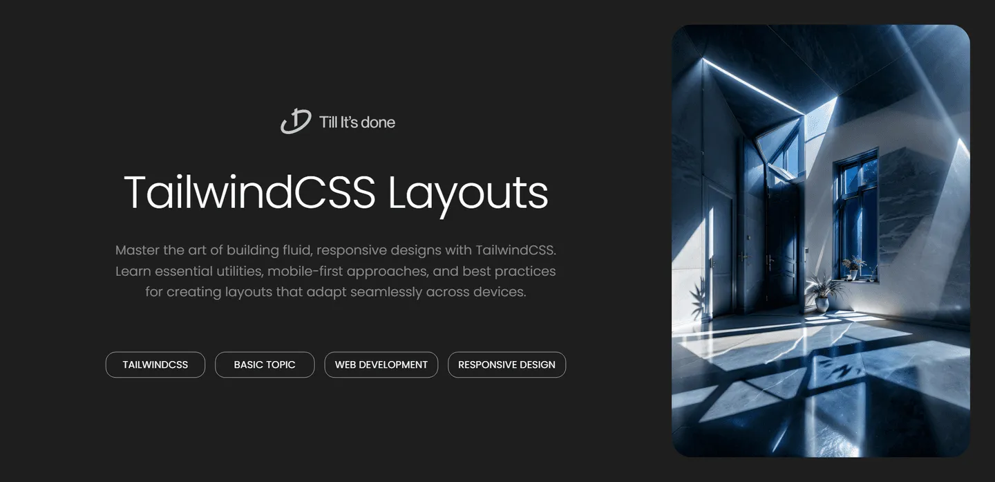
 Creating Responsive Layouts with TailwindCSS
Learn essential utilities, mobile-first approaches, and best practices for creating layouts that adapt seamlessly across devices.
Creating Responsive Layouts with TailwindCSS

Creating responsive layouts that look great on all devices can be challenging, but TailwindCSS makes this process incredibly straightforward and intuitive. Let’s explore how to build fluid, responsive designs that adapt seamlessly across different screen sizes.
Understanding Tailwind’s Responsive Design Philosophy
At its core, Tailwind embraces a mobile-first approach to responsive design. This means we start by designing for mobile devices and progressively enhance the layout for larger screens. Instead of writing complex media queries, Tailwind provides simple prefixes like sm:, md:, lg:, and xl: that make responsive design feel natural and effortless.

Essential Responsive Utilities
The bread and butter of responsive design in Tailwind comes down to a few key concepts:
Responsive Container
The container class in Tailwind is your best friend for creating responsive layouts. It automatically centers your content and adjusts the max-width based on the current breakpoint. Combined with padding utilities, it ensures your content always looks polished:
<div class="container mx-auto px-4"> <!-- Your content here --></div>Flexible Grids
Tailwind’s grid system shines when creating responsive layouts. You can easily switch between different column layouts based on screen size:
<div class="grid grid-cols-1 md:grid-cols-2 lg:grid-cols-3 gap-4"> <!-- Grid items --></div>
Advanced Responsive Patterns
Responsive Navigation
One of the most common responsive patterns is the mobile navigation menu. Tailwind makes it simple to create a navigation that transforms from a hamburger menu on mobile to a horizontal menu on desktop:
<nav class="hidden md:flex"> <!-- Desktop navigation --></nav><nav class="md:hidden"> <!-- Mobile navigation --></nav>Responsive Typography
Typography that looks good across all devices is crucial. Tailwind’s responsive modifiers allow you to adjust font sizes seamlessly:
<h1 class="text-2xl md:text-3xl lg:text-4xl"> Responsive Heading</h1>Best Practices and Tips
- Always start with mobile designs first
- Use responsive padding and margin utilities to maintain proper spacing
- Leverage Tailwind’s breakpoint preview feature in your browser’s dev tools
- Keep your responsive modifications consistent throughout your project

Remember, responsive design isn’t just about making things fit—it’s about creating experiences that feel natural and intuitive across all devices. With Tailwind’s responsive utilities, you have all the tools you need to create beautiful, adaptable layouts that work everywhere.
 Latest Blogs
  สร้างเว็บไซต์ 1 เว็บ ต้องใช้งบเท่าไหร่? เจาะลึกทุกองค์ประกอบ website development cost อยากสร้างเว็บไซต์แต่ไม่มั่นใจในเรื่องของงบประมาณ อ่านสรุปเจาะลึกตั้งแต่ดีไซน์, ฟังก์ชัน และการดูแล พร้อมตัวอย่างงบจริงจาก Till it’s done ที่แผนชัด งบไม่บานปลายแน่นอน
  Next.js สอน 14 ขั้นตอนเบื้องต้น: สร้างโปรเจกต์แรกใน 30 นาที เริ่มต้นกับ Next.js ใน 14 ขั้นตอนเพียงแค่ 30 นาที พร้อม SSR/SSG และ API Routes ด้วยตัวอย่างโค้ดง่าย ๆ อ่านต่อเพื่อสร้างโปรเจ็กต์แรกได้ทันทีที่นี่
  วิธีสมัคร Apple Developer Account เพื่อนำแอปขึ้น App Store ทีละขั้นตอน อยากปล่อยแอปบน App Store ระดับโลก มาอ่านคู่มือสมัคร Apple Developer Account พร้อมเคล็ดลับ TestFlight และวิธีอัปโหลดที่ง่ายในบทความเดียวนี้ได้เลย
  TypeScript Interface คืออะไร? อธิบายพร้อมวิธีใช้และข้อแตกต่างจาก Type เรียนรู้วิธีใช้ TypeScript Interface เพื่อสร้างโครงสร้างข้อมูลที่ปลอดภัยและเข้าใจง่าย พร้อมเปรียบเทียบข้อดีข้อแตกต่างกับ Type ที่คุณต้องรู้ ถูกรวมเอาไว้ในบทความนี้แล้ว
  Material-UI (MUI) คืออะไร อยากสร้าง UI สวยงามและเป็นมืออาชีพในเวลาอันรวดเร็วใช่ไหม มาทำความรู้จักกับ Material-UI (MUI) ที่ช่วยให้คุณพัฒนาแอปพลิเคชันบน React ได้ง่ายและดูดีในทุกอุปกรณ์
  เปรียบเทียบ 3 วิธีติดตั้ง install node js บน Ubuntu: NVM vs NodeSource vs Official Repo แบบไหนดีที่สุด? เรียนรู้วิธีติดตั้ง Node.js บน Ubuntu ด้วย NVM, NodeSource หรือ Official Repo เลือกวิธีที่เหมาะกับความต้องการของคุณ พร้อมเปรียบเทียบ เพื่อการพัฒนาที่มีประสิทธิภาพ!
 พูดคุยกับซีอีโอ
Explore our best articles, cover a wide variety of technologies 
 ReactJs
  Flutter
  Nodejs
  Nextjs
  TailwindCSS
  Typescript Golang AstroJs Jest Website development th Mobile application th Reactjs th Nextjs th Flutter th Software house th Nodejs th Typescript th
  CSS
CSS We'll be right here with you every step of the way.
We'll be here, prepared to commence this promising collaboration.


Whether you're curious about features, warranties, or shopping policies, we provide comprehensive answers to assist you.