
- Services
- Case Studies
- Technologies
- NextJs development
- Flutter development
- NodeJs development
- ReactJs development
- About
- Contact
- Tools
- Blogs
- FAQ
 Scroll to discover
 CSS Right Positioning Elements Horizontally
Explore available options like lengths, percentages, and auto for precise layouts.
Introduction
The right CSS property is used to set the horizontal position of elements that are positioned using CSS. This property specifically affects elements that have their position set to values such as absolute, relative, fixed, or sticky. It has no effect on elements that are not positioned.
Understanding how to use the right property is crucial for web developers and designers who want to create precise and dynamic layouts. This property allows you to control the horizontal placement of elements relative to their containing block or the viewport, depending on the type of positioning used.
Whether you are adjusting the position of a navigation bar, aligning images, or creating complex layouts, the right property provides the flexibility needed to achieve your design goals. This article will explore the syntax, values, and practical examples of using the right property in CSS to help you master this essential aspect of web development.
Syntax
The syntax for the right property in CSS is straightforward and can be specified using various values. Here’s a breakdown of how you can define the right property:
/* <length> values */right: 3px;right: 2.4em;right: calc(anchor(left) + 10px);right: anchor(--myAnchor 50%);
/* <percentage> values of the width of the containing block */right: 10%;
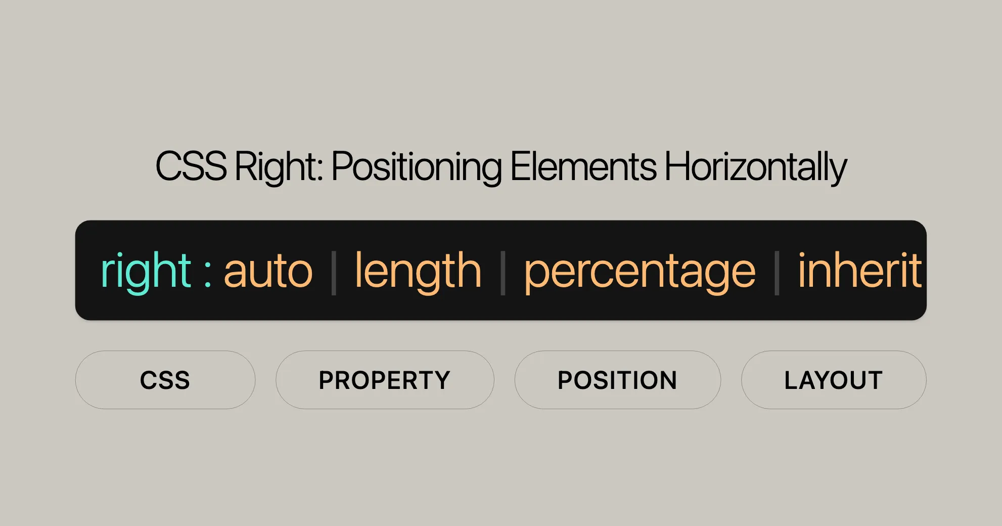
/* Keyword value */right: auto;
/* Global values */right: inherit;right: initial;right: revert;right: revert-layer;right: unset;Explanation of Syntax
- <length> values: These values can be positive, negative, or calculated using the
calc()function. For absolutely positioned elements, this represents the distance to the right edge of the containing block. For relatively positioned elements, it moves the element to the left from its normal position. - <percentage> values: These values are relative to the width of the containing block.
- Keyword value (auto): This value adjusts the position based on other properties like
leftor the element’s content. - Global values (inherit, initial, revert, revert-layer, unset): These values allow you to inherit from the parent, reset to the initial value, or revert to a previous value set in the CSS cascade.
Values
The right CSS property can take several types of values, each serving a specific purpose in determining the horizontal position of an element. Understanding these values is essential for web developers and designers to achieve precise layouts. Here are the different types of values you can use with the right property:
<length>
A <length> value can be positive, negative, or zero. It represents:
- For absolutely positioned elements, the distance to the right edge of the containing block.
- For anchor-positioned elements, the distance relative to the position of the associated anchor element’s edge.
- For relatively positioned elements, the distance the element is moved to the left from its normal position.
right: 3px;right: 2.4em;right: calc(anchor(left) + 10px);right: anchor(--myAnchor 50%);<percentage>
A <percentage> value is relative to the width of the containing block.
right: 10%;auto
The auto keyword specifies:
- For absolutely positioned elements, the position is based on the
leftproperty, withwidth: autotreated as a width based on the content. Ifleftis alsoauto, the element is positioned as if it were static. - For relatively positioned elements, the distance from its normal position is based on the
leftproperty. Ifleftis alsoauto, the element is not moved horizontally.
right: auto;inherit
The inherit keyword specifies that the value is the same as the computed value from its parent element. This value is then handled as if it were a <length>, <percentage>, or the auto keyword.
right: inherit;initial
The initial keyword sets the property to its default value, which is auto.
right: initial;revert
The revert keyword reverts the property to its default value as defined by the browser.
right: revert;revert-layer
The revert-layer keyword reverts the property to the value specified in the previous layer of the CSS cascade.
right: revert-layer;unset
The unset keyword acts as inherit if the property is inherited; otherwise, it acts as initial.
right: unset;Description
The right CSS property is used to specify the horizontal position of elements that are positioned using CSS. How the right property affects an element depends on the value of the element’s position property. Here’s a detailed breakdown of its behavior:
Absolute and Fixed Positioning
When the position of an element is set to absolute or fixed, the right property defines the distance between the element’s outer right edge and the inner right edge of its containing block. If the element has an associated anchor element and the property value includes an anchor() function, the right property positions the element relative to the specified anchor edge.
Example:
#element { position: absolute; right: 20px;}In this example, the element will be positioned 20 pixels from the right edge of its containing block.
Relative Positioning
When the position is set to relative, the right property specifies the distance the element’s right edge is moved to the left from its normal position. This means the element is shifted leftward by the specified amount.
Example:
#element { position: relative; right: 20px;}In this example, the element will be moved 20 pixels to the left from its normal position.
Sticky Positioning
When the position is set to sticky, the right property is used to compute the sticky-constraint rectangle. This determines the positioning of the element when it becomes “sticky” relative to its scrolling container.
Example:
#element { position: sticky; right: 20px;}In this example, the element will be positioned 20 pixels from the right edge of its scrolling container when it becomes sticky.
Static Positioning
When the position is set to static, the right property has no effect. Elements with static positioning are laid out in their normal flow, and the right property does not influence their position.
Constraints and Precedence
When both left and right properties are defined, the element will stretch to satisfy both, unless other constraints (such as a specified width) prevent it from doing so. If the element cannot stretch to meet both properties, the position is considered over-constrained. In such cases, the precedence is based on the container’s writing direction:
- If the container’s direction is left-to-right, the
leftvalue takes precedence. - If the container’s direction is right-to-left, the
rightvalue takes precedence.
Example:
#element { position: absolute; left: 0; right: 0;}In this example, the element will stretch to fill the entire width of its containing block, as both left and right are set to 0.
Formal Definition
The right CSS property is formally defined within the CSS Positioned Layout Module. This property is used to specify the horizontal position of an element relative to its containing block or other reference points, depending on the type of positioning applied to the element. The formal definition includes key attributes that describe the property’s behavior and default values.
Initial Value
The initial value for the right property is auto. This means that, by default, the browser will calculate the element’s positioning based on other CSS properties or the element’s content.
Applies To
The right property applies only to positioned elements. These are elements with a position value of absolute, relative, fixed, or sticky.
Inherited
The right property is not inherited from parent elements. Each element must have its own right property defined explicitly.
Percentages
When percentage values are used with the right property, they are calculated relative to the width of the containing block. This allows for responsive design adjustments based on the size of the parent element.
Computed Value
The computed value of the right property depends on how it is specified:
- If specified as a length, the computed value is the corresponding absolute length.
- If specified as a percentage, the computed value is the specified percentage.
- If specified as
auto, the computed value isauto.
Animation Type
The right property can be animated using CSS animations. The animation type can be a length, percentage, or a result of a calc() function. This allows for smooth transitions and animations of the horizontal position of elements.
Formal Syntax
The formal syntax for the right property is as follows:
right = auto | <length-percentage> | <anchor()> | <anchor-size()>
<length-percentage> = <length> | <percentage>
<anchor()> = anchor(<anchor-element>?, <anchor-side>, <length-percentage>? )
<anchor-size()> = anchor-size( [<anchor-element> || <anchor-size>]?, <length-percentage>? )
<anchor-element> = <dashed-ident>
<anchor-side> = inside | outside | top | left | right | bottom | start | end | self-start | self-end | <percentage> | center
<anchor-size> = width | height | block | inline | self-block | self-inline
Explanation of Formal Syntax
- auto: The browser calculates the position based on other properties or the content of the element. It is the default value for the
rightproperty. - <length-percentage>: This represents a length or percentage value. Length values can be specified in units like
px,em, orrem, while percentage values are relative to the width of the containing block.right: 10px;right: 50%; - <anchor()>: This function specifies the position relative to an anchor element. It includes parameters for the anchor element, the side of the anchor to use, and an optional length or percentage.
right: anchor(left, 10px);right: anchor(top, 20%);
- <anchor-size()>: This function specifies the size of the anchor element. It includes parameters for the anchor element, the dimension of the anchor to use, and an optional length or percentage.
right: anchor-size(width, 50%);right: anchor-size(height, 10px);
- <anchor-element>: This identifies the anchor element using a dashed identifier. It is used within the
anchor()andanchor-size()functions.right: anchor(--myAnchor, left, 10px); - <anchor-side>: This specifies the side of the anchor element to use for positioning. It can take values like
inside,outside,top,left,right,bottom,start,end,self-start,self-end,<percentage>, orcenter.right: anchor(top, 20%);right: anchor(center, 10px); - <anchor-size>: This specifies the dimension of the anchor element to use for positioning. It can take values like
width,height,block,inline,self-block, orself-inline.right: anchor-size(width, 50%);right: anchor-size(height, 10px);
Examples of Using the right Property
Using the right property in CSS can help you create a variety of layouts. Below are some practical examples that demonstrate its use in different scenarios.
Absolute and Relative Positioning Using right
HTML:
<div id="relative">Relatively positioned</div><div id="absolute">Absolutely positioned</div>CSS:
#relative {  width: 100px;  height: 100px;  background-color: #ffc7e4;  position: relative;  top: 20px;  left: 20px;}
#absolute {  width: 100px;  height: 100px;  background-color: #ffd7c2;  position: absolute;  bottom: 10px;  right: 20px;}
Result:
The relative div is positioned relative to its normal position, while the absolute div is positioned absolutely within its containing block. The right property specifies the distance from the right edge of the containing block for the absolutely positioned element.
Declaring Both left and right
When both left and right properties are declared, the element will stretch to meet both, unless other constraints prevent it from doing so. If the element cannot stretch or shrink to meet both, the position is considered over-constrained. The precedence is based on the container’s writing direction.
HTML:
<div id="parent"> Parent <div id="noWidth">No width</div> <div id="width">width: 100px</div></div>CSS:
div { outline: 1px solid #cccccc;}#parent { width: 200px; height: 200px; background-color: #ffc7e4; position: relative;}/* declare both a left and a right */#width,#noWidth { background-color: #c2ffd7; position: absolute; left: 0; right: 0;}/* declare a width */#width { width: 100px; top: 60px;}Result:
The noWidth div will stretch to fill the entire width of the parent div because both left and right are set to 0. The width div, however, will not stretch because it has a fixed width of 100px. In this case, the left value takes precedence, and the element is positioned from the left edge of the parent div.
Using right with Percentage Values
Percentage values for the right property are relative to the width of the containing block. This can be useful for creating responsive designs that adapt to different screen sizes.
HTML:
<div id="container"> <div id="child">Percentage positioned</div></div>CSS:
#container {  width: 300px;  height: 200px;  background-color: #ffc7e4;  position: relative;}
#child {  width: 50px;  height: 50px;  background-color: #ffd7c2;  position: absolute;  right: 10%;  top: 50%;}
Result:
The child div is positioned 10% from the right edge of the container div. The top property is also used to center the child vertically within the container.
Specifications
The right CSS property is defined within the CSS Positioned Layout Module Level 3. This specification outlines the behavior and usage of the right property, ensuring consistency and compatibility across different browsers and platforms.
Browser Compatibility
The right CSS property is widely supported across various web browsers, ensuring that web developers can consistently use this property to create dynamic and responsive layouts.
Overview of Browser Support
- Google Chrome: Supported in all versions.
- Mozilla Firefox: Supported in all versions.
- Microsoft Edge: Supported in all versions, including legacy Edge and the Chromium-based Edge.
- Internet Explorer: Supported in Internet Explorer 5.5 and later versions.
- Safari: Supported in all versions.
- Opera: Supported in all versions.
Detailed Browser Compatibility
| Browser | Version | Release Date |
|---|---|---|
| Google Chrome | 1.0 | Dec 2008 |
| Mozilla Firefox | 1.0 | Nov 2004 |
| Microsoft Edge (Legacy) | 12 | Jul 2015 |
| Microsoft Edge (Chromium) | 79 | Jan 2020 |
| Internet Explorer | 5.5 | Jul 2000 |
| Safari | 1.0 | Jun 2003 |
| Opera | 5.0 | Dec 2000 |
Notes on Compatibility
- Legacy Browsers: While the
rightproperty is supported in older versions of browsers like Internet Explorer, it’s always a good practice to test your layouts in modern browsers to ensure the best user experience. - Vendor Prefixes: In some cases, vendor prefixes may be required for older versions of browsers. However, for the
rightproperty, vendor prefixes are generally not needed. - Responsive Design: Ensuring that your layouts are responsive and adapt to different screen sizes is crucial. The
rightproperty, when used with percentage values, can help create responsive designs that work well across various devices.
Testing for Compatibility
To ensure that your web designs are compatible with different browsers, it is recommended to:
- Use Cross-Browser Testing Tools: Tools like BrowserStack, Sauce Labs, and CrossBrowserTesting can help you test your website across multiple browsers and devices.
- Check Browser Compatibility Tables: Websites like Can I Use provide detailed compatibility tables that show which browsers support specific CSS properties.
- Use Modernizr: Modernizr is a JavaScript library that detects HTML5 and CSS3 features in the user’s browser, allowing you to conditionally load resources and ensure compatibility.
Best Practices
- Graceful Degradation: Design your layouts to degrade gracefully in older browsers that may not fully support the
rightproperty. - Progressive Enhancement: Use progressive enhancement techniques to ensure that your web designs work on a basic level in all browsers, with additional features and enhancements for more capable browsers.
- Fallbacks: Provide fallbacks for older browsers to ensure that your layouts remain functional and visually appealing.
See Also
If you’re interested in learning more about CSS properties related to positioning and layout, you might find the following resources and properties helpful:
Related CSS Properties
- [
left]WebsiteUrl: This property is similar torightbut specifies the distance from the left edge of the containing block. - [
top]WebsiteUrl: Specifies the vertical position of a positioned element, setting the distance from the top edge of the containing block. - [
bottom]WebsiteUrl: Specifies the vertical position of a positioned element, setting the distance from the bottom edge of the containing block. - [
inset]WebsiteUrl: A shorthand property that sets all four inset properties (top,right,bottom, andleft) at once. - [
inset-block-start]WebsiteUrl: Sets the position of the block start edge of a positioned element. - [
inset-block-end]WebsiteUrl: Sets the position of the block end edge of a positioned element. - [
inset-inline-start]WebsiteUrl: Sets the position of the inline start edge of a positioned element. - [
inset-inline-end]WebsiteUrl: Sets the position of the inline end edge of a positioned element. - [
inset-block]WebsiteUrl: A shorthand property for setting bothinset-block-startandinset-block-end. - [
inset-inline]WebsiteUrl: A shorthand property for setting bothinset-inline-startandinset-inline-end.
Useful CSS Concepts
- [CSS Positioned Layout Module Level 3]WebsiteUrl: This specification outlines the behavior and usage of the
rightproperty and other related properties. - [CSS Positioning]WebsiteUrl: Learn more about the
positionproperty, which works in conjunction withrightand other inset properties to control the positioning of elements. - [CSS Anchor Positioning]WebsiteUrl: Understand how the
anchor()function can be used with therightproperty to position elements relative to specific reference points.
Useful Resources for CSS Positioning
- MDN Web Docs on CSS Positioning: A thorough guide to mastering CSS positioning properties.
- Can I Use: Check browser compatibility for CSS properties to ensure your code works everywhere.
- CSS Tricks: A fantastic resource with tutorials, tips, and articles on CSS and web development.
Additional Tools
- BrowserStack: Test your website across multiple browsers and devices seamlessly.
- Sauce Labs: Another great tool for cross-browser testing to ensure your site works flawlessly.
- Modernizr: A JavaScript library that detects HTML5 and CSS3 features in browsers, helping you load resources conditionally.
By exploring these resources and tools, you can become more skilled in CSS positioning and layout. This will help you create advanced, responsive web designs that offer a great user experience and work perfectly across different browsers and devices.
 Latest Blogs
  สร้างเว็บไซต์ 1 เว็บ ต้องใช้งบเท่าไหร่? เจาะลึกทุกองค์ประกอบ website development cost อยากสร้างเว็บไซต์แต่ไม่มั่นใจในเรื่องของงบประมาณ อ่านสรุปเจาะลึกตั้งแต่ดีไซน์, ฟังก์ชัน และการดูแล พร้อมตัวอย่างงบจริงจาก Till it’s done ที่แผนชัด งบไม่บานปลายแน่นอน
  Next.js สอน 14 ขั้นตอนเบื้องต้น: สร้างโปรเจกต์แรกใน 30 นาที เริ่มต้นกับ Next.js ใน 14 ขั้นตอนเพียงแค่ 30 นาที พร้อม SSR/SSG และ API Routes ด้วยตัวอย่างโค้ดง่าย ๆ อ่านต่อเพื่อสร้างโปรเจ็กต์แรกได้ทันทีที่นี่
  วิธีสมัคร Apple Developer Account เพื่อนำแอปขึ้น App Store ทีละขั้นตอน อยากปล่อยแอปบน App Store ระดับโลก มาอ่านคู่มือสมัคร Apple Developer Account พร้อมเคล็ดลับ TestFlight และวิธีอัปโหลดที่ง่ายในบทความเดียวนี้ได้เลย
  TypeScript Interface คืออะไร? อธิบายพร้อมวิธีใช้และข้อแตกต่างจาก Type เรียนรู้วิธีใช้ TypeScript Interface เพื่อสร้างโครงสร้างข้อมูลที่ปลอดภัยและเข้าใจง่าย พร้อมเปรียบเทียบข้อดีข้อแตกต่างกับ Type ที่คุณต้องรู้ ถูกรวมเอาไว้ในบทความนี้แล้ว
  Material-UI (MUI) คืออะไร อยากสร้าง UI สวยงามและเป็นมืออาชีพในเวลาอันรวดเร็วใช่ไหม มาทำความรู้จักกับ Material-UI (MUI) ที่ช่วยให้คุณพัฒนาแอปพลิเคชันบน React ได้ง่ายและดูดีในทุกอุปกรณ์
  เปรียบเทียบ 3 วิธีติดตั้ง install node js บน Ubuntu: NVM vs NodeSource vs Official Repo แบบไหนดีที่สุด? เรียนรู้วิธีติดตั้ง Node.js บน Ubuntu ด้วย NVM, NodeSource หรือ Official Repo เลือกวิธีที่เหมาะกับความต้องการของคุณ พร้อมเปรียบเทียบ เพื่อการพัฒนาที่มีประสิทธิภาพ!
 พูดคุยกับซีอีโอ
Explore our best articles, cover a wide variety of technologies 
 ReactJs
  Flutter
  Nodejs
  Nextjs
  TailwindCSS
  Typescript Golang AstroJs Jest Website development th Mobile application th Reactjs th Nextjs th Flutter th Software house th Nodejs th Typescript th
  CSS
CSS We'll be right here with you every step of the way.
We'll be here, prepared to commence this promising collaboration.


Whether you're curious about features, warranties, or shopping policies, we provide comprehensive answers to assist you.