
- Services
- Case Studies
- Technologies
- NextJs development
- Flutter development
- NodeJs development
- ReactJs development
- About
- Contact
- Tools
- Blogs
- FAQ
 Scroll to discover
 CSS Position A Comprehensive Guide for Web Developers
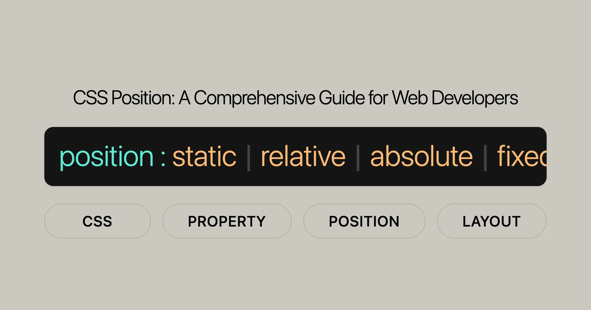
Explore the different options available, such as static, relative, absolute, fixed, and sticky positioning.
Introduction
The position property in CSS is crucial for controlling where an element sits on your web page. It works with properties like top, right, bottom, and left to determine the final spot for an element. Understanding this property is key for web developers because it helps create dynamic and visually appealing layouts.
Values
The position property in CSS can take several values, each affecting how an element is positioned within the document. Here are the main values you can use:
static:- The default value. The element follows the normal document flow.
- The
top,right,bottom,left, andz-indexproperties have no effect.
relative:- The element follows the normal document flow but can be offset using
top,right,bottom, andleft. - The offset does not affect the position of other elements.
- The element follows the normal document flow but can be offset using
absolute:- The element is removed from the normal document flow, and no space is created for it in the layout.
- It is positioned relative to its closest positioned ancestor (if any) or to the initial containing block.
- The
top,right,bottom, andleftproperties determine its final position.
fixed:- The element is removed from the normal document flow, and no space is created for it in the layout.
- It is positioned relative to the viewport, staying in the same position on the screen even when the page is scrolled.
- The
top,right,bottom, andleftproperties determine its final position.
sticky:- The element follows the normal document flow but can be offset relative to its nearest scrolling ancestor and containing block.
- The offset does not affect the position of other elements.
- This value creates a new stacking context.
- Note: At least one inset property (
top,right,bottom,left) needs to be set to a non-autovalue for the axis on which the element needs to be made sticky.
inherit:- The element inherits the
positionvalue from its parent element.
- The element inherits the
initial:- Sets the
positionvalue to its default value, which isstatic.
- Sets the
revert:- Reverts the
positionvalue to the browser’s default stylesheet value.
- Reverts the
revert-layer:- Reverts the
positionvalue to the value established by the user-agent stylesheet.
- Reverts the
unset:- Resets the
positionvalue to its inherited value if it inherits, or to its initial value if it does not.
- Resets the
Description
The position property in CSS is fundamental for controlling the layout and positioning of elements on a web page. It allows you to specify how an element should be placed within its containing block, relative to other elements, or even fixed to the viewport. Here’s a breakdown of the types of positioning you can achieve with the position property:
Types of Positioning
- Positioned Element:
- A positioned element is one whose computed
positionvalue isrelative,absolute,fixed, orsticky. - This type of element can be precisely placed using the
top,right,bottom, andleftproperties.
- A positioned element is one whose computed
- Relatively Positioned Element:
- A relatively positioned element has a computed
positionvalue ofrelative. - It is positioned according to the normal flow of the document but can be offset using the
top,right,bottom, andleftproperties. - The space that the element would normally occupy is preserved, and the offset does not affect the position of other elements.
- A relatively positioned element has a computed
- Absolutely Positioned Element:
- An absolutely positioned element has a computed
positionvalue ofabsoluteorfixed. - It is removed from the normal document flow, meaning no space is created for it in the layout.
- The element is positioned relative to its closest positioned ancestor (if any) or to the initial containing block.
- The
top,right,bottom, andleftproperties specify offsets from the edges of the element’s containing block. - The element establishes a new block formatting context (BFC) for its contents.
- An absolutely positioned element has a computed
- Stickily Positioned Element:
- A stickily positioned element has a computed
positionvalue ofsticky. - It is positioned according to the normal flow of the document but can be offset relative to its nearest scrolling ancestor and containing block.
- The offset does not affect the position of other elements.
- The element behaves as relatively positioned until it crosses a specified threshold, at which point it becomes “stuck” until meeting the opposite edge of its containing block.
- A stickily positioned element has a computed
Most of the time, absolutely positioned elements with height and width set to auto are sized to fit their contents. However, non-replaced, absolutely positioned elements can be made to fill the available vertical space by specifying both top and bottom and leaving height unspecified (i.e., auto). They can likewise be made to fill the available horizontal space by specifying both left and right and leaving width as auto.
Conflict Resolution:
- If both
topandbottomare specified (technically, notauto),topwins. - If both
leftandrightare specified,leftwins when thedirectionisltr(English, horizontal Japanese, etc.), andrightwins when thedirectionisrtl(Persian, Arabic, Hebrew, etc.).
Examples
Relative Positioning
Relatively positioned elements are offset a given amount from their normal position within the document, but without the offset affecting other elements. In the example below, note how the other elements are placed as if “Two” were taking up the space of its normal location.
HTML
<div class="box" id="one">One</div><div class="box" id="two">Two</div><div class="box" id="three">Three</div><div class="box" id="four">Four</div>CSS
* {  box-sizing: border-box;}
.box {  display: inline-block;  width: 100px;  height: 100px;  background: red;  color: white;}
#two {  position: relative;  top: 20px;  left: 20px;  background: blue;}
Absolute Positioning
Elements that are relatively positioned remain in the normal flow of the document. In contrast, an element that is absolutely positioned is taken out of the flow; thus, other elements are positioned as if it did not exist. The absolutely positioned element is positioned relative to its nearest positioned ancestor (i.e., the nearest ancestor that is not static). If a positioned ancestor doesn’t exist, it is positioned relative to the initial containing block (ICB), which is the containing block of the document’s root element.
HTML
<h1>Absolute positioning</h1>
<p>  I am a basic block-level element. My adjacent block-level elements sit on new  lines below me.</p>
<p class="positioned">  By default, we span 100% of the width of our parent element, and we are as tall  as our child content. Our total width and height are our content + padding +  border width/height.</p>
<p>  We are separated by our margins. Because of margin collapsing, we are  separated by the width of one of our margins, not both.</p>
<p>  Inline elements <span>like this one</span> and <span>this one</span> sit on  the same line as one another, and adjacent text nodes, if there is space on  the same line. Overflowing inline elements  <span>wrap onto a new line if possible — like this one containing text</span>,  or just go on to a new line if not, much like this image will do:  <img src="long.jpg" /></p>
CSS
* {  box-sizing: border-box;}
body {  width: 500px;  margin: 0 auto;}
p {  background: aqua;  border: 3px solid blue;  padding: 10px;  margin: 10px;}
span {  background: red;  border: 1px solid black;}
.positioned {  position: absolute;  background: yellow;  top: 30px;  left: 30px;}
Fixed Positioning
Fixed positioning is similar to absolute positioning, with the exception that the element’s containing block is the initial containing block established by the viewport, unless any ancestor has transform, perspective, or filter property set to something other than none. This can be used to create a “floating” element that stays in the same position regardless of scrolling. In the example below, box “One” is fixed at 80 pixels from the top of the page and 10 pixels from the left. Even after scrolling, it remains in the same place relative to the viewport.
HTML
<div class="box" id="one">One</div><div class="box" id="two">Two</div><div class="box" id="three">Three</div><div class="box" id="four">Four</div>CSS
* {  box-sizing: border-box;}
.box {  display: inline-block;  width: 100px;  height: 100px;  background: red;  color: white;}
#one {  position: fixed;  top: 80px;  left: 10px;  background: blue;}
Sticky Positioning
Sticky positioning is a hybrid of relative and fixed positioning. The element is positioned according to the normal flow of the document, but it becomes “stuck” to a specified position within its containing block. This is particularly useful for creating elements that remain visible as the user scrolls, such as sticky navigation bars.
HTML
<div class="box" id="one">One</div><div class="box" id="two">Two</div><div class="box" id="three">Three</div><div class="box" id="four">Four</div>CSS
* {  box-sizing: border-box;}
.box {  display: inline-block;  width: 100px;  height: 100px;  background: red;  color: white;}
#two {  position: sticky;  top: 20px;  background: blue;}
By understanding and applying these different types of positioning, you can create dynamic and visually appealing web designs that enhance the user experience.
Accessibility
Ensure your positioned elements are accessible:
- Avoid Obscuring Content:
- Make sure positioned elements don’t hide important content. Provide a way to hide or dismiss fixed elements.
- Zooming and Scaling:
- Test your layout at different zoom levels to ensure all content remains accessible.
- Focus Management:
- Ensure keyboard navigation isn’t disrupted by fixed elements. Use
tabindexto manage focus order.
- Ensure keyboard navigation isn’t disrupted by fixed elements. Use
- Screen Reader Compatibility:
- Ensure positioned elements are announced correctly by screen readers. Use ARIA roles and properties.
Performance & Accessibility
Performance Considerations
- Repainting and Reflow:
- Fixed or sticky elements can cause performance issues. Use
will-change: transformto improve repaint speed.
- Fixed or sticky elements can cause performance issues. Use
- Optimizing CSS:
- Avoid overusing positioning. Use CSS Grid or Flexbox for layouts.
- Minimizing Layout Thrashing:
- Avoid frequent changes to the position property to minimize layout recalculations.
Accessibility Considerations
- Avoid Obscuring Content:
- Ensure positioned elements don’t hide important content. Provide a way to hide fixed elements.
- Zooming and Scaling:
- Test your layout at different zoom levels to ensure all content remains accessible.
- Focus Management:
- Ensure keyboard navigation isn’t disrupted by fixed elements. Use
tabindexto manage focus order.
- Ensure keyboard navigation isn’t disrupted by fixed elements. Use
- Screen Reader Compatibility:
- Ensure positioned elements are announced correctly by screen readers. Use ARIA roles and properties.
By keeping these considerations in mind, you can ensure a smooth and inclusive user experience.
Resources for Performance and Accessibility
-
MDN Understanding WCAG, Guideline 1.4 explanations:
- [Perceivable Guidelines]WebsiteUrl
-
Visual Presentation: Understanding SC 1.4.8 | Understanding WCAG 2.0:
- [Visual Presentation Guidelines]WebsiteUrl
By addressing browser compatibility issues, you ensure a consistent experience across different browsers and devices. This is crucial for creating reliable web designs that work for everyone.
Browser Compatibility Tips
-
Test Across Browsers:
- Always test your website on multiple browsers and devices for consistent behavior.
- Use tools like BrowserStack or CrossBrowserTesting to simulate different environments.
-
Use Vendor Prefixes:
- Add vendor prefixes for newer CSS features to support older browser versions.
- Example:
position: -webkit-sticky; position: sticky;
-
Fallbacks:
- Provide fallbacks for older browsers that don’t support certain CSS properties.
- Example: Use
position: fixedas a fallback forposition: sticky.
-
Progressive Enhancement:
- Design your site to be functional without advanced CSS features.
- Add advanced features progressively to enhance the user experience.
Resources for Browser Compatibility
-
MDN Web Docs Browser Compatibility Tables:
- Detailed compatibility tables for CSS properties, including
position. - [MDN Web Docs - CSS position]WebsiteUrl
- Detailed compatibility tables for CSS properties, including
-
Can I Use:
- Check browser compatibility for various web technologies, including CSS properties.
- [Can I Use - CSS position]WebsiteUrl
By addressing browser compatibility issues, you ensure a consistent experience across different browsers and devices. This is crucial for creating reliable web designs that work for everyone.
See Also
For more information on related CSS properties and techniques, refer to these resources:
-
MDN Web Docs - CSS
topProperty Reference:- [MDN Web Docs - CSS
top]WebsiteUrl
- [MDN Web Docs - CSS
-
MDN Web Docs - CSS
rightProperty Reference:- [MDN Web Docs - CSS
right]WebsiteUrl
- [MDN Web Docs - CSS
-
MDN Web Docs - CSS
leftProperty Reference:- [MDN Web Docs - CSS
left]WebsiteUrl
- [MDN Web Docs - CSS
-
MDN Web Docs - CSS
bottomProperty Reference:- [MDN Web Docs - CSS
bottom]WebsiteUrl
- [MDN Web Docs - CSS
-
MDN Web Docs - CSS
z-indexProperty Reference:- [MDN Web Docs - CSS
z-index]WebsiteUrl
- [MDN Web Docs - CSS
-
MDN Web Docs - CSS Flexbox Guide:
- [MDN Web Docs - CSS Flexbox]WebsiteUrl
-
MDN Web Docs - CSS Grid Layout Guide:
- [MDN Web Docs - CSS Grid Layout]WebsiteUrl
-
W3C CSS Positioned Layout Module Level 3:
- [CSS Positioned Layout Module Level 3]WebsiteUrl
-
Can I Use:
- [Can I Use - CSS
position]WebsiteUrl
- [Can I Use - CSS
-
MDN Web Docs - CSS Accessibility:
- [MDN Web Docs - Accessibility]WebsiteUrl
By exploring these resources, you’ll deepen your understanding of the position property and related CSS techniques, helping you create more dynamic, responsive, and accessible web designs.
 Latest Blogs
  สร้างเว็บไซต์ 1 เว็บ ต้องใช้งบเท่าไหร่? เจาะลึกทุกองค์ประกอบ website development cost อยากสร้างเว็บไซต์แต่ไม่มั่นใจในเรื่องของงบประมาณ อ่านสรุปเจาะลึกตั้งแต่ดีไซน์, ฟังก์ชัน และการดูแล พร้อมตัวอย่างงบจริงจาก Till it’s done ที่แผนชัด งบไม่บานปลายแน่นอน
  Next.js สอน 14 ขั้นตอนเบื้องต้น: สร้างโปรเจกต์แรกใน 30 นาที เริ่มต้นกับ Next.js ใน 14 ขั้นตอนเพียงแค่ 30 นาที พร้อม SSR/SSG และ API Routes ด้วยตัวอย่างโค้ดง่าย ๆ อ่านต่อเพื่อสร้างโปรเจ็กต์แรกได้ทันทีที่นี่
  วิธีสมัคร Apple Developer Account เพื่อนำแอปขึ้น App Store ทีละขั้นตอน อยากปล่อยแอปบน App Store ระดับโลก มาอ่านคู่มือสมัคร Apple Developer Account พร้อมเคล็ดลับ TestFlight และวิธีอัปโหลดที่ง่ายในบทความเดียวนี้ได้เลย
  TypeScript Interface คืออะไร? อธิบายพร้อมวิธีใช้และข้อแตกต่างจาก Type เรียนรู้วิธีใช้ TypeScript Interface เพื่อสร้างโครงสร้างข้อมูลที่ปลอดภัยและเข้าใจง่าย พร้อมเปรียบเทียบข้อดีข้อแตกต่างกับ Type ที่คุณต้องรู้ ถูกรวมเอาไว้ในบทความนี้แล้ว
  Material-UI (MUI) คืออะไร อยากสร้าง UI สวยงามและเป็นมืออาชีพในเวลาอันรวดเร็วใช่ไหม มาทำความรู้จักกับ Material-UI (MUI) ที่ช่วยให้คุณพัฒนาแอปพลิเคชันบน React ได้ง่ายและดูดีในทุกอุปกรณ์
  เปรียบเทียบ 3 วิธีติดตั้ง install node js บน Ubuntu: NVM vs NodeSource vs Official Repo แบบไหนดีที่สุด? เรียนรู้วิธีติดตั้ง Node.js บน Ubuntu ด้วย NVM, NodeSource หรือ Official Repo เลือกวิธีที่เหมาะกับความต้องการของคุณ พร้อมเปรียบเทียบ เพื่อการพัฒนาที่มีประสิทธิภาพ!
 พูดคุยกับซีอีโอ
Explore our best articles, cover a wide variety of technologies 
 ReactJs
  Flutter
  Nodejs
  Nextjs
  TailwindCSS
  Typescript Golang AstroJs Jest Website development th Mobile application th Reactjs th Nextjs th Flutter th Software house th Nodejs th Typescript th
  CSS
CSS We'll be right here with you every step of the way.
We'll be here, prepared to commence this promising collaboration.


Whether you're curious about features, warranties, or shopping policies, we provide comprehensive answers to assist you.