
- Services
- Case Studies
- Technologies
- NextJs development
- Flutter development
- NodeJs development
- ReactJs development
- About
- Contact
- Tools
- Blogs
- FAQ
 Scroll to discover
 Understanding CSS max-inline-size for Web Layouts
Use it to prevent overflow and maintain layout consistency.
Options include pixels, percentages, and fit-content.
Introduction
The max-inline-size property in CSS is a useful tool for controlling the maximum width or height of an element depending on its writing mode. This property is great for keeping your layout consistent and preventing content overflow.
Baseline and Compatibility
The max-inline-size property has been well-supported since September 2021, making it a reliable choice for controlling element dimensions. It works smoothly across various browsers, ensuring your layout stays consistent regardless of the content or screen size.
Definition and Usage
The max-inline-size property sets the maximum size of an element along its inline direction, which can be either horizontal or vertical based on the writing mode. This property is crucial for controlling the maximum width or height of an element, ensuring a consistent layout and preventing content overflow.
Definition
- Property Name:
max-inline-size - Applies To: All elements
- Inherited: No
- Initial Value:
none - Animatable: Yes, as a length, percentage, or calc() function
The max-inline-size property corresponds to either max-width or max-height, depending on the writing mode. If the writing mode is vertical (e.g., vertical-rl or vertical-lr), max-inline-size relates to the maximal height. Otherwise, it relates to the maximal width.
Syntax and Values
The max-inline-size property lets you specify the maximum size of an element along its inline direction using various values.
Syntax
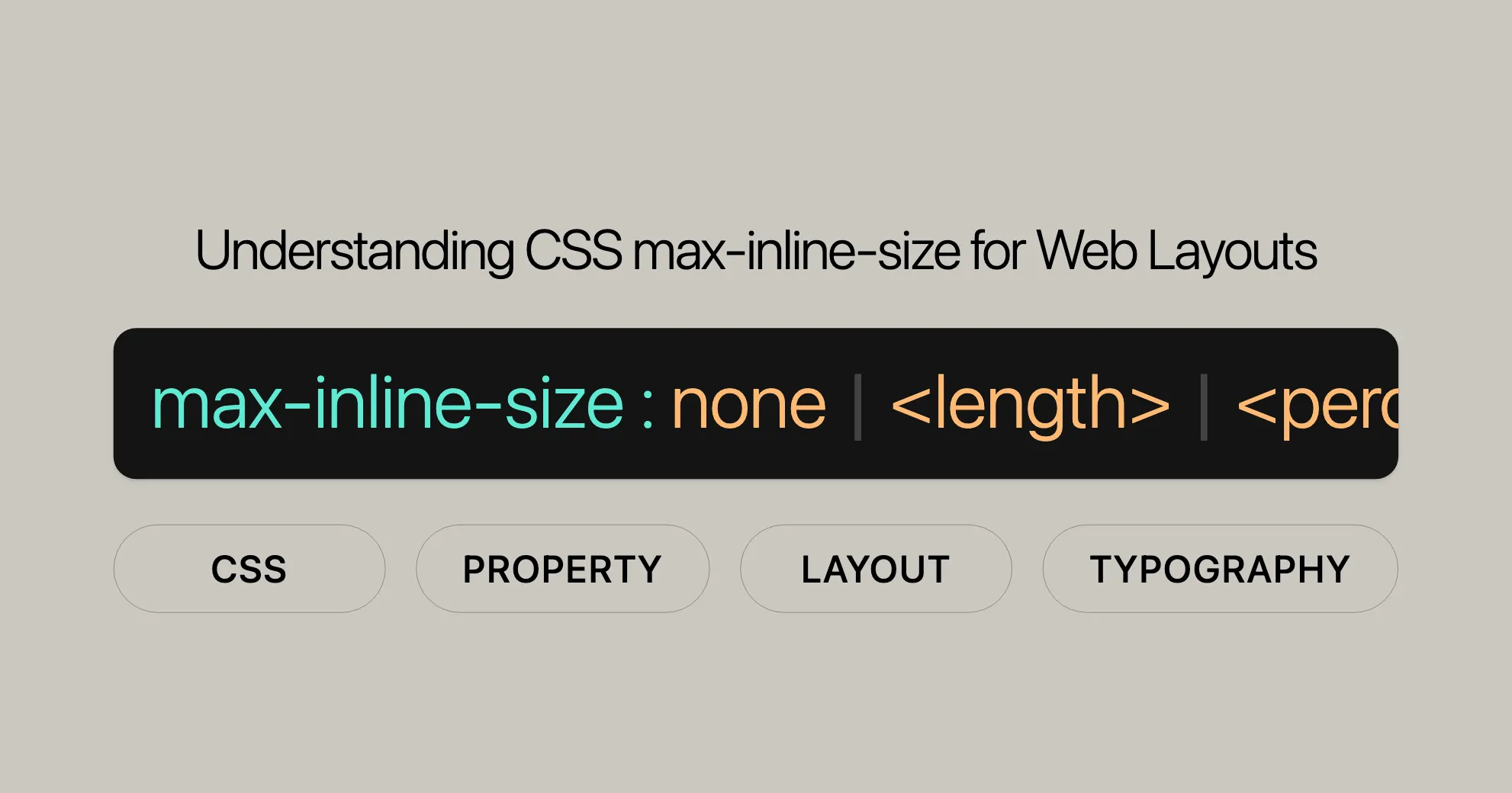
max-inline-size: <length> | <percentage> | none | max-content | min-content | fit-content(<length-percentage>);max-inline-size: inherit | initial | revert | revert-layer | unset;Values
<length>: Sets a fixed length (e.g.,px,em).<percentage>: Sets a percentage of the containing block’s size.none: No maximum size constraint.max-content: Allows the element to expand to its maximum content size.min-content: Constrains the element to its minimum content size.fit-content: Resizes the element to fit its content within specified constraints.anchor-size(<anchor-element>, <anchor-size>, <length-percentage>): Sets the size based on an anchor element.
Examples
Setting Maximum Inline Size in Pixels
<p class="exampleText">Example text</p>.exampleText { writing-mode: vertical-rl; background-color: yellow; block-size: 100%; max-inline-size: 200px;}Setting Maximum Inline Size Using Percentage
<div class="container"> <p class="exampleText">Example text</p></div>.container { width: 500px; background-color: lightblue;}
.exampleText { writing-mode: vertical-rl; background-color: yellow; block-size: 100%; max-inline-size: 50%;}Using fit-content
<div class="container"> <p class="exampleText">Example text</p></div>.container { width: 500px; background-color: lightblue;}
.exampleText { writing-mode: vertical-rl; background-color: yellow; block-size: 100%; max-inline-size: fit-content(20em);}Formal Definition
The max-inline-size property sets the maximum size of an element along its inline direction, which can be horizontal or vertical based on the writing mode. This property is crucial for controlling layout consistency and preventing content overflow.
Initial Value
- Initial Value:
none
Applies To
- Applies To: All elements
Inherited
- Inherited: No
Percentages
- Percentages: Refer to the inline size of the containing block.
Computed Value
- Computed Value: Same as
max-widthandmax-height.
Animation Type
- Animation Type: Length, percentage, or calc() function.
Formal Syntax
max-inline-size = <'max-width'>
<'max-width'> =  none |  <length-percentage> |  min-content |  max-content |  fit-content( <length-percentage> ) |  <calc-size()> |  <anchor-size()>
<length-percentage> =  <length> |  <percentage>
<calc-size()> =  calc-size( <calc-size-basis>, <calc-sum> )
<anchor-size()> =  anchor-size( [ <anchor-element> || <anchor-size> ], <length-percentage>? )
<calc-size-basis> =  <intrinsic-size-keyword> |  <calc-size()> |  any |  <calc-sum>
<calc-sum> =  <calc-product> [ [ '+' | '-' ] <calc-product> ]*
<anchor-element> =  <dashed-ident>
<anchor-size> =  width |  height |  block |  inline |  self-block |  self-inline
<calc-product> =  <calc-value> [ [ '*' | '/' ] <calc-value> ]*
<calc-value> =  <number> |  <dimension> |  <percentage> |  <calc-keyword> |  ( <calc-sum> )
<calc-keyword> =  e |  pi |  infinity |  -infinity |  NaN
Browser Compatibility
The max-inline-size property is well-supported across major browsers:
- Firefox: Supported since version 41.
- Google Chrome: Supported since version 57.
- Microsoft Edge: Supported since version 79.
- Opera: Supported since version 44.
- Safari: Supported since version 12.1.
Related Properties
max-widthmax-heightwriting-mode
Specifications
The max-inline-size property is defined in several CSS specifications:
CSS Logical Properties and Values Level 1
This specification introduces logical properties and values that are independent of the writing mode, making it easier to create flexible layouts.
- Specification: [CSS Logical Properties and Values Level 1]WebsiteUrl
CSS Box Sizing Module Level 4
This module defines sizing properties, including max-inline-size, which controls the size of elements.
- Specification: [CSS Box Sizing Module Level 4]WebsiteUrl
Conclusion
The max-inline-size property is a powerful tool for controlling the maximum size of elements based on their writing mode. By understanding its syntax, values, and usage, you can effectively use this property to create consistent and visually appealing layouts. Happy coding!
 Latest Blogs
  สร้างเว็บไซต์ 1 เว็บ ต้องใช้งบเท่าไหร่? เจาะลึกทุกองค์ประกอบ website development cost อยากสร้างเว็บไซต์แต่ไม่มั่นใจในเรื่องของงบประมาณ อ่านสรุปเจาะลึกตั้งแต่ดีไซน์, ฟังก์ชัน และการดูแล พร้อมตัวอย่างงบจริงจาก Till it’s done ที่แผนชัด งบไม่บานปลายแน่นอน
  Next.js สอน 14 ขั้นตอนเบื้องต้น: สร้างโปรเจกต์แรกใน 30 นาที เริ่มต้นกับ Next.js ใน 14 ขั้นตอนเพียงแค่ 30 นาที พร้อม SSR/SSG และ API Routes ด้วยตัวอย่างโค้ดง่าย ๆ อ่านต่อเพื่อสร้างโปรเจ็กต์แรกได้ทันทีที่นี่
  วิธีสมัคร Apple Developer Account เพื่อนำแอปขึ้น App Store ทีละขั้นตอน อยากปล่อยแอปบน App Store ระดับโลก มาอ่านคู่มือสมัคร Apple Developer Account พร้อมเคล็ดลับ TestFlight และวิธีอัปโหลดที่ง่ายในบทความเดียวนี้ได้เลย
  TypeScript Interface คืออะไร? อธิบายพร้อมวิธีใช้และข้อแตกต่างจาก Type เรียนรู้วิธีใช้ TypeScript Interface เพื่อสร้างโครงสร้างข้อมูลที่ปลอดภัยและเข้าใจง่าย พร้อมเปรียบเทียบข้อดีข้อแตกต่างกับ Type ที่คุณต้องรู้ ถูกรวมเอาไว้ในบทความนี้แล้ว
  Material-UI (MUI) คืออะไร อยากสร้าง UI สวยงามและเป็นมืออาชีพในเวลาอันรวดเร็วใช่ไหม มาทำความรู้จักกับ Material-UI (MUI) ที่ช่วยให้คุณพัฒนาแอปพลิเคชันบน React ได้ง่ายและดูดีในทุกอุปกรณ์
  เปรียบเทียบ 3 วิธีติดตั้ง install node js บน Ubuntu: NVM vs NodeSource vs Official Repo แบบไหนดีที่สุด? เรียนรู้วิธีติดตั้ง Node.js บน Ubuntu ด้วย NVM, NodeSource หรือ Official Repo เลือกวิธีที่เหมาะกับความต้องการของคุณ พร้อมเปรียบเทียบ เพื่อการพัฒนาที่มีประสิทธิภาพ!
 พูดคุยกับซีอีโอ
Explore our best articles, cover a wide variety of technologies 
 ReactJs
  Flutter
  Nodejs
  Nextjs
  TailwindCSS
  Typescript Golang AstroJs Jest Website development th Mobile application th Reactjs th Nextjs th Flutter th Software house th Nodejs th Typescript th
  CSS
CSS We'll be right here with you every step of the way.
We'll be here, prepared to commence this promising collaboration.


Whether you're curious about features, warranties, or shopping policies, we provide comprehensive answers to assist you.