
- Services
- Case Studies
- Technologies
- NextJs development
- Flutter development
- NodeJs development
- ReactJs development
- About
- Contact
- Tools
- Blogs
- FAQ
 Scroll to discover
 CSS Mask-Size Control Mask Image Dimensions
Learn about the use cases and available options like contain, cover, lengths, and percentages.
Introduction to CSS mask-size
The CSS mask-size property is a useful tool for web developers, allowing you to specify the size of mask images. This feature helps ensure that mask images fit perfectly within your design elements. Introduced in December 2023, mask-size works great with the latest devices and browser versions, but you should check compatibility for older ones.
The mask-size property can be fully or partially constrained to preserve the image’s intrinsic ratio, making it a valuable asset for creating visually appealing and responsive designs.
In this article, we’ll explore the syntax and values of the mask-size property, including keywords like contain and cover, and provide practical examples. We’ll also cover browser compatibility and offer related resources for further reading.
By the end of this article, you’ll understand how to use the mask-size property effectively in your web development projects.
Specification and Compatibility
The mask-size property is defined in the CSS Masking Module Level 1 specification. This specification outlines the behavior and usage of the mask-size property, ensuring consistency across different browsers and platforms.
Specification:
- CSS Masking Module Level 1: This module introduces the
mask-sizeproperty, detailing its functionality and how it interacts with other CSS properties.
Compatibility:
As of December 2023, the mask-size property is supported by the latest versions of popular web browsers. However, it’s important to note that older browsers and devices may not support this feature.
- Chrome: Supported from version 4.
- Firefox: Supported from version 53.
- Safari: Supported from version 15.4.
- Opera: Supported from version 15.
- Edge: Supported from version 79.
- Internet Explorer: Not supported.
To check the full compatibility details, you can refer to the browser compatibility tables provided in this article.
Syntax and Values
The mask-size property in CSS allows you to specify the size of mask images applied to an element. This property accepts various values, including keywords, lengths, percentages, and global values.
Syntax:
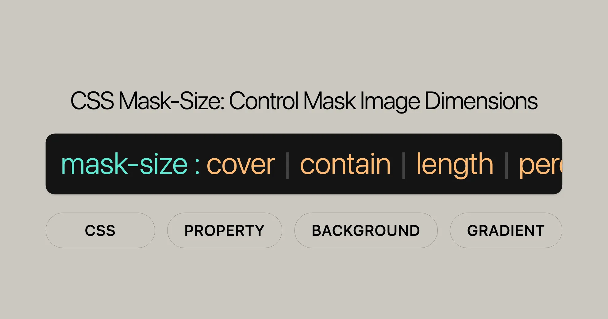
mask-size: <bg-size>[, <bg-size>]* where <bg-size> = [ <length-percentage> | auto ]{1,2} | cover | containValues:
-
Keyword Values:
cover: The mask image is scaled to cover the entire element, maintaining its aspect ratio. The image may be clipped if the element’s dimensions differ.contain: The mask image is scaled to fit within the element, maintaining its aspect ratio. The image is centered and may have empty space (letterboxing).
-
Length and Percentage Values:
<length>: Specifies the width or height using a fixed length (e.g., px, em).<percentage>: Specifies the width or height as a percentage of the mask positioning area.
-
Auto Value:
auto: Scales the mask image to its intrinsic dimensions, maintaining its intrinsic proportion.
Usage Examples:
-
One-Value Syntax:
mask-size: 50%;: Sets the width to 50% of the mask positioning area and the height to auto.mask-size: 3em;: Sets the width to 3em and the height to auto.
-
Two-Value Syntax:
mask-size: 50% auto;: Sets the width to 50% of the mask positioning area and the height to auto.mask-size: 3em 25%;: Sets the width to 3em and the height to 25% of the mask positioning area.
-
Multiple Values:
mask-size: auto, auto;: Sets multiple mask images to auto size.mask-size: 50%, 25%, 25%;: Sets the first mask image to 50% width, and the second and third mask images to 25% width each.
-
Global Values:
inherit: Inherits the value from the parent element.initial: Sets the value to its initial default.revert: Resets the value to the user agent’s default.revert-layer: Resets the value to the user agent’s default for the current cascade layer.unset: Resets the value to its natural value, which means it acts asinheritif the property is inherited, otherwise asinitial.
Usage of Keywords: contain and cover
The mask-size property in CSS offers two powerful keywords, contain and cover, which provide convenient ways to control the size and positioning of mask images. These keywords are essential for ensuring that mask images fit well within their designated areas while maintaining their aspect ratios.
Keyword: contain
The contain keyword scales the mask image to fit within the mask positioning area while maintaining its aspect ratio. This means the image will fit completely within the element without being stretched or distorted. If the dimensions of the image and the element differ, the image will be letterboxed, which means there may be empty space around the image.
Usage Example:
mask-size: contain;Keyword: cover
The cover keyword scales the mask image to cover the entire mask positioning area while maintaining its aspect ratio. This means the image will fill the element completely, and if the dimensions of the image and the element differ, the image will be clipped on the sides or top/bottom.
Usage Example:
mask-size: cover;Practical Example:
Let’s compare the usage of contain and cover with a practical example:
HTML:
<div class="container"> <div class="mask-contain"></div> <div class="mask-cover"></div></div>CSS:
.container {  display: flex;  justify-content: space-around;}
.mask-contain, .mask-cover {  width: 200px;  height: 200px;  background: url('image.png') no-repeat center;  mask-image: url('mask.png');  mask-size: contain; /* Change to cover to see the difference */}
.mask-cover {  mask-size: cover;}
Output:
- The
mask-containelement will display the mask image scaled to fit within the 200px by 200px area, with possible letterboxing. - The
mask-coverelement will display the mask image scaled to cover the entire 200px by 200px area, with possible clipping.
Browser Support:
- The
containandcoverkeywords are supported across the latest versions of popular web browsers, including Chrome, Firefox, Safari, Opera, and Edge.
Working with Width and Height Values
The mask-size property in CSS allows you to specify the size of mask images using width and height values. This provides precise control over the dimensions of the mask image, ensuring it fits perfectly within your design elements. By using width and height values, you can scale the mask image to specific lengths or percentages, maintaining its intrinsic proportions or adjusting it as needed.
Syntax:
mask-size: <width> <height>;Values:
- Width and Height Values:
<width>: Specifies the width of the mask image. This can be a fixed length (e.g., px, em), a percentage, or the keywordauto.<height>: Specifies the height of the mask image. This can be a fixed length (e.g., px, em), a percentage, or the keywordauto.
Usage Examples:
-
One-Value Syntax:
mask-size: 50%;: Sets the width to 50% of the mask positioning area and the height toauto.mask-size: 3em;: Sets the width to 3em and the height toauto.
-
Two-Value Syntax:
mask-size: 50% auto;: Sets the width to 50% of the mask positioning area and the height toauto.mask-size: 3em 25%;: Sets the width to 3em and the height to 25% of the mask positioning area.
Handling Intrinsic Dimensions and Proportions:
The interpretation of width and height values depends on the intrinsic dimensions and proportions of the mask image. Here’s how the mask-size property handles different scenarios:
-
Both Components Specified (Not
auto):- If both width and height are specified with fixed values (e.g.,
mask-size: 100px 50px;), the mask image will render at the specified size.
- If both width and height are specified with fixed values (e.g.,
-
One Component
auto:- If one dimension is set to
auto(e.g.,mask-size: auto 50%;), the mask image will render using the specified dimension and compute the other dimension from the specified dimension and the intrinsic proportion. - If the image has no intrinsic proportion, the specified dimension will be used for that dimension, and the other dimension will use the image’s corresponding intrinsic dimension if available, or the corresponding dimension of the mask positioning area if not.
- If one dimension is set to
-
Both Components
auto:- If both dimensions are set to
auto(e.g.,mask-size: auto auto;), the mask image will render at its intrinsic dimensions if available. - If the image has no intrinsic dimensions and no intrinsic proportion, it will render at the size of the mask positioning area.
- If the image has no dimensions but has a proportion, it will render as if
containhad been specified. - If the image has one intrinsic dimension and a proportion, it will render at the size determined by that one dimension and the proportion.
- If the image has one intrinsic dimension but no proportion, it will render using the intrinsic dimension and the corresponding dimension of the mask positioning area.
- If both dimensions are set to
Practical Example:
Let’s illustrate the usage of width and height values with a practical example:
HTML:
<div class="container"> <div class="mask-fixed"></div> <div class="mask-percentage"></div></div>CSS:
.container {  display: flex;  justify-content: space-around;}
.mask-fixed, .mask-percentage {  width: 200px;  height: 200px;  background: url('image.png') no-repeat center;  mask-image: url('mask.png');}
.mask-fixed {  mask-size: 100px 50px;}
.mask-percentage {  mask-size: 50% 75%;}
Output:
- The
mask-fixedelement will display the mask image scaled to 100px width and 50px height. - The
mask-percentageelement will display the mask image scaled to 50% of the width and 75% of the height of the mask positioning area.
Browser Support:
- The width and height values for the
mask-sizeproperty are supported across the latest versions of popular web browsers, including Chrome, Firefox, Safari, Opera, and Edge.
Handling Intrinsic Dimensions and Proportions
The mask-size property in CSS is designed to handle the intrinsic dimensions and proportions of mask images effectively. This ensures that the images are displayed appropriately within their designated areas, maintaining their natural aspect ratios. Understanding how mask-size interacts with intrinsic dimensions and proportions is crucial for achieving the desired visual outcomes in your web designs.
Intrinsic Dimensions: Intrinsic dimensions refer to the natural width and height of an image. For instance, a bitmap image has fixed intrinsic dimensions, while a vector image may or may not have defined intrinsic dimensions. Gradients are treated as images with no intrinsic dimensions or proportions.
Intrinsic Proportions: Intrinsic proportions refer to the aspect ratio of an image, which is the ratio of its width to its height. Maintaining the intrinsic proportion ensures that the image does not get stretched or distorted.
Behavior of mask-size:
The rendered size of the mask image is computed based on the values provided in the mask-size property and the intrinsic dimensions and proportions of the image. Here’s how the mask-size property handles different scenarios:
-
Both Components Specified (Not
auto):- If both width and height are specified with fixed values (e.g.,
mask-size: 100px 50px;), the mask image will render at the specified size.
- If both width and height are specified with fixed values (e.g.,
-
One Component
auto:- If one dimension is set to
auto(e.g.,mask-size: auto 50%;), the mask image will render using the specified dimension and compute the other dimension from the specified dimension and the intrinsic proportion. - If the image has no intrinsic proportion, the specified dimension will be used for that dimension, and the other dimension will use the image’s corresponding intrinsic dimension if available, or the corresponding dimension of the mask positioning area if not.
- If one dimension is set to
-
Both Components
auto:- If both dimensions are set to
auto(e.g.,mask-size: auto auto;), the mask image will render at its intrinsic dimensions if available. - If the image has no intrinsic dimensions and no intrinsic proportion, it will render at the size of the mask positioning area.
- If the image has no dimensions but has a proportion, it will render as if
containhad been specified. - If the image has one intrinsic dimension and a proportion, it will render at the size determined by that one dimension and the proportion.
- If the image has one intrinsic dimension but no proportion, it will render using the intrinsic dimension and the corresponding dimension of the mask positioning area.
- If both dimensions are set to
By understanding how mask-size interacts with intrinsic dimensions and proportions, you can effectively control the appearance of mask images in your web designs, ensuring they fit seamlessly within their designated areas while maintaining their natural aspect ratios.
Practical Examples
Example 1: Setting Mask Size Using Keywords
HTML:
<div class="container"> <div class="mask-contain"></div> <div class="mask-cover"></div></div>CSS:
.container {  display: flex;  justify-content: space-around;  margin: 20px;}
.mask-contain, .mask-cover {  width: 200px;  height: 200px;  background: url('image.png') no-repeat center;  mask-image: url('mask.png');}
.mask-contain {  mask-size: contain;}
.mask-cover {  mask-size: cover;}
Output:
mask-contain: Scales the mask image to fit within the 200px by 200px area.mask-cover: Scales the mask image to cover the entire 200px by 200px area.
Example 2: Setting Mask Size Using Length and Percentage Values
HTML:
<div class="container"> <div class="mask-fixed"></div> <div class="mask-percentage"></div></div>CSS:
.container {  display: flex;  justify-content: space-around;  margin: 20px;}
.mask-fixed, .mask-percentage {  width: 200px;  height: 200px;  background: url('image.png') no-repeat center;  mask-image: url('mask.png');}
.mask-fixed {  mask-size: 100px 50px;}
.mask-percentage {  mask-size: 50% 75%;}
Output:
mask-fixed: Displays the mask image at 100px width and 50px height.mask-percentage: Displays the mask image scaled to 50% width and 75% height of the mask positioning area.
Example 3: Setting Mask Size Using auto
HTML:
<div class="container"> <div class="mask-auto"></div></div>CSS:
.container {  display: flex;  justify-content: space-around;  margin: 20px;}
.mask-auto {  width: 200px;  height: 200px;  background: url('image.png') no-repeat center;  mask-image: url('mask.png');  mask-size: auto;}
Output:
mask-auto: Displays the mask image at its intrinsic dimensions.
Example 4: Setting Mask Size Using Multiple Values
HTML:
<div class="container"> <div class="mask-multiple"></div></div>CSS:
.container {  display: flex;  justify-content: space-around;  margin: 20px;}
.mask-multiple {  width: 200px;  height: 200px;  background: url('image.png') no-repeat center;  mask-image: url('mask1.png'), url('mask2.png');  mask-size: 50%, 25%, 25%;}
Output:
mask-multiple: Displays the first mask image at 50% width, and the second and third mask images at 25% width each.
Example 5: Combining mask-size with Other CSS Properties
HTML:
<div class="container"> <div class="mask-combined"></div></div>CSS:
.container {  display: flex;  justify-content: space-around;  margin: 20px;}
.mask-combined {  width: 200px;  height: 200px;  background: url('image.png') no-repeat center;  mask-image: url('mask.png');  mask-size: cover;  mask-repeat: no-repeat;  mask-position: center;}
Output:
mask-combined: Displays the mask image scaled to cover the entire 200px by 200px area, with no repetition, and centered within the element.
Browser Compatibility
The mask-size property is a relatively new feature in CSS. While it is supported by the latest versions of popular web browsers, it’s important to be aware of its compatibility across different platforms and versions. Here’s a breakdown of the browser compatibility for the mask-size property:
Chrome:
- Supported from version 4 onwards.
Firefox:
- Supported from version 53 onwards.
Safari:
- Supported from version 15.4 onwards.
Opera:
- Supported from version 15 onwards.
Edge:
- Supported from version 79 onwards.
Internet Explorer:
- Not supported.
Browser Compatibility Table:
| Browser | Version | Supported |
|---|---|---|
| Chrome | 4+ | Yes |
| Firefox | 53+ | Yes |
| Safari | 15.4+ | Yes |
| Opera | 15+ | Yes |
| Edge | 79+ | Yes |
| Internet Explorer | - | No |
Note:
- The
mask-sizeproperty might not
 Latest Blogs
  สร้างเว็บไซต์ 1 เว็บ ต้องใช้งบเท่าไหร่? เจาะลึกทุกองค์ประกอบ website development cost อยากสร้างเว็บไซต์แต่ไม่มั่นใจในเรื่องของงบประมาณ อ่านสรุปเจาะลึกตั้งแต่ดีไซน์, ฟังก์ชัน และการดูแล พร้อมตัวอย่างงบจริงจาก Till it’s done ที่แผนชัด งบไม่บานปลายแน่นอน
  Next.js สอน 14 ขั้นตอนเบื้องต้น: สร้างโปรเจกต์แรกใน 30 นาที เริ่มต้นกับ Next.js ใน 14 ขั้นตอนเพียงแค่ 30 นาที พร้อม SSR/SSG และ API Routes ด้วยตัวอย่างโค้ดง่าย ๆ อ่านต่อเพื่อสร้างโปรเจ็กต์แรกได้ทันทีที่นี่
  วิธีสมัคร Apple Developer Account เพื่อนำแอปขึ้น App Store ทีละขั้นตอน อยากปล่อยแอปบน App Store ระดับโลก มาอ่านคู่มือสมัคร Apple Developer Account พร้อมเคล็ดลับ TestFlight และวิธีอัปโหลดที่ง่ายในบทความเดียวนี้ได้เลย
  TypeScript Interface คืออะไร? อธิบายพร้อมวิธีใช้และข้อแตกต่างจาก Type เรียนรู้วิธีใช้ TypeScript Interface เพื่อสร้างโครงสร้างข้อมูลที่ปลอดภัยและเข้าใจง่าย พร้อมเปรียบเทียบข้อดีข้อแตกต่างกับ Type ที่คุณต้องรู้ ถูกรวมเอาไว้ในบทความนี้แล้ว
  Material-UI (MUI) คืออะไร อยากสร้าง UI สวยงามและเป็นมืออาชีพในเวลาอันรวดเร็วใช่ไหม มาทำความรู้จักกับ Material-UI (MUI) ที่ช่วยให้คุณพัฒนาแอปพลิเคชันบน React ได้ง่ายและดูดีในทุกอุปกรณ์
  เปรียบเทียบ 3 วิธีติดตั้ง install node js บน Ubuntu: NVM vs NodeSource vs Official Repo แบบไหนดีที่สุด? เรียนรู้วิธีติดตั้ง Node.js บน Ubuntu ด้วย NVM, NodeSource หรือ Official Repo เลือกวิธีที่เหมาะกับความต้องการของคุณ พร้อมเปรียบเทียบ เพื่อการพัฒนาที่มีประสิทธิภาพ!
 พูดคุยกับซีอีโอ
Explore our best articles, cover a wide variety of technologies 
 ReactJs
  Flutter
  Nodejs
  Nextjs
  TailwindCSS
  Typescript Golang AstroJs Jest Website development th Mobile application th Reactjs th Nextjs th Flutter th Software house th Nodejs th Typescript th
  CSS
CSS We'll be right here with you every step of the way.
We'll be here, prepared to commence this promising collaboration.


Whether you're curious about features, warranties, or shopping policies, we provide comprehensive answers to assist you.