
- Services
- Case Studies
- Technologies
- NextJs development
- Flutter development
- NodeJs development
- ReactJs development
- About
- Contact
- Tools
- Blogs
- FAQ
 Scroll to discover
 CSS Mask-Image Enhance Designs with Image Masks
Use images or gradients to create intricate masks and control element visibility.
Introduction
The mask-image property in CSS allows you to use an image as a mask layer for an element. This controls which parts of the element are visible based on the image’s transparency. It’s a powerful tool for creating intricate designs and effects, making it valuable for web developers and designers.
Since December 2023, mask-image is fully supported across the latest devices and browsers. However, older ones might not support it, so always check compatibility.
By default, mask-image uses the alpha channel of the mask image to determine visibility. You can control this with the mask-mode property.
Compatibility
The mask-image property is widely supported across modern browsers. Since December 2023, it works reliably on the latest versions. However, older devices and browsers might not support it, so always test your website thoroughly.
For detailed compatibility info, check the online compatibility tables. These tables show which browsers and versions support this feature, helping you make informed decisions.
If you find any issues or have feedback about compatibility, report it through the appropriate channels to help improve support.
Syntax
The mask-image property lets you set an image as a mask layer for an element. Here’s the basic syntax:
Basic Syntax
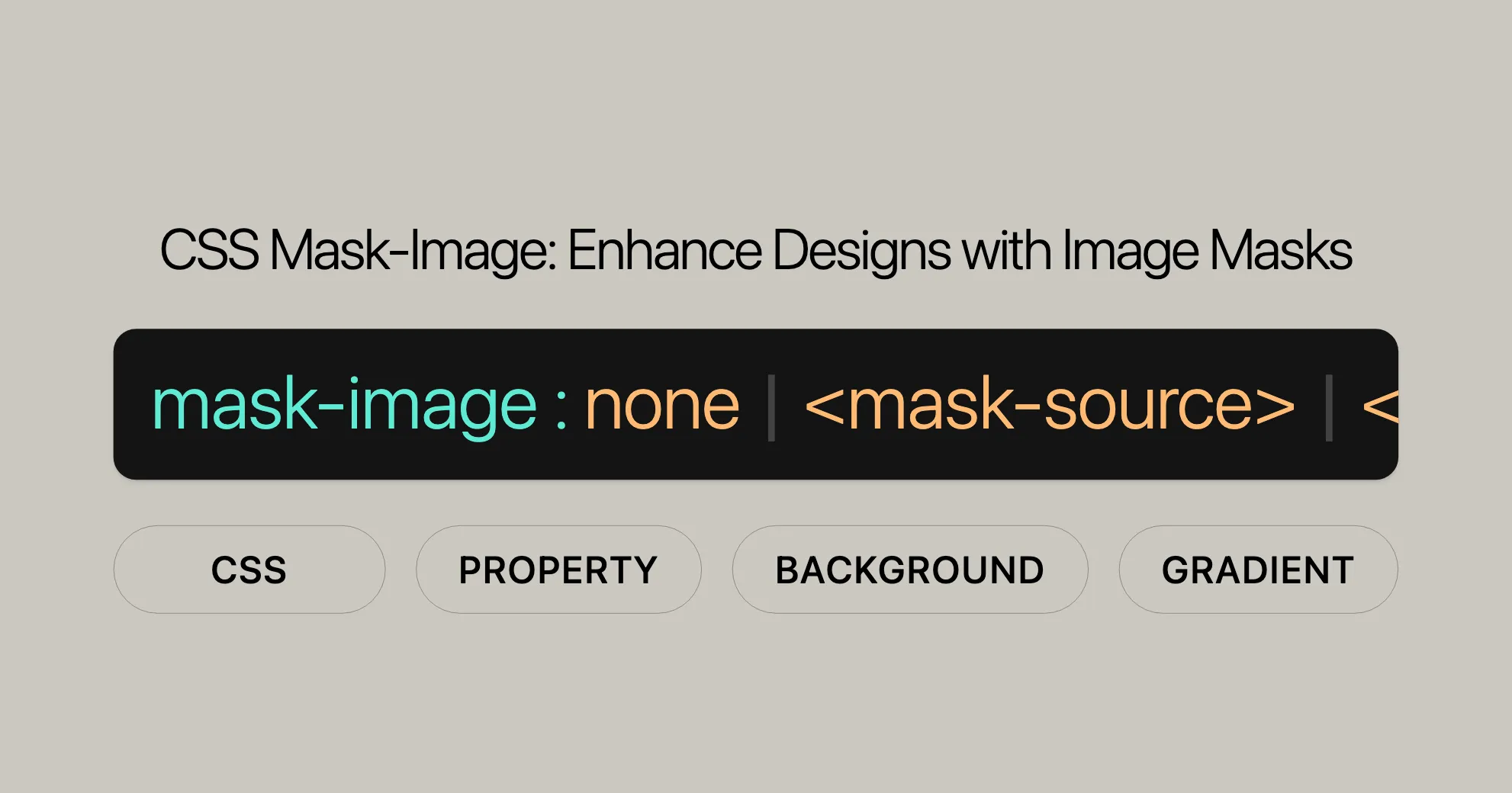
/* Keyword value */mask-image: none;
/* URL value */mask-image: url(masks.svg#mask1);
/* Image values */mask-image: linear-gradient(rgb(0 0 0 / 100%), transparent);mask-image: image(url(mask.png), skyblue);
/* Multiple values */mask-image: image(url(mask.png), skyblue),  linear-gradient(rgb(0 0 0 / 100%), transparent);
/* Global values */mask-image: inherit;mask-image: initial;mask-image: revert;mask-image: revert-layer;mask-image: unset;
Explanation of Values
none: Removes any mask, making the element fully visible.<mask-source>: A URL reference to a mask or a CSS image. Only HTTP and HTTPS images are accepted due to CORS policy.<image>: An image value like a URL or a gradient.
Notes
- To test URL image sources locally, set up a local server. Images served using
file://protocol are not accepted. - If the mask image is empty, fails to download, is in an unsupported format, or doesn’t exist, it will be treated as a transparent black image layer.
Values
The mask-image property supports various values for customizing the mask layer. Here are the main ones:
none
Removes any mask, making the element fully visible.
mask-image: none;<mask-source>
A URL reference to a mask or a CSS image. Only HTTP and HTTPS images are accepted.
mask-image: url(masks.svg#mask1);Note: Images served locally using file:// protocol are not accepted. Set up a local server to test.
<image>
Any image type supported by CSS, including URLs and gradients.
mask-image: linear-gradient(rgb(0 0 0 / 100%), transparent);mask-image: image(url(mask.png), skyblue);Multiple Values
Specify multiple mask images by separating them with commas.
mask-image: image(url(mask.png), skyblue), linear-gradient(rgb(0 0 0 / 100%), transparent);Global Values
Supports global values like inherit, initial, revert, revert-layer, and unset.
mask-image: inherit;mask-image: initial;mask-image: revert;mask-image: revert-layer;mask-image: unset;Special Cases
The mask will be treated as a transparent black image layer if:
- The mask image is empty.
- The mask image fails to download.
- The mask image format is not supported.
- The mask image doesn’t exist.
- The mask value doesn’t point to a valid mask image.
Formal Definition
The mask-image property specifies the image used as a mask layer for an element. Here’s what you need to know:
Initial Value
The initial value is none, meaning no mask is applied by default.
mask-image: none;Applies To
Applies to all elements. In SVG, it applies to container elements, excluding <defs> and all graphics elements.
Inherited
Not inherited. Mask settings for an element won’t apply to its child elements unless explicitly specified.
Computed Value
The computed value is the specified value, with any URLs made absolute.
Animation Type
Animated using discrete animation. Changes to mask-image will switch abruptly.
Formal Syntax
mask-image = <mask-reference>#
<mask-reference> = none | <image> | <mask-source>
<image> = <url> | <gradient>
<mask-source> = <url>
<url> = url(<string> <url-modifier>*) | <url-token>
<src> = src(<string> <url-modifier>*)
Example
<div class="masked"></div>.masked { width: 200px; height: 200px; mask-repeat: no-repeat; mask-size: 100%; background: red; mask-image: url(star.svg), radial-gradient(transparent 50%, black);}In this example, .masked uses both a URL (star.svg) and a radial gradient as masks. The mask-repeat and mask-size properties control the repetition and size of the mask image.
Examples
Here are some practical examples to help you understand how to use the mask-image property.
Setting a Mask Image with a URL
Use an SVG image as a mask for a div element. The transparency of the SVG image determines which parts of the div are visible.
Setting a Mask Image with a Gradient
Apply a linear gradient mask to a div element.
HTML
<div class="gradient-masked"></div>CSS
.gradient-masked { width: 200px; height: 200px; background-color: blue; mask-image: linear-gradient(to right, black, transparent); mask-repeat: no-repeat; mask-size: contain;}Setting Multiple Mask Images
Apply multiple mask images to an element by separating them with commas.
HTML
<div class="multiple-masks"></div>CSS
.multiple-masks { width: 200px; height: 200px; background-color: green; mask-image: url(circle.svg), linear-gradient(to bottom, black, transparent); mask-repeat: no-repeat; mask-size: contain;}Setting a Mask Image with a URL
HTML
<div class="masked"></div>CSS
.masked { width: 200px; height: 200px; background-color: red; mask-image: url(star.svg); mask-repeat: no-repeat; mask-size: contain;}In this example, mask-image uses star.svg as a mask. The mask-repeat property ensures the mask image doesn’t repeat, and mask-size adjusts the size to fit within the div.
Specifications
The mask-image property is defined by the CSS Masking Module Level 1 specification. This module introduces properties and values for creating complex masking effects in web design.
Specification Details
- Specification Name: CSS Masking Module Level 1
- Property:
mask-image - Documentation: [CSS Masking Module Level 1]WebsiteUrl
Overview
The CSS Masking Module Level 1 specification defines how masking properties, including mask-image, enable advanced visual effects.
Key Features
- Mask Sources: Define how different mask sources like URLs and gradients can be used with
mask-image. - Mask Modes: The
mask-modeproperty allows further control over how the mask image is applied. - Compatibility and Behavior: Outlines the expected behavior of
mask-imageacross different browsers and devices.
Importance for Web Developers
Understanding the specifications of mask-image is crucial for creating visually appealing and interactive web designs. The CSS Masking Module Level 1 is a comprehensive guide on using masking properties effectively.
Reference Links
- [CSS Masking Module Level 1 Specification]WebsiteUrl
- [MDN Web Docs on CSS Masking]WebsiteUrl
These resources provide detailed information on mask-image and the CSS Masking Module Level 1.
Browser Compatibility
The mask-image property in CSS is widely supported by modern browsers, but it’s important to know the details to ensure your designs work across different platforms. Here’s a quick overview:
Supported Browsers
- Google Chrome: Supported since version 1.
- Microsoft Edge: Supported since version 79.
- Mozilla Firefox: Supported since version 53.
- Opera: Supported since version 15.
- Safari: Supported since version 15.4.
Compatibility Notes
- Older Browsers: The
mask-imageproperty might not work correctly in older versions of these browsers. Always test your designs thoroughly. - Fallbacks: Consider providing fallback styles for browsers that don’t support
mask-image. This can include simpler CSS properties or JavaScript solutions. - Cross-Browser Testing: Use cross-browser testing tools to check how your designs appear and function in different browsers and devices.
Compatibility Tables
For detailed compatibility information, check out the Browser Compatibility Data (BCD) tables. These tables provide specific information about which browsers and versions support the mask-image property.
Reporting Compatibility Issues
If you encounter any compatibility issues, report them through the appropriate channels. This helps improve the feature’s support across different platforms.
See Also
For further reading, check out these resources:
- Clipping and Masking in CSS: Learn the differences between clipping and masking and how to use these techniques effectively.
- [Clipping and Masking in CSS]WebsiteUrl
- Applying Effects with CSS’s
mask-imageProperty: Discover advanced techniques for using themask-imageproperty to apply various effects to images and elements.- [Apply Effects to Images with CSS’s
mask-imageProperty]WebsiteUrl
- [Apply Effects to Images with CSS’s
FAQs
What is the mask-image property in CSS?
The mask-image property in CSS is used to define an image as a mask for an element, controlling which parts of the element are visible based on the image’s transparency or alpha channel.
How do you create a mask using mask-image?
To create a mask, specify an image in the mask-image property, like so: mask-image: url('mask.png');. The transparency of the image will dictate which parts of the element are visible.
Can mask-image use gradients?
Yes, mask-image can use CSS gradients to create a mask effect. For example, mask-image: linear-gradient(to right, black, transparent); will mask the element with a gradient transitioning from fully opaque to fully transparent.
What is the difference between mask-image and clip-path?
The mask-image property uses images or gradients to control visibility, allowing for complex shapes and soft edges. clip-path, on the other hand, uses geometric shapes (like circles or polygons) to clip the content, often resulting in sharper edges.
Are there limitations to using mask-image in CSS?
mask-image may have limitations such as varying browser support, performance impacts on complex masks, and lack of support for some image formats. Always check for compatibility and performance considerations when using it.
 Latest Blogs
  สร้างเว็บไซต์ 1 เว็บ ต้องใช้งบเท่าไหร่? เจาะลึกทุกองค์ประกอบ website development cost อยากสร้างเว็บไซต์แต่ไม่มั่นใจในเรื่องของงบประมาณ อ่านสรุปเจาะลึกตั้งแต่ดีไซน์, ฟังก์ชัน และการดูแล พร้อมตัวอย่างงบจริงจาก Till it’s done ที่แผนชัด งบไม่บานปลายแน่นอน
  Next.js สอน 14 ขั้นตอนเบื้องต้น: สร้างโปรเจกต์แรกใน 30 นาที เริ่มต้นกับ Next.js ใน 14 ขั้นตอนเพียงแค่ 30 นาที พร้อม SSR/SSG และ API Routes ด้วยตัวอย่างโค้ดง่าย ๆ อ่านต่อเพื่อสร้างโปรเจ็กต์แรกได้ทันทีที่นี่
  วิธีสมัคร Apple Developer Account เพื่อนำแอปขึ้น App Store ทีละขั้นตอน อยากปล่อยแอปบน App Store ระดับโลก มาอ่านคู่มือสมัคร Apple Developer Account พร้อมเคล็ดลับ TestFlight และวิธีอัปโหลดที่ง่ายในบทความเดียวนี้ได้เลย
  TypeScript Interface คืออะไร? อธิบายพร้อมวิธีใช้และข้อแตกต่างจาก Type เรียนรู้วิธีใช้ TypeScript Interface เพื่อสร้างโครงสร้างข้อมูลที่ปลอดภัยและเข้าใจง่าย พร้อมเปรียบเทียบข้อดีข้อแตกต่างกับ Type ที่คุณต้องรู้ ถูกรวมเอาไว้ในบทความนี้แล้ว
  Material-UI (MUI) คืออะไร อยากสร้าง UI สวยงามและเป็นมืออาชีพในเวลาอันรวดเร็วใช่ไหม มาทำความรู้จักกับ Material-UI (MUI) ที่ช่วยให้คุณพัฒนาแอปพลิเคชันบน React ได้ง่ายและดูดีในทุกอุปกรณ์
  เปรียบเทียบ 3 วิธีติดตั้ง install node js บน Ubuntu: NVM vs NodeSource vs Official Repo แบบไหนดีที่สุด? เรียนรู้วิธีติดตั้ง Node.js บน Ubuntu ด้วย NVM, NodeSource หรือ Official Repo เลือกวิธีที่เหมาะกับความต้องการของคุณ พร้อมเปรียบเทียบ เพื่อการพัฒนาที่มีประสิทธิภาพ!
 พูดคุยกับซีอีโอ
Explore our best articles, cover a wide variety of technologies 
 ReactJs
  Flutter
  Nodejs
  Nextjs
  TailwindCSS
  Typescript Golang AstroJs Jest Website development th Mobile application th Reactjs th Nextjs th Flutter th Software house th Nodejs th Typescript th
  CSS
CSS We'll be right here with you every step of the way.
We'll be here, prepared to commence this promising collaboration.


Whether you're curious about features, warranties, or shopping policies, we provide comprehensive answers to assist you.