
- Services
- Case Studies
- Technologies
- NextJs development
- Flutter development
- NodeJs development
- ReactJs development
- About
- Contact
- Tools
- Blogs
- FAQ
 Scroll to discover
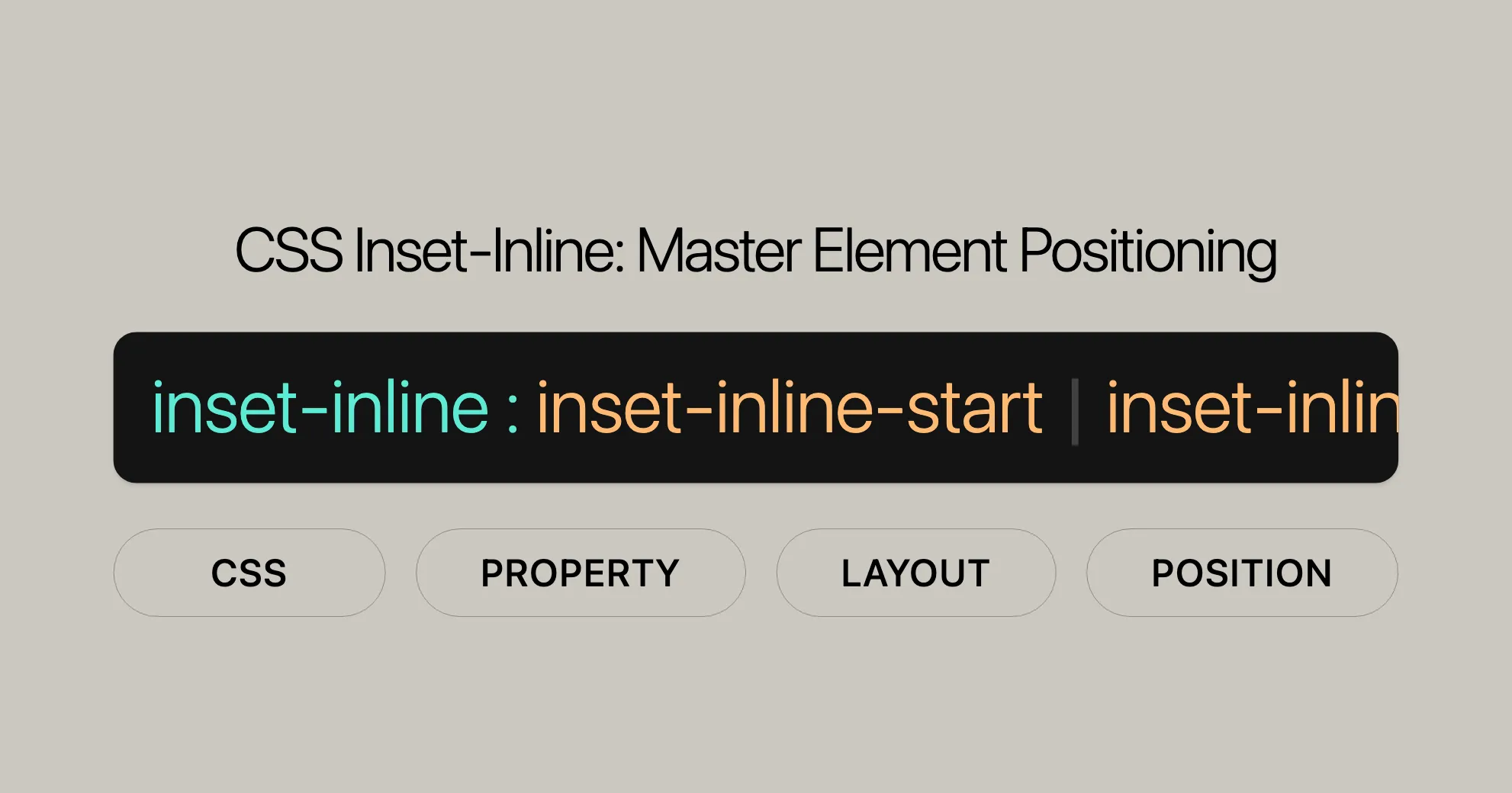
 CSS Inset-Inline Master Element Positioning
Learn about available options, practical examples, and browser compatibility.
Using the inset-inline Property in CSS
The inset-inline property in CSS allows you to control the logical start and end offsets of an element in the inline direction. Here are practical examples and detailed explanations to help you understand how to use it effectively.
Examples
Setting Inline Start and End Offsets
You can use the inset-inline property to position an element with specific start and end offsets.
HTML
<div class="container"> <div class="positioned-element">Positioned Element</div></div>CSS
.container {  position: relative;  width: 300px;  height: 200px;  background-color: lightgray;}
.positioned-element {  position: absolute;  inset-inline: 20px 30px; /* 20px start offset, 30px end offset */  background-color: coral;  padding: 10px;}
Using Percentage Values
You can also use percentage values to set the start and end offsets of an element.
HTML
<div class="container"> <div class="percentage-element">Percentage Element</div></div>CSS
.container {  position: relative;  width: 300px;  height: 200px;  background-color: lightgray;}
.percentage-element {  position: absolute;  inset-inline: 10% 5%; /* 10% start offset, 5% end offset */  background-color: lightblue;  padding: 10px;}
Using a Single Value
If you provide a single value, it applies to both the start and end offsets.
HTML
<div class="container"> <div class="single-value-element">Single Value Element</div></div>CSS
.container {  position: relative;  width: 300px;  height: 200px;  background-color: lightgray;}
.single-value-element {  position: absolute;  inset-inline: 20px; /* 20px for both start and end offsets */  background-color: lightgreen;  padding: 10px;}
Using the auto Keyword
The auto keyword lets the browser determine the offsets based on the element’s positioning context.
HTML
<div class="container"> <div class="auto-element">Auto Element</div></div>CSS
.container {  position: relative;  width: 300px;  height: 200px;  background-color: lightgray;}
.auto-element {  position: absolute;  inset-inline: auto; /* Browser determines the offsets */  background-color: lightyellow;  padding: 10px;}
Formal Syntax
The inset-inline property in CSS allows you to define the logical start and end offsets of an element in the inline direction. Here’s the formal syntax:
inset-inline =  [<'top'>]{1,2}
<top> =  auto |  <length-percentage> |  <anchor()> |  <anchor-size()>
<length-percentage> =  <length> |  <percentage>
<anchor()> =  anchor( <anchor-element> [&& <anchor-side> , <length-percentage>? ] )
<anchor-size()> =  anchor-size( [[ <anchor-element> || <anchor-size> ]? , <length-percentage>? ] )
<anchor-element> =  <dashed-ident>
<anchor-side> =  inside |  outside |  top |  left |  right |  bottom |  start |  end |  self-start |  self-end |  <percentage> |  center
<anchor-size> =  width |  height |  block |  inline |  self-block |  self-inline
Explanation of Formal Syntax
- Top: Represents the value for the
inset-inlineproperty, which can be one of the following:auto<length-percentage><anchor()><anchor-size()>
- Length-Percentage: Can be either a length value (e.g.,
px,em) or a percentage value. - Anchor(): Defines the offset relative to a specific anchor point. It includes:
anchor-element: A dashed identifier.anchor-side: Specifies the side of the anchor (e.g.,inside,outside,top,left, etc.).length-percentage: An optional length or percentage value.
- Anchor-Size(): Defines the size relative to a specific anchor point. It includes:
anchor-element: A dashed identifier.anchor-size: Specifies the size (e.g.,width,height,block,inline, etc.).length-percentage: An optional length or percentage value.
Examples
The inset-inline property in CSS is versatile for controlling the logical start and end offsets of an element in the inline direction. Here are some practical examples:
Using Length Values
inset-inline: 3px 10px;inset-inline: 2.4em 3em;inset-inline: 10px; /* value applied to start and end */Using Percentage Values
inset-inline: 10% 5%;Using the auto Keyword
inset-inline: auto;Using the calc() Function
inset-inline: calc(10% + 20px) calc(20% + 30px);Using Anchor Values
inset-inline: anchor(--myAnchor 50%) auto;By understanding these examples, you can effectively use the inset-inline property to achieve precise and responsive element positioning in your web projects.
Setting Inline Start and End Offsets
The inset-inline property allows you to control the logical start and end offsets of an element in the inline direction. Here’s how to use it with different value types:
Basic Syntax
inset-inline: <start-offset> <end-offset>;<start-offset>: The logical start offset of the element.<end-offset>: The logical end offset of the element.
Example: Using Length Values
HTML
<div> <p class="exampleText">Example text</p></div>CSS
div {  background-color: yellow;  width: 120px;  height: 120px;}
.exampleText {  writing-mode: vertical-lr;  position: relative;  inset-inline: 20px 50px;  background-color: #c8c800;}
Result
The exampleText element will be positioned with a start offset of 20px and an end offset of 50px within its containing div.
Example: Using Percentage Values
HTML
<div> <p class="exampleText">Example text</p></div>CSS
div {  background-color: yellow;  width: 120px;  height: 120px;}
.exampleText {  writing-mode: vertical-lr;  position: relative;  inset-inline: 10% 20%;  background-color: #c8c800;}
Result
The exampleText element will be positioned with a start offset of 10% and an end offset of 20% relative to the width of the containing div.
Example: Using the auto Keyword
HTML
<div> <p class="exampleText">Example text</p></div>CSS
div {  background-color: yellow;  width: 120px;  height: 120px;}
.exampleText {  writing-mode: vertical-lr;  position: relative;  inset-inline: auto;  background-color: #c8c800;}
Result
The exampleText element will be positioned based on the browser’s automatic calculation of the offsets.
Example: Using the calc() Function
HTML
<div> <p class="exampleText">Example text</p></div>CSS
div {  background-color: yellow;  width: 120px;  height: 120px;}
.exampleText {  writing-mode: vertical-lr;  position: relative;  inset-inline: calc(10% + 20px) calc(20% + 30px);  background-color: #c8c800;}
Result
The exampleText element will be positioned with a start offset calculated as 10% of the containing block’s width plus 20px, and an end offset calculated as 20% of the containing block’s width plus 30px.
By following these examples, you can effectively use the inset-inline property to set the start and end offsets of elements in the inline direction, making your web designs more flexible and responsive.
Browser Compatibility
The inset-inline property is widely supported across many browsers and versions, ensuring consistent display across different platforms.
Supported Browsers
- Google Chrome: Version 87 and later.
- Mozilla Firefox: Version 63 and later.
- Microsoft Edge: Version 87 and later.
- Opera: Version 73 and later.
- Safari: Version 14.1 and later.
Compatibility Table
| Browser | Version |
|---|---|
| Google Chrome | 87+ |
| Mozilla Firefox | 63+ |
| Microsoft Edge | 87+ |
| Opera | 73+ |
| Safari | 14.1+ |
To ensure the inset-inline property works correctly, test your designs across different browsers and versions. Tools like BrowserStack or Sauce Labs can help with cross-browser testing.
Fallbacks and Polyfills
If you need to support older browsers that don’t support the inset-inline property, consider using fallbacks or polyfills. This ensures your web pages render correctly across all browsers.
By understanding and using the inset-inline property effectively, you can create responsive and visually appealing web designs that work seamlessly across different browsers and platforms.
See Also
To further understand the inset-inline property and related CSS features, check out these resources:
Related Properties
top,right,bottom,left: These define physical offsets of an element, corresponding to the logical offsets defined byinset-inlinebased on the writing mode, directionality, and text orientation.inset: A shorthand for setting all four physical offsets (top,right,bottom,left) at once.inset-block: Defines the logical start and end offsets of an element in the block direction.
Related CSS Features
writing-mode: Specifies the writing mode of an element, determining the direction in which text flows.direction: Sets the text direction of an element, either left-to-right (ltr) or right-to-left (rtl).text-orientation: Defines the orientation of text within an element, allowing for vertical text orientation.
Additional Resources
- MDN Web Docs: Comprehensive documentation on the
inset-inlineproperty and related CSS features. - CSS Tricks: Articles and tutorials on using CSS properties effectively in web design.
- W3C Specifications: Official specifications for CSS properties, including the
inset-inlineproperty.
By exploring these resources, you can gain a deeper understanding of how to use the inset-inline property effectively in your web development projects.
Conclusion
The inset-inline property is great for controlling the inline start and end offsets of elements in CSS. It’s widely supported and reliable for creating flexible and responsive layouts. By understanding browser compatibility and using fallbacks, you can ensure your designs are accessible and functional across all platforms.
Help Improve MDN
Was this page helpful? Your feedback helps us improve our content. Please let us know if you found this information useful or if there are areas where we can provide more clarity.
- Yes: Great! We’re glad you found this helpful.
- No: We’re sorry to hear that. Please provide more details on how we can improve this content.
Learn How to Contribute
Interested in contributing to MDN? Check out our contribution guidelines to learn how you can help improve our documentation and make it even more valuable for the web development community.
Last Modified
This page was last modified on [current date]. Your contributions and feedback help us keep our content up-to-date and relevant for the web development community.
View This Page on GitHub
You can view the source code for this page on GitHub. Feel free to fork the repository, make improvements, and submit a pull request to help us improve our documentation.
Report a Problem
If you encounter any issues with this content or have suggestions for improvement, please report a problem. Your feedback helps us improve our documentation and make it more valuable for the web development community.
By using these resources and understanding the inset-inline property, you can create more effective and visually appealing web designs that work seamlessly across different browsers and platforms.
 Latest Blogs
  สร้างเว็บไซต์ 1 เว็บ ต้องใช้งบเท่าไหร่? เจาะลึกทุกองค์ประกอบ website development cost อยากสร้างเว็บไซต์แต่ไม่มั่นใจในเรื่องของงบประมาณ อ่านสรุปเจาะลึกตั้งแต่ดีไซน์, ฟังก์ชัน และการดูแล พร้อมตัวอย่างงบจริงจาก Till it’s done ที่แผนชัด งบไม่บานปลายแน่นอน
  Next.js สอน 14 ขั้นตอนเบื้องต้น: สร้างโปรเจกต์แรกใน 30 นาที เริ่มต้นกับ Next.js ใน 14 ขั้นตอนเพียงแค่ 30 นาที พร้อม SSR/SSG และ API Routes ด้วยตัวอย่างโค้ดง่าย ๆ อ่านต่อเพื่อสร้างโปรเจ็กต์แรกได้ทันทีที่นี่
  วิธีสมัคร Apple Developer Account เพื่อนำแอปขึ้น App Store ทีละขั้นตอน อยากปล่อยแอปบน App Store ระดับโลก มาอ่านคู่มือสมัคร Apple Developer Account พร้อมเคล็ดลับ TestFlight และวิธีอัปโหลดที่ง่ายในบทความเดียวนี้ได้เลย
  TypeScript Interface คืออะไร? อธิบายพร้อมวิธีใช้และข้อแตกต่างจาก Type เรียนรู้วิธีใช้ TypeScript Interface เพื่อสร้างโครงสร้างข้อมูลที่ปลอดภัยและเข้าใจง่าย พร้อมเปรียบเทียบข้อดีข้อแตกต่างกับ Type ที่คุณต้องรู้ ถูกรวมเอาไว้ในบทความนี้แล้ว
  Material-UI (MUI) คืออะไร อยากสร้าง UI สวยงามและเป็นมืออาชีพในเวลาอันรวดเร็วใช่ไหม มาทำความรู้จักกับ Material-UI (MUI) ที่ช่วยให้คุณพัฒนาแอปพลิเคชันบน React ได้ง่ายและดูดีในทุกอุปกรณ์
  เปรียบเทียบ 3 วิธีติดตั้ง install node js บน Ubuntu: NVM vs NodeSource vs Official Repo แบบไหนดีที่สุด? เรียนรู้วิธีติดตั้ง Node.js บน Ubuntu ด้วย NVM, NodeSource หรือ Official Repo เลือกวิธีที่เหมาะกับความต้องการของคุณ พร้อมเปรียบเทียบ เพื่อการพัฒนาที่มีประสิทธิภาพ!
 พูดคุยกับซีอีโอ
Explore our best articles, cover a wide variety of technologies 
 ReactJs
  Flutter
  Nodejs
  Nextjs
  TailwindCSS
  Typescript Golang AstroJs Jest Website development th Mobile application th Reactjs th Nextjs th Flutter th Software house th Nodejs th Typescript th
  CSS
CSS We'll be right here with you every step of the way.
We'll be here, prepared to commence this promising collaboration.


Whether you're curious about features, warranties, or shopping policies, we provide comprehensive answers to assist you.