
- Services
- Case Studies
- Technologies
- NextJs development
- Flutter development
- NodeJs development
- ReactJs development
- About
- Contact
- Tools
- Blogs
- FAQ
 Scroll to discover
 CSS image-rendering Control Image Scaling Algorithms
Introduction
The image-rendering CSS property determines how images are scaled. It’s crucial for maintaining image quality when they are resized due to page design or user interactions like zooming. This property is especially useful for managing the visual integrity of images that are either upscaled or downscaled.
Definition and Syntax
The image-rendering property controls the algorithm used for scaling images. It applies to the element itself, any images set in its other properties, and its descendants.
Syntax:
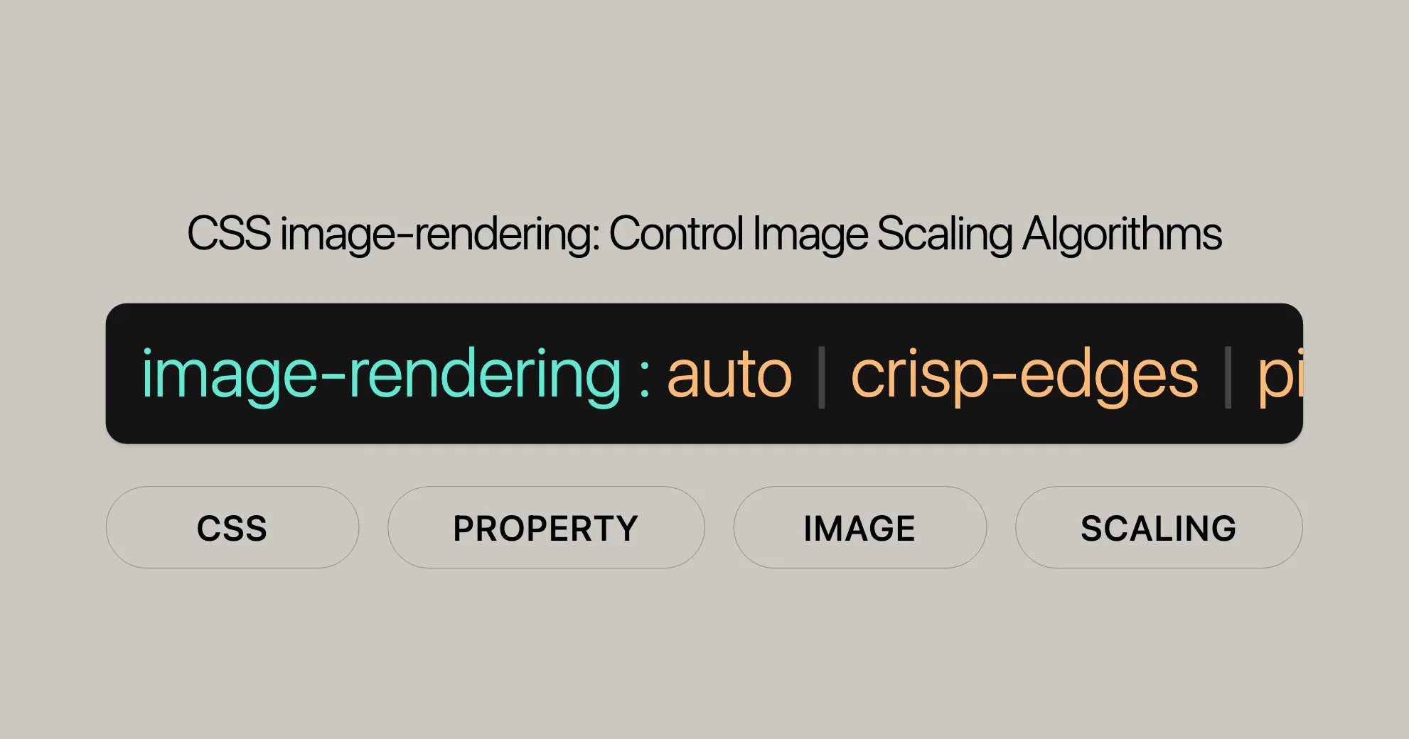
/* Keyword values */image-rendering: auto;image-rendering: crisp-edges;image-rendering: pixelated;
/* Global values */image-rendering: inherit;image-rendering: initial;image-rendering: revert;image-rendering: revert-layer;image-rendering: unset;
Keyword Values:
auto: The browser chooses the best scaling algorithm.crisp-edges: Uses an algorithm that preserves contrast and edges, suitable for pixel art or line drawings.pixelated: Preserves a “pixelated” look without introducing scaling artifacts.
Global Values:
inherit: Inherits the value from the parent element.initial: Sets the property to its default value.unset: Resets the property to its natural value.revert: Reverts the property to the value set by the user-agent stylesheet.revert-layer: Reverts the property to the value set by the user-agent stylesheet for the parent layer.
Examples
Example 1: Comparing auto and crisp-edges
HTML:
<!DOCTYPE html><html><head> <title>CSS | image-rendering</title> <style> .image-auto { image-rendering: auto; } .image-crisp { image-rendering: crisp-edges; } </style></head><body> <h1 style="color: green">Website</h1> <b>CSS | image-rendering</b> <p>Comparing the 'auto' value with the 'crisp-edges' value</p> <div class="container"> <img class="image-auto" src="( WebsiteUrl )" width="250px"> <img class="image-crisp" src="( WebsiteUrl )" width="250px"> </div></body></html>Output:
- The
autovalue uses the browser’s default scaling algorithm. - The
crisp-edgesvalue preserves contrast and edges, making the image sharper.
Example 2: Using pixelated
HTML:
<!DOCTYPE html><html><head> <title>CSS | image-rendering</title> <style> .image-auto { image-rendering: auto; } .image-pixelated { image-rendering: pixelated; } </style></head><body> <h1 style="color: green">Website</h1> <b>CSS | image-rendering</b> <p>Comparing the 'auto' value with the 'pixelated' value</p> <div class="container"> <img class="image-auto" src="( WebsiteUrl )" width="250px"> <img class="image-pixelated" src="( WebsiteUrl )" width="250px"> </div></body></html>Output:
- The
autovalue uses the browser’s default scaling algorithm. - The
pixelatedvalue preserves a “pixelated” look without introducing scaling artifacts.
Example 3: Using initial
HTML:
<!DOCTYPE html><html><head> <title>CSS | image-rendering</title> <style> .image-crisp { image-rendering: crisp-edges; } .image-auto { image-rendering: initial; } </style></head><body> <h1 style="color: green">Website</h1> <b>CSS | image-rendering</b> <p>Comparing the 'crisp-edges' value with the 'initial' value</p> <div class="container"> <img class="image-crisp" src="( WebsiteUrl )" width="250px"> <img class="image-auto" src="( WebsiteUrl )" width="250px"> </div></body></html>Output:
- The
crisp-edgesvalue preserves contrast and edges. - The
initialvalue resets the property to its default value as defined by the browser.
Specifications
The image-rendering CSS property is defined in the CSS Images Module Level 3 specification. This specification ensures consistency across different browsers and platforms.
Specification Details:
- Specification Name: CSS Images Module Level 3
- Section:
image-rendering - Link: CSS Images Module Level 3 - image-rendering
Browser Compatibility
The image-rendering property is widely supported across modern browsers:
- Chrome: Supported since version 13.
- Edge: Supported since version 79.
- Firefox: Supported since version 3.6.
- Safari: Supported since version 6.
- Opera: Supported since version 15.
See Also
For further reading and related CSS properties, you may find the following resources helpful:
object-fit: Specifies how the content of a replaced element should be resized to fit its container.object-position: Specifies the alignment of the content of a replaced element inside its box.image-orientation: Specifies the orientation of an image.image-resolution: Specifies the intrinsic resolution of a raster image.- CSS images module: Provides an overview of CSS properties related to images and their manipulation.
- SVG
image-renderingattribute: Similar to the CSSimage-renderingproperty, used to control the rendering of images within SVG elements.
 Latest Blogs
  สร้างเว็บไซต์ 1 เว็บ ต้องใช้งบเท่าไหร่? เจาะลึกทุกองค์ประกอบ website development cost อยากสร้างเว็บไซต์แต่ไม่มั่นใจในเรื่องของงบประมาณ อ่านสรุปเจาะลึกตั้งแต่ดีไซน์, ฟังก์ชัน และการดูแล พร้อมตัวอย่างงบจริงจาก Till it’s done ที่แผนชัด งบไม่บานปลายแน่นอน
  Next.js สอน 14 ขั้นตอนเบื้องต้น: สร้างโปรเจกต์แรกใน 30 นาที เริ่มต้นกับ Next.js ใน 14 ขั้นตอนเพียงแค่ 30 นาที พร้อม SSR/SSG และ API Routes ด้วยตัวอย่างโค้ดง่าย ๆ อ่านต่อเพื่อสร้างโปรเจ็กต์แรกได้ทันทีที่นี่
  วิธีสมัคร Apple Developer Account เพื่อนำแอปขึ้น App Store ทีละขั้นตอน อยากปล่อยแอปบน App Store ระดับโลก มาอ่านคู่มือสมัคร Apple Developer Account พร้อมเคล็ดลับ TestFlight และวิธีอัปโหลดที่ง่ายในบทความเดียวนี้ได้เลย
  TypeScript Interface คืออะไร? อธิบายพร้อมวิธีใช้และข้อแตกต่างจาก Type เรียนรู้วิธีใช้ TypeScript Interface เพื่อสร้างโครงสร้างข้อมูลที่ปลอดภัยและเข้าใจง่าย พร้อมเปรียบเทียบข้อดีข้อแตกต่างกับ Type ที่คุณต้องรู้ ถูกรวมเอาไว้ในบทความนี้แล้ว
  Material-UI (MUI) คืออะไร อยากสร้าง UI สวยงามและเป็นมืออาชีพในเวลาอันรวดเร็วใช่ไหม มาทำความรู้จักกับ Material-UI (MUI) ที่ช่วยให้คุณพัฒนาแอปพลิเคชันบน React ได้ง่ายและดูดีในทุกอุปกรณ์
  เปรียบเทียบ 3 วิธีติดตั้ง install node js บน Ubuntu: NVM vs NodeSource vs Official Repo แบบไหนดีที่สุด? เรียนรู้วิธีติดตั้ง Node.js บน Ubuntu ด้วย NVM, NodeSource หรือ Official Repo เลือกวิธีที่เหมาะกับความต้องการของคุณ พร้อมเปรียบเทียบ เพื่อการพัฒนาที่มีประสิทธิภาพ!
 พูดคุยกับซีอีโอ
Explore our best articles, cover a wide variety of technologies 
 ReactJs
  Flutter
  Nodejs
  Nextjs
  TailwindCSS
  Typescript Golang AstroJs Jest Website development th Mobile application th Reactjs th Nextjs th Flutter th Software house th Nodejs th Typescript th
  CSS
CSS We'll be right here with you every step of the way.
We'll be here, prepared to commence this promising collaboration.


Whether you're curious about features, warranties, or shopping policies, we provide comprehensive answers to assist you.