
- Services
- Case Studies
- Technologies
- NextJs development
- Flutter development
- NodeJs development
- ReactJs development
- About
- Contact
- Tools
- Blogs
- FAQ
 Scroll to discover
 CSS grid-template-rows A Comprehensive Guide
It offers various options like fixed lengths, percentages, fr units, and dynamic functions like minmax() and fit-content().
This guide explains how to use grid-template-rows effectively in your web design projects.
### Basics of `grid-template-rows`
The `grid-template-rows` property in CSS helps you define the number and height of rows in a grid container. This is a key part of CSS Grid Layout, allowing for flexible and responsive designs. The property has been well-supported across browsers since July 2020, making it reliable for modern web design.
### Baseline and Compatibility
The `grid-template-rows` property is widely supported across many devices and browsers. It's been available since July 2020, so you can use it confidently in your web projects.
### Syntax and Examples
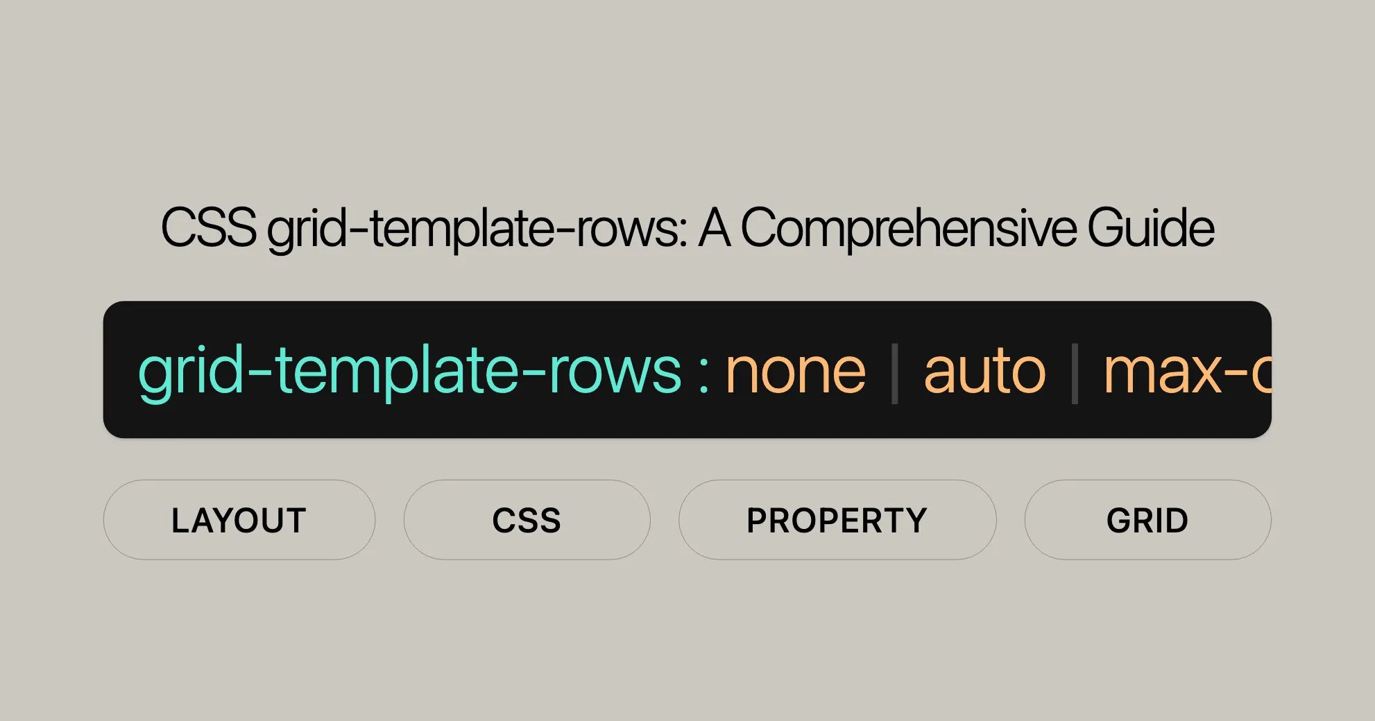
The `grid-template-rows` property lets you define the structure and size of rows in a grid container. Here's the basic syntax:
```cssgrid-template-rows: none | auto | max-content | min-content | length | initial | inherit;Examples
Let’s look at some practical examples to see how grid-template-rows works.
Example 1: Using auto and Length Values
Here, we create a grid with 4 columns and 2 rows, each cell containing a letter from A to H.
HTML:
<!DOCTYPE html><html><head> <title>CSS grid-template-rows Property</title> <style> .grid-container { background-color: green; padding: 30px; display: grid; grid-template-columns: auto auto auto auto; grid-template-rows: auto auto; grid-gap: 10px; } .grid-item { background-color: white; border: 1px solid white; font-size: 30px; text-align: center; } </style></head><body> <div class="grid-container"> <div class="grid-item">A</div> <div class="grid-item">B</div> <div class="grid-item">C</div> <div class="grid-item">D</div> <div class="grid-item">E</div> <div class="grid-item">F</div> <div class="grid-item">G</div> <div class="grid-item">H</div> </div></body></html>CSS:
.grid-container { background-color: green; padding: 30px; display: grid; grid-template-columns: auto auto auto auto; grid-template-rows: auto auto; grid-gap: 10px;}.grid-item { background-color: white; border: 1px solid white; font-size: 30px; text-align: center;}Example 2: Using min-content and max-content Values
Here, we create a grid with 4 columns and 2 rows. The first row adjusts automatically, and the second row is fixed at 150px.
HTML:
<!DOCTYPE html><html><head> <title>CSS grid-template-rows Property</title> <style> .grid-container { background-color: green; padding: 30px; display: grid; grid-template-columns: auto auto auto auto; grid-template-rows: auto 150px; grid-gap: 10px; } .grid-item { background-color: white; border: 1px solid white; font-size: 30px; text-align: center; } </style></head><body> <div class="grid-container"> <div class="grid-item">A</div> <div class="grid-item">B</div> <div class="grid-item">C</div> <div class="grid-item">D</div> <div class="grid-item">E</div> <div class="grid-item">F</div> <div class="grid-item">G</div> <div class="grid-item">H</div> </div></body></html>CSS:
.grid-container { background-color: green; padding: 30px; display: grid; grid-template-columns: auto auto auto auto; grid-template-rows: auto 150px; grid-gap: 10px;}.grid-item { background-color: white; border: 1px solid white; font-size: 30px; text-align: center;}Values and Descriptions
The grid-template-rows property accepts various values to define the size and behavior of rows within a grid container. Here’s a breakdown:
none
- Description: No explicit grid; rows are generated implicitly.
grid-template-rows: none;[linename]
- Description: Names a line in the grid.
grid-template-rows: [linename] 100px;grid-template-rows: [linename1] 100px [linename2 linename3];<length>
- Description: Sets the row size using a length value (e.g., px, em, rem).
grid-template-rows: 100px 1fr;<percentage>
- Description: Sets the row size as a percentage of the grid container’s block size.
grid-template-rows: 50% 200px;<flex>
- Description: Uses the
frunit to set the flex factor of the row.
grid-template-rows: 1fr 2fr;max-content
- Description: Sizes the row to fit the largest content of the grid items.
grid-template-rows: max-content;min-content
- Description: Sizes the row to fit the smallest content of the grid items.
grid-template-rows: min-content;minmax(min, max)
- Description: Defines a size range for the row.
grid-template-rows: minmax(100px, 1fr);auto
- Description: Sets the row size based on the content.
grid-template-rows: auto;fit-content([ <length> | <percentage> ])
- Description: Clamps the row size at a specified value.
grid-template-rows: fit-content(50%);repeat([ <positive-integer> | auto-fill | auto-fit ], <track-list>)
- Description: Repeats a fragment of the track list.
grid-template-rows: repeat(3, 200px);masonry
- Description: Uses the masonry algorithm for layout.
grid-template-rows: masonry;subgrid
- Description: Adopts the parent grid’s row sizes.
grid-template-rows: subgrid;Formal Definition and Syntax
The grid-template-rows property allows you to define the structure and size of rows in a grid container.
Formal Definition
| Initial Value | none |
|---|---|
| Applies to | Grid containers |
| Inherited | No |
| Percentages | Refer to the corresponding dimension of the content area |
| Computed Value | As specified, but with relative lengths converted into absolute lengths |
| Animation Type | Simple list of length, percentage, or calc, provided the only differences are in the values of the length, percentage, or calc components in the list |
Explanation of Syntax Components
- none: No explicit grid defined. Rows are created implicitly.
- <track-list>: List of track sizes and optional line names. Includes fixed, flexible, and dynamic sizes.
- <auto-track-list>: List allowing automatic row generation, useful for responsive designs.
- subgrid <line-name-list>?: Grid adopts the spanned portion of its parent grid. Optional line names.
- <line-names>: Custom identifier for naming grid lines, enclosed in square brackets.
- <track-size>: Defines track size using fixed lengths, percentages, flexible sizes (fr), or functions like
minmax()orfit-content(). - <track-repeat>: Repeats a fragment of the track list for patterns.
- <fixed-size>: Specifically for fixed sizes.
- <fixed-repeat>: Repeats a fragment of the fixed size list.
- <auto-repeat>: Repeats a fragment of the auto track list for responsive layouts.
- <name-repeat>: Repeats line names.
- <track-breadth>: Defines track breadth using lengths, percentages, flexible sizes (fr), or dynamic sizes.
- <inflexible-breadth>: Specifically for inflexible sizes.
- <length-percentage>: Length or percentage value for track size.
- <fixed-breadth>: Defines fixed breadth using lengths or percentages.
Specifying Grid Row Sizes
The grid-template-rows property in CSS lets you define row sizes within a grid container, creating flexible and responsive layouts. Here’s how to specify row sizes using different values and functions.
HTML
<div id="grid"> <div id="areaA">A</div> <div id="areaB">B</div></div>CSS
#grid {  display: grid;  height: 100px;  grid-template-rows: 30px 1fr;}
#areaA {  background-color: lime;}
#areaB {  background-color: yellow;}
This example creates a grid with two rows. The first row is 30px tall, and the second row takes up the remaining space using the fr unit.
Specifying Grid Row Sizes with Different Values
You can define row sizes using fixed lengths, percentages, and dynamic functions like minmax(). Here are some examples:
Fixed Lengths
grid-template-rows: 100px 200px;Percentages
grid-template-rows: 50% 50%;fr Unit
grid-template-rows: 1fr 2fr;minmax() Function
grid-template-rows: minmax(100px, 1fr);fit-content() Function
grid-template-rows: fit-content(200px);Combining Different Values
Combine fixed lengths, percentages, and the fr unit for complex layouts:
grid-template-rows: 100px 50% 1fr;Examples
Using repeat() for Repeated Rows
grid-template-rows: repeat(3, 100px);This example creates three rows, each 100px tall, using the repeat() function.
Example 1: Fixed Rows
HTML:
<!DOCTYPE html><html><head> <title>CSS grid-template-rows Property</title> <style> .grid-container { background-color: green; padding: 30px; display: grid; grid-template-columns: repeat(3, 1fr); grid-template-rows: repeat(3, 100px); grid-gap: 10px; } .grid-item { background-color: white; border: 1px solid white; font-size: 30px; text-align: center; } </style></head><body> <div class="grid-container"> <div class="grid-item">A</div> <div class="grid-item">B</div> <div class="grid-item">C</div> <div class="grid-item">D</div> <div class="grid-item">E</div> <div class="grid-item">F</div> <div class="grid-item">G</div> <div class="grid-item">H</div> <div class="grid-item">I</div> </div></body></html>CSS:
.grid-container {    background-color: green;    padding: 30px;    display: grid;    grid-template-columns: repeat(3, 1fr);    grid-template-rows: repeat(3, 100px);    grid-gap: 10px;}
.grid-item {    background-color: white;    border: 1px solid white;    font-size: 30px;    text-align: center;}
This example creates a grid with three columns and three rows, each row being 100px high.
Example 2: Flexible Rows with minmax()
HTML:
<!DOCTYPE html><html><head> <title>CSS grid-template-rows Property</title> <style> .grid-container { background-color: green; padding: 30px; display: grid; grid-template-columns: repeat(3, 1fr); grid-template-rows: minmax(50px, 1fr); grid-gap: 10px; } .grid-item { background-color: white; border: 1px solid white; font-size: 30px; text-align: center; } </style></head><body> <div class="grid-container"> <div class="grid-item">A</div> <div class="grid-item">B</div> <div class="grid-item">C</div> <div class="grid-item">D</div> <div class="grid-item">E</div> <div class="grid-item">F</div> <div class="grid-item">G</div> <div class="grid-item">H</div> <div class="grid-item">I</div> </div></body></html>CSS:
.grid-container {    background-color: green;    padding: 30px;    display: grid;    grid-template-columns: repeat(3, 1fr);    grid-template-rows: minmax(50px, 1fr);    grid-gap: 10px;}
.grid-item {    background-color: white;    border: 1px solid white;    font-size: 30px;    text-align: center;}
This example creates flexible rows with a minimum height of 50px and a maximum height that adapts to the content.
Example 3: Content-Based Rows with fit-content()
HTML:
<!DOCTYPE html><html><head> <title>CSS grid-template-rows Property</title> <style> .grid-container { background-color: green; padding: 30px; display: grid; grid-template-columns: repeat(3, 1fr); grid-template-rows: fit-content(100px); grid-gap: 10px; } .grid-item { background-color: white; border: 1px solid white; font-size: 30px; text-align: center; } </style></head><body> <div class="grid-container"> <div class="grid-item">A</div> <div class="grid-item">B</div> <div class="grid-item">C</div> <div class="grid-item">D</div> <div class="grid-item">E</div> <div class="grid-item">F</div> <div class="grid-item">G</div> <div class="grid-item">H</div> <div class="grid-item">I</div> </div></body></html>CSS:
.grid-container {    background-color: green;    padding: 30px;    display: grid;    grid-template-columns: repeat(3, 1fr);    grid-template-rows: fit-content(100px);    grid-gap: 10px;}
.grid-item {    background-color: white;    border: 1px solid white;    font-size: 30px;    text-align: center;}
This example creates rows that adjust to the content size, with a maximum height of 100px.
Example 4: Nested Grids with subgrid
HTML:
<!DOCTYPE html><html><head> <title>CSS grid-template-rows Property</title> <style> .parent-grid { display: grid; grid-template-rows: 100px 200px; grid-gap: 10px; } .child-grid { display: grid; grid-template-rows: subgrid; grid-gap: 10px; } .grid-item { background-color: white; border: 1px solid white; font-size: 30px; text-align: center; } </style></head><body> <div class="parent-grid"> <div class="grid-item">A</div> <div class="child-grid"> <div class="grid-item">B</div> <div class="grid-item">C</div> </div> <div class="grid-item">D</div> </div></body></html>CSS:
.parent-grid {    display: grid;    grid-template-rows: 100px 200px;    grid-gap: 10px;}
.child-grid {    display: grid;    grid-template-rows: subgrid;    grid-gap: 10px;}
.grid-item {    background-color: white;    border: 1px solid white;    font-size: 30px;    text-align: center;}
This example creates a nested grid where the child grid adopts the row sizes from the parent grid using subgrid.
Browser Compatibility
The grid-template-rows property is widely supported across modern browsers. This ensures your grid layouts work seamlessly across various platforms and devices.
Full Compatibility
- Google Chrome: Supported since version 57 (March 2017).
- Firefox: Supported since version 52 (March 2017).
- IE/Edge: Supported since version 16 (September 2017).
- Opera: Supported since version 44 (March 2017).
- Safari: Supported since version 10 (September 2016).
Browser Compatibility Table
| Browser | Version | Release Date |
|---|---|---|
| Google Chrome | 57 | March 2017 |
| Firefox | 52 | March 2017 |
| IE/Edge | 16 | September 2017 |
| Opera | 44 | March 2017 |
| Safari | 10 | September 2016 |
Additional Resources
For more information on browser compatibility, refer to:
FAQs
What does the grid-template-rows property do?
The grid-template-rows property sets the height of each row in a grid container. It can use fixed heights, flexible heights (fr), or dynamic sizes with functions like minmax().
How do I define rows using grid-template-rows?
You can define row heights like this: grid-template-rows: 100px auto 1fr;, which creates three rows: the first is 100px, the second takes up as much space as its content, and the third fills the remaining space.
Can grid-template-rows be used with auto-fit or auto-fill?
While auto-fit and auto-fill are typically used with grid-template-columns, you can still control row sizes responsively using functions like minmax() with grid-template-rows.
What’s the difference between grid-template-rows and grid-auto-rows?
grid-template-rows defines the explicit row structure, while grid-auto-rows controls the size of rows that are automatically added when content overflows the defined grid.
How does grid-template-rows work with grid-template-areas?
grid-template-rows determines the row heights within the overall grid layout, while grid-template-areas defines named areas. The row heights should align with the areas to ensure a consistent design.
Can I use grid-template-rows with repeat()?
Yes, you can use the repeat() function with grid-template-rows to create a repeated fragment of the row list, making it easier to define multiple rows with a recurring pattern. For example, grid-template-rows: repeat(3, 100px);.
What is the subgrid value in grid-template-rows?
The subgrid value indicates that the grid will adopt the spanned portion of its parent grid in that axis. Instead of being specified explicitly, the sizes of the grid rows/columns will be taken from the parent grid’s definition.
How do I use fit-content() with grid-template-rows?
The fit-content() function represents the formula min(max-content, max(auto, argument)), which is calculated similarly to auto (i.e., minmax(auto, max-content)), except that the track size is clamped at the specified argument if it is greater than the auto minimum. For example, grid-template-rows: fit-content(200px);.
What does the masonry value do in grid-template-rows?
The masonry value indicates that this axis should be laid out according to the masonry algorithm, which arranges items in a way that minimizes gaps.
Can I combine grid-template-rows with other CSS properties?
Yes, you can combine grid-template-rows with other CSS properties to create more complex and dynamic layouts. For example, you can use grid-gap to add space between rows, or align-items to control the alignment of items within the grid.
By understanding these FAQs, you can effectively use the grid-template-rows property to create flexible and responsive grid layouts in your web design projects. Whether you’re working with fixed heights, flexible sizes, or dynamic functions, this property offers the tools you need to create sophisticated grid layouts.
 Latest Blogs
  สร้างเว็บไซต์ 1 เว็บ ต้องใช้งบเท่าไหร่? เจาะลึกทุกองค์ประกอบ website development cost อยากสร้างเว็บไซต์แต่ไม่มั่นใจในเรื่องของงบประมาณ อ่านสรุปเจาะลึกตั้งแต่ดีไซน์, ฟังก์ชัน และการดูแล พร้อมตัวอย่างงบจริงจาก Till it’s done ที่แผนชัด งบไม่บานปลายแน่นอน
  Next.js สอน 14 ขั้นตอนเบื้องต้น: สร้างโปรเจกต์แรกใน 30 นาที เริ่มต้นกับ Next.js ใน 14 ขั้นตอนเพียงแค่ 30 นาที พร้อม SSR/SSG และ API Routes ด้วยตัวอย่างโค้ดง่าย ๆ อ่านต่อเพื่อสร้างโปรเจ็กต์แรกได้ทันทีที่นี่
  วิธีสมัคร Apple Developer Account เพื่อนำแอปขึ้น App Store ทีละขั้นตอน อยากปล่อยแอปบน App Store ระดับโลก มาอ่านคู่มือสมัคร Apple Developer Account พร้อมเคล็ดลับ TestFlight และวิธีอัปโหลดที่ง่ายในบทความเดียวนี้ได้เลย
  TypeScript Interface คืออะไร? อธิบายพร้อมวิธีใช้และข้อแตกต่างจาก Type เรียนรู้วิธีใช้ TypeScript Interface เพื่อสร้างโครงสร้างข้อมูลที่ปลอดภัยและเข้าใจง่าย พร้อมเปรียบเทียบข้อดีข้อแตกต่างกับ Type ที่คุณต้องรู้ ถูกรวมเอาไว้ในบทความนี้แล้ว
  Material-UI (MUI) คืออะไร อยากสร้าง UI สวยงามและเป็นมืออาชีพในเวลาอันรวดเร็วใช่ไหม มาทำความรู้จักกับ Material-UI (MUI) ที่ช่วยให้คุณพัฒนาแอปพลิเคชันบน React ได้ง่ายและดูดีในทุกอุปกรณ์
  เปรียบเทียบ 3 วิธีติดตั้ง install node js บน Ubuntu: NVM vs NodeSource vs Official Repo แบบไหนดีที่สุด? เรียนรู้วิธีติดตั้ง Node.js บน Ubuntu ด้วย NVM, NodeSource หรือ Official Repo เลือกวิธีที่เหมาะกับความต้องการของคุณ พร้อมเปรียบเทียบ เพื่อการพัฒนาที่มีประสิทธิภาพ!
 พูดคุยกับซีอีโอ
Explore our best articles, cover a wide variety of technologies 
 ReactJs
  Flutter
  Nodejs
  Nextjs
  TailwindCSS
  Typescript Golang AstroJs Jest Website development th Mobile application th Reactjs th Nextjs th Flutter th Software house th Nodejs th Typescript th
  CSS
CSS We'll be right here with you every step of the way.
We'll be here, prepared to commence this promising collaboration.


Whether you're curious about features, warranties, or shopping policies, we provide comprehensive answers to assist you.