
- Services
- Case Studies
- Technologies
- NextJs development
- Flutter development
- NodeJs development
- ReactJs development
- About
- Contact
- Tools
- Blogs
- FAQ
 Scroll to discover
 Mastering CSS grid-column-end for Flexible Layouts
It's crucial for precise control over layouts.
Available options include auto, custom identifiers, integers, and spans.
Introduction
The grid-column-end property in CSS is a powerful tool for web developers. It defines where a grid item ends within a column, helping you control the layout of your grid. This property is widely supported and has been available since July 2020. It’s essential for creating complex and responsive designs.
Baseline Widely Available
The grid-column-end property is widely supported across devices and browsers. Since its introduction in July 2020, it has become a key tool for web developers. This broad compatibility ensures your grid layouts work smoothly across different platforms.
Overview of grid-column-end
The grid-column-end property in CSS specifies where a grid item ends within a column. It’s part of the CSS Grid Layout module and helps determine the placement of items within a grid container. By defining the end position, you can control the layout precisely.
Syntax
The grid-column-end syntax is straightforward and allows for flexible control over the layout:
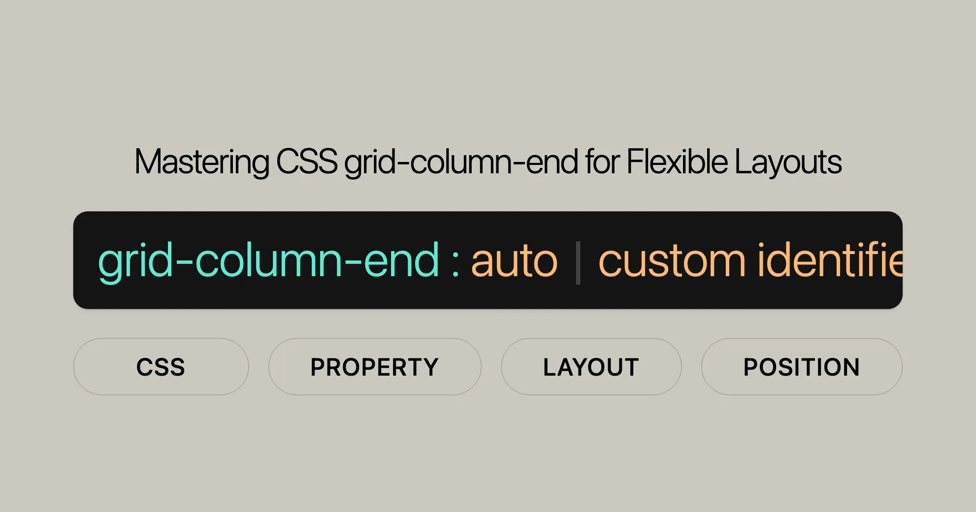
grid-column-end: auto | <custom-ident> | <integer> | span <integer> | <custom-ident> <integer> | span <custom-ident>;Values
auto: Uses default grid placement rules.<custom-ident>: Uses a named grid line.<integer>: Specifies the nth grid line. Negative values count from the end.span <integer>: Defines a span of n grid lines.
Global Values
inherit,initial,revert,revert-layer,unset: These values allow you to inherit, reset, or unset the property.
Example Usage
Here’s how you can use grid-column-end:
/* Keyword value */grid-column-end: auto;
/* Custom identifier value */grid-column-end: somegridarea;
/* Integer value */grid-column-end: 2;
/* Span with integer value */grid-column-end: span 3;
/* Global values */grid-column-end: inherit;grid-column-end: initial;grid-column-end: revert;grid-column-end: revert-layer;grid-column-end: unset;
Formal Definition
The grid-column-end property specifies the end position of a grid item within a column. It helps determine the block-end edge of a grid area by contributing a line, a span, or nothing (automatic) to the item’s grid placement.
- Initial Value:
auto - Applies to: Grid items and absolutely-positioned boxes within a grid container
- Inherited: No
- Computed Value: As specified
- Animation Type: Discrete
Formal Syntax
grid-column-end = <grid-line>;
<grid-line> = auto | <custom-ident> | [<integer>] [<custom-ident>]? | span [<integer> || <custom-ident>];
Syntax Breakdown
auto: Uses default grid placement rules.<custom-ident>: Uses a named grid line.[<integer>]: Specifies the nth grid line. Negative values count from the end.[<custom-ident>]?: Optionally specifies a custom identifier to count only lines with that name.span [<integer> || <custom-ident>]: Defines a grid span of n lines from the start edge.
Examples
HTML
<div class="wrapper"> <div class="box1">One</div> <div class="box2">Two</div> <div class="box3">Three</div> <div class="box4">Four</div> <div class="box5">Five</div></div>CSS
.wrapper {  display: grid;  grid-template-columns: repeat(3, 1fr);  grid-auto-rows: 100px;}
.box1 {  grid-column-start: 1;  grid-column-end: 4;  grid-row-start: 1;  grid-row-end: 3;}
.box2 {  grid-column-start: 1;  grid-row-start: 3;  grid-row-end: 5;}
Example: Using grid-column-end: auto;
HTML
<!DOCTYPE html><html><head>    <title>CSS grid-column-end Property</title>    <style>        .main {            display: grid;            grid-template-columns: auto auto auto;            grid-gap: 20px;            padding: 30px;            background-color: green;        }
        .GFG {            text-align: center;            font-size: 35px;            background-color: white;            padding: 20px 0;        }
        .Geeks1 {            grid-column-end: auto;        }    </style></head><body>    <div class="main">        <div class="Geeks1 GFG">1</div>        <div class="Geeks2 GFG">2</div>        <div class="Geeks3 GFG">3</div>        <div class="Geeks4 GFG">4</div>        <div class="Geeks5 GFG">5</div>    </div></body></html>
Example: Using grid-column-end: span 3;
HTML
<!DOCTYPE html><html><head>    <title>CSS grid-column-end Property</title>    <style>        .main {            display: grid;            grid-template-columns: auto auto auto;            grid-gap: 20px;            padding: 30px;            background-color: green;        }
        .GFG {            text-align: center;            font-size: 35px;            background-color: white;            padding: 20px 0;        }
        .Geeks1 {            grid-column-end: span 3;        }    </style></head><body>    <div class="main">        <div class="Geeks1 GFG">1</div>        <div class="Geeks2 GFG">2</div>        <div class="Geeks3 GFG">3</div>        <div class="Geeks4 GFG">4</div>        <div class="Geeks5 GFG">5</div>    </div></body></html>
Example: Using grid-column-end: 3;
HTML
<!DOCTYPE html><html><head>    <title>CSS grid-column-end Property</title>    <style>        .main {            display: grid;            grid-template-columns: auto auto auto;            grid-gap: 20px;            padding: 30px;            background-color: green;        }
        .GFG {            text-align: center;            font-size: 35px;            background-color: white;            padding: 20px 0;        }
        .Geeks1 {            grid-column-end: 3;        }    </style></head><body>    <div class="main">        <div class="Geeks1 GFG">1</div>        <div class="Geeks2 GFG">2</div>        <div class="Geeks3 GFG">3</div>        <div class="Geeks4 GFG">4</div>        <div class="Geeks5 GFG">5</div>    </div></body></html>
Example: Using grid-column-end with Named Grid Lines
HTML
<!DOCTYPE html><html><head>    <title>CSS grid-column-end Property</title>    <style>        .main {            display: grid;            grid-template-columns: [start] 1fr [middle] 1fr [end] 1fr;            grid-gap: 20px;            padding: 30px;            background-color: green;        }
        .GFG {            text-align: center;            font-size: 35px;            background-color: white;            padding: 20px 0;        }
        .Geeks1 {            grid-column-end: end;        }    </style></head><body>    <div class="main">        <div class="Geeks1 GFG">1</div>        <div class="Geeks2 GFG">2</div>        <div class="Geeks3 GFG">3</div>        <div class="Geeks4 GFG">4</div>        <div class="Geeks5 GFG">5</div>    </div></body></html>
Example: Using grid-column-end with Negative Integers
HTML
<!DOCTYPE html><html><head>    <title>CSS grid-column-end Property</title>    <style>        .main {            display: grid;            grid-template-columns: repeat(3, 1fr);            grid-gap: 20px;            padding: 30px;            background-color: green;        }
        .GFG {            text-align: center;            font-size: 35px;            background-color: white;            padding: 20px 0;        }
        .Geeks1 {            grid-column-end: -2;        }    </style></head><body>    <div class="main">        <div class="Geeks1 GFG">1</div>        <div class="Geeks2 GFG">2</div>        <div class="Geeks3 GFG">3</div>        <div class="Geeks4 GFG">4</div>        <div class="Geeks5 GFG">5</div>    </div></body></html>
These examples show how versatile the grid-column-end property is. By understanding and using these examples, you can effectively create sophisticated and responsive grid layouts in your web development projects.
Specifications
The grid-column-end property is defined in the CSS Grid Layout Module Level 2 specification. This specification outlines the standard for grid layouts in CSS, including the use of grid-column-end to control the end position of grid items.
- Specification: CSS Grid Layout Module Level 2 - line-placement
Browser Compatibility
The grid-column-end property is widely supported across modern web browsers, ensuring that your grid layouts will function consistently across different platforms and devices. Here is a summary of the browser compatibility for the grid-column-end property:
- Google Chrome: Supported since version 57 (March 2017)
- Mozilla Firefox: Supported since version 52 (March 2017)
- Microsoft Edge: Supported since version 16 (September 2017)
- Opera: Supported since version 44 (March 2017)
- Safari: Supported since version 10 (September 2016)
Browser Compatibility Table
| Browser | Version | Release Date |
|---|---|---|
| Google Chrome | 57 | March 2017 |
| Mozilla Firefox | 52 | March 2017 |
| Microsoft Edge | 16 | September 2017 |
| Opera | 44 | March 2017 |
| Safari | 10 | September 2016 |
This broad compatibility ensures that your grid layouts will work seamlessly across various devices and browsers, providing a consistent user experience.
For the most up-to-date information on browser compatibility, you can refer to the Browser Compatibility Data.
By leveraging the grid-column-end property in your web development projects, you can create sophisticated and responsive grid layouts that are compatible with the latest web standards and provide a seamless experience for users across different platforms.
See Also
To further enhance your understanding and usage of the grid-column-end property, you may find the following resources and related properties helpful:
grid-column-start: Specifies the starting position of a grid item within a grid column, complementinggrid-column-endto define the total span of an item across the grid’s columns.grid-column: Shorthand property to set both the start and end positions of a grid item within a grid column in a single declaration.grid-row-start: Specifies the starting position of a grid item within a grid row, similar togrid-column-startbut for rows.grid-row-end: Specifies the ending position of a grid item within a grid row, similar togrid-column-endbut for rows.grid-row: Shorthand property to set both the start and end positions of a grid item within a grid row in a single declaration.- Line-based placement with CSS grid: Guide on using line-based placement within CSS grid layouts, helping you understand the intricacies of positioning grid items.
- Video: Line-based placement: Practical examples and explanations of line-based placement in CSS grid, making it easier to grasp the concept and its applications.
By exploring these related properties and resources, you can deepen your knowledge of CSS grid layouts and enhance your ability to create complex and responsive designs. These resources will help you master the grid-column-end property and integrate it effectively into your web development projects.
FAQs
Here are some frequently asked questions about the grid-column-end property in CSS:
What does the grid-column-end property do in CSS?
The grid-column-end property specifies the ending position of a grid item within a grid column. It determines the column line where a grid item should stop, effectively controlling how many columns the item spans. This property is crucial for precise control over the layout of grid items.
How can I make an item stop at a specific column line?
You can set grid-column-end to a specific line number like this:
grid-column-end: 4;This makes the item end at the 4th grid line.
What is the difference between grid-column-start and grid-column-end?
grid-column-start: Sets the beginning of a grid item’s span within the grid column.grid-column-end: Sets where the grid item stops within the grid column, effectively defining the total span of the item across the grid’s columns.
Together, these properties define the total span of an item across the grid’s columns.
Can I use grid-column-end with span to control column span?
Yes, you can use span with grid-column-end, for example:
grid-column-end: span 3;This makes the item span 3 columns from its starting position.
How does grid-column-end interact with grid-template-columns?
The grid-column-end property works in relation to the grid-template-columns property. It respects the widths and sizes defined for each column when determining where an item stops. This interaction ensures that the grid layout is consistent and well-structured.
What happens if I use grid-column-end: auto?
Using grid-column-end: auto means the grid item will follow the default grid placement rules, allowing for auto-placement, an automatic span, or a default span of 1. This is useful when you want the grid to handle the placement automatically.
Can I use grid-column-end with named grid lines?
Yes, you can use grid-column-end with named grid lines. For example:
grid-column-end: somegridarea;This makes the item end at the named grid line somegridarea. If no such line exists, it defaults to the integer 1.
Is grid-column-end widely supported across browsers?
Yes, grid-column-end is widely supported across modern browsers, including Google Chrome, Mozilla Firefox, Microsoft Edge, Opera, and Safari. This ensures that your grid layouts will function consistently across different platforms and devices.
How do I use grid-column-end effectively in my projects?
To use grid-column-end effectively:
- Understand the Syntax: Familiarize yourself with the various values (
auto,<custom-ident>,<integer>,span <integer>) and how they control the end position of a grid item. - Experiment with Values: Try different values to see how they affect the layout. This will help you understand how to achieve the desired positioning.
- Combine with Other Properties: Use
grid-column-endin conjunction with other grid properties likegrid-column-start,grid-row-start, andgrid-row-endto create complex and responsive layouts. - Use Named Grid Lines: Naming your grid lines can make your CSS more readable and easier to maintain.
By understanding these FAQs, you can effectively use the grid-column-end property in your web development projects to create sophisticated and responsive grid layouts.
 Latest Blogs
  สร้างเว็บไซต์ 1 เว็บ ต้องใช้งบเท่าไหร่? เจาะลึกทุกองค์ประกอบ website development cost อยากสร้างเว็บไซต์แต่ไม่มั่นใจในเรื่องของงบประมาณ อ่านสรุปเจาะลึกตั้งแต่ดีไซน์, ฟังก์ชัน และการดูแล พร้อมตัวอย่างงบจริงจาก Till it’s done ที่แผนชัด งบไม่บานปลายแน่นอน
  Next.js สอน 14 ขั้นตอนเบื้องต้น: สร้างโปรเจกต์แรกใน 30 นาที เริ่มต้นกับ Next.js ใน 14 ขั้นตอนเพียงแค่ 30 นาที พร้อม SSR/SSG และ API Routes ด้วยตัวอย่างโค้ดง่าย ๆ อ่านต่อเพื่อสร้างโปรเจ็กต์แรกได้ทันทีที่นี่
  วิธีสมัคร Apple Developer Account เพื่อนำแอปขึ้น App Store ทีละขั้นตอน อยากปล่อยแอปบน App Store ระดับโลก มาอ่านคู่มือสมัคร Apple Developer Account พร้อมเคล็ดลับ TestFlight และวิธีอัปโหลดที่ง่ายในบทความเดียวนี้ได้เลย
  TypeScript Interface คืออะไร? อธิบายพร้อมวิธีใช้และข้อแตกต่างจาก Type เรียนรู้วิธีใช้ TypeScript Interface เพื่อสร้างโครงสร้างข้อมูลที่ปลอดภัยและเข้าใจง่าย พร้อมเปรียบเทียบข้อดีข้อแตกต่างกับ Type ที่คุณต้องรู้ ถูกรวมเอาไว้ในบทความนี้แล้ว
  Material-UI (MUI) คืออะไร อยากสร้าง UI สวยงามและเป็นมืออาชีพในเวลาอันรวดเร็วใช่ไหม มาทำความรู้จักกับ Material-UI (MUI) ที่ช่วยให้คุณพัฒนาแอปพลิเคชันบน React ได้ง่ายและดูดีในทุกอุปกรณ์
  เปรียบเทียบ 3 วิธีติดตั้ง install node js บน Ubuntu: NVM vs NodeSource vs Official Repo แบบไหนดีที่สุด? เรียนรู้วิธีติดตั้ง Node.js บน Ubuntu ด้วย NVM, NodeSource หรือ Official Repo เลือกวิธีที่เหมาะกับความต้องการของคุณ พร้อมเปรียบเทียบ เพื่อการพัฒนาที่มีประสิทธิภาพ!
 พูดคุยกับซีอีโอ
Explore our best articles, cover a wide variety of technologies 
 ReactJs
  Flutter
  Nodejs
  Nextjs
  TailwindCSS
  Typescript Golang AstroJs Jest Website development th Mobile application th Reactjs th Nextjs th Flutter th Software house th Nodejs th Typescript th
  CSS
CSS We'll be right here with you every step of the way.
We'll be here, prepared to commence this promising collaboration.


Whether you're curious about features, warranties, or shopping policies, we provide comprehensive answers to assist you.