
- Services
- Case Studies
- Technologies
- NextJs development
- Flutter development
- NodeJs development
- ReactJs development
- About
- Contact
- Tools
- Blogs
- FAQ
 Scroll to discover
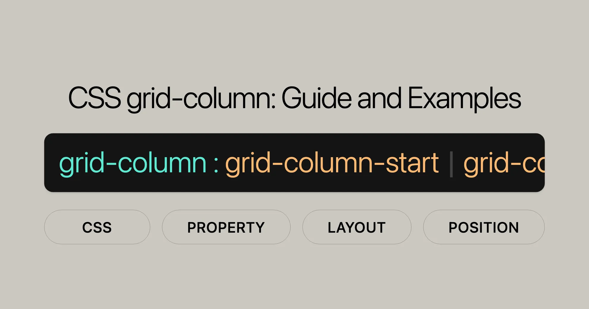
 CSS grid-column Guide and Examples
Learn how to control the size and location of grid items within a grid layout.
Understanding the grid-column Property
The CSS grid-column property is a powerful tool for creating complex and flexible grid layouts. It allows you to specify the size and location of a grid item by setting its starting and ending column lines. This shorthand property combines grid-column-start and grid-column-end, making it easy to control grid items.
Specification
The grid-column property is part of the CSS Grid Layout Module Level 2. This module provides tools for creating intricate and responsive grid layouts. The grid-column property simplifies the process of setting both the starting and ending column lines of a grid item with a single declaration.
Description
The CSS grid-column property is a shorthand property that specifies the size and location of a grid item within a grid container. It allows you to define both the starting and ending column lines of a grid item, making it easier to control the placement and span of elements in your grid layout.
Wide Compatibility
The CSS grid-column property is widely supported across many devices and browser versions, making it a reliable choice for web developers. Introduced in July 2020, this feature has become well-established and works seamlessly across various platforms.
Constituent Properties
The CSS grid-column property is a shorthand that combines the functionalities of two other CSS properties:
grid-column-start: This property specifies the starting line of a grid item’s column. It defines where the grid item begins within the grid container.grid-column-end: This property specifies the ending line of a grid item’s column. It defines where the grid item ends within the grid container.
By using the grid-column property, you can set both the starting and ending column lines of a grid item with a single declaration. For example, instead of writing:
grid-column-start: 1;grid-column-end: 4;You can simply use:
grid-column: 1 / 4;This shorthand notation reduces the amount of code and improves readability, making it easier to manage your grid layouts.
Syntax
The CSS grid-column property follows a straightforward syntax that allows you to specify the starting and ending column lines of a grid item. The basic syntax is as follows:
grid-column: grid-column-start / grid-column-end;Here is a detailed breakdown of the syntax:
- Keyword values:
grid-column: auto;grid-column: auto / auto;
- Custom identifiers:
grid-column: somegridarea;grid-column: somegridarea / someothergridarea;
- Integer values:
grid-column: somegridarea 4;grid-column: 4 somegridarea / 6;
- Span with integer or custom identifiers:
grid-column: span 3;grid-column: span somegridarea;grid-column: 5 somegridarea span;grid-column: span 3 / 6;grid-column: span somegridarea / span someothergridarea;grid-column: 5 somegridarea span / 2 span;
- Global values:
grid-column: inherit;grid-column: initial;grid-column: revert;grid-column: revert-layer;grid-column: unset;
The grid-column property can be specified using one or two <grid-line> values. If two values are provided, they are separated by a /. The first value sets the starting column line (grid-column-start), and the second value sets the ending column line (grid-column-end).
Each <grid-line> value can be specified in several ways:
autokeyword: Indicates that the property contributes nothing to the grid item’s placement, allowing automatic placement, span, or default settings.- Custom identifier (
<custom-ident>): If there is a named line with the name<custom-ident>-start/<custom-ident>-end, it contributes the corresponding line to the grid item’s placement. - Integer value: Specifies the nth grid line to the grid item’s placement. If a negative integer is given, it counts in reverse, starting from the end edge of the explicit grid.
spankeyword with integer or custom identifier: Contributes a grid span to the grid item’s placement such that the corresponding edge of the grid item’s grid area is n lines from the opposite edge.
Values
The CSS grid-column property accepts a variety of values that allow you to define the starting and ending column lines of a grid item. These values provide the flexibility to control the placement and span of grid items in a grid layout. Here are the different types of values that can be used with the grid-column property:
auto- Description: The
autokeyword indicates that the property contributes nothing to the grid item’s placement, allowing for automatic placement, span, or a default span of1. - Example:
grid-column: auto;grid-column: auto / auto;
- Description: The
<custom-ident>- Description: If there is a named line with the name
<custom-ident>-start/<custom-ident>-end, it contributes the corresponding line to the grid item’s placement. If no such named line exists, it is treated as if the integer1had been specified along with the<custom-ident>. - Note: Named grid areas automatically generate implicit named lines of this form, so specifying
grid-column: foo;will choose the start/end edge of that named grid area (unless another line namedfoo-start/foo-endwas explicitly specified before it). - Example:
grid-column: somegridarea;grid-column: somegridarea / someothergridarea;
- Description: If there is a named line with the name
<integer> && <custom-ident>?- Description: Specifies the nth grid line to the grid item’s placement. If a negative integer is given, it counts in reverse, starting from the end edge of the explicit grid. If a name is given as a
<custom-ident>, only lines with that name are counted. If not enough lines with that name exist, all implicit grid lines are assumed to have that name for the purpose of finding this position. - Example:
grid-column: somegridarea 4;grid-column: 4 somegridarea / 6;
- Description: Specifies the nth grid line to the grid item’s placement. If a negative integer is given, it counts in reverse, starting from the end edge of the explicit grid. If a name is given as a
span && [ <integer> || <custom-ident> ]- Description: Contributes a grid span to the grid item’s placement such that the corresponding edge of the grid item’s grid area is n lines from the opposite edge. If a name is given as a
<custom-ident>, only lines with that name are counted. If not enough lines with that name exist, all implicit grid lines on the side of the explicit grid corresponding to the search direction are assumed to have that name for the purpose of counting this span. If the<integer>is omitted, it defaults to1. Negative integers or0are invalid. - Example:
grid-column: span 3;grid-column: span somegridarea;grid-column: 5 somegridarea span;grid-column: span 3 / 6;grid-column: span somegridarea / span someothergridarea;grid-column: 5 somegridarea span / 2 span;
- Description: Contributes a grid span to the grid item’s placement such that the corresponding edge of the grid item’s grid area is n lines from the opposite edge. If a name is given as a
- Global Values
- Description: These values apply globally and can be used to reset or inherit styles.
- Example:
grid-column: inherit;grid-column: initial;grid-column: revert;grid-column: revert-layer;grid-column: unset;
Formal Definition
The grid-column property in CSS is formally defined as a shorthand property that combines the functionalities of grid-column-start and grid-column-end. This property allows you to specify the starting and ending column lines of a grid item within a grid container, providing precise control over the grid layout.
Initial Value:
- The initial value for
grid-columnis set toautofor bothgrid-column-startandgrid-column-end. This means that by default, grid items will be placed automatically within the grid container.
Applies To:
- The
grid-columnproperty applies to grid items and absolutely-positioned boxes whose containing block is a grid container. This ensures that the property is only effective within the context of a grid layout.
Inherited:
- The
grid-columnproperty is not inherited. This means that the property values are not automatically applied to child elements unless explicitly specified.
Computed Value:
- The computed value for
grid-columnis determined as specified for each of the shorthand properties:grid-column-startandgrid-column-end. This ensures that the computed values reflect the specified starting and ending column lines accurately.
Animation Type:
- The
grid-columnproperty is not animatable. This means that the property cannot be used in CSS animations or transitions.
Formal Syntax
The CSS grid-column property follows a specific formal syntax that defines how to specify the starting and ending column lines of a grid item. The syntax is structured to allow for various combinations of values, providing flexibility in defining the grid layout.
Here is the formal syntax for the grid-column property:
grid-column: <grid-line> [ / <grid-line> ]?;The syntax can be broken down as follows:
- Keyword values:
grid-column: auto;grid-column: auto / auto;
- Custom identifiers:
grid-column: somegridarea;grid-column: somegridarea / someothergridarea;
- Integer values:
grid-column: somegridarea 4;grid-column: 4 somegridarea / 6;
- Span with integer or custom identifiers:
grid-column: span 3;grid-column: span somegridarea;grid-column: 5 somegridarea span;grid-column: span 3 / 6;grid-column: span somegridarea / span someothergridarea;grid-column: 5 somegridarea span / 2 span;
- Global values:
grid-column: inherit;grid-column: initial;grid-column: revert;grid-column: revert-layer;grid-column: unset;
Examples
Example 1: Basic Usage
HTML:
<div class="grid-container"> <div class="item1">Item 1</div> <div class="item2">Item 2</div> <div class="item3">Item 3</div></div>CSS:
.grid-container {  display: grid;  grid-template-columns: repeat(3, 1fr);  grid-gap: 10px;  padding: 10px;  background-color: lightgray;}
.item1 {  background-color: lime;  grid-column: 1 / 3;}
.item2 {  background-color: yellow;  grid-column: 3 / 4;}
.item3 {  background-color: blue;}
Explanation:
- The
.grid-containerhas three columns. .item1spans from the first column line to the third column line..item2spans from the third column line to the fourth column line..item3takes the default placement.
Example 2: Using span
HTML:
<div class="grid-container"> <div class="item1">Item 1</div> <div class="item2">Item 2</div> <div class="item3">Item 3</div></div>CSS:
.grid-container {  display: grid;  grid-template-columns: repeat(4, 1fr);  grid-gap: 10px;  padding: 10px;  background-color: lightgray;}
.item1 {  background-color: lime;  grid-column: span 2;}
.item2 {  background-color: yellow;  grid-column: 3 / span 2;}
.item3 {  background-color: blue;}
Explanation:
- The
.grid-containerhas four columns. .item1spans two columns starting from its default position..item2starts from the third column line and spans two columns..item3takes the default placement.
Example 3: Using Named Grid Lines
HTML:
<div class="grid-container"> <div class="item1">Item 1</div> <div class="item2">Item 2</div> <div class="item3">Item 3</div></div>CSS:
.grid-container {  display: grid;  grid-template-columns: [start] 1fr [middle] 1fr [end] 1fr;  grid-gap: 10px;  padding: 10px;  background-color: lightgray;}
.item1 {  background-color: lime;  grid-column: start / middle;}
.item2 {  background-color: yellow;  grid-column: middle / end;}
.item3 {  background-color: blue;  grid-column: end / 4;}
Explanation:
- The
.grid-containerhas three columns namedstart,middle, andend. .item1spans from thestartline to themiddleline..item2spans from themiddleline to theendline..item3spans from theendline to the fourth column line.
Example 4: Using Named Grid Areas
HTML:
<div class="grid-container"> <div class="item1">Item 1</div> <div class="item2">Item 2</div> <div class="item3">Item 3</div></div>CSS:
.grid-container {  display: grid;  grid-template-areas:    "header header header"    "sidebar main main"    "footer footer footer";  grid-template-columns: 1fr 2fr 1fr;  grid-template-rows: auto;  grid-gap: 10px;  padding: 10px;  background-color: lightgray;}
.item1 {  background-color: lime;  grid-area: header;}
.item2 {  background-color: yellow;  grid-area: sidebar;}
.item3 {  background-color: blue;  grid-area: main;}
Explanation:
- The
.grid-containeruses named grid areas. .item1spans theheaderarea..item2spans thesidebararea..item3spans themainarea.
Example 5: Spanning Multiple Columns with span
HTML:
<div class="grid-container"> <div class="item1">Item 1</div> <div class="item2">Item 2</div> <div class="item3">Item 3</div></div>CSS:
.grid-container {  display: grid;  grid-template-columns: repeat(6, 1fr);  grid-gap: 10px;  padding: 10px;  background-color: lightgray;}
.item1 {  background-color: lime;  grid-column: span 3;}
.item2 {  background-color: yellow;  grid-column: 4 / span 2;}
.item3 {  background-color: blue;}
Explanation:
- The
.grid-containerhas six columns. .item1spans three columns starting from its default position..item2starts from the fourth column line and spans two columns..item3takes the default placement.
Example 6: Combining span and Named Grid Lines
HTML:
<div class="grid-container"> <div class="item1">Item 1</div> <div class="item2">Item 2</div> <div class="item3">Item 3</div></div>CSS:
.grid-container {  display: grid;  grid-template-columns: [start] 1fr [middle] 1fr [end] 1fr;  grid-gap: 10px;  padding: 10px;  background-color: lightgray;}
.item1 {  background-color: lime;  grid-column: start / span middle;}
.item2 {  background-color: yellow;  grid-column: middle / span end;}
.item3 {  background-color: blue;  grid-column: end / span 1;}
Explanation:
- The
.grid-containerhas three columns namedstart,middle, andend. .item1spans from thestartline to themiddleline..item2spans from themiddleline to theendline..item3spans one column starting from theendline.
Example 7: Using auto Keyword
HTML:
<div class="grid-container"> <div class="item1">Item 1</div> <div class="item2">Item 2</div> <div class="item3">Item 3</div></div>CSS:
.grid-container {  display: grid;  grid-template-columns: repeat(3, 1fr);  grid-gap: 10px;  padding: 10px;  background-color: lightgray;}
.item1 {  background-color: lime;  grid-column: auto / span 2;}
.item2 {  background-color: yellow;  grid-column: auto / span 1;}
.item3 {  background-color: blue;  grid-column: auto;}
Explanation:
- The
.grid-containerhas three columns. .item1spans two columns starting from its default position..item2spans one column starting from its default position..item3takes the default placement.
Conclusion
The CSS grid-column property is a powerful tool for creating flexible and responsive grid layouts. By mastering this property, you can create complex and dynamic designs that look great on any device.
Browser Support
The CSS grid-column property is widely supported across modern web browsers, ensuring your layouts work consistently across different platforms. Here’s an overview:
- Google Chrome: Supported since Chrome 57.
- Mozilla Firefox: Supported since Firefox 52.
- Microsoft Edge: Supported since Edge 16.
- Opera: Supported since Opera 44.
- Safari: Supported since Safari 10.
This broad support means your grid layouts will display correctly on most modern browsers, enhancing user experience and accessibility.
You May Also Like
For more info on CSS Grid and related properties, check out these resources:
- CSS
grid-rowProperty Reference: Learn about thegrid-rowproperty, which works similarly togrid-columnbut for rows. - CSS
grid-row-startProperty Reference: Understand how to set the starting row line for a grid item. - CSS
grid-row-endProperty Reference: Learn how to specify the ending row line for a grid item. - CSS
grid-column-startProperty Reference: Explore how to set the starting column line for a grid item. - CSS
grid-column-endProperty Reference: Learn how to define the ending column line for a grid item. - Line-based Placement with CSS Grid: Dive into line-based placement for precise grid item placement.
- Video: Line-based Placement: Watch a tutorial on effective line-based placement in CSS Grid.
These resources will help you master CSS Grid and create stunning, responsive layouts.
 Latest Blogs
  สร้างเว็บไซต์ 1 เว็บ ต้องใช้งบเท่าไหร่? เจาะลึกทุกองค์ประกอบ website development cost อยากสร้างเว็บไซต์แต่ไม่มั่นใจในเรื่องของงบประมาณ อ่านสรุปเจาะลึกตั้งแต่ดีไซน์, ฟังก์ชัน และการดูแล พร้อมตัวอย่างงบจริงจาก Till it’s done ที่แผนชัด งบไม่บานปลายแน่นอน
  Next.js สอน 14 ขั้นตอนเบื้องต้น: สร้างโปรเจกต์แรกใน 30 นาที เริ่มต้นกับ Next.js ใน 14 ขั้นตอนเพียงแค่ 30 นาที พร้อม SSR/SSG และ API Routes ด้วยตัวอย่างโค้ดง่าย ๆ อ่านต่อเพื่อสร้างโปรเจ็กต์แรกได้ทันทีที่นี่
  วิธีสมัคร Apple Developer Account เพื่อนำแอปขึ้น App Store ทีละขั้นตอน อยากปล่อยแอปบน App Store ระดับโลก มาอ่านคู่มือสมัคร Apple Developer Account พร้อมเคล็ดลับ TestFlight และวิธีอัปโหลดที่ง่ายในบทความเดียวนี้ได้เลย
  TypeScript Interface คืออะไร? อธิบายพร้อมวิธีใช้และข้อแตกต่างจาก Type เรียนรู้วิธีใช้ TypeScript Interface เพื่อสร้างโครงสร้างข้อมูลที่ปลอดภัยและเข้าใจง่าย พร้อมเปรียบเทียบข้อดีข้อแตกต่างกับ Type ที่คุณต้องรู้ ถูกรวมเอาไว้ในบทความนี้แล้ว
  Material-UI (MUI) คืออะไร อยากสร้าง UI สวยงามและเป็นมืออาชีพในเวลาอันรวดเร็วใช่ไหม มาทำความรู้จักกับ Material-UI (MUI) ที่ช่วยให้คุณพัฒนาแอปพลิเคชันบน React ได้ง่ายและดูดีในทุกอุปกรณ์
  เปรียบเทียบ 3 วิธีติดตั้ง install node js บน Ubuntu: NVM vs NodeSource vs Official Repo แบบไหนดีที่สุด? เรียนรู้วิธีติดตั้ง Node.js บน Ubuntu ด้วย NVM, NodeSource หรือ Official Repo เลือกวิธีที่เหมาะกับความต้องการของคุณ พร้อมเปรียบเทียบ เพื่อการพัฒนาที่มีประสิทธิภาพ!
 พูดคุยกับซีอีโอ
Explore our best articles, cover a wide variety of technologies 
 ReactJs
  Flutter
  Nodejs
  Nextjs
  TailwindCSS
  Typescript Golang AstroJs Jest Website development th Mobile application th Reactjs th Nextjs th Flutter th Software house th Nodejs th Typescript th
  CSS
CSS We'll be right here with you every step of the way.
We'll be here, prepared to commence this promising collaboration.


Whether you're curious about features, warranties, or shopping policies, we provide comprehensive answers to assist you.