
- Services
- Case Studies
- Technologies
- NextJs development
- Flutter development
- NodeJs development
- ReactJs development
- About
- Contact
- Tools
- Blogs
- FAQ
 Scroll to discover
 Mastering CSS grid-auto-columns for Flexible Layouts
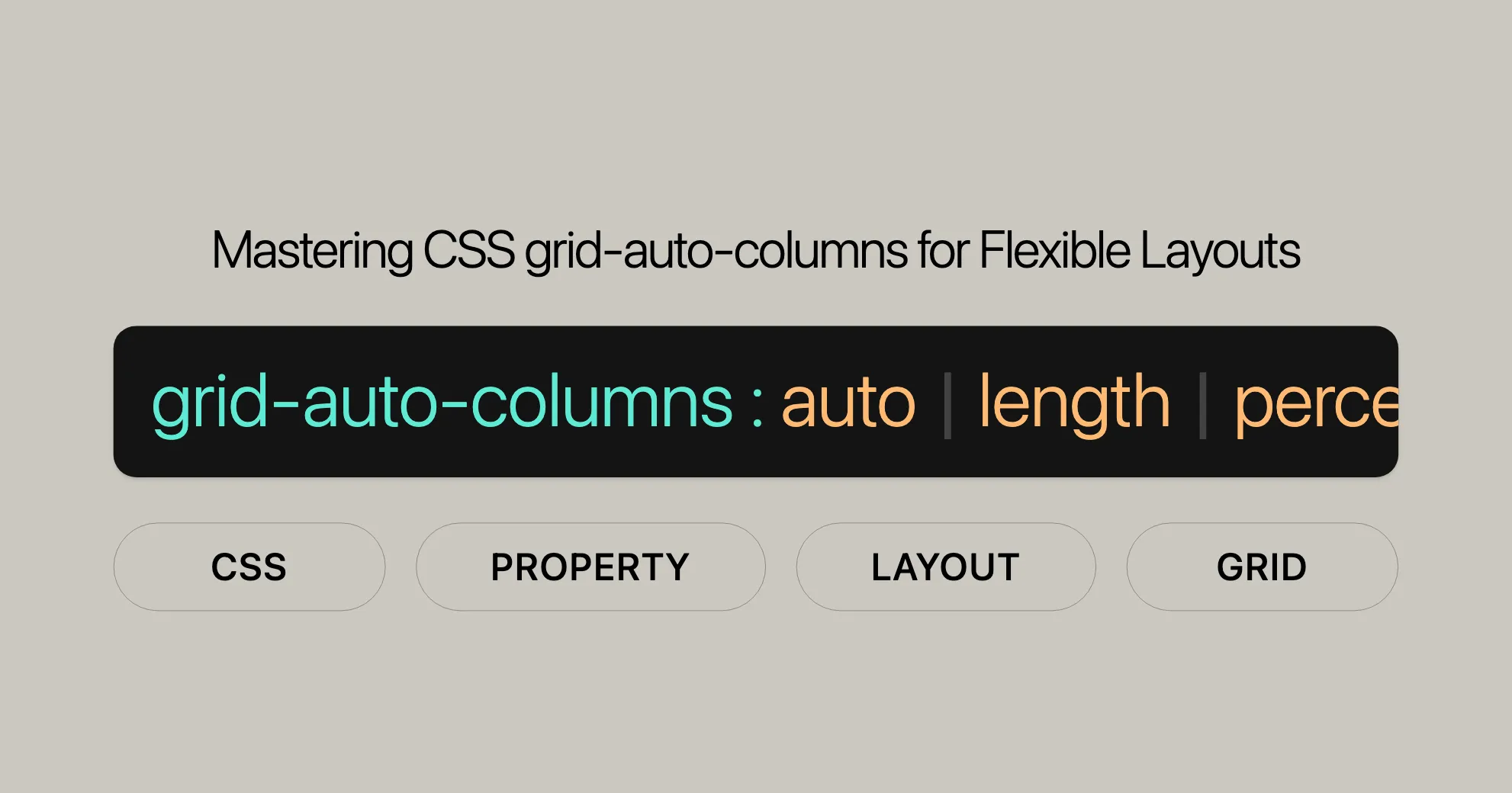
Control implicit column sizes with auto, length, percentage, minmax(), and more.
Introduction
The grid-auto-columns CSS property is a handy tool for defining the size of implicitly-created grid columns. This property has been widely supported since July 2020 and helps you create flexible and responsive grid layouts.
Specification
The grid-auto-columns property is part of the CSS Grid Layout Module Level 2 specification. It’s defined in the CSS Grid Layout Module Level 2 and is crucial for managing grid layouts.
Description
The grid-auto-columns CSS property controls the size of implicitly-created grid columns. It’s useful when grid items are placed into columns that aren’t explicitly defined by the grid-template-columns property. This property allows you to use various values like auto, lengths, percentages, and more to define the size of these columns.
Baseline Compatibility
The grid-auto-columns property is widely supported across many browsers and devices since July 2020. This ensures that your grid layouts will work consistently across different platforms.
Syntax
The syntax for the grid-auto-columns property is straightforward:
grid-auto-columns: <track-size>+;Here are some examples of how you can use it:
grid-auto-columns: auto;grid-auto-columns: 100px;grid-auto-columns: 20%;grid-auto-columns: 0.5fr;grid-auto-columns: minmax(100px, auto);grid-auto-columns: fit-content(400px);Values
The grid-auto-columns property supports various values:
- Length Values: Specify the exact size of the column.
grid-auto-columns: 100px;
- Percentage Values: Relative to the block size of the grid container.
grid-auto-columns: 10%;
- Flex Values: Specify the track’s flex factor.
grid-auto-columns: 0.5fr;
- Max-Content: Largest maximal content contribution of the grid items.
grid-auto-columns: max-content;
- Min-Content: Largest minimal content contribution of the grid items.
grid-auto-columns: min-content;
- Minmax(min, max): Defines a size range.
grid-auto-columns: minmax(100px, auto);
- Fit-Content(): Clamps the track size at the specified length.
grid-auto-columns: fit-content(400px);
- Auto: Represents the range between the minimum and maximum sizes.
grid-auto-columns: auto;
Global Values
- Inherit: Inherits the value from the parent element.
- Initial: Sets the property to its default value.
- Revert: Resets the property to the user agent’s default stylesheet.
- Revert-Layer: Resets the property considering the cascade layer.
- Unset: Resets the property to its natural value.
grid-auto-columns: inherit;grid-auto-columns: initial;grid-auto-columns: revert;grid-auto-columns: revert-layer;grid-auto-columns: unset;Formal Definition
The grid-auto-columns property is used to specify the size of implicitly-created grid columns.
Initial Value
- The initial value for
grid-auto-columnsisauto.
Applies To
- This property applies to grid containers.
Inherited
- This property is not inherited from the parent element.
Percentages
- Percentage values refer to the corresponding dimension of the content area. If the block size of the grid container is indefinite, the percentage value is treated like
auto.
Computed Value
- The computed value is either the specified percentage or the absolute length.
Animation Type
- The animation type is by computed value type.
Formal Syntax
The formal syntax for the grid-auto-columns property is:
grid-auto-columns: <track-size>+;Track Size
<track-size> = <track-breadth> | minmax( <inflexible-breadth> , <track-breadth> ) | fit-content( <length-percentage [0,∞]> );Track Breadth
<track-breadth> = <length-percentage [0,∞]> | <flex [0,∞]> | min-content | max-content | auto;Inflexible Breadth
<inflexible-breadth> = <length-percentage [0,∞]> | min-content | max-content | auto;Length-Percentage
<length-percentage> = <length> | <percentage>;Example
Here’s an example to illustrate how to use the grid-auto-columns property:
<!DOCTYPE html><html lang="en"><head> <meta charset="UTF-8"> <meta name="viewport" content="width=device-width, initial-scale=1.0"> <title>Grid Auto Columns Example</title> <style> .grid-container { display: grid; grid-auto-columns: minmax(100px, auto); grid-gap: 10px; } .grid-item { background-color: lightblue; padding: 20px; border: 1px solid #000; } </style></head><body> <div class="grid-container"> <div class="grid-item">Item 1</div> <div class="grid-item">Item 2</div> <div class="grid-item">Item 3</div> <div class="grid-item">Item 4</div> </div></body></html>In this example, the grid-auto-columns property is used to create a grid layout where the implicit columns have a minimum size of 100px and can grow to accommodate the content.
Examples
To better understand how to use the grid-auto-columns property, let’s explore some practical examples. Each example demonstrates a different way to specify the size of implicitly-created grid columns.
Example: Using grid-auto-columns
HTML:
<!DOCTYPE html><html><head>    <title>CSS grid-auto-columns Property</title>    <style>        .main {            display: grid;            grid-template-areas: "a a";            grid-gap: 20px;            padding: 30px;            background-color: green;            grid-auto-columns: auto;        }
        .GFG {            text-align: center;            font-size: 35px;            background-color: white;            padding: 20px 0;        }    </style></head><body>    <div class="main">        <div class="GFG">1</div>        <div class="GFG">2</div>        <div class="GFG">3</div>        <div class="GFG">4</div>        <div class="GFG">5</div>    </div></body></html>
Output:

HTML:
<!DOCTYPE html><html><head>    <title>CSS grid-auto-columns Property</title>    <style>        .main {            display: grid;            grid-template-areas: "a a";            grid-gap: 20px;            padding: 30px;            background-color: green;            grid-auto-columns: 8.5cm;        }
        .GFG {            text-align: center;            font-size: 35px;            background-color: white;            padding: 20px 0;        }    </style></head><body>    <div class="main">        <div class="GFG">1</div>        <div class="GFG">2</div>        <div class="GFG">3</div>        <div class="GFG">4</div>        <div class="GFG">5</div>    </div></body></html>
Output:

HTML:
<!DOCTYPE html><html><head>    <title>CSS grid-auto-columns Property</title>    <style>        .main {            display: grid;            grid-template-areas: "a a";            grid-gap: 20px;            padding: 30px;            background-color: green;            grid-auto-columns: 30%;        }
        .GFG {            text-align: center;            font-size: 35px;            background-color: white;            padding: 20px 0;        }    </style></head><body>    <div class="main">        <div class="GFG">1</div>        <div class="GFG">2</div>        <div class="GFG">3</div>        <div class="GFG">4</div>        <div class="GFG">5</div>    </div></body></html>
Output:

HTML:
<!DOCTYPE html><html><head>    <title>CSS grid-auto-columns Property</title>    <style>        .main {            display: grid;            grid-template-areas: "a a";            grid-gap: 20px;            padding: 30px;            background-color: green;            grid-auto-columns: minmax(100px, 4cm);        }
        .GFG {            text-align: center;            font-size: 35px;            background-color: white;            padding: 20px 0;        }    </style></head><body>    <div class="main">        <div class="GFG">1</div>        <div class="GFG">2</div>        <div class="GFG">3</div>        <div class="GFG">4</div>        <div class="GFG">5</div>    </div></body></html>
Output:

HTML:
<!DOCTYPE html><html><head>    <title>CSS grid-auto-columns Property</title>    <style>        .main {            display: grid;            grid-template-areas: "a a";            grid-gap: 20px;            padding: 30px;            background-color: green;            grid-auto-columns: initial;        }
        .GFG {            text-align: center;            font-size: 35px;            background-color: white;            padding: 20px 0;        }    </style></head><body>    <div class="main">        <div class="GFG">1</div>        <div class="GFG">2</div>        <div class="GFG">3</div>        <div class="GFG">4</div>        <div class="GFG">5</div>    </div></body></html>
Output:

HTML:
<!DOCTYPE html><html><head>    <title>CSS grid-auto-columns Property</title>    <style>        .main {            display: grid;            grid-template-areas: "a a";            grid-gap: 20px;            padding: 30px;            background-color: green;            grid-auto-columns: inherit;        }
        .GFG {            text-align: center;            font-size: 35px;            background-color: white;            padding: 20px 0;        }    </style></head><body>    <div class="main">        <div class="GFG">1</div>        <div class="GFG">2</div>        <div class="GFG">3</div>        <div class="GFG">4</div>        <div class="GFG">5</div>    </div></body></html>
Output:
Browser Compatibility
The grid-auto-columns property is well-supported across a wide range of browsers, ensuring that your grid layouts function consistently across different platforms and devices. This feature has been available since July 2020 and is compatible with the following browser versions:
- Google Chrome: Version 57 and above (released in March 2017)
- Mozilla Firefox: Version 52 and above (released in March 2017)
- Microsoft Edge: Version 16 and above (released in September 2017)
- Opera: Version 44 and above (released in March 2017)
- Safari: Version 10 and above (released in September 2016)
For the most up-to-date information on browser compatibility, you can refer to the Browser Compatibility Data (BCD) provided by MDN Web Docs.
See Also
For further learning and to expand your knowledge on CSS grid layouts and related properties, consider exploring the following resources:
- CSS
grid-auto-rows: Learn about thegrid-auto-rowsproperty, which specifies the size of implicitly-created grid rows. - CSS
grid-auto-flow: Understand how thegrid-auto-flowproperty controls the auto-placement algorithm in grid layouts. - CSS
grid: Get an overview of the CSS Grid Layout module and its various properties. - Auto-placement in grid layout: sizing rows in the implicit grid: Learn more about how the auto-placement algorithm works and how to size rows in the implicit grid.
- Video: Introducing grid auto-placement and order: Watch a video tutorial that introduces the concepts of grid auto-placement and order.
These resources will provide you with a deeper understanding of CSS grid layouts and help you master the use of the grid-auto-columns property in your web development projects.
 Latest Blogs
  สร้างเว็บไซต์ 1 เว็บ ต้องใช้งบเท่าไหร่? เจาะลึกทุกองค์ประกอบ website development cost อยากสร้างเว็บไซต์แต่ไม่มั่นใจในเรื่องของงบประมาณ อ่านสรุปเจาะลึกตั้งแต่ดีไซน์, ฟังก์ชัน และการดูแล พร้อมตัวอย่างงบจริงจาก Till it’s done ที่แผนชัด งบไม่บานปลายแน่นอน
  Next.js สอน 14 ขั้นตอนเบื้องต้น: สร้างโปรเจกต์แรกใน 30 นาที เริ่มต้นกับ Next.js ใน 14 ขั้นตอนเพียงแค่ 30 นาที พร้อม SSR/SSG และ API Routes ด้วยตัวอย่างโค้ดง่าย ๆ อ่านต่อเพื่อสร้างโปรเจ็กต์แรกได้ทันทีที่นี่
  วิธีสมัคร Apple Developer Account เพื่อนำแอปขึ้น App Store ทีละขั้นตอน อยากปล่อยแอปบน App Store ระดับโลก มาอ่านคู่มือสมัคร Apple Developer Account พร้อมเคล็ดลับ TestFlight และวิธีอัปโหลดที่ง่ายในบทความเดียวนี้ได้เลย
  TypeScript Interface คืออะไร? อธิบายพร้อมวิธีใช้และข้อแตกต่างจาก Type เรียนรู้วิธีใช้ TypeScript Interface เพื่อสร้างโครงสร้างข้อมูลที่ปลอดภัยและเข้าใจง่าย พร้อมเปรียบเทียบข้อดีข้อแตกต่างกับ Type ที่คุณต้องรู้ ถูกรวมเอาไว้ในบทความนี้แล้ว
  Material-UI (MUI) คืออะไร อยากสร้าง UI สวยงามและเป็นมืออาชีพในเวลาอันรวดเร็วใช่ไหม มาทำความรู้จักกับ Material-UI (MUI) ที่ช่วยให้คุณพัฒนาแอปพลิเคชันบน React ได้ง่ายและดูดีในทุกอุปกรณ์
  เปรียบเทียบ 3 วิธีติดตั้ง install node js บน Ubuntu: NVM vs NodeSource vs Official Repo แบบไหนดีที่สุด? เรียนรู้วิธีติดตั้ง Node.js บน Ubuntu ด้วย NVM, NodeSource หรือ Official Repo เลือกวิธีที่เหมาะกับความต้องการของคุณ พร้อมเปรียบเทียบ เพื่อการพัฒนาที่มีประสิทธิภาพ!
 พูดคุยกับซีอีโอ
Explore our best articles, cover a wide variety of technologies 
 ReactJs
  Flutter
  Nodejs
  Nextjs
  TailwindCSS
  Typescript Golang AstroJs Jest Website development th Mobile application th Reactjs th Nextjs th Flutter th Software house th Nodejs th Typescript th
  CSS
CSS We'll be right here with you every step of the way.
We'll be here, prepared to commence this promising collaboration.


Whether you're curious about features, warranties, or shopping policies, we provide comprehensive answers to assist you.