
- Services
- Case Studies
- Technologies
- NextJs development
- Flutter development
- NodeJs development
- ReactJs development
- About
- Contact
- Tools
- Blogs
- FAQ
 Scroll to discover
 CSS Gap Simplifying Layout Spacing
Explore available options and practical examples.
Using the gap Property in CSS
The gap property in CSS is a handy shorthand for setting the space between rows and columns in flex, grid, and multi-column layouts. This property makes it easier to manage spacing, enhancing the visual appeal and user experience of your web pages.
Key Features of the gap Property
- Simplifies Spacing: The
gapproperty combinesrow-gapandcolumn-gapinto a single property, making it easier to set consistent spacing. - Versatile: It works with flex containers, grid containers, and multi-column layouts.
- Enhances Visual Appeal: By controlling the spacing precisely, you can create balanced and professional-looking layouts.
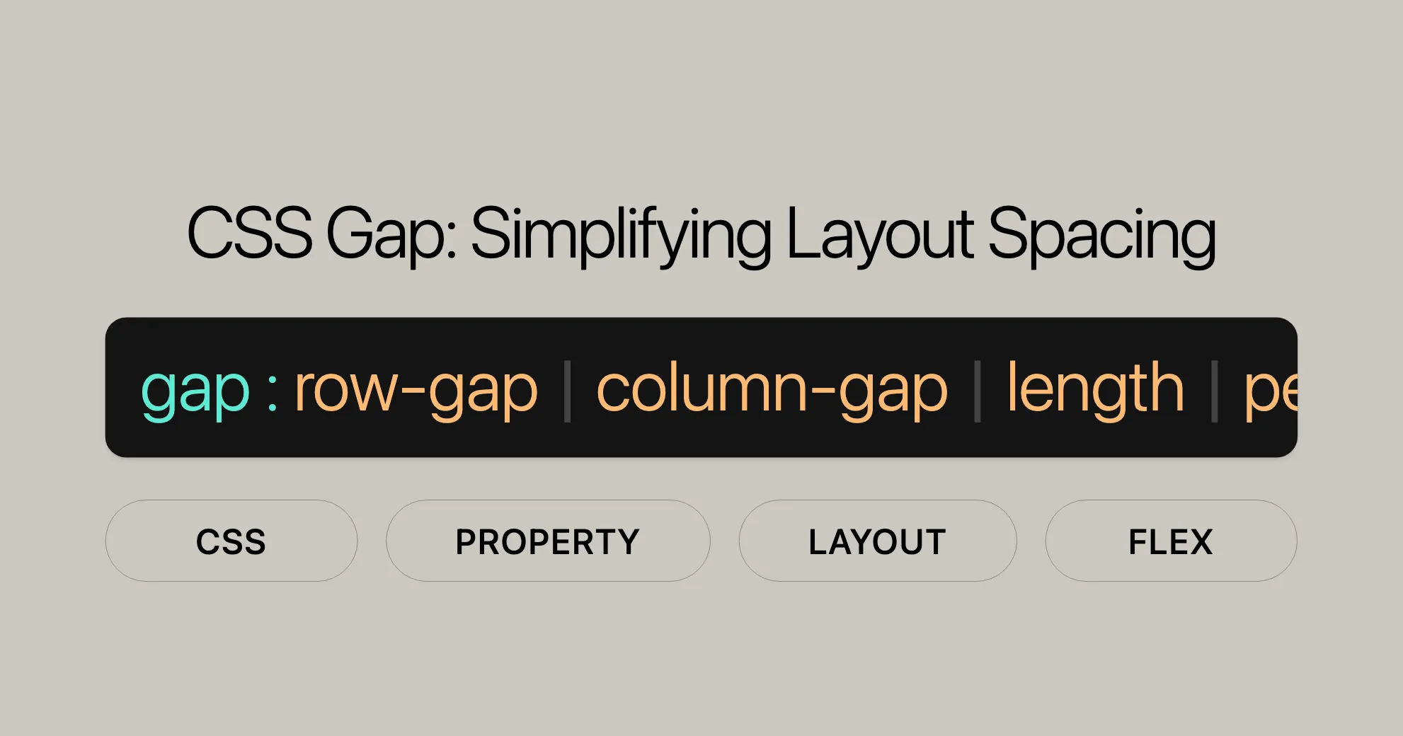
Syntax and Values
The syntax for the gap property is straightforward:
gap: <row-gap> <column-gap>;-
One Value: Applies to both rows and columns.
gap: 20px;gap: 1em;gap: 16%; -
Two Values: First value for rows, second value for columns.
gap: 20px 10px;gap: 1em 0.5em;gap: 16% 100%; -
Percentages: Relative to the container size.
gap: 16%;gap: 100%; -
Calc Function: For more complex calculations.
gap: calc(10% + 20px);gap: calc(20px + 10%) calc(10% - 5px); -
Global Values: Inherit, initial, revert, revert-layer, unset.
gap: inherit;gap: initial;gap: revert;gap: revert-layer;gap: unset;
Formal Definition
The gap property is part of the CSS Box Alignment Module Level 3. It combines row-gap and column-gap properties:
- Initial Value:
normal(typically0except in multi-column layouts). - Applies To: Multi-column elements, flex containers, grid containers.
- Inherited: No.
- Computed Value: As specified, with lengths made absolute, and
normalcomputing to zero except on multi-column elements. - Animation Type: A length, percentage, or calc().
Practical Examples
Flex Layout
HTML:
<div id="flexbox"> <div></div> <div></div> <div></div> <div></div> <div></div> <div></div></div>CSS:
#flexbox {  display: flex;  gap: 20px 10px; /* Row gap: 20px, Column gap: 10px */}
#flexbox div {  width: 50px;  height: 50px;  background-color: lightblue;}
Grid Layout
HTML:
<div id="grid"> <div>1</div> <div>2</div> <div>3</div> <div>4</div></div>CSS:
#grid {  display: grid;  gap: 10px; /* Gap between rows and columns */  grid-template-columns: repeat(2, 1fr);}
#grid div {  background-color: lightcoral;  padding: 20px;}
Multi-Column Layout
HTML:
<div id="multicol"> <p>Lorem ipsum dolor sit amet, consectetur adipiscing elit.</p> <p>Lorem ipsum dolor sit amet, consectetur adipiscing elit.</p></div>CSS:
#multicol {  column-count: 2;  column-gap: 20px; /* Gap between columns */}
#multicol p {  margin: 0;}
Percentage Gap Value and Explicit Container Size
When the container has a fixed size, the gap value is calculated based on the container’s size.
HTML:
<span>Grid</span><div id="grid"> <div>1</div> <div>2</div> <div>3</div> <div>4</div> <div>5</div></div><span>Flex</span><div id="flex"> <div>1</div> <div>2</div> <div>3</div> <div>4</div> <div>5</div></div>CSS:
body > div {  background-color: #ccc;  width: 200px;  flex-flow: column;}
#grid {  display: inline-grid;  height: 200px;  gap: 12.5% 0;}
#flex {  display: inline-flex;  height: 200px;  gap: 12.5% 0;}
#grid > div,#flex > div {  background-color: coral;  width: 20px;  height: 20px;}
Percentage Gap Value and Implicit Container Size
When the container does not have a fixed size, the behavior of the percentage gap can vary.
HTML:
<span>Grid</span><div id="grid"> <div>1</div> <div>2</div> <div>3</div> <div>4</div> <div>5</div></div><span>Flex</span><div id="flex"> <div>1</div> <div>2</div> <div>3</div> <div>4</div> <div>5</div></div>CSS:
body > div {  background-color: #ccc;  width: 200px;}
#grid {  display: inline-grid;  gap: 12.5% 0;}
#flex {  display: inline-flex;  gap: 12.5% 0;  flex-flow: column;}
#grid > div,#flex > div {  background-color: coral;  width: 20px;  height: 20px;}
Key Points
gapproperty: Sets the space between items and lines in flex and grid layouts.flex-wrap: wrap;: Allows flex items to wrap into multiple rows.grid-template: Defines the grid structure.column-count: Defines the number of columns in a multi-column layout.
Browser Compatibility
The gap property works well across modern browsers:
- Chrome: Supported since version 50.0 (April 2016)
- Firefox: Supported since version 52.0 (March 2017)
- IE/Edge: Supported since version 10.0 (September 2012)
- Opera: Supported since version 37.0 (May 2016)
- Safari: Supported since version 9.0 (September 2015)
For the latest compatibility info, check Can I use.
Related Topics
For more info, explore these resources:
row-gap: Controls the space between rows.column-gap: Controls the space between columns.- Basic concepts of grid layout: gutters: Understand gutters in grid layouts.
- CSS box alignment: Learn about aligning elements in flex and grid containers.
- CSS flexible box layout: Create flexible and responsive layouts.
- CSS grid layout: Design complex grid-based layouts.
- CSS multi-column layout: Create multi-column text layouts.
Specifications
The gap property is defined in the CSS Box Alignment Module Level 3. For detailed info, check the CSS Box Alignment Module Level 3 specification.
Browser Compatibility
The gap property is widely supported across modern browsers:
- Google Chrome: Supported since version 50.0 (April 2016).
- Mozilla Firefox: Supported since version 52.0 (March 2017).
- Internet Explorer/Edge: Supported since version 10.0 (September 2012).
- Opera: Supported since version 37.0 (May 2016).
- Safari: Supported since version 9.0 (September 2015).
For the latest compatibility info, check Can I use.
See Also
For further reading, explore these resources:
row-gap: Controls the space between rows.column-gap: Controls the space between columns.- Basic concepts of grid layout: gutters: Understand gutters in grid layouts.
- CSS box alignment: Learn about aligning elements in flex and grid containers.
- CSS flexible box layout: Create flexible and responsive layouts.
- CSS grid layout: Design complex grid-based layouts.
- CSS multi-column layout: Create multi-column text layouts.
These resources provide a comprehensive understanding of the gap property and related CSS properties, helping you create well-structured and visually appealing web designs.
 Latest Blogs
  สร้างเว็บไซต์ 1 เว็บ ต้องใช้งบเท่าไหร่? เจาะลึกทุกองค์ประกอบ website development cost อยากสร้างเว็บไซต์แต่ไม่มั่นใจในเรื่องของงบประมาณ อ่านสรุปเจาะลึกตั้งแต่ดีไซน์, ฟังก์ชัน และการดูแล พร้อมตัวอย่างงบจริงจาก Till it’s done ที่แผนชัด งบไม่บานปลายแน่นอน
  Next.js สอน 14 ขั้นตอนเบื้องต้น: สร้างโปรเจกต์แรกใน 30 นาที เริ่มต้นกับ Next.js ใน 14 ขั้นตอนเพียงแค่ 30 นาที พร้อม SSR/SSG และ API Routes ด้วยตัวอย่างโค้ดง่าย ๆ อ่านต่อเพื่อสร้างโปรเจ็กต์แรกได้ทันทีที่นี่
  วิธีสมัคร Apple Developer Account เพื่อนำแอปขึ้น App Store ทีละขั้นตอน อยากปล่อยแอปบน App Store ระดับโลก มาอ่านคู่มือสมัคร Apple Developer Account พร้อมเคล็ดลับ TestFlight และวิธีอัปโหลดที่ง่ายในบทความเดียวนี้ได้เลย
  TypeScript Interface คืออะไร? อธิบายพร้อมวิธีใช้และข้อแตกต่างจาก Type เรียนรู้วิธีใช้ TypeScript Interface เพื่อสร้างโครงสร้างข้อมูลที่ปลอดภัยและเข้าใจง่าย พร้อมเปรียบเทียบข้อดีข้อแตกต่างกับ Type ที่คุณต้องรู้ ถูกรวมเอาไว้ในบทความนี้แล้ว
  Material-UI (MUI) คืออะไร อยากสร้าง UI สวยงามและเป็นมืออาชีพในเวลาอันรวดเร็วใช่ไหม มาทำความรู้จักกับ Material-UI (MUI) ที่ช่วยให้คุณพัฒนาแอปพลิเคชันบน React ได้ง่ายและดูดีในทุกอุปกรณ์
  เปรียบเทียบ 3 วิธีติดตั้ง install node js บน Ubuntu: NVM vs NodeSource vs Official Repo แบบไหนดีที่สุด? เรียนรู้วิธีติดตั้ง Node.js บน Ubuntu ด้วย NVM, NodeSource หรือ Official Repo เลือกวิธีที่เหมาะกับความต้องการของคุณ พร้อมเปรียบเทียบ เพื่อการพัฒนาที่มีประสิทธิภาพ!
 พูดคุยกับซีอีโอ
Explore our best articles, cover a wide variety of technologies 
 ReactJs
  Flutter
  Nodejs
  Nextjs
  TailwindCSS
  Typescript Golang AstroJs Jest Website development th Mobile application th Reactjs th Nextjs th Flutter th Software house th Nodejs th Typescript th
  CSS
CSS We'll be right here with you every step of the way.
We'll be here, prepared to commence this promising collaboration.


Whether you're curious about features, warranties, or shopping policies, we provide comprehensive answers to assist you.