
- Services
- Case Studies
- Technologies
- NextJs development
- Flutter development
- NodeJs development
- ReactJs development
- About
- Contact
- Tools
- Blogs
- FAQ
 Scroll to discover
 CSS Column-Width A Comprehensive Guide
Learn how to use it to create responsive designs and explore available options.
Introduction to column-width
The column-width CSS property sets the ideal width for each column in a multi-column container. It ensures that the container will have as many columns as can fit without any of them being narrower than the specified width. If the container’s width is less than the specified column width, the single column’s width will be smaller than the declared column width.
This property is useful in web development and design, as it helps create flexible and adaptable layouts that adjust to different screen sizes. When used with other CSS properties like column-count, width, column-gap, and column-rule-width, column-width can fine-tune the appearance of columns to meet specific design requirements.
Specification and Usage
The column-width property in CSS is defined by the CSS Box Sizing Module Level 3 and the CSS Multi-column Layout Module Level 1. These specifications outline the behavior and usage of column-width, ensuring consistent implementation across different browsers.
Usage:
- Ideal Column Width: The
column-widthproperty sets the ideal width for each column in a multi-column layout. The container will try to fit as many columns as possible without any column being narrower than the specified width. - Responsive Design: This property is essential for creating responsive designs. It allows the layout to adjust the number of columns based on the available space, ensuring that the content remains readable and visually appealing on different devices.
- Combining with Other Properties: For precise control over column layouts,
column-widthcan be used in conjunction with other CSS properties likecolumn-count,width,column-gap, andcolumn-rule-width. These properties work together to define the exact width, count, spacing, and appearance of columns.
Syntax and Values
The column-width property in CSS is straightforward to use, with a simple and intuitive syntax.
Syntax:
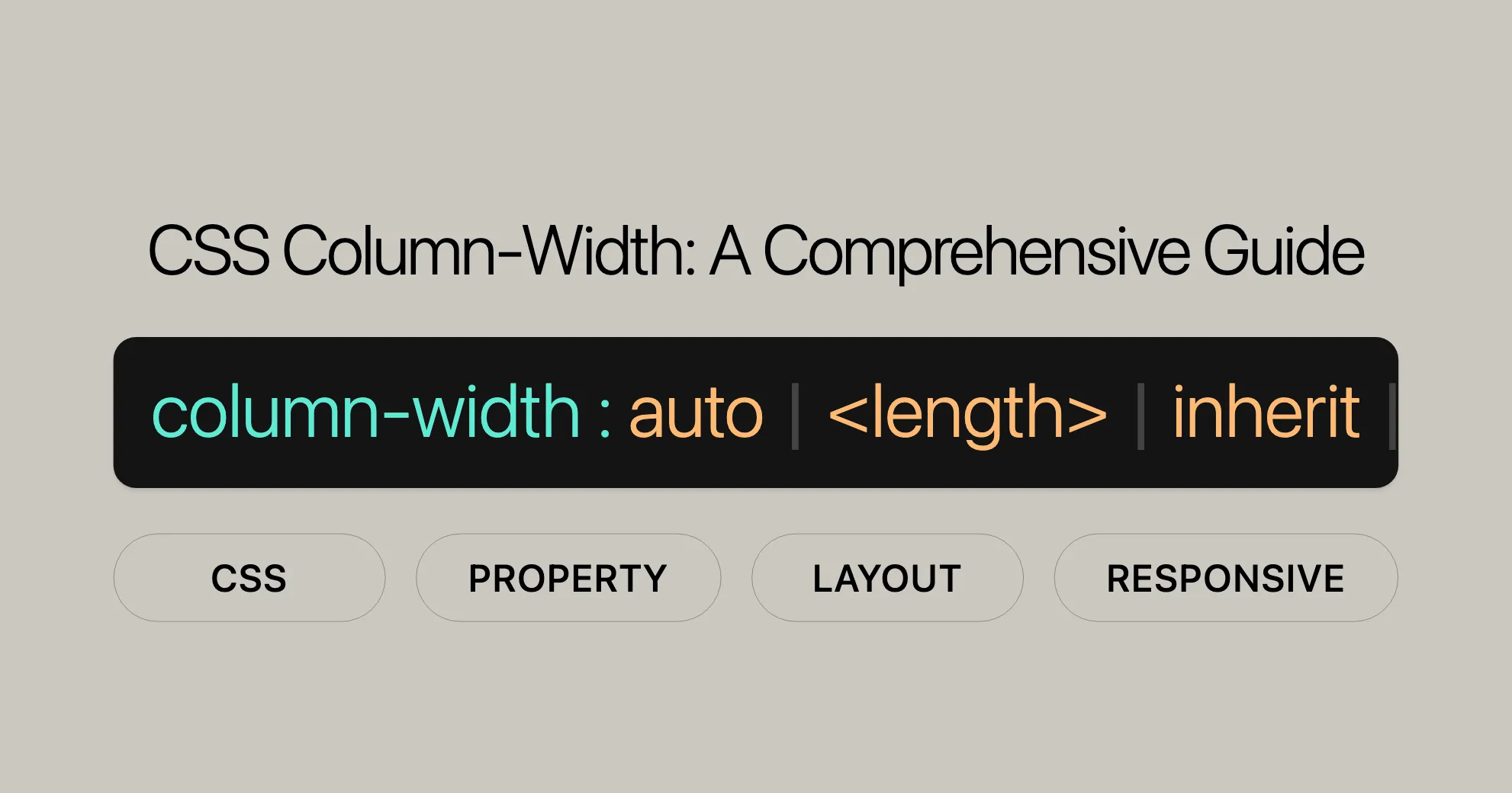
column-width: auto | <length>;Values:
<length>:- Specifies the optimal column width using a length unit such as pixels (
px), ems (em), or viewport widths (vw). The actual column width may vary depending on the available space in the container. - Example:
column-width: 200px;column-width: 15em;column-width: 3vw;
- Specifies the optimal column width using a length unit such as pixels (
auto:- The default value. When set to
auto, the browser determines the width of the columns based on other CSS properties, such ascolumn-count. - Example:
column-width: auto;
- The default value. When set to
- Global Values:
inherit: Inherits thecolumn-widthvalue from the parent element.initial: Sets thecolumn-widthto its default value.revert: Resets thecolumn-widthto the browser’s default styling.revert-layer: Resets thecolumn-widthto the value established by the user-agent stylesheet for the current cascade layer.unset: Resets thecolumn-widthto its inherited value if it inherits from its parent, or to its initial value if it does not inherit.- Examples:
column-width: inherit;column-width: initial;column-width: revert;column-width: revert-layer;column-width: unset;
Formal Definition and Syntax
The column-width property in CSS is formally defined to specify the ideal width for columns in a multi-column layout.
Formal Definition:
- Initial Value:
auto - Applies to: Block containers, except table wrapper boxes
- Inherited: No
- Computed Value: An absolute length, zero or larger
- Animation Type: A length
Syntax:
column-width = auto | <length> | initial | inherit | revert | revert-layer | unset;Formal Syntax Breakdown:
auto:- The browser determines the width of the columns based on other CSS properties, such as
column-count. - Example:
column-width: auto;
- The browser determines the width of the columns based on other CSS properties, such as
<length>:- Specifies the optimal column width using a length unit such as pixels (
px), ems (em), or viewport widths (vw). The actual column width may vary depending on the available space in the container. - Example:
column-width: 200px;column-width: 15em;column-width: 3vw;
- Specifies the optimal column width using a length unit such as pixels (
- Global Values:
initial: Sets thecolumn-widthto its default value.inherit: Inherits thecolumn-widthvalue from the parent element.revert: Resets thecolumn-widthto the browser’s default styling.revert-layer: Resets thecolumn-widthto the value established by the user-agent stylesheet for the current cascade layer.unset: Resets thecolumn-widthto its inherited value if it inherits from its parent, or to its initial value if it does not inherit.- Examples:
column-width: initial;column-width: inherit;column-width: revert;column-width: revert-layer;column-width: unset;
Examples and Use Cases
Use Case 1: Setting Column Width in Pixels
HTML:
<p class="content-box"> Lorem ipsum dolor sit amet, consectetuer adipiscing elit, sed diam nonummy nibh euismod tincidunt ut laoreet dolore magna aliquam erat volutpat. Ut wisi enim ad minim veniam, quis nostrud exercitation ullamcorper suscipit lobortis nisl ut aliquip ex ea commodo consequat.</p>CSS:
.content-box { column-width: 100px;}Result: The text will be divided into columns that are at least 100 pixels wide, adjusting to the available space in the container.
Use Case 2: Setting Column Width in Ems
HTML:
<p class="content-box"> Lorem ipsum dolor sit amet, consectetuer adipiscing elit, sed diam nonummy nibh euismod tincidunt ut laoreet dolore magna aliquam erat volutpat. Ut wisi enim ad minim veniam, quis nostrud exercitation ullamcorper suscipit lobortis nisl ut aliquip ex ea commodo consequat.</p>CSS:
.content-box { column-width: 15em;}Result: The text will be divided into columns that are at least 15 ems wide, adjusting to the available space in the container.
Use Case 3: Setting Column Width to Auto
HTML:
<p class="content-box"> Lorem ipsum dolor sit amet, consectetuer adipiscing elit, sed diam nonummy nibh euismod tincidunt ut laoreet dolore magna aliquam erat volutpat. Ut wisi enim ad minim veniam, quis nostrud exercitation ullamcorper suscipit lobortis nisl ut aliquip ex ea commodo consequat.</p>CSS:
.content-box { column-width: auto;}Result: The browser will determine the optimal width for the columns, ensuring a balanced and responsive layout.
Use Case 4: Combining Column Width with Other CSS Properties
HTML:
<div class="content-box"> Lorem ipsum dolor sit amet, consectetuer adipiscing elit, sed diam nonummy nibh euismod tincidunt ut laoreet dolore magna aliquam erat volutpat. Ut wisi enim ad minim veniam, quis nostrud exercitation ullamcorper suscipit lobortis nisl ut aliquip ex ea commodo consequat.</div>CSS:
.content-box { column-width: 200px; column-count: 3; width: 100%; column-gap: 20px; column-rule-width: 1px;}Result: The text will be divided into three columns, each at least 200 pixels wide, with a gap of 20 pixels between columns and a rule width of 1 pixel.
Browser Compatibility
The column-width property is widely supported across modern web browsers, ensuring that your multi-column layouts work seamlessly on various platforms.
Browser Support:
- Chrome: Supported
- Firefox: Supported
- Safari: Supported
- Edge: Supported
- Opera: Supported
Notes:
- For optimal compatibility, it is recommended to use vendor prefixes for older versions of some browsers.
- Example:
.content-box {-webkit-column-width: 200px; /* Safari and older Chrome */-moz-column-width: 200px; /* Firefox */column-width: 200px; /* Standard syntax */}
FAQs
What does the column-width property do in CSS?
The column-width property specifies the ideal width of each column in a multi-column layout. It helps create responsive designs that adjust to different screen sizes.
How does column-width differ from column-count?
The column-width property defines the width of the columns, while the column-count property determines the number of columns. Together, they allow for precise control over the layout.
How do I set a specific column width?
You can set a specific column width using the column-width property:
column-width: 200px;Can column-width be responsive?
Yes, use media queries to adjust the column-width for different screen sizes:
@media (max-width: 600px) {  .content-box {    column-width: 100px;  }}
@media (min-width: 601px) {  .content-box {    column-width: 200px;  }}
What happens if the container width is less than the column-width?
If the container’s width is smaller than the specified column-width, fewer columns will be displayed, or only a single column will fit, depending on the layout.
How does column-width interact with other CSS properties?
The column-width property works well with other CSS properties like column-count, width, column-gap, and column-rule-width. These properties together define the exact width, count, spacing, and appearance of columns.
Is column-width supported in all browsers?
The column-width property is widely supported in modern browsers. For older versions, use vendor prefixes:
.content-box { -webkit-column-width: 200px; /* For Chrome, Safari, Opera */ -moz-column-width: 200px; /* For Firefox */ column-width: 200px; /* Standard syntax */}Related Properties and Resources
Related Properties
-
column-count- Description: Specifies the number of columns in a multi-column layout.
- Usage:
column-count: 3;
-
column-gap- Description: Specifies the gap between columns.
- Usage:
column-gap: 20px;
-
column-rule- Description: Shorthand for setting the width, style, and color of the rule between columns.
- Usage:
column-rule: 1px solid black;
-
column-rule-width- Description: Specifies the width of the rule between columns.
- Usage:
column-rule-width: 2px;
-
column-rule-style- Description: Specifies the style of the rule between columns.
- Usage:
column-rule-style: dashed;
-
column-rule-color- Description: Specifies the color of the rule between columns.
- Usage:
column-rule-color: red;
Resources
-
MDN Web Docs
- Link: MDN Web Docs - column-width
- Description: Comprehensive documentation on the
column-widthproperty.
-
CSS-Tricks
- Link: CSS-Tricks - Guide to Multi-Column Layouts
- Description: Detailed guide on creating responsive-friendly multi-column layouts.
-
W3Schools
- Link: W3Schools - CSS Multi-Column Layout
- Description: Step-by-step tutorial on using multi-column layouts with CSS.
-
Can I Use
- Link: Can I Use - column-width
- Description: Check the compatibility of CSS properties across different browsers.
 Latest Blogs
  สร้างเว็บไซต์ 1 เว็บ ต้องใช้งบเท่าไหร่? เจาะลึกทุกองค์ประกอบ website development cost อยากสร้างเว็บไซต์แต่ไม่มั่นใจในเรื่องของงบประมาณ อ่านสรุปเจาะลึกตั้งแต่ดีไซน์, ฟังก์ชัน และการดูแล พร้อมตัวอย่างงบจริงจาก Till it’s done ที่แผนชัด งบไม่บานปลายแน่นอน
  Next.js สอน 14 ขั้นตอนเบื้องต้น: สร้างโปรเจกต์แรกใน 30 นาที เริ่มต้นกับ Next.js ใน 14 ขั้นตอนเพียงแค่ 30 นาที พร้อม SSR/SSG และ API Routes ด้วยตัวอย่างโค้ดง่าย ๆ อ่านต่อเพื่อสร้างโปรเจ็กต์แรกได้ทันทีที่นี่
  วิธีสมัคร Apple Developer Account เพื่อนำแอปขึ้น App Store ทีละขั้นตอน อยากปล่อยแอปบน App Store ระดับโลก มาอ่านคู่มือสมัคร Apple Developer Account พร้อมเคล็ดลับ TestFlight และวิธีอัปโหลดที่ง่ายในบทความเดียวนี้ได้เลย
  TypeScript Interface คืออะไร? อธิบายพร้อมวิธีใช้และข้อแตกต่างจาก Type เรียนรู้วิธีใช้ TypeScript Interface เพื่อสร้างโครงสร้างข้อมูลที่ปลอดภัยและเข้าใจง่าย พร้อมเปรียบเทียบข้อดีข้อแตกต่างกับ Type ที่คุณต้องรู้ ถูกรวมเอาไว้ในบทความนี้แล้ว
  Material-UI (MUI) คืออะไร อยากสร้าง UI สวยงามและเป็นมืออาชีพในเวลาอันรวดเร็วใช่ไหม มาทำความรู้จักกับ Material-UI (MUI) ที่ช่วยให้คุณพัฒนาแอปพลิเคชันบน React ได้ง่ายและดูดีในทุกอุปกรณ์
  เปรียบเทียบ 3 วิธีติดตั้ง install node js บน Ubuntu: NVM vs NodeSource vs Official Repo แบบไหนดีที่สุด? เรียนรู้วิธีติดตั้ง Node.js บน Ubuntu ด้วย NVM, NodeSource หรือ Official Repo เลือกวิธีที่เหมาะกับความต้องการของคุณ พร้อมเปรียบเทียบ เพื่อการพัฒนาที่มีประสิทธิภาพ!
 พูดคุยกับซีอีโอ
Explore our best articles, cover a wide variety of technologies 
 ReactJs
  Flutter
  Nodejs
  Nextjs
  TailwindCSS
  Typescript Golang AstroJs Jest Website development th Mobile application th Reactjs th Nextjs th Flutter th Software house th Nodejs th Typescript th
  CSS
CSS We'll be right here with you every step of the way.
We'll be here, prepared to commence this promising collaboration.


Whether you're curious about features, warranties, or shopping policies, we provide comprehensive answers to assist you.