
- Services
- Case Studies
- Technologies
- NextJs development
- Flutter development
- NodeJs development
- ReactJs development
- About
- Contact
- Tools
- Blogs
- FAQ
 Scroll to discover
 CSS column-count Enhance Layouts with Multi-Columns
Discover options like auto, integer values, and more for enhanced readability.
The column-count Property in CSS
The column-count property in CSS is a powerful tool for dividing content into multiple columns, making it easier to read long texts like articles, news, blogs, and essays. This property helps in creating a more structured and organized layout, similar to what you might find in print media.
Specification
The column-count property is part of the CSS Multi-column Layout Module Level 1. This module defines how to split content into multiple columns within an element, much like a newspaper or magazine layout. By following this specification, you can ensure that your multi-column layouts are consistent and functional across different platforms and devices.
Syntax
The column-count property uses a straightforward syntax to specify the number of columns into which the content of an element should be divided:
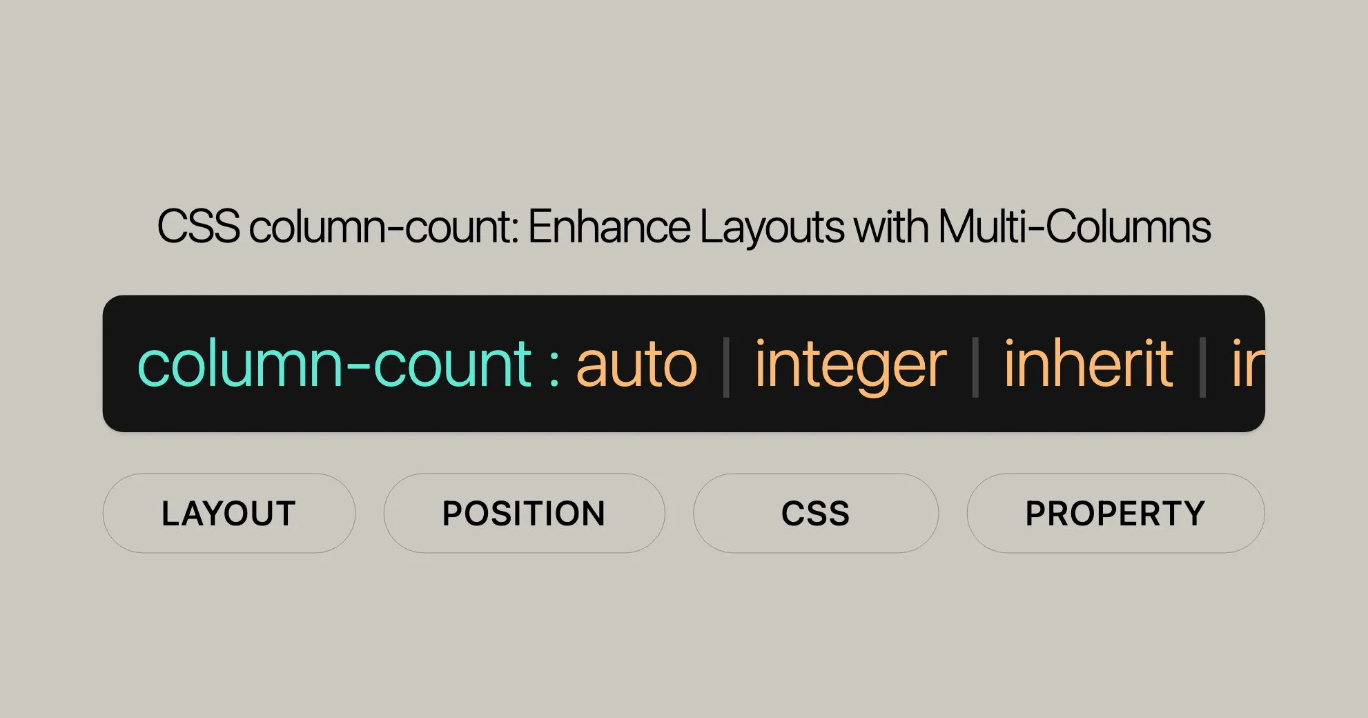
column-count: auto | <integer> | inherit | initial | revert | revert-layer | unset;Explanation of the Syntax:
auto: Allows the number of columns to be determined by other CSS properties, such ascolumn-width.<integer>: Specifies the number of columns.- Global values:
inherit: Inherits the property from the parent element.initial: Sets the property to its default value (auto).revert: Resets the property to the user agent’s default.revert-layer: Resets the property to its value in the previous cascade layer.unset: Resets the property to its natural value.
Example:
.content-box { column-count: 3;}In this example, the column-count property is set to 3, dividing the content inside the .content-box element into three columns.
Values
The column-count property accepts several values:
auto: The number of columns is determined by other CSS properties.<integer>: A positive integer that specifies the ideal number of columns.inherit: Inherits thecolumn-countvalue from the parent element.initial: Sets the property to its default value (auto).revert: Resets the property to the user agent’s default.revert-layer: Resets the property to its value in the previous cascade layer.unset: Resets the property to its natural value.
Example:
.content-box { column-count: 3;}Formal Definition
The column-count property is formally defined to control the number of columns into which the content of an element is divided.
Initial Value:
- The initial value is
auto.
Applies To:
- Applies to block containers, except table wrapper boxes.
Inherited:
- This property is not inherited.
Computed Value:
- The computed value is as specified.
Animation Type:
- The property can be animated as an integer.
Formal Syntax
The formal syntax of the column-count property is:
column-count: auto | <integer [1,∞]>;Explanation of the Syntax:
auto: The number of columns is determined by other CSS properties.<integer [1,∞]>: A positive integer representing the number of columns.
Example:
.content-box { column-count: 3;}Examples
Here are some practical examples of using the column-count property:
Example 1: Splitting a Paragraph into Three Columns
HTML:
<p class="content-box"> This is a bunch of text split into three columns using the CSS `column-count` property. The text is equally distributed over the columns.</p>CSS:
.content-box { column-count: 3;}Result:
The content inside the .content-box element is divided into three columns.
Example 2: Creating a Two-Column Layout with a Column Rule
HTML:
<div class="content-box"> This is a longer piece of text that will be divided into two columns. Each column will have a rule (line) between them, enhancing the visual separation.</div>CSS:
.content-box { column-count: 2; column-rule: 10px double green;}Result:
The content inside the .content-box element is divided into two columns with a green double line between them.
Example 3: Responsive Column Layout
HTML:
<div class="content-box"> This content will adjust the number of columns based on the screen size. On larger screens, it will display in three columns, while on smaller screens, it will display in a single column.</div>CSS:
.content-box {  column-count: 3;}
@media (max-width: 600px) {  .content-box {    column-count: 1;  }}
Result:
The content inside the .content-box element is divided into three columns by default but displays in a single column on screens smaller than 600 pixels wide.
Browser Compatibility
The column-count property is widely supported across modern web browsers:
| Browser | Version |
|---|---|
| Google Chrome | 50.0 and above |
| Mozilla Firefox | 52.0 and above |
| Microsoft Edge | 12.0 and above |
| Safari | 9.0 and above |
| Opera | 37.0 and above |
Browser-Specific Prefixes:
In some cases, you may need to use browser-specific prefixes:
.content-box { -webkit-column-count: 3; /* For Safari and older Chrome versions */ -moz-column-count: 3; /* For Firefox */ column-count: 3; /* Standard syntax */}Understanding the column-count property and its compatibility ensures that your multi-column layouts work consistently across different platforms and devices.
Related Properties
While the column-count property is essential for creating multi-column layouts, there are several related CSS properties that can enhance and customize your layouts even further. Here are some key related properties you should be aware of:
column-width
- Description: Specifies the optimal width of the columns. Often used with
column-countto define column width. - Usage Example:
.content-box {column-count: 3;column-width: 150px;}
columns
- Description: Shorthand for setting both
column-widthandcolumn-count. Defines the number of columns and their width in one declaration. - Usage Example:
.content-box {columns: 3 150px;}
column-rule
- Description: Shorthand for setting the width, style, and color of the rule (line) between columns. Enhances visual separation.
- Usage Example:
.content-box {column-count: 2;column-rule: 5px solid #ccc;}
column-rule-color
- Description: Specifies the color of the rule between columns.
- Usage Example:
.content-box {column-count: 2;column-rule-color: green;}
column-rule-style
- Description: Specifies the style of the rule between columns.
- Usage Example:
.content-box {column-count: 2;column-rule-style: dashed;}
column-rule-width
- Description: Specifies the width of the rule between columns.
- Usage Example:
.content-box {column-count: 2;column-rule-width: 3px;}
column-fill
- Description: Specifies how content is distributed across columns. Can be set to
auto,balance, orbalance-all. - Usage Example:
.content-box {column-count: 3;column-fill: balance;}
column-gap
- Description: Specifies the gap (space) between columns. Useful for controlling the spacing between columns.
- Usage Example:
.content-box {column-count: 3;column-gap: 20px;}
Understanding and utilizing these related properties can help you create more sophisticated and customized multi-column layouts. Whether you’re designing a blog, news article, or any other content-rich page, these properties provide the tools you need to create visually appealing and well-organized layouts.
FAQs
What does the column-count property do in CSS?
The column-count property in CSS specifies the number of columns an element’s content should be divided into. It’s used in multi-column layouts for text and content distribution.
How do I create a three-column layout using column-count?
You can create a three-column layout by setting the column-count property to 3.
.content-box { column-count: 3;}What happens if the content is too wide for the specified columns?
If the content is too wide, it will overflow or wrap within each column, depending on the column-width and the overall container width.
Can I set column-count to be responsive?
Yes, you can adjust column-count using media queries for responsive designs.
.content-box {  column-count: 3;}
@media (max-width: 600px) {  .content-box {    column-count: 1;  }}
What is the default value of column-count?
The default value of column-count is auto, meaning no columns are created unless explicitly specified. Content remains in a single block.
How do I specify the width of columns?
You can specify the width of columns using the column-width property.
.content-box { column-count: 3; column-width: 150px;}Can I add a line between columns?
Yes, you can add a line between columns using the column-rule property.
.content-box { column-count: 2; column-rule: 5px solid #ccc;}How do I balance the content across columns?
You can balance the content across columns using the column-fill property. Setting it to balance ensures that the content is evenly distributed across the columns.
.content-box { column-count: 3; column-fill: balance;}What is the difference between column-count and columns?
The column-count property specifies the number of columns, while the columns property is a shorthand for setting both the column-width and column-count properties in a single declaration.
.content-box { columns: 3 150px;}These FAQs provide a comprehensive overview of how to use the column-count property effectively in your web design projects. By understanding these common questions and their answers, you can leverage the column-count property to create engaging and well-organized multi-column layouts.
Browser Support
The column-count property is well-supported across modern web browsers, ensuring that your multi-column layouts work consistently on different platforms and devices. Here is an overview of the browser support for the column-count property:
| Browser | Version |
|---|---|
| Google Chrome | 50.0 and above |
| Mozilla Firefox | 52.0 and above |
| Microsoft Edge | 12.0 and above |
| Safari | 9.0 and above |
| Opera | 37.0 and above |
Note: Internet Explorer 10 and above also supports the column-count property, but it is recommended to use modern browsers for better performance and compatibility.
Browser Compatibility Data:
- Google Chrome: Support for the
column-countproperty was introduced in version 50.0 and above. - Mozilla Firefox: Support for the
column-countproperty was introduced in version 52.0 and above. - Microsoft Edge: Support for the
column-countproperty was introduced in version 12.0 and above. - Safari: Support for the
column-countproperty was introduced in version 9.0 and above. - Opera: Support for the
column-countproperty was introduced in version 37.0 and above.
Browser-Specific Prefixes:
In some cases, you may need to use browser-specific prefixes to ensure compatibility across different browsers. For example:
.content-box { -webkit-column-count: 3; /* For Safari and older Chrome versions */ -moz-column-count: 3; /* For Firefox */ column-count: 3; /* Standard syntax */}Important Considerations:
- Always test your multi-column layouts on various browsers and devices to ensure consistent behavior.
- Use feature detection libraries like Modernizr to dynamically adjust your layouts based on browser support.
- Consider providing fallback styles for browsers that do not support the
column-countproperty to maintain a good user experience.
By understanding the browser support for the column-count property, you can create multi-column layouts that work seamlessly across different platforms and devices, enhancing the overall user experience of your web design projects.
References
To gain a deeper understanding and effectively use the column-count property in your web design projects, explore the following valuable references:
These resources provide comprehensive information and guidelines on using the column-count property and related CSS properties for multi-column layouts.
References for Understanding column-count in CSS
Looking to master the column-count property in CSS? Here are some great resources to help you out:
-
MDN Web Docs:
- Offers detailed info on the
column-countproperty, including how to use it, examples, and browser support. - MDN Web Docs - column-count
- Offers detailed info on the
-
W3C CSS Multi-column Layout Module Level 1:
- The official spec from W3C gives you in-depth details about the CSS Multi-column Layout Module, including
column-count. - W3C CSS Multi-column Layout Module Level 1
- The official spec from W3C gives you in-depth details about the CSS Multi-column Layout Module, including
-
CSS-Tricks:
- Provides practical guides, tutorials, and examples on how to use
column-count. - CSS-Tricks - column-count
- Provides practical guides, tutorials, and examples on how to use
-
Can I Use:
- Check browser compatibility for CSS properties, including
column-count. - Can I Use - column-count
- Check browser compatibility for CSS properties, including
-
Modernizr:
- A JavaScript library that helps detect HTML5 and CSS3 features, allowing you to create fallbacks for unsupported features.
- Modernizr
These resources will help you understand and effectively use the column-count property in your web design projects. By leveraging these tools, you can create sophisticated and responsive multi-column layouts that enhance readability and visual appeal.
 Latest Blogs
  สร้างเว็บไซต์ 1 เว็บ ต้องใช้งบเท่าไหร่? เจาะลึกทุกองค์ประกอบ website development cost อยากสร้างเว็บไซต์แต่ไม่มั่นใจในเรื่องของงบประมาณ อ่านสรุปเจาะลึกตั้งแต่ดีไซน์, ฟังก์ชัน และการดูแล พร้อมตัวอย่างงบจริงจาก Till it’s done ที่แผนชัด งบไม่บานปลายแน่นอน
  Next.js สอน 14 ขั้นตอนเบื้องต้น: สร้างโปรเจกต์แรกใน 30 นาที เริ่มต้นกับ Next.js ใน 14 ขั้นตอนเพียงแค่ 30 นาที พร้อม SSR/SSG และ API Routes ด้วยตัวอย่างโค้ดง่าย ๆ อ่านต่อเพื่อสร้างโปรเจ็กต์แรกได้ทันทีที่นี่
  วิธีสมัคร Apple Developer Account เพื่อนำแอปขึ้น App Store ทีละขั้นตอน อยากปล่อยแอปบน App Store ระดับโลก มาอ่านคู่มือสมัคร Apple Developer Account พร้อมเคล็ดลับ TestFlight และวิธีอัปโหลดที่ง่ายในบทความเดียวนี้ได้เลย
  TypeScript Interface คืออะไร? อธิบายพร้อมวิธีใช้และข้อแตกต่างจาก Type เรียนรู้วิธีใช้ TypeScript Interface เพื่อสร้างโครงสร้างข้อมูลที่ปลอดภัยและเข้าใจง่าย พร้อมเปรียบเทียบข้อดีข้อแตกต่างกับ Type ที่คุณต้องรู้ ถูกรวมเอาไว้ในบทความนี้แล้ว
  Material-UI (MUI) คืออะไร อยากสร้าง UI สวยงามและเป็นมืออาชีพในเวลาอันรวดเร็วใช่ไหม มาทำความรู้จักกับ Material-UI (MUI) ที่ช่วยให้คุณพัฒนาแอปพลิเคชันบน React ได้ง่ายและดูดีในทุกอุปกรณ์
  เปรียบเทียบ 3 วิธีติดตั้ง install node js บน Ubuntu: NVM vs NodeSource vs Official Repo แบบไหนดีที่สุด? เรียนรู้วิธีติดตั้ง Node.js บน Ubuntu ด้วย NVM, NodeSource หรือ Official Repo เลือกวิธีที่เหมาะกับความต้องการของคุณ พร้อมเปรียบเทียบ เพื่อการพัฒนาที่มีประสิทธิภาพ!
 พูดคุยกับซีอีโอ
Explore our best articles, cover a wide variety of technologies 
 ReactJs
  Flutter
  Nodejs
  Nextjs
  TailwindCSS
  Typescript Golang AstroJs Jest Website development th Mobile application th Reactjs th Nextjs th Flutter th Software house th Nodejs th Typescript th
  CSS
CSS We'll be right here with you every step of the way.
We'll be here, prepared to commence this promising collaboration.


Whether you're curious about features, warranties, or shopping policies, we provide comprehensive answers to assist you.