
- Services
- Case Studies
- Technologies
- NextJs development
- Flutter development
- NodeJs development
- ReactJs development
- About
- Contact
- Tools
- Blogs
- FAQ
 Scroll to discover
 CSS Caret-Color Customize Your Text Cursor
Customize the text cursor with options like auto, color values, transparent, and currentcolor.
Improve user experience with this widely supported feature.
The caret-color CSS Property
The caret-color CSS property lets you change the color of the insertion caret, the blinking marker where you type. It applies to elements like <input>, <textarea>, and contenteditable. By default, the caret is black, but you can change it to improve visibility or match your website’s design.
Syntax
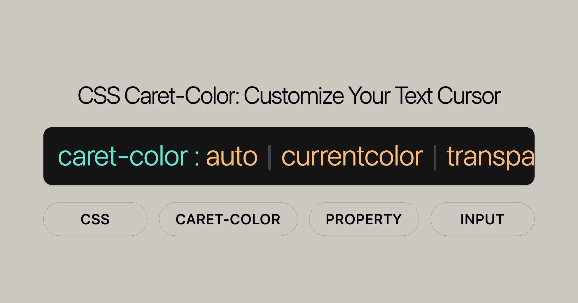
caret-color: auto;caret-color: transparent;caret-color: currentcolor;
/* <color> values */caret-color: red;caret-color: #5729e9;caret-color: rgb(0 200 0);caret-color: hsl(228deg 4% 24% / 80%);
/* Global values */caret-color: inherit;caret-color: initial;caret-color: revert;caret-color: revert-layer;caret-color: unset;
Values
auto: The browser chooses a color for the caret.<color>: Specifies the caret color using standard CSS color values.transparent: Makes the caret invisible.currentcolor: Uses the current text color of the element.inherit: Inherits thecaret-colorvalue from the parent element.initial: Sets thecaret-colorto its initial value (auto).revert: Reverts thecaret-colorto the default value.revert-layer: Reverts thecaret-colorto the value defined in the previous layer of the cascade.unset: Resets thecaret-colorto its inherited value if it inherits, or to its initial value if not.
Examples
Setting a Custom Caret Color
HTML
<!DOCTYPE html><html><head>    <title>caret-color Property</title>    <style>        .custom {            caret-color: red;        }
        .transparent {            caret-color: transparent;        }    </style></head><body>    <h1>The caret-color Property</h1>    <input value="Default caret color" size="64" />    <br><br>    <input class="custom" value="Custom caret color" size="64" />    <br><br>    <input class="transparent" value="Transparent caret color" size="64" />    <br><br>    <p contenteditable class="custom">        This paragraph can be edited, and its caret has a custom color as well!    </p></body></html>
CSS
input.custom {    caret-color: red;}
input.transparent {    caret-color: transparent;}
p.custom {    caret-color: green;}
Using Different Caret Color Values
HTML
<!DOCTYPE html><html><head>    <title>caret-color Values</title>    <style>        .auto {            caret-color: auto;        }
        .currentcolor {            caret-color: currentcolor;        }
        .hex {            caret-color: #5729e9;        }
        .rgb {            caret-color: rgb(0, 200, 0);        }
        .hsl {            caret-color: hsl(228deg, 4%, 24% / 80%);        }    </style></head><body>    <h1>Different Caret Color Values</h1>    <input class="auto" value="Auto caret color" size="64" />    <br><br>    <input class="currentcolor" value="Currentcolor caret color" size="64" />    <br><br>    <input class="hex" value="Hex caret color" size="64" />    <br><br>    <input class="rgb" value="RGB caret color" size="64" />    <br><br>    <input class="hsl" value="HSL caret color" size="64" /></body></html>
CSS
.auto {    caret-color: auto;}
.currentcolor {    caret-color: currentcolor;}
.hex {    caret-color: #5729e9;}
.rgb {    caret-color: rgb(0, 200, 0);}
.hsl {    caret-color: hsl(228deg, 4%, 24% / 80%);}
Specifications
The caret-color property is defined in the CSS Basic User Interface Module Level 4 (CSS UI Level 4) specification. This module outlines the user interface-related aspects of CSS, including the caret-color property.
Key Specifications
- CSS Basic User Interface Module Level 4: This specification includes the
caret-colorproperty, detailing its syntax, values, and expected behavior across different browsers and devices.
Relevant Documentation
- CSS Basic User Interface Module Level 4 - caret-color: This document provides comprehensive information about the
caret-colorproperty, including its definition, use cases, and compatibility notes.
Formal Definition
The caret-color CSS property sets the color of the insertion caret. This property can be applied to various elements, such as <input> fields and elements with the contenteditable attribute. By default, the caret is black, but its color can be customized to enhance visibility or match the overall design of your website.
Initial Value
The initial value of the caret-color property is auto. This means that the browser selects an appropriate color for the caret, which is generally the same as currentcolor, but the browser may choose a different color to ensure good visibility and contrast with the surrounding content.
Applies To
The caret-color property applies to all elements, but it is particularly useful for editable elements such as <input>, <textarea>, and elements with the contenteditable attribute.
Inherited
Yes, the caret-color property is inherited. This means that if a parent element has a caret-color value set, child elements will inherit this value unless overridden.
Computed Value
The computed value of the caret-color property is auto when specified as such, and it computes <color> values as defined for the color property.
Animation Type
The caret-color property is animatable and can be used in CSS transitions and animations. The animation type is a color, which means that the color values are interpolated on each of their red, green, and blue components.
Formal Syntax
caret-color = auto | <color>Summary
The caret-color property is a powerful tool for web developers and designers to customize the appearance of the insertion caret. By specifying different values such as auto, <color>, transparent, and currentcolor, you can enhance the user experience and ensure that the caret is visible and consistent with the overall design of your website. This property is widely supported across major browsers and is defined in the CSS Basic User Interface Module Level 4 (CSS UI Level 4) specification.
Related Properties
While the caret-color property specifically deals with the color of the insertion caret, there are several other CSS properties related to colors and text styling that you might find useful in your web development projects. These properties can be used in conjunction with caret-color to create a cohesive and visually appealing design.
Color-Related Properties
-
color:- Description: Sets the foreground color of an element’s text.
- Usage: This property is fundamental for defining the text color and can be used to ensure that the caret color complements the text color.
p {color: blue;} -
background-color:- Description: Sets the background color of an element.
- Usage: This property is often used to create a contrasting background for text, ensuring that the caret color is visible against the background.
div {background-color: lightgray;} -
border-color:- Description: Sets the color of an element’s border.
- Usage: This property can be used to style the borders of input fields or other elements, ensuring a consistent color scheme.
input {border-color: green;} -
outline-color:- Description: Sets the color of an element’s outline.
- Usage: This property is useful for creating custom focus outlines, which can improve accessibility.
input:focus {outline-color: orange;} -
text-decoration-color:- Description: Sets the color of text decorations, such as underlines or overlines.
- Usage: This property can be used to match the caret color with the color of text decorations.
a {text-decoration-color: purple;} -
text-emphasis-color:- Description: Sets the color of text emphasis marks.
- Usage: This property is useful for styling emphasis marks, ensuring they match the overall color scheme.
p {text-emphasis-color: red;} -
text-shadow:- Description: Applies shadow effects to text.
- Usage: This property can be used to create subtle shadow effects that complement the caret color.
h1 {text-shadow: 2px 2px 5px rgba(0, 0, 0, 0.3);} -
column-rule-color:- Description: Sets the color of the rule (line) between columns.
- Usage: This property is useful for styling multi-column layouts, ensuring the rule color matches the overall design.
.multicol {column-rule-color: darkgray;}
FAQs
What is the caret-color property?
The caret-color property specifies the color of the text input cursor (caret) in editable elements.
How do I change the caret color in an input field?
You can change the caret color by setting the caret-color property to a specific color value. For example, caret-color: red;.
Can I set caret-color to transparent?
Yes, setting caret-color to transparent hides the caret entirely.
Does caret-color work with all elements?
The caret-color property is primarily used with editable elements like input fields, textareas, and contenteditable elements.
What is the default value of caret-color?
The default value of caret-color is auto, which usually matches the color property of the element.
How can I make the caret color match the text color?
You can use the currentcolor value for the caret-color property. For example, caret-color: currentcolor;.
Is caret-color widely supported across browsers?
Yes, the caret-color property is widely supported across major browsers.
Can I animate the caret-color property?
The caret-color property is animatable, but the auto value is not interpolated in transitions and animations.
What are some related CSS properties to caret-color?
Some related CSS properties include color, background-color, border-color, outline-color, text-decoration-color, text-emphasis-color, text-shadow, and column-rule-color.
Can I inherit the caret-color property from a parent element?
Yes, the caret-color property is inherited. If a parent element has a caret-color value set, child elements will inherit this value unless overridden.
These FAQs provide a simple and clear overview of the caret-color property, helping you create visually appealing and functional web forms and editable elements.
 Latest Blogs
  สร้างเว็บไซต์ 1 เว็บ ต้องใช้งบเท่าไหร่? เจาะลึกทุกองค์ประกอบ website development cost อยากสร้างเว็บไซต์แต่ไม่มั่นใจในเรื่องของงบประมาณ อ่านสรุปเจาะลึกตั้งแต่ดีไซน์, ฟังก์ชัน และการดูแล พร้อมตัวอย่างงบจริงจาก Till it’s done ที่แผนชัด งบไม่บานปลายแน่นอน
  Next.js สอน 14 ขั้นตอนเบื้องต้น: สร้างโปรเจกต์แรกใน 30 นาที เริ่มต้นกับ Next.js ใน 14 ขั้นตอนเพียงแค่ 30 นาที พร้อม SSR/SSG และ API Routes ด้วยตัวอย่างโค้ดง่าย ๆ อ่านต่อเพื่อสร้างโปรเจ็กต์แรกได้ทันทีที่นี่
  วิธีสมัคร Apple Developer Account เพื่อนำแอปขึ้น App Store ทีละขั้นตอน อยากปล่อยแอปบน App Store ระดับโลก มาอ่านคู่มือสมัคร Apple Developer Account พร้อมเคล็ดลับ TestFlight และวิธีอัปโหลดที่ง่ายในบทความเดียวนี้ได้เลย
  TypeScript Interface คืออะไร? อธิบายพร้อมวิธีใช้และข้อแตกต่างจาก Type เรียนรู้วิธีใช้ TypeScript Interface เพื่อสร้างโครงสร้างข้อมูลที่ปลอดภัยและเข้าใจง่าย พร้อมเปรียบเทียบข้อดีข้อแตกต่างกับ Type ที่คุณต้องรู้ ถูกรวมเอาไว้ในบทความนี้แล้ว
  Material-UI (MUI) คืออะไร อยากสร้าง UI สวยงามและเป็นมืออาชีพในเวลาอันรวดเร็วใช่ไหม มาทำความรู้จักกับ Material-UI (MUI) ที่ช่วยให้คุณพัฒนาแอปพลิเคชันบน React ได้ง่ายและดูดีในทุกอุปกรณ์
  เปรียบเทียบ 3 วิธีติดตั้ง install node js บน Ubuntu: NVM vs NodeSource vs Official Repo แบบไหนดีที่สุด? เรียนรู้วิธีติดตั้ง Node.js บน Ubuntu ด้วย NVM, NodeSource หรือ Official Repo เลือกวิธีที่เหมาะกับความต้องการของคุณ พร้อมเปรียบเทียบ เพื่อการพัฒนาที่มีประสิทธิภาพ!
 พูดคุยกับซีอีโอ
Explore our best articles, cover a wide variety of technologies 
 ReactJs
  Flutter
  Nodejs
  Nextjs
  TailwindCSS
  Typescript Golang AstroJs Jest Website development th Mobile application th Reactjs th Nextjs th Flutter th Software house th Nodejs th Typescript th
  CSS
CSS We'll be right here with you every step of the way.
We'll be here, prepared to commence this promising collaboration.


Whether you're curious about features, warranties, or shopping policies, we provide comprehensive answers to assist you.