
- Services
- Case Studies
- Technologies
- NextJs development
- Flutter development
- NodeJs development
- ReactJs development
- About
- Contact
- Tools
- Blogs
- FAQ
 Scroll to discover
 Understanding CSS Box-Sizing Simplified Guide
Learn about available options like content-box and border-box to create more predictable layouts.
Introduction
The box-sizing property in CSS is crucial for web development and design. It controls how the total width and height of an element are calculated, which is essential for creating precise and responsive layouts. By default, the width and height you set for an element only apply to its content area. Any padding or borders are added on top, which can cause overflow or misalignment issues.
Description
The box-sizing property in CSS controls how the total width and height of an element are calculated. By default, the box-sizing property is set to content-box, meaning the specified width and height apply only to the content area. Any padding or borders are added on top, which can make it challenging to create precise layouts.
The border-box value includes the padding and border within the specified width and height, making it easier to manage the total dimensions of an element. This is particularly useful for creating responsive designs without complicated calculations.
Default Behavior
By default, the box-sizing property is content-box. This means the specified width and height apply only to the content area. Any padding or borders are added on top. For example, if you set a width of 200 pixels and add 20 pixels of padding and a 5-pixel border, the total width will be 250 pixels.
Values
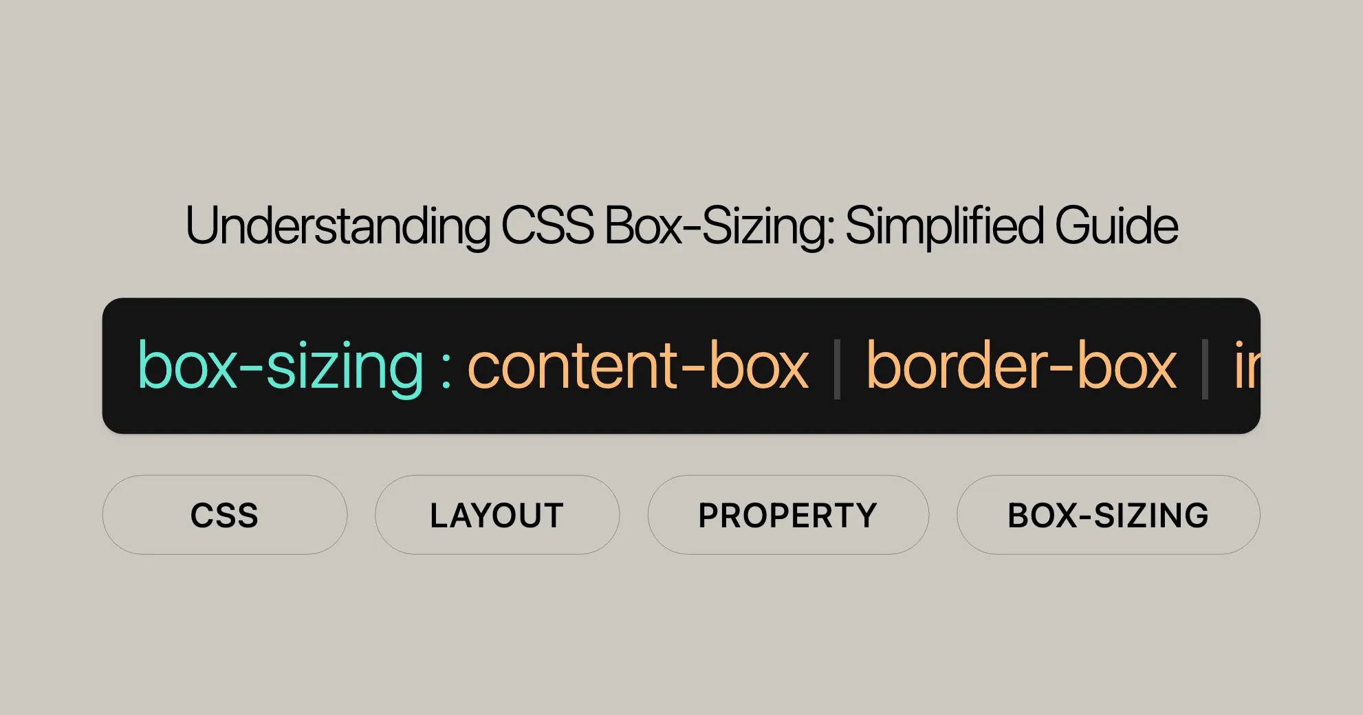
The box-sizing property has several values:
content-box: Default value. The specified width and height apply only to the content area.border-box: The specified width and height include the padding and border.- Global Values:
inherit,initial,revert,revert-layer, andunset.
Example
Content Box
HTML:
<div class="content-box">Content box</div>CSS:
.content-box { width: 200px; height: 100px; padding: 20px; border: 10px solid red; background: yellow; box-sizing: content-box;}Result:
- Total width: 240px (200px width + 2 * 20px padding + 2 * 10px border)
- Total height: 140px (100px height + 2 * 20px padding + 2 * 10px border)
Border Box
HTML:
<div class="border-box">Border box</div>CSS:
.border-box { width: 200px; height: 100px; padding: 20px; border: 10px solid red; background: yellow; box-sizing: border-box;}Result:
- Total width: 200px
- Total height: 100px
Usage in Layout
Enhancing Responsive Design
Using box-sizing: border-box simplifies responsive design. It ensures that padding and borders are included within the specified width and height, making it easier to manage the overall size of elements.
Example:
.grid-container {  display: flex;}
.grid-item {  width: 25%;  padding: 10px;  border: 2px solid black;  box-sizing: border-box;}
Simplifying Complex Layouts
box-sizing helps manage complex layouts, ensuring that the total dimensions of nested elements are predictable.
Example:
.card {  width: 300px;  padding: 20px;  border: 1px solid #ccc;  box-sizing: border-box;}
.card-header,.card-content,.card-footer {  padding: 10px;  border-bottom: 1px solid #ccc;  box-sizing: border-box;}
Improving Form Layouts
Applying box-sizing: border-box to form elements ensures consistent sizing and alignment.
Example:
form {  width: 300px;}
input,select,button {  width: 100%;  padding: 10px;  margin-bottom: 10px;  box-sizing: border-box;}
Global Application
To ensure consistent sizing behavior across all elements, you can apply box-sizing: border-box globally.
Example:
* { box-sizing: border-box;}Why Use box-sizing: border-box
Using box-sizing: border-box improves your design by making layouts more responsive, simplifying complex layouts, enhancing form layouts, and ensuring consistent sizing across all elements. By understanding and using this property correctly, web developers can create more precise, predictable, and visually appealing layouts with ease.
Browser Compatibility
The box-sizing property is widely supported across all major web browsers. Here’s an overview:
- Google Chrome: Supported since version 10.0 (March 2011).
- Mozilla Firefox: Supported since version 29.0 (April 2014).
- Microsoft Edge: Supported since version 12.0 (July 2015).
- Internet Explorer: Supported since version 8.0 (March 2009).
- Opera: Supported since version 9.5 (June 2008).
- Safari: Supported since version 5.1 (July 2011).
Browser Support Table
| Browser | Version | Release Date |
|---|---|---|
| Google Chrome | 10.0 | March 2011 |
| Mozilla Firefox | 29.0 | April 2014 |
| Microsoft Edge | 12.0 | July 2015 |
| Internet Explorer | 8.0 | March 2009 |
| Opera | 9.5 | June 2008 |
| Safari | 5.1 | July 2011 |
Further Reading
For more information and related topics, you can explore the following resources:
- CSS Box Model: Learn more about the fundamentals of the CSS box model, including how elements are sized and positioned.
- CSS Box Sizing Module Level 3 Specification: Dive into the official specification for the
box-sizingproperty to understand its intricacies and how it is implemented across different browsers. - Can I Use: Check the compatibility of the
box-sizingproperty across various browsers and versions to ensure your web designs are supported widely. - MDN Web Docs: Explore comprehensive guides and references on CSS properties, including
box-sizing, to enhance your understanding and skills in web development. - CSS Tricks: Find practical tips, tutorials, and examples on how to use CSS effectively, including the
box-sizingproperty, to create innovative and responsive web designs.
 Latest Blogs
  สร้างเว็บไซต์ 1 เว็บ ต้องใช้งบเท่าไหร่? เจาะลึกทุกองค์ประกอบ website development cost อยากสร้างเว็บไซต์แต่ไม่มั่นใจในเรื่องของงบประมาณ อ่านสรุปเจาะลึกตั้งแต่ดีไซน์, ฟังก์ชัน และการดูแล พร้อมตัวอย่างงบจริงจาก Till it’s done ที่แผนชัด งบไม่บานปลายแน่นอน
  Next.js สอน 14 ขั้นตอนเบื้องต้น: สร้างโปรเจกต์แรกใน 30 นาที เริ่มต้นกับ Next.js ใน 14 ขั้นตอนเพียงแค่ 30 นาที พร้อม SSR/SSG และ API Routes ด้วยตัวอย่างโค้ดง่าย ๆ อ่านต่อเพื่อสร้างโปรเจ็กต์แรกได้ทันทีที่นี่
  วิธีสมัคร Apple Developer Account เพื่อนำแอปขึ้น App Store ทีละขั้นตอน อยากปล่อยแอปบน App Store ระดับโลก มาอ่านคู่มือสมัคร Apple Developer Account พร้อมเคล็ดลับ TestFlight และวิธีอัปโหลดที่ง่ายในบทความเดียวนี้ได้เลย
  TypeScript Interface คืออะไร? อธิบายพร้อมวิธีใช้และข้อแตกต่างจาก Type เรียนรู้วิธีใช้ TypeScript Interface เพื่อสร้างโครงสร้างข้อมูลที่ปลอดภัยและเข้าใจง่าย พร้อมเปรียบเทียบข้อดีข้อแตกต่างกับ Type ที่คุณต้องรู้ ถูกรวมเอาไว้ในบทความนี้แล้ว
  Material-UI (MUI) คืออะไร อยากสร้าง UI สวยงามและเป็นมืออาชีพในเวลาอันรวดเร็วใช่ไหม มาทำความรู้จักกับ Material-UI (MUI) ที่ช่วยให้คุณพัฒนาแอปพลิเคชันบน React ได้ง่ายและดูดีในทุกอุปกรณ์
  เปรียบเทียบ 3 วิธีติดตั้ง install node js บน Ubuntu: NVM vs NodeSource vs Official Repo แบบไหนดีที่สุด? เรียนรู้วิธีติดตั้ง Node.js บน Ubuntu ด้วย NVM, NodeSource หรือ Official Repo เลือกวิธีที่เหมาะกับความต้องการของคุณ พร้อมเปรียบเทียบ เพื่อการพัฒนาที่มีประสิทธิภาพ!
 พูดคุยกับซีอีโอ
Explore our best articles, cover a wide variety of technologies 
 ReactJs
  Flutter
  Nodejs
  Nextjs
  TailwindCSS
  Typescript Golang AstroJs Jest Website development th Mobile application th Reactjs th Nextjs th Flutter th Software house th Nodejs th Typescript th
  CSS
CSS We'll be right here with you every step of the way.
We'll be here, prepared to commence this promising collaboration.


Whether you're curious about features, warranties, or shopping policies, we provide comprehensive answers to assist you.