
- Services
- Case Studies
- Technologies
- NextJs development
- Flutter development
- NodeJs development
- ReactJs development
- About
- Contact
- Tools
- Blogs
- FAQ
 Scroll to discover
 CSS border-start-end-radius A Guide for Web Developers
This property allows you to define a logical border radius that adapts to different writing modes and text orientations.
Border Start End Radius
The border-start-end-radius property in CSS is a handy tool for web developers and designers. It lets you define a logical border radius on an element, which adjusts based on the element’s writing mode, direction, and text orientation. This makes it great for creating styles that work seamlessly across different languages and text directions.
Definition and Usage
The border-start-end-radius property is used to define a logical border radius on an element. It’s especially useful for creating styles that adapt to different writing modes, directions, and text orientations. This property affects the corner between the block-start and the inline-end sides of an element. For example, in a left-to-right (ltr) horizontal writing mode, it corresponds to the border-top-right-radius property.
Here’s a simple example:
div { background-color: rebeccapurple; width: 120px; height: 120px; border-start-end-radius: 10px;}Browser Compatibility
The border-start-end-radius property is widely supported across modern web browsers:
- Google Chrome: Supported since version 89.
- Microsoft Edge: Supported since version 89.
- Mozilla Firefox: Supported since version 66.
- Opera: Supported since version 75.
- Safari: Supported since version 15.
- Internet Explorer: Not supported.
Syntax
The border-start-end-radius property allows you to define the radius of the corner between the block-start and inline-end sides of an element. Here is the syntax:
/* Using length values */border-start-end-radius: 10px;border-start-end-radius: 1em;
/* Using two length values */border-start-end-radius: 1em 2em;
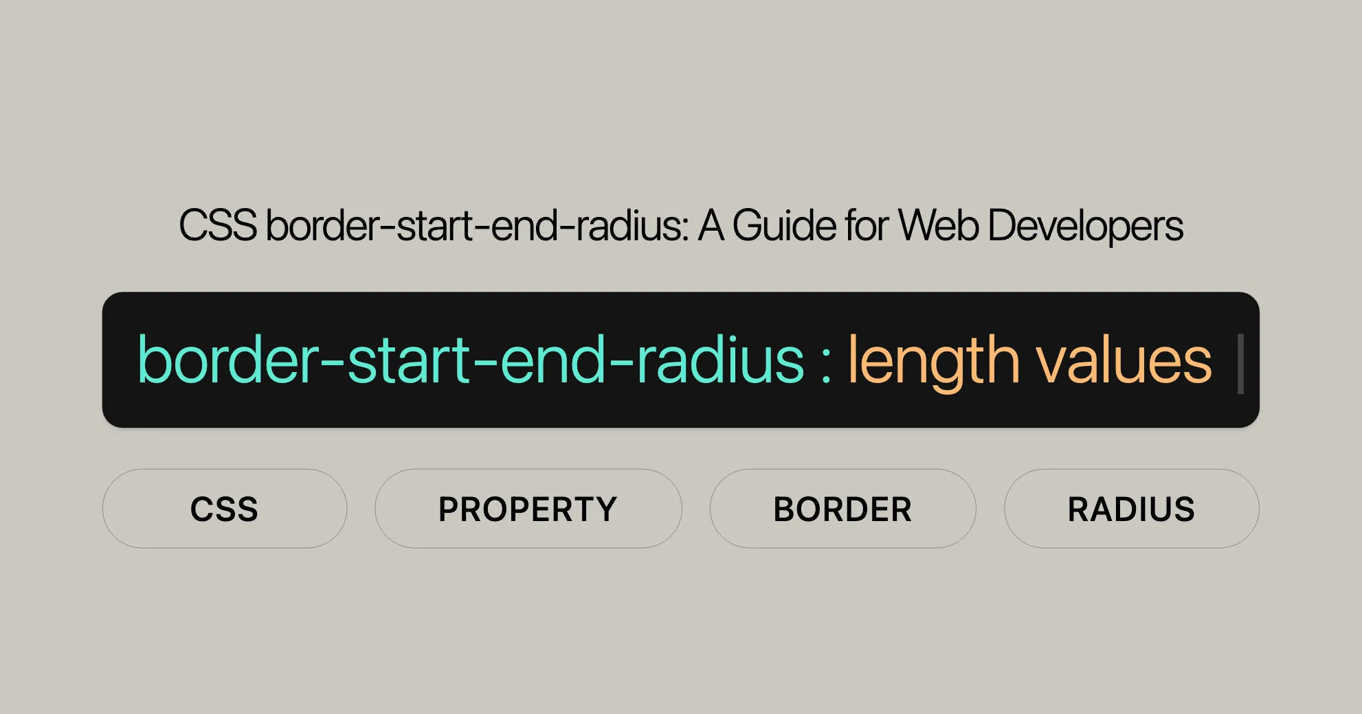
/* Global values */border-start-end-radius: inherit;border-start-end-radius: initial;border-start-end-radius: revert;border-start-end-radius: revert-layer;border-start-end-radius: unset;Values
The border-start-end-radius property can accept various values, including lengths and percentages.
Length Values
- Single Length Value: Creates a circular corner. For example,
border-start-end-radius: 10px;. - Two Length Values: Creates an elliptical corner. For example,
border-start-end-radius: 1em 2em;.
Percentage Values
- Single Percentage Value: Creates a circular corner. For example,
border-start-end-radius: 50%;. - Two Percentage Values: Creates an elliptical corner. For example,
border-start-end-radius: 50% 25%;.
Global Values
- inherit: Inherits the value from the parent element.
- initial: Uses the initial value defined by the browser.
- revert: Uses the default value defined by the user-agent stylesheet.
- revert-layer: Uses the value from the next layer of the cascade.
- unset: Behaves as if the property is not set.
Examples
Here are some practical examples of how to use the border-start-end-radius property:
/* Using length values */border-start-end-radius: 10px; /* Creates a circular corner with a radius of 10 pixels */border-start-end-radius: 1em; /* Creates a circular corner with a radius of 1 em */
/* Using two length values */border-start-end-radius: 1em 2em; /* Creates an elliptical corner */
/* Using percentage values */border-start-end-radius: 50%; /* Creates a circular corner that is half the size of the box */border-start-end-radius: 50% 25%; /* Creates an elliptical corner */
/* Global values */border-start-end-radius: inherit; /* Inherits the value from the parent element */border-start-end-radius: initial; /* Uses the initial value defined by the browser */border-start-end-radius: revert; /* Uses the default value defined by the user-agent stylesheet */border-start-end-radius: revert-layer; /* Uses the value from the next layer of the cascade */border-start-end-radius: unset; /* Behaves as if the property is not set */
Formal Syntax
The formal syntax for the border-start-end-radius property is as follows:
border-start-end-radius =  <length-percentage [0,∞]>{1,2}
<length-percentage> =  <length> | <percentage>
Explanation
- <length-percentage>: Can be either a length value (e.g.,
10px,1em) or a percentage (e.g.,50%). - Single Value: Creates a circular corner.
- Two Values: Creates an elliptical corner.
Formal Definition
The border-start-end-radius property is formally defined as a way to specify the logical border radius of an element. This property maps to a physical border radius depending on the element’s writing-mode, direction, and text-orientation.
Initial Value
The initial value for the border-start-end-radius property is 0.
Applies To
This property applies to all elements. However, user agents are not required to apply it to table and inline-table elements when border-collapse is set to collapse. The behavior on internal table elements is currently undefined. It also applies to the ::first-letter pseudo-element.
Inherited
No, this property is not inherited from parent elements.
Percentages
Percentages refer to the corresponding dimension of the border box. For the horizontal axis, percentages refer to the width of the box, and for the vertical axis, they refer to the height of the box.
Computed Value
The computed value for the border-start-end-radius property is two absolute lengths or percentages.
Animation Type
The animation type for the border-start-end-radius property is a length, percentage, or calc(). This means that the values of this property can be interpolated as real, floating-point numbers, allowing for smooth animations and transitions.
Specifications
The border-start-end-radius property is defined in the CSS Logical Properties and Values Level 1 specification. This specification outlines how to use logical properties that adapt to different writing modes and text orientations.
Relevant Specification
- CSS Logical Properties and Values Level 1: This specification introduces logical properties, including
border-start-end-radius, to create styles that work well across various writing modes and text orientations.
You can find more detailed information about the border-start-end-radius property here:
See Also
For more information, check out these resources:
- CSS Logical Properties and Values: Learn about logical properties and values that adapt to different writing modes.
- Mapped Physical Property: Understand the physical property corresponding to
border-start-end-radius. - Related Properties: Explore other CSS properties that help create adaptable designs.
Supported Browsers
The border-start-end-radius property is supported across modern web browsers:
- Google Chrome: Supported since version 89.
- Microsoft Edge: Supported since version 89.
- Mozilla Firefox: Supported since version 66.
- Opera: Supported since version 75.
- Safari: Supported since version 15.
- Internet Explorer: Not supported.
Examples
Here are some practical examples of using the border-start-end-radius property.
Example 1: Basic Usage
Create a circular corner on a div element.
HTML:
<div class="example"> <p>Example Text</p></div>CSS:
.example { background-color: rebeccapurple; width: 120px; height: 120px; border-start-end-radius: 10px;}Output:
A div with a background color of rebeccapurple and a circular corner with a radius of 10 pixels.
Example 2: Elliptical Corner
Create an elliptical corner on a div element.
HTML:
<div class="example2"> <p>Example Text</p></div>CSS:
.example2 { background-color: rebeccapurple; width: 120px; height: 120px; border-start-end-radius: 1em 2em;}Output:
A div with a background color of rebeccapurple and an elliptical corner with a semi-major axis of 1em and a semi-minor axis of 2em.
Example 3: Vertical Text with Border Radius
Create a border radius on a div element with vertical text.
HTML:
<div class="vertical-text"> <p>Example Text</p></div>CSS:
.vertical-text { background-color: rebeccapurple; width: 120px; height: 120px; border-start-end-radius: 10px; writing-mode: vertical-rl; padding: 10px;}Output:
A div with vertical text and a border radius of 10 pixels. The text is oriented vertically using writing-mode: vertical-rl;.
These examples show how the border-start-end-radius property can create visually appealing designs that adapt to different writing modes and text orientations.
 Latest Blogs
  สร้างเว็บไซต์ 1 เว็บ ต้องใช้งบเท่าไหร่? เจาะลึกทุกองค์ประกอบ website development cost อยากสร้างเว็บไซต์แต่ไม่มั่นใจในเรื่องของงบประมาณ อ่านสรุปเจาะลึกตั้งแต่ดีไซน์, ฟังก์ชัน และการดูแล พร้อมตัวอย่างงบจริงจาก Till it’s done ที่แผนชัด งบไม่บานปลายแน่นอน
  Next.js สอน 14 ขั้นตอนเบื้องต้น: สร้างโปรเจกต์แรกใน 30 นาที เริ่มต้นกับ Next.js ใน 14 ขั้นตอนเพียงแค่ 30 นาที พร้อม SSR/SSG และ API Routes ด้วยตัวอย่างโค้ดง่าย ๆ อ่านต่อเพื่อสร้างโปรเจ็กต์แรกได้ทันทีที่นี่
  วิธีสมัคร Apple Developer Account เพื่อนำแอปขึ้น App Store ทีละขั้นตอน อยากปล่อยแอปบน App Store ระดับโลก มาอ่านคู่มือสมัคร Apple Developer Account พร้อมเคล็ดลับ TestFlight และวิธีอัปโหลดที่ง่ายในบทความเดียวนี้ได้เลย
  TypeScript Interface คืออะไร? อธิบายพร้อมวิธีใช้และข้อแตกต่างจาก Type เรียนรู้วิธีใช้ TypeScript Interface เพื่อสร้างโครงสร้างข้อมูลที่ปลอดภัยและเข้าใจง่าย พร้อมเปรียบเทียบข้อดีข้อแตกต่างกับ Type ที่คุณต้องรู้ ถูกรวมเอาไว้ในบทความนี้แล้ว
  Material-UI (MUI) คืออะไร อยากสร้าง UI สวยงามและเป็นมืออาชีพในเวลาอันรวดเร็วใช่ไหม มาทำความรู้จักกับ Material-UI (MUI) ที่ช่วยให้คุณพัฒนาแอปพลิเคชันบน React ได้ง่ายและดูดีในทุกอุปกรณ์
  เปรียบเทียบ 3 วิธีติดตั้ง install node js บน Ubuntu: NVM vs NodeSource vs Official Repo แบบไหนดีที่สุด? เรียนรู้วิธีติดตั้ง Node.js บน Ubuntu ด้วย NVM, NodeSource หรือ Official Repo เลือกวิธีที่เหมาะกับความต้องการของคุณ พร้อมเปรียบเทียบ เพื่อการพัฒนาที่มีประสิทธิภาพ!
 พูดคุยกับซีอีโอ
Explore our best articles, cover a wide variety of technologies 
 ReactJs
  Flutter
  Nodejs
  Nextjs
  TailwindCSS
  Typescript Golang AstroJs Jest Website development th Mobile application th Reactjs th Nextjs th Flutter th Software house th Nodejs th Typescript th
  CSS
CSS We'll be right here with you every step of the way.
We'll be here, prepared to commence this promising collaboration.


Whether you're curious about features, warranties, or shopping policies, we provide comprehensive answers to assist you.