
- Services
- Case Studies
- Technologies
- NextJs development
- Flutter development
- NodeJs development
- ReactJs development
- About
- Contact
- Tools
- Blogs
- FAQ
 Scroll to discover
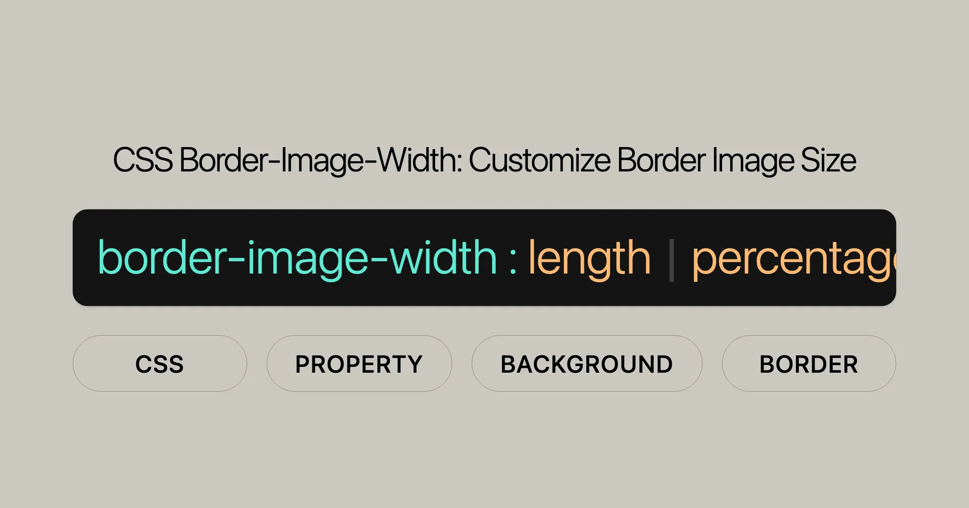
 CSS Border-Image-Width Customize Border Image Size
Discover available options, including lengths, percentages, numbers, and the auto keyword.
Introduction
The border-image-width CSS property sets the width of an element’s border image, providing full control over the appearance of your web pages. This property is widely supported across different browsers and devices, making it a reliable choice for creating visually appealing and responsive designs.
Baseline Widely Available
Introduced in February 2017, the border-image-width property has become a standard tool in web development, ensuring consistent and polished designs across various platforms.
Description
The border-image-width property in CSS is used to define the width of an element’s border image. This property allows for customization of the border image width for the top, right, bottom, and left sides, enhancing the overall design of your web pages.
Syntax
/* Keyword value */border-image-width: auto;
/* <length> value */border-image-width: 1rem;
/* <percentage> value */border-image-width: 25%;
/* <number> value */border-image-width: 3;
/* top and bottom | left and right */border-image-width: 2em 3em;
/* top | left and right | bottom */border-image-width: 5% 15% 10%;
/* top | right | bottom | left */border-image-width: 5% 2em 10% auto;
/* Global values */border-image-width: inherit;border-image-width: initial;border-image-width: revert;border-image-width: revert-layer;border-image-width: unset;
Explanation of Syntax
- One Value: Applies the same width to all four sides.
- Two Values: The first value applies to the top and bottom, while the second value applies to the left and right sides.
- Three Values: The first value applies to the top, the second to the left and right, and the third to the bottom.
- Four Values: The values apply to the top, right, bottom, and left sides in that order (clockwise).
Values
Length (<length>)
Specifies the width of the border image using standard CSS length units such as pixels (px), ems (em), or any other valid CSS length unit.
Example:
border-image-width: 1rem;Percentage (<percentage>)
Sets the width of the border image as a percentage relative to the width or height of the border image area.
Example:
border-image-width: 25%;Number (<number>)
Specifies the width of the border image as a multiple of the corresponding border-width.
Example:
border-image-width: 3;Auto (auto)
Sets the width of the border image to the intrinsic width or height of the corresponding border-image-slice. If the image does not have the required intrinsic dimension, the corresponding border-width is used instead.
Example:
border-image-width: auto;Global Values
initial: Sets the property to its default value.inherit: Inherits the value from the parent element.revert: Resets the property to the user agent’s default.revert-layer: Resets the property to the value defined by the user agent for the active layer.unset: Resets the property to its natural value, which effectively means it behaves as though the property is not set.
Example:
border-image-width: inherit;Formal Definition
| Initial Value | 1 |
| Applies To | All elements, except internal table elements when border-collapse is collapse. It also applies to ::first-letter. |
| Inherited | No |
| Percentages | Refer to the width or height of the border image area |
| Computed Value | As specified, but with relative lengths converted into absolute lengths |
| Animation Type | By computed value type |
Formal Syntax
border-image-width = [ <length-percentage [0,∞]> | <number [0,∞]> | auto ]{1,4}
<length-percentage> = <length> | <percentage>
Examples
Example 1: Basic Usage
<!DOCTYPE html><html><head> <title>Basic border-image-width Example</title> <style> .border-image { border: 25px solid transparent; padding: 15px; border-image: url('( WebsiteUrl )') 30 round; border-image-width: 25px; } </style></head><body> <div class="border-image"> An element with a basic border-image-width setting </div></body></html>Example 2: Using Different Widths for Each Side
<!DOCTYPE html><html><head> <title>Custom border-image-width Example</title> <style> .border-image { border: 25px solid transparent; padding: 15px; border-image: url('( WebsiteUrl )') 30 round; border-image-width: 10px 20px 30px 40px; } </style></head><body> <div class="border-image"> An element with custom border-image-width settings </div></body></html>Example 3: Using Percentages
<!DOCTYPE html><html><head> <title>Percentage border-image-width Example</title> <style> .border-image { border: 25px solid transparent; padding: 15px; border-image: url('( WebsiteUrl )') 30 round; border-image-width: 10% 20% 30% 40%; } </style></head><body> <div class="border-image"> An element with percentage border-image-width settings </div></body></html>Example 4: Using the auto Keyword
<!DOCTYPE html><html><head> <title>Auto border-image-width Example</title> <style> .border-image { border: 25px solid transparent; padding: 15px; border-image: url('( WebsiteUrl )') 30 round; border-image-width: auto; } </style></head><body> <div class="border-image"> An element with auto border-image-width setting </div></body></html>Tiling a Border Image
Using border-image-width lets you control the repetition and placement of an image around an element’s border.
Example: Tiling a Border Image
<!DOCTYPE html><html><head> <title>Tiling a Border Image Example</title> <style> .border-image { border: 20px solid transparent; padding: 40px; border-image: url('( WebsiteUrl )') 30 round; border-image-width: 16px; } </style></head><body> <div class="border-image"> Lorem ipsum dolor sit amet, consetetur sadipscing elitr, sed diam nonumy eirmod tempor invidunt ut labore et dolore magna aliquyam erat, sed diam voluptua. At vero eos et accusam et justo duo dolores et ea rebum. Stet clita kasd gubergren, no sea takimata sanctus est Lorem ipsum dolor sit amet. </div></body></html>Image Explanation:
- The image used (
( WebsiteUrl )) is a 90 by 90 pixels image containing eight circles. Each circle is 30 by 30 pixels. border-image-slice: 30specifies that each slice of the border image is 30 pixels.
Result:
The border image will be tiled around the element with a width of 16 pixels, creating a repeating pattern.
Specifications
The border-image-width property is defined in the CSS Backgrounds and Borders Module Level 3 specification.
CSS Backgrounds and Borders Module Level 3
- Specification: CSS Backgrounds and Borders Module Level 3
Browser Compatibility
- Google Chrome: Version 15.0 and later
- Microsoft Edge: Version 12.0 and later
- Internet Explorer: Version 11.0 and later
- Mozilla Firefox: Version 13.0 and later
- Opera: Version 15.0 and later
- Apple Safari: Version 6.0 and later
For the most up-to-date information, refer to the MDN Web Docs Browser Compatibility Table.
FAQs
What is the border-image-width property in CSS?
The border-image-width property sets the width of the image used in the border. It controls how much space the image occupies around the element, allowing for custom border thickness.
How does border-image-width differ from border-width?
border-width controls the thickness of traditional borders, while border-image-width defines the space occupied by an image used as a border. They can work together to fine-tune designs.
Can I use different widths for each side of the border?
Yes, you can specify different widths for each side using a space-separated list. For example: border-image-width: 10px 15px 20px 5px; sets different widths for the top, right, bottom, and left sides, respectively.
What units can be used with border-image-width?
You can use absolute units like pixels (px), relative units like em or rem, percentages, or even unitless values that act as multipliers of the border image slice. This gives you flexibility in controlling the border’s appearance.
How does border-image-width affect responsive designs?
Using percentage values or relative units like em for border-image-width ensures that the border scales smoothly on different screen sizes, making it a better choice for responsive designs.
Responsive Designs with border-image-width
Creating responsive designs with the border-image-width property ensures that your border images scale smoothly across different screen sizes. By using percentage values or relative units like em or rem, you can make sure that the border image adjusts dynamically to fit the size of the element.
Example: Responsive Border Image
<!DOCTYPE html><html><head> <title>Responsive border-image-width Example</title> <style> .border-image { border: 25px solid transparent; padding: 15px; border-image: url('( WebsiteUrl )') 30 round; border-image-width: 10% 20% 10% 20%; } </style></head><body> <div class="border-image"> An element with a responsive border-image-width setting </div></body></html>Explanation:
border-image-width: 10% 20% 10% 20%defines the widths for the top, right, bottom, and left sides as percentages of the border image area.- This makes the border image responsive to different screen sizes.
Benefits of Responsive Border Images
- Consistency Across Devices: Percentage values ensure the border image maintains its proportions on any screen size, providing a consistent look.
- Improved User Experience: Responsive designs adapt to the user’s device, making the website more user-friendly.
- Enhanced Aesthetics: Smooth scaling of the border image maintains the visual appeal without compromising functionality.
Additional Tips for Responsive Designs
- Media Queries: Use media queries to adjust the
border-image-widthproperty based on different screen sizes. This allows fine-tuning for various devices. - Flexible Units: Combine percentage values with relative units like
emorremfor highly adaptable designs that respond to both screen size and content. - Testing: Regularly test designs on different devices and screen sizes to ensure the border image scales correctly and looks good.
Implementing these strategies helps create responsive designs that look great and provide a seamless user experience across all devices. The border-image-width property is a powerful tool for achieving this, offering the flexibility and control needed for visually stunning and functional web designs.
 Latest Blogs
  สร้างเว็บไซต์ 1 เว็บ ต้องใช้งบเท่าไหร่? เจาะลึกทุกองค์ประกอบ website development cost อยากสร้างเว็บไซต์แต่ไม่มั่นใจในเรื่องของงบประมาณ อ่านสรุปเจาะลึกตั้งแต่ดีไซน์, ฟังก์ชัน และการดูแล พร้อมตัวอย่างงบจริงจาก Till it’s done ที่แผนชัด งบไม่บานปลายแน่นอน
  Next.js สอน 14 ขั้นตอนเบื้องต้น: สร้างโปรเจกต์แรกใน 30 นาที เริ่มต้นกับ Next.js ใน 14 ขั้นตอนเพียงแค่ 30 นาที พร้อม SSR/SSG และ API Routes ด้วยตัวอย่างโค้ดง่าย ๆ อ่านต่อเพื่อสร้างโปรเจ็กต์แรกได้ทันทีที่นี่
  วิธีสมัคร Apple Developer Account เพื่อนำแอปขึ้น App Store ทีละขั้นตอน อยากปล่อยแอปบน App Store ระดับโลก มาอ่านคู่มือสมัคร Apple Developer Account พร้อมเคล็ดลับ TestFlight และวิธีอัปโหลดที่ง่ายในบทความเดียวนี้ได้เลย
  TypeScript Interface คืออะไร? อธิบายพร้อมวิธีใช้และข้อแตกต่างจาก Type เรียนรู้วิธีใช้ TypeScript Interface เพื่อสร้างโครงสร้างข้อมูลที่ปลอดภัยและเข้าใจง่าย พร้อมเปรียบเทียบข้อดีข้อแตกต่างกับ Type ที่คุณต้องรู้ ถูกรวมเอาไว้ในบทความนี้แล้ว
  Material-UI (MUI) คืออะไร อยากสร้าง UI สวยงามและเป็นมืออาชีพในเวลาอันรวดเร็วใช่ไหม มาทำความรู้จักกับ Material-UI (MUI) ที่ช่วยให้คุณพัฒนาแอปพลิเคชันบน React ได้ง่ายและดูดีในทุกอุปกรณ์
  เปรียบเทียบ 3 วิธีติดตั้ง install node js บน Ubuntu: NVM vs NodeSource vs Official Repo แบบไหนดีที่สุด? เรียนรู้วิธีติดตั้ง Node.js บน Ubuntu ด้วย NVM, NodeSource หรือ Official Repo เลือกวิธีที่เหมาะกับความต้องการของคุณ พร้อมเปรียบเทียบ เพื่อการพัฒนาที่มีประสิทธิภาพ!
 พูดคุยกับซีอีโอ
Explore our best articles, cover a wide variety of technologies 
 ReactJs
  Flutter
  Nodejs
  Nextjs
  TailwindCSS
  Typescript Golang AstroJs Jest Website development th Mobile application th Reactjs th Nextjs th Flutter th Software house th Nodejs th Typescript th
  CSS
CSS We'll be right here with you every step of the way.
We'll be here, prepared to commence this promising collaboration.


Whether you're curious about features, warranties, or shopping policies, we provide comprehensive answers to assist you.