
- Services
- Case Studies
- Technologies
- NextJs development
- Flutter development
- NodeJs development
- ReactJs development
- About
- Contact
- Tools
- Blogs
- FAQ
 Scroll to discover
 CSS Border-Image Enhance Design with Custom Borders
Explore options like source, slice, width, outset, and repeat for unique designs.
Formal Definition
The border-image property in CSS is a powerful tool that lets you use custom images as borders around elements. Understanding its formal definition helps you see how this property works and how it interacts with other CSS properties.
Initial Values
The initial values for the border-image property are:
- border-image-source:
none - border-image-slice:
100% - border-image-width:
1 - border-image-outset:
0 - border-image-repeat:
stretch
Applies To
The border-image property applies to all elements that can have a border, such as div, p, button, and more.
Syntax
The basic syntax for the border-image property is:
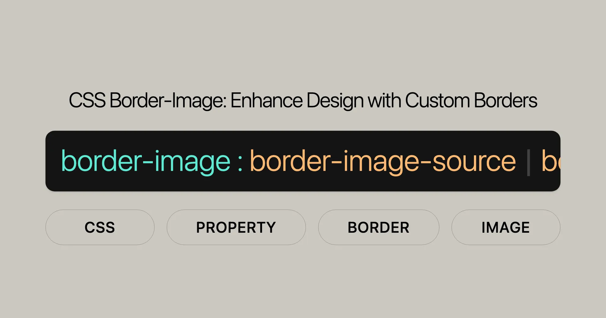
border-image: source slice width outset repeat | initial | inherit;Values
-
source
- Specifies the image or gradient used as the border.
- Example:
url('border.png'),linear-gradient(red, blue)
-
slice
- Defines how the source image is sliced into regions.
- Example:
27,30%
-
width
- Sets the width of the border image.
- Example:
35px,1rem
-
outset
- Specifies the distance by which the border image is extended beyond the element’s border box.
- Example:
1rem,10px
-
repeat
- Determines how the border image is repeated or stretched.
- Example:
stretch,repeat,round,space
Example Usage
Here’s how you can use the border-image property in your CSS:
/* Basic usage */border-image: url('border.png') 30 round;
/* With width and outset */border-image: url('border.png') 30 / 20px / 10px round;
/* Using a gradient */border-image: linear-gradient(red, blue) 30 round;
Accessibility
While border-image can make your web elements look great, it’s important to consider accessibility. Not all users can see images, so make sure the border image doesn’t contain essential information. If it does, provide a text alternative.
Summary
The border-image property is a versatile tool for creating visually appealing borders. By understanding its syntax and values, you can customize borders to fit your design needs. Just remember to keep accessibility in mind to ensure a good experience for all users.
For more details, check out the full compatibility table and provide any feedback here.
Border Image Property
The border-image property in CSS lets you use images as borders for elements, except for internal table elements when border-collapse is set to collapse. It also works with the ::first-letter pseudo-element.
Key Points
- Inherited:
border-imageis not inherited from parent elements. - Percentages: Used in
border-image-slice(size of the border image) andborder-image-width(width or height of the border image area). - Computed Value:
border-image-outset:As specified, with relative lengths converted to absolute lengths.border-image-repeat:As specified.border-image-slice:One to four percentages or absolute lengths, plus the keywordfillif specified.border-image-source:noneor the image with its URI made absolute.border-image-width:As specified, with relative lengths converted to absolute lengths.
- Animation Type:
border-image-outset:By computed value type.border-image-repeat:Discrete.border-image-slice:By computed value type.border-image-source:Discrete.border-image-width:By computed value type.
Formal Syntax
border-image =  [<'border-image-source'>] ||  [<'border-image-slice'> || / [<'border-image-width'>] || / [<'border-image-outset'>] ||  [<'border-image-repeat'>];
<border-image-source> =  none | <image>;
<border-image-slice> =  [ [<number> | <percentage>] {1,4} ] && fill?;
<border-image-width> =  [ [<length-percentage> | <number> | auto] {1,4} ];
<border-image-outset> =  [ [<length> | <number>] {1,4} ];
<border-image-repeat> =  [ [stretch | repeat | round | space] {1,2} ];
<image> =  <url> | <gradient>;
<length-percentage> =  <length> | <percentage>;
<url> =  url(<string> <url-modifier>*) | <src()>;
<src()> =  src(<string> <url-modifier>*);
Examples
Bitmap
HTML:
<div id="bitmap"> This element is surrounded by a bitmap-based border image!</div>CSS:
#bitmap { width: 200px; background-color: #ffa; border: 36px solid orange; margin: 30px; padding: 10px; border-image: url("border.png") 27 / 36px 28px 18px 8px / 18px 14px 9px 4px round;}Explanation:
border-imageusesborder.pngas the source.27slices the image.36px 28px 18px 8pxsets the border width.18px 14px 9px 4pxsets the outset.roundensures the border slices fit evenly.
Gradient
HTML:
<div id="gradient"> This element is surrounded by a gradient-based border image!</div>CSS:
#gradient { width: 200px; border: 30px solid; border-image: repeating-linear-gradient(45deg, #f33, #3bf, #f33 30px) 60; padding: 20px;}Explanation:
borderis30px solid.border-imageuses a repeating linear gradient.60slices the gradient image.paddingis20px.
Rounded Borders
HTML:
<div id="rounded"> This element is surrounded by a border image with rounded corners!</div>CSS:
#rounded { width: 200px; border: 10px solid transparent; padding: 20px; border-radius: 20px; background-image: linear-gradient(white, white), linear-gradient(to right, cyan, lime); background-origin: border-box; background-clip: padding-box, border-box;}Explanation:
borderis10px solid transparent.background-imagecreates a gradient background.background-clipensures the background is clipped to the padding box and border box.
Summary
The border-image property lets you create visually appealing borders using images or gradients. By understanding the syntax and examples, you can enhance your web designs with unique and engaging border styles.
Specifications
The border-image property is defined in the CSS Backgrounds and Borders Module Level 3. Understanding this helps ensure compatibility across browsers.
Key Highlights
- Properties:
border-image-source,border-image-slice,border-image-width,border-image-outset,border-image-repeat. - Syntax: Ensures correct usage.
- Behavior: Describes slicing, repeating, and positioning.
Importance
Following specifications ensures consistency and compatibility across browsers.
Summary
The border-image property’s specifications help create consistent and compatible designs. For details, refer to the CSS Backgrounds and Borders Module Level 3.
Browser Compatibility
The border-image property is widely supported. Here’s a compatibility table:
| Browser | Version | Release Date |
|---|---|---|
| Google Chrome | 16.0 | Dec 2011 |
| Firefox | 15.0 | Aug 2012 |
| Internet Explorer | 11.0 | Oct 2013 |
| Opera | 15.0 | May 2013 |
| Safari | 6.0 | Jul 2012 |
Best Practices
- Fallback Styles: Provide fallbacks for older browsers.
- Prefixes: Use vendor prefixes if needed.
- Testing: Regularly test across different browsers and devices.
Summary
Understanding browser compatibility ensures your designs work consistently. Always test and provide fallbacks for the best user experience.
For the latest information, refer to the Browser Compatibility Data.
See Also
For further reading and related properties:
borderoutlinebox-shadowbackground-image<url>type- Gradient functions:
Additional Resources
- Border images in CSS: A key focus area for Interop 2023 on MDN blog (2023)
Summary
These resources provide additional context for CSS borders and images. Explore them to deepen your understanding and enhance your design skills.
Help Improve MDN
MDN Web Docs is a collaborative project that relies on contributions from the community. Your feedback and contributions are invaluable in improving the quality and accuracy of the documentation.
How to Contribute
- Learn how to contribute: Visit the MDN Contribution Guide to learn how you can contribute to the project.
- Report issues: If you find any issues or have suggestions for improvement, you can report them on the MDN GitHub repository.
Get Involved
Your involvement in improving MDN helps ensure that the documentation remains up-to-date, accurate, and useful for the web development community. Whether you’re reporting a typo, suggesting a new example, or contributing a detailed explanation, your efforts make a significant difference.
Thank you for your support and contributions!
View this Page on GitHub
You can view the source code for this page on GitHub by visiting the GitHub repository for this page. This allows you to see the raw content, make suggestions, or contribute to the documentation directly.
By exploring the GitHub repository, you can gain insights into how the documentation is structured and contribute to its improvement. Whether you are fixing a typo, adding an example, or providing a detailed explanation, your efforts help ensure that the documentation remains accurate and useful for the web development community.
How to Contribute
- View the Source Code: Navigate to the GitHub page to see the raw content of this page.
- Suggest Changes: If you spot any issues or have suggestions for improvement, you can propose changes directly on GitHub.
- Contribute: Follow the MDN Contribution Guide to learn how to contribute to the project.
Get Involved
Your involvement in improving MDN helps ensure that the documentation remains up-to-date, accurate, and useful for the web development community. Whether you’re reporting a typo, suggesting a new example, or contributing a detailed explanation, your efforts make a significant difference.
Thank you for your support and contributions!
Report a Problem with this Content
If you encounter any issues with the content on this page, such as errors, omissions, or outdated information, we encourage you to report them. Your feedback helps us improve the quality and accuracy of the documentation.
How to Report a Problem
-
Visit the GitHub Repository:
- You can report a problem directly on the GitHub repository for this page.
-
Provide Details:
- Include a description of the issue.
- Specify where the issue is located.
- Suggest improvements if possible.
-
Submit the Issue:
- Fill out the form and submit it. Our team will review your report.
Why Your Feedback Matters
Your feedback is crucial for maintaining high-quality documentation. By reporting issues, you help ensure that the information is accurate and useful for the web development community.
Thank You
We appreciate your support and contributions. Your efforts make a significant difference in improving the documentation and helping others in the community.
Thank you for your support and contributions!
Supported Browsers
The border-image property in CSS is widely supported across many modern browsers, ensuring that your designs look consistent and appealing. Below is a list of browsers and their versions that support the border-image property:
- Google Chrome: Supported since version 16.0, released in December 2011.
- Firefox: Supported since version 15.0, released in August 2012.
- Internet Explorer: Supported since version 11.0, released in October 2013.
- Opera: Supported since version 15.0, released in May 2013.
- Safari: Supported since version 6.0, released in July 2012.
Summary
The border-image property is well-supported across major browsers, making it a reliable choice for enhancing the visual appeal of your web designs.
FAQs
What is the border-image property in CSS?
The border-image property allows you to use an image as a border instead of a solid color. It provides control over how the image is sliced, resized, and applied around the element.
How do I use the border-image property to create a custom border?
To use the border-image property, follow these steps:
-
Specify the Image Source:
border-image-source: url('border.png'); -
Define the Slice Values:
border-image-slice: 27; -
Set the Width:
border-image-width: 35px; -
Specify the Outset:
border-image-outset: 1rem; -
Control the Repeat Behavior:
border-image-repeat: round;
Combining these properties:
border-image: url('border.png') 27 / 35px / 1rem round;Can I apply border-image to only one side of an element?
The border-image property applies to all sides of an element. For a custom border on just one side, use alternative approaches like background images or pseudo-elements.
What is the difference between border-image and border?
The border property sets the style, width, and color of an element’s border, typically using solid colors or predefined styles. The border-image property allows you to use an image or gradient as the border, providing more design flexibility.
Why isn’t my border-image displaying correctly?
If your border-image is not displaying correctly, consider the following:
- Check the Image Path: Ensure the image path is correct.
- Specify
border-style: Setborder-styleto something other thannone.border-style: solid; - Adjust Slice and Width Values: Ensure
border-image-sliceandborder-image-widthvalues are correctly set. - Use Fallback Styles: Provide fallback styles for browsers that do not support the
border-imageproperty.
How do I ensure accessibility with border-image?
To ensure accessibility when using the border-image property:
- Text Alternatives: Provide a text alternative if the border image contains critical information.
- Contrast: Ensure the border image does not compromise the readability of the text or other important content.
- Screen Readers: Screen readers cannot parse border images. If the image conveys meaningful information, include that information in the text or use ARIA attributes.
Summary
The border-image property in CSS is a powerful tool for creating visually appealing and customized borders. By understanding how to use the property and following best practices for accessibility, you can enhance the design of your web pages and ensure that they are accessible to all users.
 Latest Blogs
  สร้างเว็บไซต์ 1 เว็บ ต้องใช้งบเท่าไหร่? เจาะลึกทุกองค์ประกอบ website development cost อยากสร้างเว็บไซต์แต่ไม่มั่นใจในเรื่องของงบประมาณ อ่านสรุปเจาะลึกตั้งแต่ดีไซน์, ฟังก์ชัน และการดูแล พร้อมตัวอย่างงบจริงจาก Till it’s done ที่แผนชัด งบไม่บานปลายแน่นอน
  Next.js สอน 14 ขั้นตอนเบื้องต้น: สร้างโปรเจกต์แรกใน 30 นาที เริ่มต้นกับ Next.js ใน 14 ขั้นตอนเพียงแค่ 30 นาที พร้อม SSR/SSG และ API Routes ด้วยตัวอย่างโค้ดง่าย ๆ อ่านต่อเพื่อสร้างโปรเจ็กต์แรกได้ทันทีที่นี่
  วิธีสมัคร Apple Developer Account เพื่อนำแอปขึ้น App Store ทีละขั้นตอน อยากปล่อยแอปบน App Store ระดับโลก มาอ่านคู่มือสมัคร Apple Developer Account พร้อมเคล็ดลับ TestFlight และวิธีอัปโหลดที่ง่ายในบทความเดียวนี้ได้เลย
  TypeScript Interface คืออะไร? อธิบายพร้อมวิธีใช้และข้อแตกต่างจาก Type เรียนรู้วิธีใช้ TypeScript Interface เพื่อสร้างโครงสร้างข้อมูลที่ปลอดภัยและเข้าใจง่าย พร้อมเปรียบเทียบข้อดีข้อแตกต่างกับ Type ที่คุณต้องรู้ ถูกรวมเอาไว้ในบทความนี้แล้ว
  Material-UI (MUI) คืออะไร อยากสร้าง UI สวยงามและเป็นมืออาชีพในเวลาอันรวดเร็วใช่ไหม มาทำความรู้จักกับ Material-UI (MUI) ที่ช่วยให้คุณพัฒนาแอปพลิเคชันบน React ได้ง่ายและดูดีในทุกอุปกรณ์
  เปรียบเทียบ 3 วิธีติดตั้ง install node js บน Ubuntu: NVM vs NodeSource vs Official Repo แบบไหนดีที่สุด? เรียนรู้วิธีติดตั้ง Node.js บน Ubuntu ด้วย NVM, NodeSource หรือ Official Repo เลือกวิธีที่เหมาะกับความต้องการของคุณ พร้อมเปรียบเทียบ เพื่อการพัฒนาที่มีประสิทธิภาพ!
 พูดคุยกับซีอีโอ
Explore our best articles, cover a wide variety of technologies 
 ReactJs
  Flutter
  Nodejs
  Nextjs
  TailwindCSS
  Typescript Golang AstroJs Jest Website development th Mobile application th Reactjs th Nextjs th Flutter th Software house th Nodejs th Typescript th
  CSS
CSS We'll be right here with you every step of the way.
We'll be here, prepared to commence this promising collaboration.


Whether you're curious about features, warranties, or shopping policies, we provide comprehensive answers to assist you.