
- Services
- Case Studies
- Technologies
- NextJs development
- Flutter development
- NodeJs development
- ReactJs development
- About
- Contact
- Tools
- Blogs
- FAQ
 Scroll to discover
 Understanding CSS aspect-ratio for Consistent Layouts
Explore available options like auto and fractional values.
Introduction to CSS aspect-ratio
The aspect-ratio property in CSS is a powerful tool for web developers and designers. It helps define the desired width-to-height ratio of an element’s box, ensuring consistent proportions even when the parent container or viewport size changes. This property has been widely available since September 2021 and is well-supported across many devices and browser versions.
By using the aspect-ratio property, you can create elements that maintain their aspect ratio, providing a more visually appealing and consistent design. This property is particularly useful for ensuring that images, videos, and other media maintain their original proportions, even as they scale with the screen size.
In this article, we will explore the aspect-ratio property in detail, covering its definition, basic usage, syntax, values, effects, handling natural aspect ratios, practical applications, and dealing with legacy browser support.
By the end of this article, you will have a comprehensive understanding of the aspect-ratio property and how to effectively use it in your web development and design projects.
Baseline and Browser Compatibility
The aspect-ratio property is a well-established feature and is widely available across many devices and browser versions. It has been supported in browsers since September 2021, making it a reliable tool for web developers and designers.
Baseline
The baseline refers to the core functionality of the aspect-ratio property, which is widely supported and stable. This means you can confidently use it in your projects without worrying about compatibility issues.
Browser Compatibility
The aspect-ratio property is supported in all major browsers, including:
- Google Chrome: Version 88 and above
- Microsoft Edge: Version 88 and above
- Mozilla Firefox: Version 89 and above
- Opera: Version 74 and above
- Safari: Version 15 and above
This widespread support ensures that your designs will look consistent and maintain their aspect ratios across different browsers and devices.
Learn More
For detailed compatibility information, you can refer to the following resources:
By understanding the baseline and browser compatibility of the aspect-ratio property, you can ensure your web designs are robust and consistent across various platforms.
Definition and Basic Usage
The aspect-ratio property in CSS allows you to define the desired width-to-height ratio of an element’s box. This means that even if the parent container or viewport size changes, the browser will adjust the element’s dimensions to maintain the specified aspect ratio. This property is particularly useful for maintaining consistent proportions of elements like images, videos, and other media.
Basic Usage
To use the aspect-ratio property, you simply specify the ratio of the width to the height. This can be done using a fractional value, such as 1 / 1 for a square or 16 / 9 for a widescreen ratio. Here’s a simple example:
.element { aspect-ratio: 1 / 1;}In this example, the element will maintain a square shape, with the width and height being equal.
Syntax
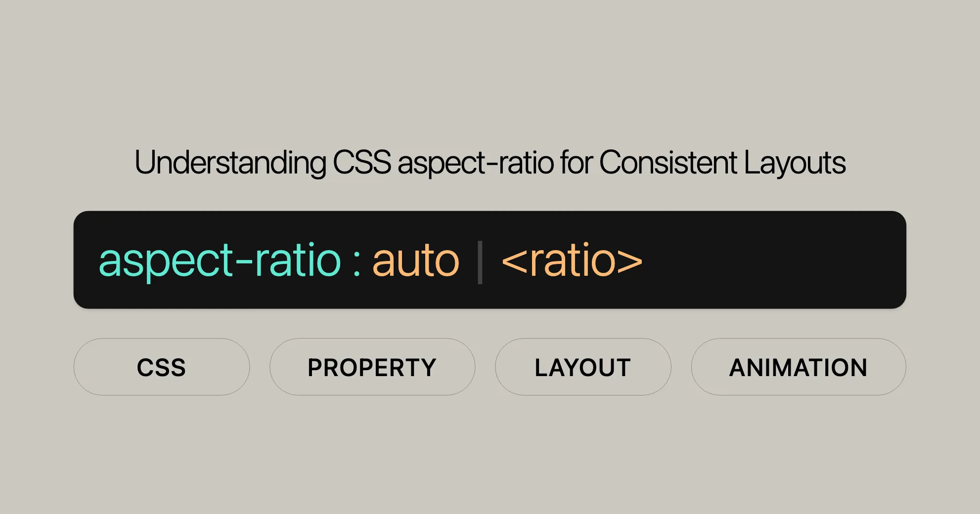
The syntax for the aspect-ratio property is straightforward. You can specify the aspect ratio using a fractional value or the keyword auto. Here are some examples:
aspect-ratio: 1 / 1; /* Square aspect ratio */aspect-ratio: 16 / 9; /* Widescreen aspect ratio */aspect-ratio: auto; /* No preferred aspect ratio */Important Considerations
- Automatic Sizes: At least one of the box’s sizes (width or height) needs to be automatic for
aspect-ratioto have any effect. If neither the width nor height is automatic, the provided aspect ratio will have no effect on the box’s preferred sizes. - Replaced Elements: For replaced elements like images, the
aspect-ratioproperty can be used to set a preferred aspect ratio until the content is loaded. After the content is loaded, theautovalue is applied, so the intrinsic aspect ratio of the loaded content is used.
Examples
Here’s a practical example demonstrating the use of the aspect-ratio property:
<!DOCTYPE html><html lang="en"><head> <meta charset="UTF-8"> <meta name="viewport" content="width=device-width, initial-scale=1.0"> <title>CSS aspect-ratio Property</title> <style> .box { width: 200px; aspect-ratio: 1 / 1; /* Square shape */ background-color: lightblue; } </style></head><body> <div class="box"></div></body></html>In this example, the .box element will maintain a square shape with a width and height of 200px, thanks to the aspect-ratio property.
By understanding the definition and basic usage of the aspect-ratio property, you can effectively control the proportions of elements in your web designs, ensuring a consistent and visually appealing layout.
Values and Their Effects
The aspect-ratio property in CSS allows you to specify the desired width-to-height ratio of an element. Understanding the different values and their effects is crucial for utilizing this property effectively. Here, we will explore the various values you can use with aspect-ratio and how they impact the layout of your elements.
Values
auto- Description: The default value. It means the element has no preferred aspect ratio and will size itself as it normally would. For replaced elements like images with an intrinsic aspect ratio, the natural aspect ratio is used.
- Effect: The element’s dimensions are determined based on its content and the surrounding layout, without any enforced aspect ratio.
<ratio>- Description: Specifies the aspect ratio as a fractional value. The syntax is
<width> / <height>, where both values are positive numbers. If the height value is omitted, it defaults to1. - Effect: The element’s dimensions are adjusted to maintain the specified width-to-height ratio. This ensures that the element keeps its proportions, even as the parent container or viewport size changes.
- Description: Specifies the aspect ratio as a fractional value. The syntax is
auto && <ratio>- Description: Specifies both
autoand a<ratio>. If the element is a replaced element with a natural aspect ratio (like an image), theautovalue is used, and the intrinsic aspect ratio of the content is applied. Otherwise, the specified ratio is used. - Effect: This combination allows for a fallback mechanism. For replaced elements, the natural aspect ratio is used. For non-replaced elements, the specified ratio is applied.
- Description: Specifies both
Examples
Example 1: Using auto
In this example, the element will size itself based on its content and the surrounding layout, without any enforced aspect ratio.
.element { aspect-ratio: auto;}Example 2: Using <ratio>
In this example, the element will maintain a 16:9 aspect ratio.
.element { aspect-ratio: 16 / 9;}Example 3: Using auto && <ratio>
In this example, the element will use a 3:2 aspect ratio until the content is loaded. For replaced elements like images, the natural aspect ratio will be used after the content is loaded.
img { aspect-ratio: 3 / 2 auto;}Practical Applications
Consistent Image Sizes
Using the aspect-ratio property can help maintain consistent image sizes, ensuring that images do not stretch or distort when resized.
img { width: 100%; aspect-ratio: 4 / 3;}Responsive Videos
For embedding videos, the aspect-ratio property can be used to ensure that the video maintains its aspect ratio when the viewport size changes.
iframe { aspect-ratio: 16 / 9; width: 100%;}Grid Layouts
In grid layouts, the aspect-ratio property can be used to ensure that grid items maintain their proportions, creating a more visually appealing and consistent layout.
.grid-item { aspect-ratio: 1 / 1;}Conclusion
Understanding the values and their effects is essential for effectively using the aspect-ratio property. By specifying the desired aspect ratio, you can ensure that your elements maintain their proportions, creating a more visually appealing and responsive layout. Whether you’re working with images, videos, or grid layouts, the aspect-ratio property provides a powerful tool for controlling the dimensions of your elements.
Exploring aspect-ratio with Fixed Width
The aspect-ratio property in CSS is particularly useful when dealing with elements that have fixed widths. Understanding how aspect-ratio interacts with fixed widths can help you create more flexible and responsive designs. In this section, we will explore the behavior of the aspect-ratio property when an element has a fixed width.
Behavior with Fixed Width
When you set a fixed width on an element and apply the aspect-ratio property, the browser adjusts the height of the element to maintain the specified aspect ratio. This ensures that the element retains its proportions, even as the width changes.
Example
Let’s consider an example where we have a series of <div> elements with fixed widths and different aspect ratios.
HTML
<!DOCTYPE html><html lang="en"><head> <meta charset="UTF-8"> <meta name="viewport" content="width=device-width, initial-scale=1.0"> <title>CSS aspect-ratio Property</title> <style> .box1 { width: 200px; aspect-ratio: 1 / 1; /* Square shape */ background-color: lightblue; } .box2 { width: 300px; aspect-ratio: 16 / 9; /* Widescreen shape */ background-color: lightgreen; } .box3 { width: 200px; aspect-ratio: 3 / 2 auto; /* Fallback to natural aspect ratio */ background-color: lime; } </style></head><body> <div class="box1"></div> <div class="box2"></div> <div class="box3"></div></body></html>In this example, the .box1 element will maintain a square shape with a width and height of 200px. The .box2 element will have a widescreen shape with a width of 300px and an aspect ratio of 16:9. The .box3 element will initially use a 3:2 aspect ratio and fall back to its natural aspect ratio if it is a replaced element.
Important Considerations
- Automatic Sizes: At least one of the box’s sizes (width or height) needs to be automatic for
aspect-ratioto have any effect. If neither the width nor height is automatic, the provided aspect ratio will have no effect on the box’s preferred sizes. - Replaced Elements: For replaced elements like images, the
aspect-ratioproperty can be used to set a preferred aspect ratio until the content is loaded. After the content is loaded, theautovalue is applied, so the intrinsic aspect ratio of the loaded content is used.
Practical Applications
Consistent Image Sizes
Using the aspect-ratio property can help maintain consistent image sizes, ensuring that images do not stretch or distort when resized.
img { width: 100%; aspect-ratio: 4 / 3;}Responsive Videos
For embedding videos, the aspect-ratio property can be used to ensure that the video maintains its aspect ratio when the viewport size changes.
iframe { aspect-ratio: 16 / 9; width: 100%;}Grid Layouts
In grid layouts, the aspect-ratio property can be used to ensure that grid items maintain their proportions, creating a more visually appealing and consistent layout.
.grid-item { aspect-ratio: 1 / 1;}Conclusion
Understanding how the aspect-ratio property behaves with fixed widths is essential for creating flexible and responsive designs. By ensuring that elements maintain their proportions, you can create a more visually appealing and consistent layout. Whether you’re working with images, videos, or grid layouts, the aspect-ratio property provides a powerful tool for controlling the dimensions of your elements.
Handling Natural Aspect Ratios
The aspect-ratio property in CSS is particularly useful for handling natural aspect ratios of replaced elements like images and videos. Understanding how the aspect-ratio property interacts with natural aspect ratios can help you create more flexible and responsive designs. In this section, we will explore the behavior of the aspect-ratio property with natural aspect ratios.
Behavior with Natural Aspect Ratios
For replaced elements like images, the aspect-ratio property can be used to set a preferred aspect ratio until the content is loaded. After the content is loaded, the auto value is applied, so the intrinsic aspect ratio of the loaded content is used.
Example
Let’s consider an example where we have an image with a natural aspect ratio and use the aspect-ratio property to set a preferred aspect ratio.
HTML
<!DOCTYPE html><html lang="en"><head> <meta charset="UTF-8"> <meta name="viewport" content="width=device-width, initial-scale=1.0"> <title>CSS aspect-ratio Property</title> <style> img { width: 200px; aspect-ratio: 3 / 2 auto; /* Fallback to natural aspect ratio */ border: 2px dashed red; background-color: lime; } </style></head><body> <img src="example.jpg" alt="Example Image"></body></html>In this example, the image will initially use a 3:2 aspect ratio. Once the image content is loaded, it will use its natural aspect ratio.
Important Considerations
- Automatic Sizes: At least one of the box’s sizes (width or height) needs to be automatic for
aspect-ratioto have any effect. If neither the width nor height is automatic, the provided aspect ratio will have no effect on the box’s preferred sizes. - Replaced Elements: For replaced elements like images, the
aspect-ratioproperty can be used to set a preferred aspect ratio until the content is loaded. After the content is loaded, theautovalue is applied, so the intrinsic aspect ratio of the loaded content is used.
Practical Applications
Consistent Image Sizes
Using the aspect-ratio property can help maintain consistent image sizes, ensuring that images do not stretch or distort when resized.
img { width: 100%; aspect-ratio: 4 / 3;}Responsive Videos
For embedding videos, the aspect-ratio property can be used to ensure that the video maintains its aspect ratio when the viewport size changes.
iframe { aspect-ratio: 16 / 9; width: 100%;}Grid Layouts
In grid layouts, the aspect-ratio property can be used to ensure that grid items maintain their proportions, creating a more visually appealing and consistent layout.
.grid-item { aspect-ratio: 1 / 1;}Conclusion
Understanding how the aspect-ratio property handles natural aspect ratios is essential for creating flexible and responsive designs. By ensuring that elements maintain their proportions, you can create a more visually appealing and consistent layout. Whether you’re working with images, videos, or grid layouts, the aspect-ratio property provides a powerful tool for controlling the dimensions of your elements.
Specifications and Formal Definitions
The aspect-ratio property in CSS is defined in the CSS Box Sizing Module Level 4 specification. Understanding the formal definitions and specifications can help you use the property more effectively and ensure compatibility across different browsers.
Specifications
The aspect-ratio property is part of the CSS Box Sizing Module Level 4 specification, which defines the sizing and layout of elements in CSS. The specification provides detailed information on how the aspect-ratio property works and how it should be implemented by browsers.
Formal Definitions
aspect-ratio: Specifies the preferred aspect ratio for the box. The aspect ratio is defined as the ratio of the width to the height. The value can be a fractional value or the keywordauto.auto: Indicates that the element has no preferred aspect ratio and will size itself as it normally would. For replaced elements like images with an intrinsic aspect ratio, the natural aspect ratio is used.<ratio>: Specifies the aspect ratio as a fractional value. The syntax is<width> / <height>, where both values are positive numbers. If the height value is omitted, it defaults to1.
Browser Compatibility
The aspect-ratio property is supported in all major browsers, including:
- Google Chrome: Version 88 and above
- Microsoft Edge: Version 88 and above
- Mozilla Firefox: Version 89 and above
- Opera: Version 74 and above
- Safari: Version 15 and above
This widespread support ensures that your designs will look consistent and maintain their aspect ratios across different browsers and devices.
Learn More
For detailed compatibility information, you can refer to the following resources:
Conclusion
Understanding the specifications and formal definitions of the aspect-ratio property can help you use it more effectively in your web development and design projects. By ensuring compatibility across different browsers, you can create robust and consistent designs that maintain their aspect ratios.
Practical Applications and Legacy Browser Support
The aspect-ratio property in CSS is a powerful tool for maintaining consistent proportions in your web designs. In this section, we will explore practical applications of the aspect-ratio property and discuss how to deal with legacy browser support.
Practical Applications
Consistent Image Sizes
Using the aspect-ratio property can help maintain consistent image sizes, ensuring that images do not stretch or distort when resized.
img { width: 100%; aspect-ratio: 4 / 3;}Responsive Videos
For embedding videos, the aspect-ratio property can be used to ensure that the video maintains its aspect ratio when the viewport size changes.
iframe { aspect-ratio: 16 / 9; width: 100%;}Grid Layouts
In grid layouts, the aspect-ratio property can be used to ensure that grid items maintain their proportions, creating a more visually appealing and consistent layout.
.grid-item { aspect-ratio: 1 / 1;}Dealing with Legacy Browser Support
While the aspect-ratio property is widely supported in modern browsers, you may still need to consider legacy browser support for older browsers that do not support this property. Here are some strategies to deal with legacy browser support:
Fallback Mechanisms
You can use fallback mechanisms to ensure that your designs still look good in older browsers. For example, you can use the object-fit property for images and videos, which is supported in older browsers.
img { width: 100%; height: auto; object-fit: cover;}Feature Detection
You can use feature detection to check if the aspect-ratio property is supported in the browser and apply fallback styles if it is not supported.
if (!CSS.supports('aspect-ratio', '1 / 1')) { // Apply fallback styles}Polyfills
You can use polyfills to add support for the aspect-ratio property in older browsers. Polyfills are scripts that provide support for new features in older browsers.
<script src="path/to/aspect-ratio-polyfill.js"></script>Example: Padded-Box Technique
The padded-box technique is a common fallback solution for maintaining aspect ratios in older browsers. It uses padding to create a box with the desired aspect ratio.
<!DOCTYPE html><html lang="en"><head> <meta charset="UTF-8"> <meta name="viewport" content="width=device-width, initial-scale=1.0"> <title>Padded-Box Technique</title> <style> .element { position: relative; width: 100%; padding-top: 56.25%; /* 16:9 aspect ratio */ background-color: lightblue; } </style></head><body> <div class="element"></div></body></html>Practical Applications with Fallbacks
Responsive Images with Fallback
Ensure images keep their aspect ratios in older browsers.
img {  width: 100%;  aspect-ratio: 16 / 9;}
@supports not (aspect-ratio: 16 / 9) {  img {    position: relative;    padding-top: 56.25%; /* 16:9 aspect ratio */  }  img::before {    content: "";    display: block;    padding-top: 100%;  }}
Consistent Grid Layouts with Fallback
Ensure grid items keep their proportions in older browsers.
.grid-item {  aspect-ratio: 1 / 1;}
@supports not (aspect-ratio: 1 / 1) {  .grid-item {    position: relative;    padding-top: 100%; /* 1:1 aspect ratio */  }  .grid-item::before {    content: "";    display: block;    padding-top: 100%;  }}
Conclusion
Dealing with legacy browser support is essential for consistent and functional designs. By using @supports and the padded-box technique, you can provide fallbacks for older browsers that don’t support the aspect-ratio property.
Related CSS Properties
Several related CSS properties complement the aspect-ratio property, enhancing your ability to create responsive and well-structured designs.
width and height
Define the dimensions of an element.
max-width and max-height
Define the maximum width and height of an element.
min-width and min-height
Define the minimum width and height of an element.
object-fit
Define how the content of a replaced element (like an image or video) should be resized to fit its container.
box-sizing
Define how the total width and height of an element are calculated.
Example
.element { width: 200px; height: auto; aspect-ratio: 1 / 1; /* Square shape */ box-sizing: border-box; /* Include padding and border in the element's total width and height */}Conclusion
Understanding and using related CSS properties with aspect-ratio can greatly enhance your ability to create responsive and visually appealing web designs. By mastering these properties, you can create designs that are not only visually appealing but also responsive and functional across different devices and screen sizes.
Hope this helps! Let me know if you need further simplification or have any other questions.
 Latest Blogs
  สร้างเว็บไซต์ 1 เว็บ ต้องใช้งบเท่าไหร่? เจาะลึกทุกองค์ประกอบ website development cost อยากสร้างเว็บไซต์แต่ไม่มั่นใจในเรื่องของงบประมาณ อ่านสรุปเจาะลึกตั้งแต่ดีไซน์, ฟังก์ชัน และการดูแล พร้อมตัวอย่างงบจริงจาก Till it’s done ที่แผนชัด งบไม่บานปลายแน่นอน
  Next.js สอน 14 ขั้นตอนเบื้องต้น: สร้างโปรเจกต์แรกใน 30 นาที เริ่มต้นกับ Next.js ใน 14 ขั้นตอนเพียงแค่ 30 นาที พร้อม SSR/SSG และ API Routes ด้วยตัวอย่างโค้ดง่าย ๆ อ่านต่อเพื่อสร้างโปรเจ็กต์แรกได้ทันทีที่นี่
  วิธีสมัคร Apple Developer Account เพื่อนำแอปขึ้น App Store ทีละขั้นตอน อยากปล่อยแอปบน App Store ระดับโลก มาอ่านคู่มือสมัคร Apple Developer Account พร้อมเคล็ดลับ TestFlight และวิธีอัปโหลดที่ง่ายในบทความเดียวนี้ได้เลย
  TypeScript Interface คืออะไร? อธิบายพร้อมวิธีใช้และข้อแตกต่างจาก Type เรียนรู้วิธีใช้ TypeScript Interface เพื่อสร้างโครงสร้างข้อมูลที่ปลอดภัยและเข้าใจง่าย พร้อมเปรียบเทียบข้อดีข้อแตกต่างกับ Type ที่คุณต้องรู้ ถูกรวมเอาไว้ในบทความนี้แล้ว
  Material-UI (MUI) คืออะไร อยากสร้าง UI สวยงามและเป็นมืออาชีพในเวลาอันรวดเร็วใช่ไหม มาทำความรู้จักกับ Material-UI (MUI) ที่ช่วยให้คุณพัฒนาแอปพลิเคชันบน React ได้ง่ายและดูดีในทุกอุปกรณ์
  เปรียบเทียบ 3 วิธีติดตั้ง install node js บน Ubuntu: NVM vs NodeSource vs Official Repo แบบไหนดีที่สุด? เรียนรู้วิธีติดตั้ง Node.js บน Ubuntu ด้วย NVM, NodeSource หรือ Official Repo เลือกวิธีที่เหมาะกับความต้องการของคุณ พร้อมเปรียบเทียบ เพื่อการพัฒนาที่มีประสิทธิภาพ!
 พูดคุยกับซีอีโอ
Explore our best articles, cover a wide variety of technologies 
 ReactJs
  Flutter
  Nodejs
  Nextjs
  TailwindCSS
  Typescript Golang AstroJs Jest Website development th Mobile application th Reactjs th Nextjs th Flutter th Software house th Nodejs th Typescript th
  CSS
CSS We'll be right here with you every step of the way.
We'll be here, prepared to commence this promising collaboration.


Whether you're curious about features, warranties, or shopping policies, we provide comprehensive answers to assist you.