
- Services
- Case Studies
- Technologies
- NextJs development
- Flutter development
- NodeJs development
- ReactJs development
- About
- Contact
- Tools
- Blogs
- FAQ
 Scroll to discover
 Mastering CSS Animation-Name for Dynamic Web Design
Discover available options such as 'none', custom identifiers, and global values.
Introduction
The animation-name property in CSS is crucial for linking an element to one or more @keyframes rules that define its animation. This property lets you specify which animations will be applied to an element. Understanding the animation-name property is essential for creating dynamic and engaging animations. This article will guide you through its syntax, values, and practical examples.
Specification
The animation-name property is defined in the CSS Animations Level 1 specification. This specification provides guidelines for using animations in CSS and ensures consistent behavior across different browsers.
For more details, you can check the official specification:
Syntax
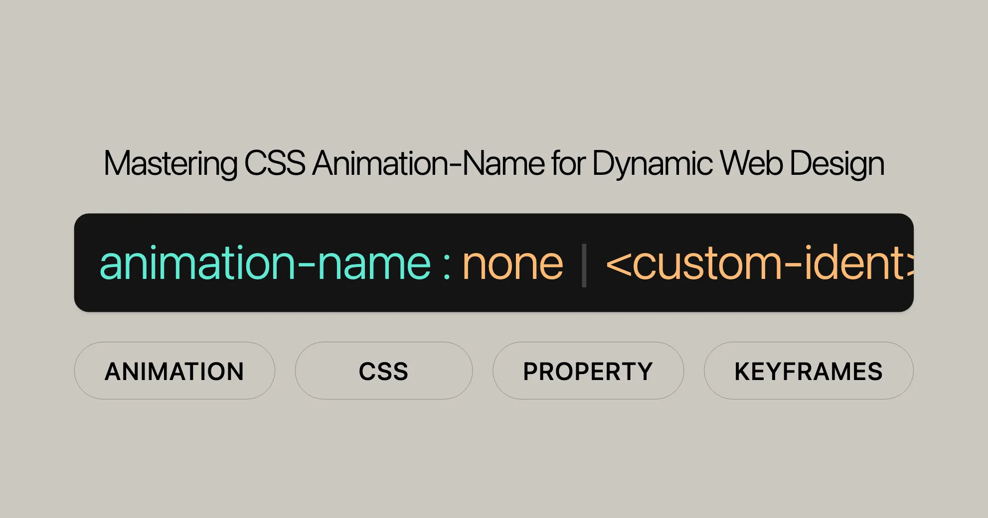
The animation-name property in CSS specifies the names of one or more @keyframes rules. Here’s the basic syntax:
/* Single animation */animation-name: none;animation-name: test_05;animation-name: -specific;animation-name: sliding-vertically;
/* Multiple animations */animation-name: test1, animation4;animation-name:  none,  -moz-specific,  sliding;
/* Global values */animation-name: inherit;animation-name: initial;animation-name: revert;animation-name: revert-layer;animation-name: unset;
Explanation
- Single Animation: Specify a single keyframe name.
- Multiple Animations: Specify multiple keyframe names separated by commas.
- Global Values: Use values like
inherit,initial,revert,revert-layer, andunsetto control the property’s behavior.
Understanding the syntax is key to effectively controlling and customizing animations in your web projects.
Values
The animation-name property accepts several values:
none
Deactivates the animation without changing the order of other identifiers.
<custom-ident>
A custom identifier representing the animation name. It can include letters (a to z), numbers (0 to 9), underscores (_), and dashes (-). The first non-dash character must be a letter, and it cannot start with two dashes.
Example:
animation-name: myAnimation;Global Values
inherit: Inherits the value from the parent element.initial: Sets the property to its default value (none).revert: Reverts the property to its default value as specified by the browser.revert-layer: Reverts the property to its value from a different cascade layer.unset: Resets the property to its natural value.
Note
When specifying multiple animations, they are applied in the order specified by the animation-name property. For mismatched values, refer to Setting multiple animation property values.
Formal Definition
The animation-name property links an element to @keyframes rules that define its animation.
Initial Value
- Initial Value:
none
Applies To
- Applies To: All elements, including
::beforeand::afterpseudo-elements.
Inheritance
- Inherited: No
Computed Value
- Computed Value: As specified
Animation Type
- Animation Type: Not animatable
Formal Syntax
animation-name =  [ none | <keyframes-name> ]#
<keyframes-name> =  <custom-ident> | <string>
Explanation
none: Deactivates the animation.<keyframes-name>: The name of the@keyframesrule.<custom-ident>: A custom identifier for the animation.<string>: A string value for the keyframe name.
Examples
Here are various examples demonstrating the use of the animation-name property.
Naming an Animation
Create a simple animation that rotates a box when hovered over.
HTML
<div class="box"></div>CSS
.box {  background-color: rebeccapurple;  border-radius: 10px;  width: 100px;  height: 100px;}
.box:hover {  animation-name: rotate;  animation-duration: 0.7s;}
@keyframes rotate {  0% {    transform: rotate(0);  }  100% {    transform: rotate(360deg);  }}
Result
Hover over the rectangle to start the animation.
Multiple Animations
Apply multiple animations to an element.
HTML
<div class="multi-animation"></div>CSS
.multi-animation {  background-color: steelblue;  width: 100px;  height: 100px;  animation-name: slide, fade;  animation-duration: 2s, 1s;  animation-iteration-count: infinite;}
@keyframes slide {  0% {    transform: translateX(0);  }  100% {    transform: translateX(200px);  }}
@keyframes fade {  0% {    opacity: 1;  }  100% {    opacity: 0.5;  }}
Result
The element will slide horizontally while fading in and out.
Using Global Values
Use global values like inherit to control the animation-name property.
HTML
<div class="parent"> <div class="child"></div></div>CSS
.parent {  background-color: lightblue;  width: 200px;  height: 200px;  animation-name: parent-animation;  animation-duration: 2s;  animation-iteration-count: infinite;}
.child {  background-color: darkblue;  width: 100px;  height: 100px;  animation-name: inherit;}
@keyframes parent-animation {  0% {    transform: rotate(0);  }  100% {    transform: rotate(360deg);  }}
Result
The child element will inherit the animation from the parent element, causing both to rotate together.
Note
When specifying multiple animations, ensure the number of animation-name values matches the other animation-* property values. For mismatched values, refer to Setting multiple animation property values.
Browser Compatibility
The animation-name property is widely supported across modern web browsers:
| Browser | Minimum Version | Release Date |
|---|---|---|
| Google Chrome | 43.0 | May 2015 |
| Mozilla Firefox | 16.0 | October 2012 |
| Internet Explorer/Edge | 10.0 | September 2012 |
| Opera | 30.0 | June 2015 |
| Safari | 9.0 | September 2015 |
Important Considerations
While the animation-name property is widely supported, it’s good practice to test your animations across different browsers and devices to ensure a consistent user experience. Consider providing fallback styles for older browsers that do not support CSS animations.
Note
Mismatched animation properties can cause unexpected behavior. Ensure the number of animation-name values matches the other animation-* property values. For more details, refer to Setting multiple animation property values.
Understanding the animation-name property will help you create dynamic and engaging animations in your web projects.
Useful Resources
To learn more about CSS animations and related properties, check out these resources:
Related CSS Properties
- Using CSS Animations: A detailed guide on creating and controlling animations with CSS.
- JavaScript
AnimationEventAPI: How to use JavaScript to interact with and control CSS animations. animation: A shorthand property to set all animation properties at once.animation-composition: Sets the behavior of overlapping animations.animation-delay: Defines the delay before an animation starts.animation-direction: Specifies the direction of the animation.animation-duration: Sets the duration of the animation cycle.animation-fill-mode: Defines how styles are applied before and after the animation.animation-iteration-count: Specifies the number of times an animation cycle should play.animation-play-state: Controls the play state of the animation.animation-timeline: Defines the timeline for the animation.animation-timing-function: Specifies the speed curve of the animation.
Additional Resources
- CSS Transition Property Reference: Learn about CSS transitions and how they differ from animations.
- HTML Reference Guide: A guide to HTML elements and attributes.
- MDN Web Docs: Extensive documentation and examples for CSS properties and techniques.
Related Topics
- Web Development: Explore other areas of web development, including JavaScript, HTML, and accessibility.
- Web Design: Learn about design principles, user experience (UX), and user interface (UI) design.
- Responsive Design: Understand how to create websites that adapt to different screen sizes and devices.
By exploring these resources, you can gain a better understanding of CSS animations and related properties, helping you create more dynamic and engaging web experiences.
 Latest Blogs
  สร้างเว็บไซต์ 1 เว็บ ต้องใช้งบเท่าไหร่? เจาะลึกทุกองค์ประกอบ website development cost อยากสร้างเว็บไซต์แต่ไม่มั่นใจในเรื่องของงบประมาณ อ่านสรุปเจาะลึกตั้งแต่ดีไซน์, ฟังก์ชัน และการดูแล พร้อมตัวอย่างงบจริงจาก Till it’s done ที่แผนชัด งบไม่บานปลายแน่นอน
  Next.js สอน 14 ขั้นตอนเบื้องต้น: สร้างโปรเจกต์แรกใน 30 นาที เริ่มต้นกับ Next.js ใน 14 ขั้นตอนเพียงแค่ 30 นาที พร้อม SSR/SSG และ API Routes ด้วยตัวอย่างโค้ดง่าย ๆ อ่านต่อเพื่อสร้างโปรเจ็กต์แรกได้ทันทีที่นี่
  วิธีสมัคร Apple Developer Account เพื่อนำแอปขึ้น App Store ทีละขั้นตอน อยากปล่อยแอปบน App Store ระดับโลก มาอ่านคู่มือสมัคร Apple Developer Account พร้อมเคล็ดลับ TestFlight และวิธีอัปโหลดที่ง่ายในบทความเดียวนี้ได้เลย
  TypeScript Interface คืออะไร? อธิบายพร้อมวิธีใช้และข้อแตกต่างจาก Type เรียนรู้วิธีใช้ TypeScript Interface เพื่อสร้างโครงสร้างข้อมูลที่ปลอดภัยและเข้าใจง่าย พร้อมเปรียบเทียบข้อดีข้อแตกต่างกับ Type ที่คุณต้องรู้ ถูกรวมเอาไว้ในบทความนี้แล้ว
  Material-UI (MUI) คืออะไร อยากสร้าง UI สวยงามและเป็นมืออาชีพในเวลาอันรวดเร็วใช่ไหม มาทำความรู้จักกับ Material-UI (MUI) ที่ช่วยให้คุณพัฒนาแอปพลิเคชันบน React ได้ง่ายและดูดีในทุกอุปกรณ์
  เปรียบเทียบ 3 วิธีติดตั้ง install node js บน Ubuntu: NVM vs NodeSource vs Official Repo แบบไหนดีที่สุด? เรียนรู้วิธีติดตั้ง Node.js บน Ubuntu ด้วย NVM, NodeSource หรือ Official Repo เลือกวิธีที่เหมาะกับความต้องการของคุณ พร้อมเปรียบเทียบ เพื่อการพัฒนาที่มีประสิทธิภาพ!
 พูดคุยกับซีอีโอ
Explore our best articles, cover a wide variety of technologies 
 ReactJs
  Flutter
  Nodejs
  Nextjs
  TailwindCSS
  Typescript Golang AstroJs Jest Website development th Mobile application th Reactjs th Nextjs th Flutter th Software house th Nodejs th Typescript th
  CSS
CSS We'll be right here with you every step of the way.
We'll be here, prepared to commence this promising collaboration.


Whether you're curious about features, warranties, or shopping policies, we provide comprehensive answers to assist you.